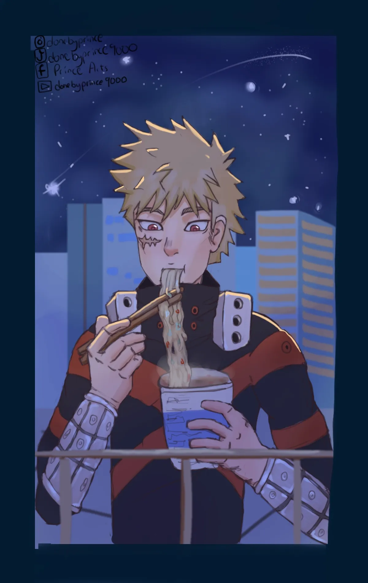
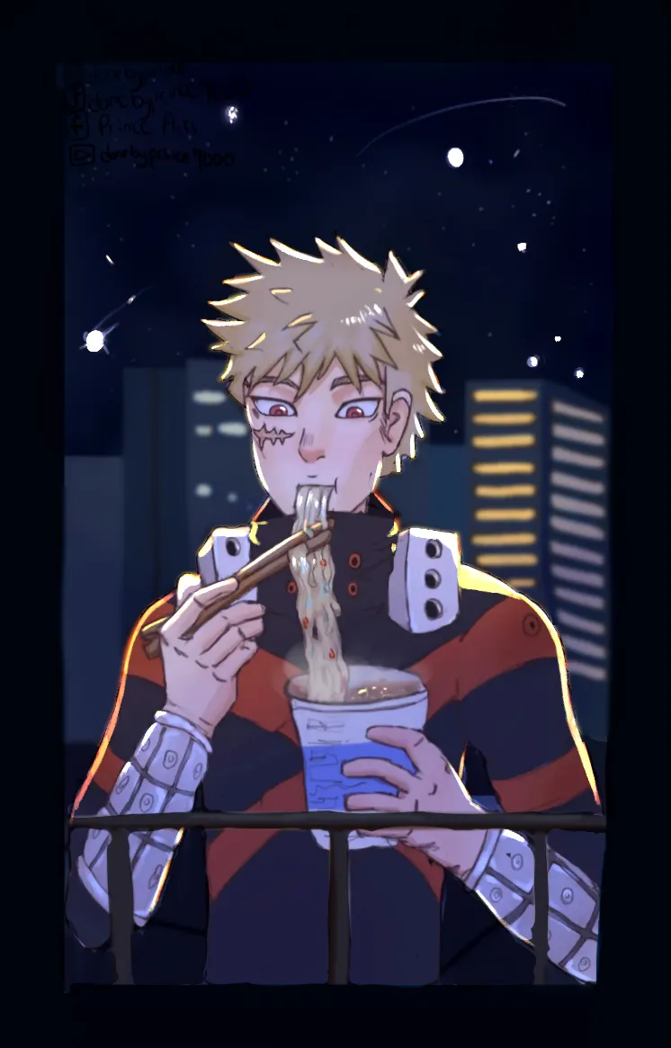

Hello again! So, the main advice I want to give you for this one is "push it." Go further with what you've got and exaggerate. Here's what I mean: Based on your original image, it seemed that your light source was the buildings behind Bakugo. Thus, you gave him a rim light. However, you only had that rim light on a few strands of hair and up along his collar bone. What I did was push that rim light further, exaggerating it along his shoulders and hair, and putting it all along his upper arms and even a little on the metal of his bracers. Of course, a rim light is only really helpful if it helps to separate the character from their surroundings. The background was a bit too light, so I darkened it. This helped to make Bakugo stand out more from the background, making him the clear subject of the piece. This also allowed me to make the stars and the windows brighter, to really sell the light source that's hitting him. The best thing you can do when lighting your scene is to set your image to black and white. I recommend creating a new layer at the very top of your illustration, setting its blending mode to "Color," and then filling it with pure white. If you do this, then you can toggle it on and off to see your drawing in black and white. By doing this, you can more easily see the values of your image, and you can see how readable your image is. When I did this for Bakugo, I saw that the ground around his torso was nearly the same value as his shirt. That made him stand out less, so I darkened the ground. The last thing I did was blur the buildings, since they're so distant in the scene. The blur really makes the subject pop. Hope this helped!
Thanks for the feedback, this was helpful