Inktober Edition: How to Ink Your Drawings (For Artists Who Have Been Avoiding It)
Inktober Edition: How to Ink Your Drawings (For Artists Who Have Been Avoiding It)
Every October, millions of artists pick up a pen for Inktober and immediately remember why they've been avoiding ink all year. The sketch looked good - the ink looks worse problem. Something went wrong somewhere and now there's a dead, scratchy line sitting on top of a drawing that had energy five minutes ago.
If you've been a sketch-only artist - someone whose drawings live in pencil forever because committing to ink feels too permanent, too exposing, too likely to ruin something good - this is for you.
If you have been avoiding inktober because you consider yourself more of a painter - this is also for you.
Why artists avoid inking (and why those reasons are wrong)
The most common reason is permanence. Pencil can be erased. Ink cannot. So the sketch stays a sketch because at least it's safe there, preserved in its potential.
But permanence is also what makes ink powerful. The commitment forces decisions. When you can't go back, you stop second-guessing every line and start making actual choices. The lines that result from that commitment have a quality that endlessly corrected pencil work almost never achieves.
The second reason is the wobble. Artists assume their lines have to be perfect to be worth inking. They don't. A slightly imperfect ink line drawn with confidence reads completely differently from a technically accurate line drawn with hesitation. One looks intentional. The other looks afraid. The wobble you're worried about is often the thing that gives hand-drawn ink its character - the evidence that a human being made this mark. Another reason is that plenty of artists simply don't know how to work with ink - how to add tone to your outline? How to separate an object from the background? It's easy to do with colors, but as soon as it comes to ink... Well.
And for digital inking specifically, the fear makes even less sense. There's an undo button. There's a stabiliser. There are layers. The only thing stopping you is deciding to start.
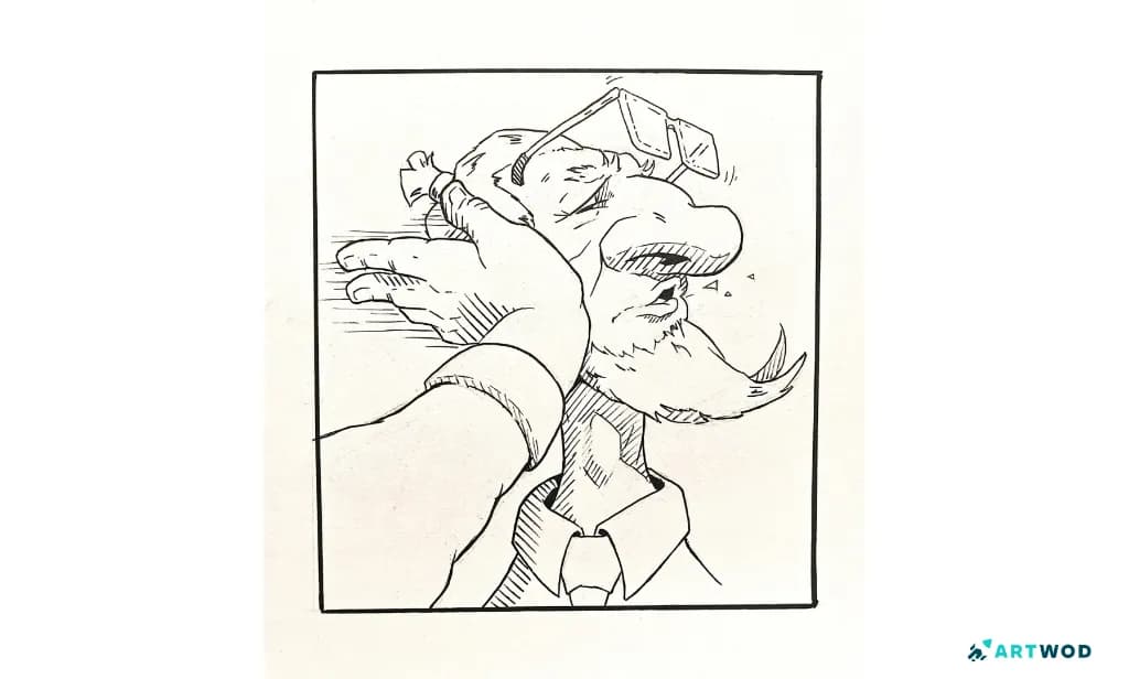
Inktober 2026 submission by @rikuh. Inktober Smack. Traditional drawing
Line weight - the concept that changes everything
Before any technique, this. Line weight is the single most important concept in inking, and getting it wrong is what makes most inked drawings feel flat regardless of how carefully they were executed.
The basic principle: thick lines carry visual weight and demand attention. Thin lines recede and support. So thick lines belong on silhouettes - the outer edges of forms - and on areas where shapes overlap or press against each other. Thin lines belong on internal details, surface texture, and anything that shouldn't pull the eye.
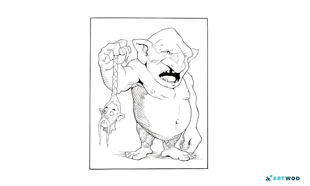
Inktober 2026 submission by @rikuh. Inktober Orge. Traditional drawing
When everything is the same thickness, nothing has hierarchy. The drawing reads as flat because there's no signal about what matters and what doesn't. Line weight is that signal. It's doing the same job that values do in a painting - creating depth, directing attention, separating forms. Look at the example by @rikuh and notice, where he uses thicker and thinner lines.
In traditional inking, line weight comes from pressure and speed. In digital inking, it comes from brush settings and deliberate variation. The concept is identical. Learn it once and it applies everywhere.
Traditional inking techniques
The single most important traditional inking technique has nothing to do with the pen. It's the confident stroke.
Tentative inking - short hesitant marks layered over each other trying to approximate one clean line - is the most common mistake beginners make and the hardest habit to break. The result looks scratchy and unsure, not because the lines are imperfect but because they're visibly afraid. The fix is counterintuitive: go faster, not slower. A fast confident line drawn from the shoulder will almost always read better than a slow careful line drawn from the wrist, even when the fast one isn't technically perfect.
The shoulder versus wrist distinction matters particularly for longer lines. Short details can be drawn from the wrist. Anything longer - the sweep of a jaw, the curve of a back, a long straight edge - needs the whole arm involved. The wrist can't maintain a clean arc over a long distance. The shoulder can. Creating tone with Inking
Hatching and cross-hatching are how traditional inking creates value. Parallel lines close together read as dark. Spaced further apart they read as lighter. Cross-hatching - hatching in two or more directions - builds up deeper shadow and texture. The key is consistency in the direction and spacing within a given area. Messy hatching that changes direction randomly reads as noise rather than value.
The other major traditional technique is the black fill - knowing when to fill an area completely solid rather than hatch it. Deep shadow areas, cast shadows, hair that reads as very dark, background negative space. Black fills are graphic and decisive and they give an inked illustration much of its visual punch. The mistake is being timid with them. If an area is in deep shadow, fill it. The contrast is the point.
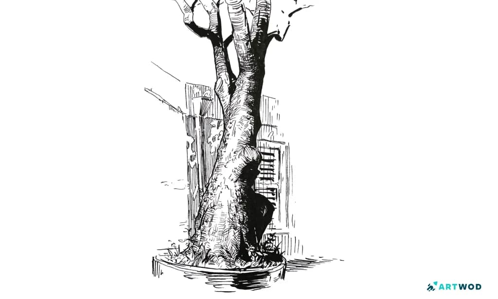
Tree traditional ink drawing by Antonio Stappaerts
Digital inking techniques
The stabiliser is the most underused tool in digital inking. It smooths the path of your stroke without removing the feel of a drawn line - compensating for hand wobble and giving you cleaner curves and straighter lines than your raw hand movement would produce. Most beginners either don't know it exists or set it too high, which makes lines feel rubbery and artificial. The right stabiliser setting is the one where your lines feel controlled but still like yours. Spend ten minutes testing it before you ink anything important.
Inking in passes is the technique that prevents digital work from getting muddy. Don't try to ink everything in one go on one layer. Start with the silhouette - the outer edge of the figure or object, nothing else. Get that right. Then add a layer for major internal lines. Then a layer for details and texture. Working in stages means a mistake on one layer doesn't destroy everything else, and it forces you to think about hierarchy - silhouette first, details last, always.
Brush choice matters more than most artists realise. A brush with a soft, feathery edge makes crisp clean inking nearly impossible - the lines bloom and lose their edge. For inking, you almost always want a hard-edged brush, something that produces a clean definite line. Save the textured and soft brushes for rendering. Ink with something that behaves like ink.
One digital technique worth developing is the deliberate simulation of traditional line weight. Because digital stabilisers make every line equally smooth, it's easy to end up with inking that feels too perfect - uniform, mechanical, lifeless. Fighting this means manually varying line weight throughout the drawing, building up thicker lines at overlaps and silhouette edges and letting lines taper at their ends. It takes intention but it's what gives digital inking warmth and personality. Look at this Artwod Community submission by @scalarwaver. They chose a textured hard brush that imitates the ink perfectly.
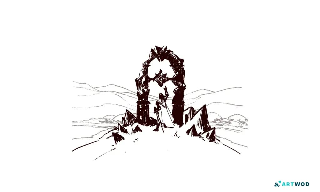
Artwod Community submission
How to ink over a sketch without killing the energy
This is the complaint that comes up most often from artists who finally try inking. The sketch had life. The clean version looks dead.
The reason is almost always tracing. When you follow the pencil line exactly, you're not drawing - you're copying. And copying removes all the decisions that gave the sketch its energy in the first place. The slight angle of the head. The curve in the spine. The way the hand was positioned. All of those were micro-decisions made quickly while sketching. Tracing them line for line at inking speed kills them.
So use the sketch as a guide, not a template. Look at what the sketch is doing and re-draw it with ink - same gesture, same proportions, same intent, but as a fresh drawing rather than a reproduction. The ink version should feel like you drew it, not like you copied it.
This also means you'll make small changes. A line that worked at sketch weight doesn't always work as an ink line. A curve that felt right in pencil might need slight adjustment in ink. These changes aren't failures - they're part of the process of translating one medium into another.
If your inked version keeps coming out stiff and dead, try inking faster. Most of the energy in a sketch comes from the speed it was drawn at. Inking slowly by default removes that energy. Push yourself to ink at a pace closer to sketching speed, especially on flowing lines, and see what changes.
FAQ
What is Inktober and how do I participate?
Inktober is an annual drawing challenge that takes place every October. Artists draw one ink drawing per day following official prompts. You can participate by following the official prompts and if you need critique or help, submit your work to communities like the Artwod Community Hub to get feedback and connect with other artists doing the challenge.
How do I stop my ink lines from looking scratchy?
The chicken scratch problem comes from tentative inking - short overlapping marks instead of single confident strokes. Ghost the stroke first by moving your pen along the path without touching the surface, then commit to one clean stroke. Go faster rather than slower and draw from the shoulder on longer lines.
How do I vary line weight when inking?
In traditional inking, line weight comes from pressure and speed - more pressure and slower speed for thicker lines, lighter pressure and faster movement for thinner ones. In digital inking, vary it manually throughout the drawing, building up thickness at silhouette edges and overlapping forms and letting lines taper at their ends.
How do I use hatching in traditional inking?
Draw parallel lines in a consistent direction within each area you want to shade. Lines closer together read as darker, lines further apart as lighter. Cross-hatching in two or more directions builds deeper shadow. Keep direction consistent within a given area - random hatching reads as noise rather than value.
How do I keep the energy of my sketch when inking over it?
Don't trace - re-draw. Use the sketch as a guide for gesture and proportion but draw the ink version as a fresh drawing rather than a copy. Ink at a pace closer to sketching speed, especially on flowing lines. Small adjustments during inking are normal and part of translating between mediums.
How do I get feedback on my Inktober drawings?
Submit your work to the Artwod Community Hub, explain what you were trying to achieve and what feels off, and ask a specific question - whether the line weight hierarchy is working, whether the hatching is reading as value, whether the inking has killed the energy of the sketch. Specific questions get more actionable feedback than general ones.