How to Lead the Viewer's Eye Through a Composition: A Guide for Artists
How to Lead the Viewer's Eye Through a Composition
Some artworks pull you in immediately: your eye knows exactly where to go, moves through the image naturally, and lands somewhere satisfying. Others leave you cold - technically competent, maybe even beautifully rendered, but somehow flat. You look at them and feel nothing pulling you in.
The difference is almost never skill level or rendering quality. It's composition - and specifically whether the artist thought deliberately about where the viewer's eye goes. Most beginners never think about this at all. They focus on drawing things correctly and assume the composition will take care of itself. It doesn't.
Here's how to start designing your compositions instead of just filling them.
1. Understand how the eye naturally moves
The eye isn't passive. It doesn't float randomly around an image - it looks for specific things: contrast, detail, sharp edges, bright spots. It moves from the area of highest contrast to the next, from the sharpest edge to the softer ones, from bright to dark. This is not a choice the viewer makes consciously. It's hardwired.
Understanding this is the foundation of compositional control. Think of it like this: you're not decorating a picture - you're designing a path. Every mark you make either supports that path or interrupts it.
Once you start thinking this way, you start placing things where they do a job.
2. Establish a clear focal point first
Before you think about anything else - before values, colors, details, rendering - decide where you want the viewer to look first. This is your focal point, and everything else in the composition exists to support that single decision.
If you don't have a clear focal point, the eye starts to wander. It moves around the image looking for somewhere to land and never finds it. The result is a composition that reads as weak or unresolved even when the individual elements are drawn well. Viewers feel vaguely unsatisfied without knowing why.
So commit to a focal point early - before you've rendered anything. Ask yourself: what is this image actually about? Where do I want the viewer's attention? Then design everything around that answer.
3. Use contrast to direct attention
The highest contrast area in any image is where the eye goes first. This is the most powerful and direct tool you have for controlling attention. Value contrast, color contrast, edge contrast - all of them pull the eye toward them instinctively.
This means your focal point needs to be your area of highest contrast. Place your strongest value jump there. Your sharpest edges. Your most saturated color if you're working in color. And then deliberately reduce contrast everywhere else - soften the edges, push the values closer together, desaturate the colors. The eye needs somewhere to go and somewhere to rest. Give it both.
A common beginner mistake is placing high contrast elements scattered across the composition - a bright highlight here, a sharp edge there, a saturated color somewhere else. The eye bounces between them without settling. One area of high contrast with everything else supporting it is almost always stronger than several competing focal points.
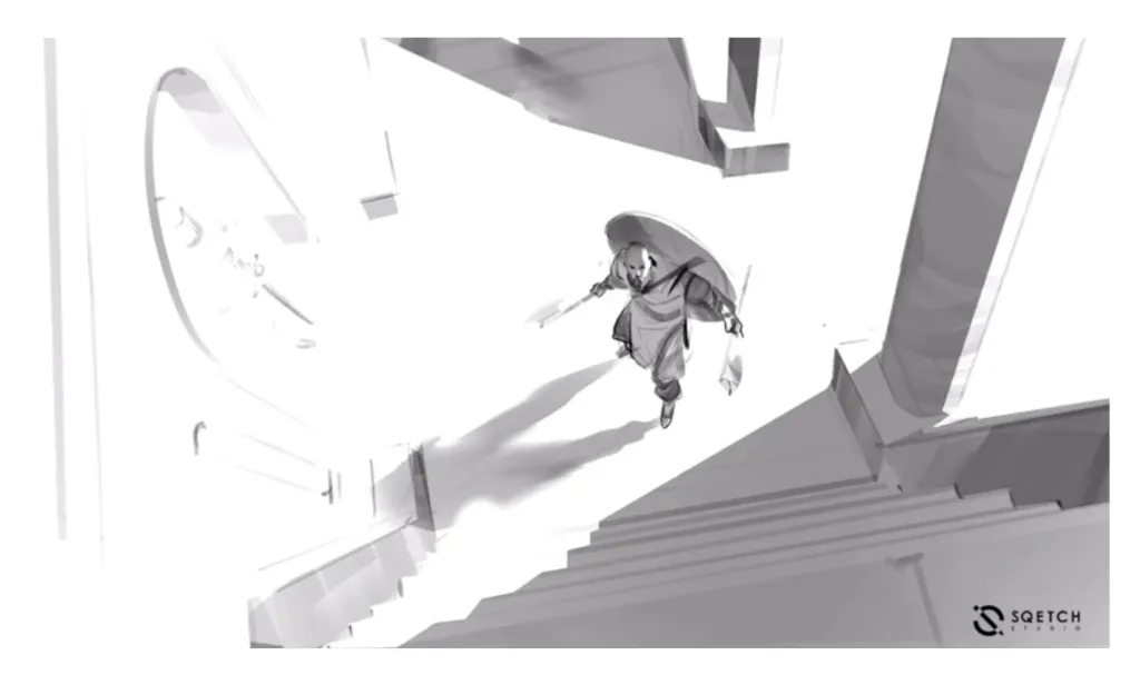
Digital 2d work by Antonio Stappaerts, a man standing at the bottom of the stairs and looking up. Horizontal composition
4. Use lines and shapes to guide the path
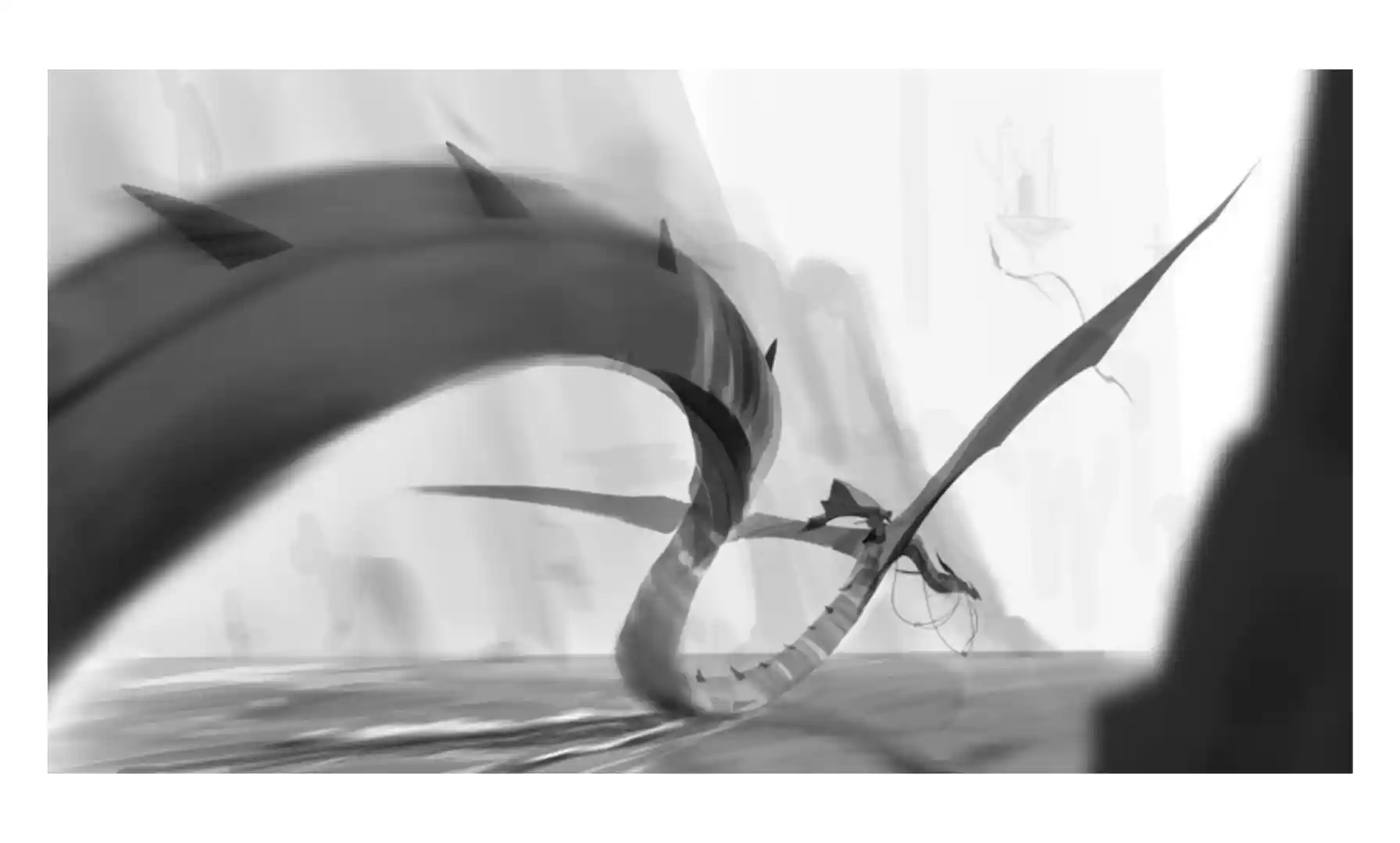
Once the eye lands at your focal point, you can design where it goes next. Leading lines, curves, and shapes physically steer the viewer's eye through the composition. A road receding into the distance. An outstretched arm pointing toward the subject. A C-curve of clouds sweeping across the sky. A river winding through a landscape. These are all tools for directing movement, and the eye follows them instinctively.
The most useful shapes for this are curves rather than straight lines. Straight lines move the eye quickly and abruptly. Curves slow it down and feel more natural, more like the eye is being guided rather than pushed. C-curves and S-curves are particularly effective because they create a sense of flow that keeps the viewer inside the image rather than shooting them out of it.
When planning your composition, sketch the path you want the eye to take before you add any detail. Where does it enter? Where does it go first? Where does it move next? Does it stay inside the frame or does it exit somewhere? Designing that path deliberately is what separates a composed image from an assembled one.
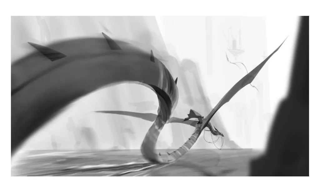
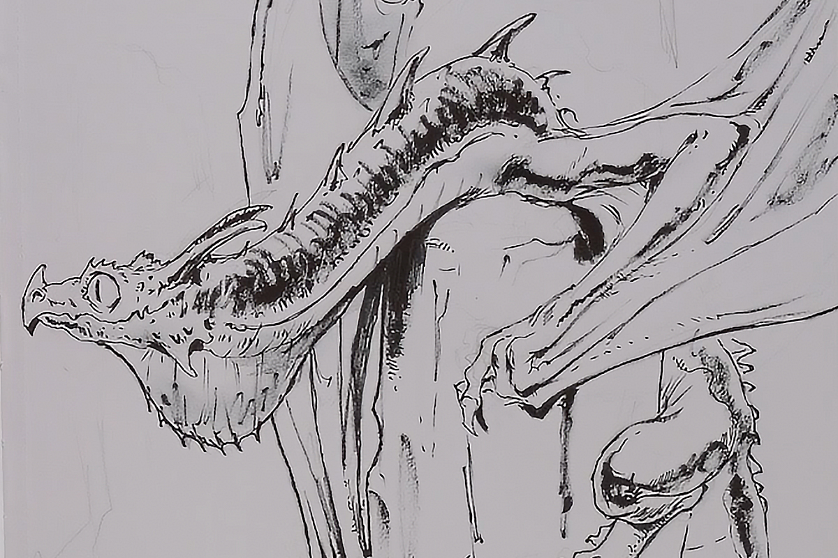
Digital 2d painting - dragon rider. By Antonio Stappaerts. In black and white
5. Use edge quality to control pacing
Edge quality is one of the most underused compositional tools, especially among beginners. Hard edges attract attention - the eye snaps to them. Soft edges let the eye slide past without stopping. This means you can control not just where the viewer looks but how long they linger and how quickly they move through the image.
Sharp, hard edges at the focal point. Softer, lost edges in the areas you want the eye to pass through quickly. Gradual transitions in the background and secondary elements. This hierarchy of edges creates a sense of depth and keeps the composition from feeling flat, even before you've added a single detail.
Think of edge quality as the pacing of your composition. Hard edges are moments where the eye stops and pays attention. Soft edges are transitions - the visual equivalent of a corridor between rooms. Design both deliberately. Look at the image below. Notice, how the dragon rider has the highest contrast and the sharpest edges.

Digital 2d work by Antonio Stappaerts, in color. Dragon rider standing in front of a dragon.
6. Avoid compositional traps
Even with a clear focal point, strong contrast, leading lines, and controlled edges, a few common mistakes can accidentally break the eye path:
Tangents - when two shapes just barely touch at their edges, creating a small area of visual tension that pulls the eye to exactly the wrong place. Check your composition carefully for shapes that nearly overlap without fully overlapping.
Exit points - lines or shapes that lead the eye directly out of the frame. A road that leads to the bottom edge, an arm that points off screen, a horizon line that draws the eye to the corner. The eye follows these exits and leaves the image. Redirect them inward.
Equal weight - when two areas of the composition compete for attention with roughly equal contrast, detail, and edge sharpness, the eye bounces between them without settling on either. One area needs to win. If you have two strong areas, make one clearly dominant and let the other support it.
Leading the viewer's eye isn't a finishing touch - it's a decision you make before you render anything. Focal point first. Contrast to attract attention. Lines and curves to guide the path. Edge quality to control the pacing. Get those four working together and your compositions will feel intentional even when everything else is still a work in progress.
If you want honest feedback on whether your eye path is actually working, our Community Hub is the fastest way to find out. Submit your composition and let real artists tell you where their eye went - because where they actually looked and where you intended them to look might be two very different places.