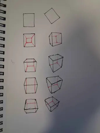
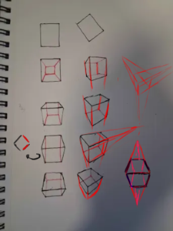
The issue I see here is that the 2-point perspective boxes aren’t following the same logic as the 1-point perspective boxes.
In the 1-point perspective examples, the boxes go from looking “narrower” to “wider” (from top to bottom) because of their distance from the horizon line.
In other words, the first box is closer to the horizon line, which is why the top plane appears narrower.
Meanwhile, the third box feels more “open” because it’s farther away from the horizon line.
That same concept should also apply to the 2-point perspective boxes.
Notice how the first one should appear narrower because it’s closer to the horizon line, while the third one should feel wider due to being farther away.
It’s the same principle I mentioned in the previous feedback about ellipses.
Also, try to make sure that your parallel lines converge more accurately toward the vanishing points.
Hope this helps!
Tahnk you for the feedback I realize I should have clarified my goal in the post. I am practicing a box rotation/grduation chart where the boxes are actively tilting and rolling as they move down rather than just sliding straight down the page. Because they are rolloing away from the view the top planes are supposed to compress and squish at the bottom. However your point about line convergence is super helpful I will focus on that.