this is nice, try using cool colors
Pintar (1)
A boggy trek
Notas do artista:
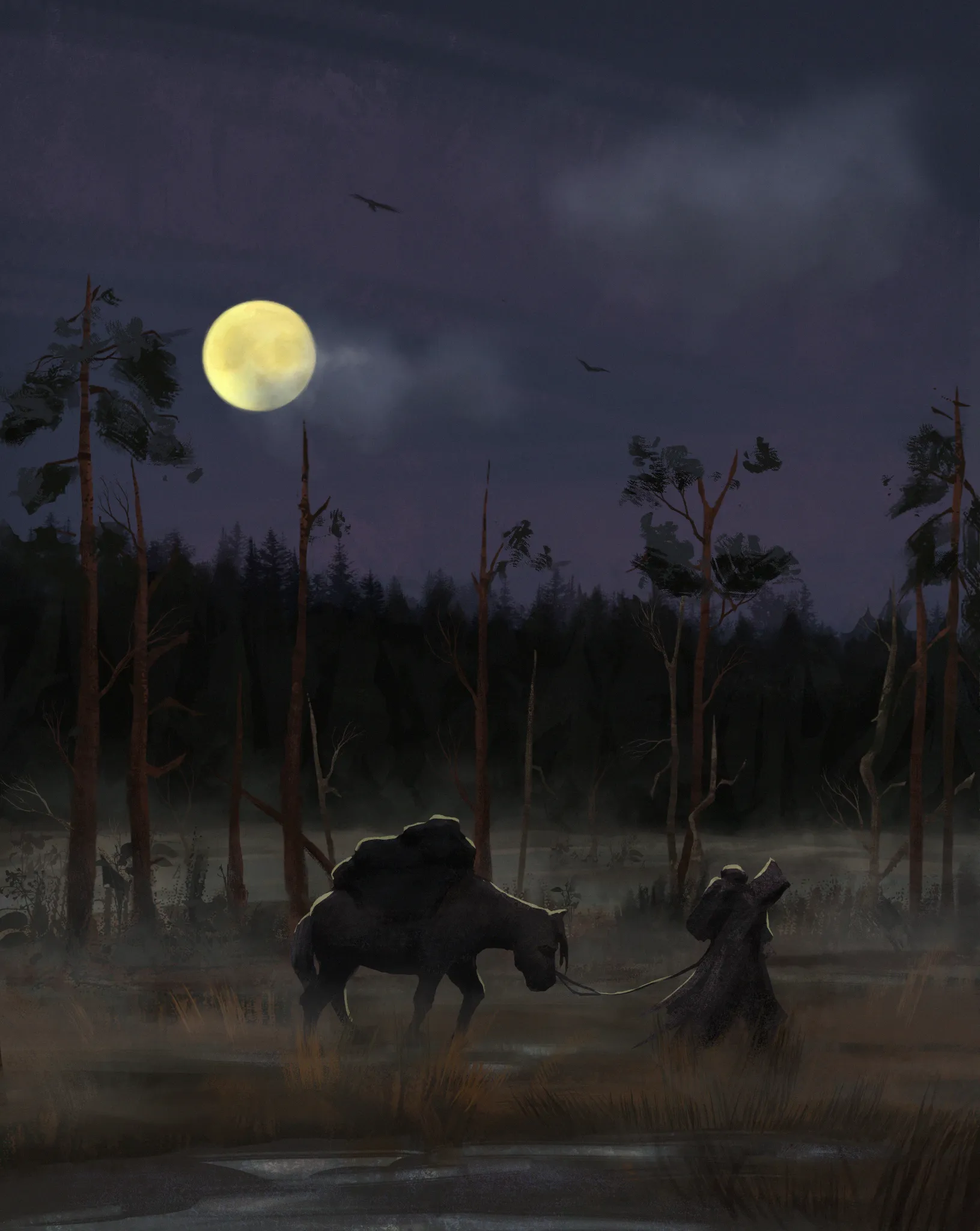
I need some fresh eyes on this one to figure out the composition and design. I haven't done that many landscapes yet, and the Intro to Environments course is still untouched, so a lot of my questions might very well be answered there. But here we are, so: I tried to focus on mood and atmospheric perspective. Went a little too wild with the mist so paintovers might be annoying because of that, sorry in advance. So, composition questions: lighting - does it feel like its nightime? position of and size characters? moon too bright? should the foreground have some kind of bigger(closer) object like a tree or a eroded fallen statue/rock? Point out anything you would change or add, the file is still very much editable :) Thanks!
Comenta 2
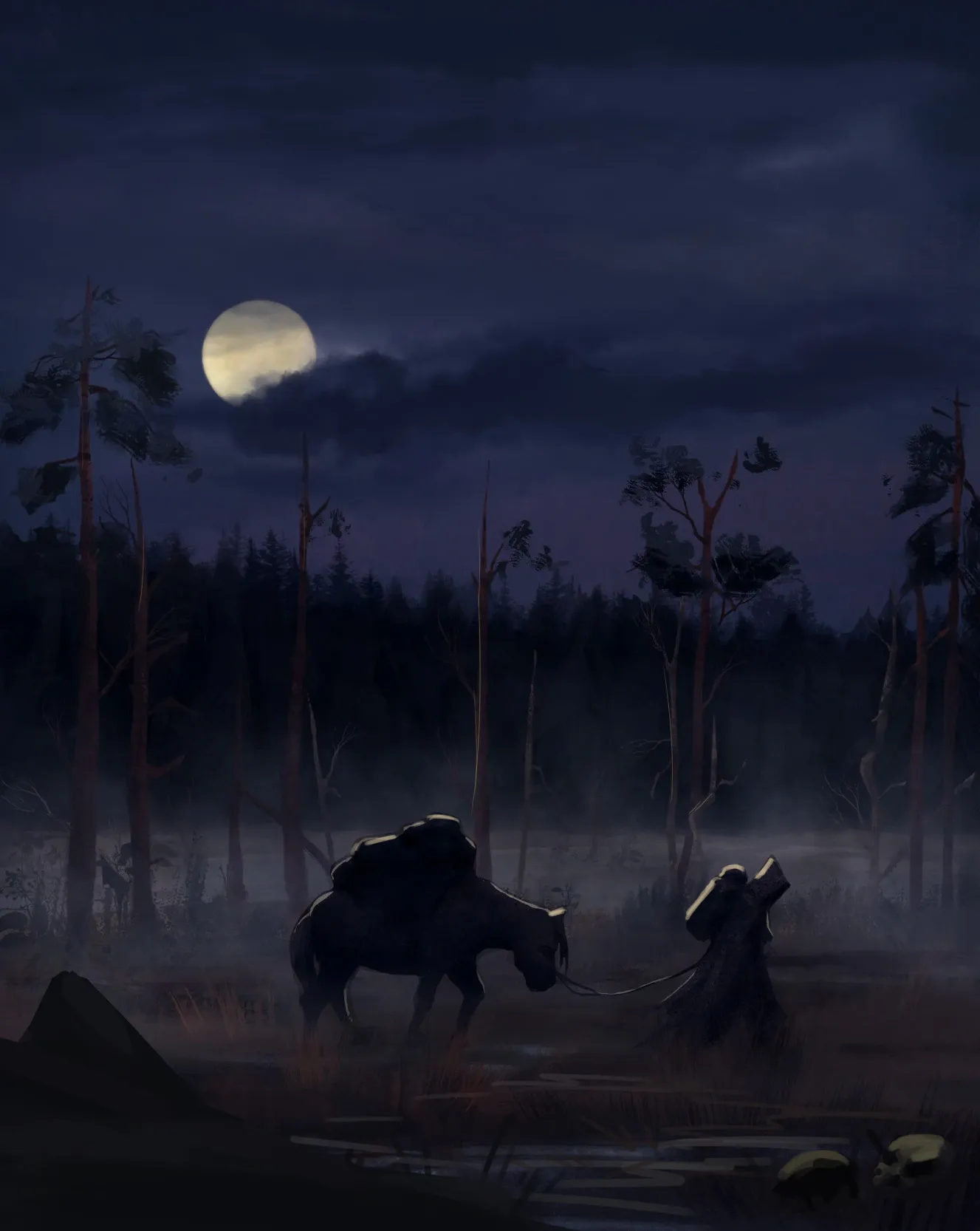
Hey! Good job here! :) Overall, I think the composition works well, and I like the storytelling in the scene. What I would do is shift the color temperature toward cooler, more bluish tones to give it a stronger nighttime mood. However, you'd also need to adjust the values and make the scene a little darker. :) Notice that I also added more fog behind the character and the donkey/horse to make their silhouettes stand out even more, creating a clearer "dark against light" contrast. As for the elements in the FG, they're not always necessary. However, if you do add something to the foreground, ideally it should help guide the viewer's eye toward the focal point while also adding some storytelling and context to the scene. For example, what if they're travelling through a swamp where people have died? You could add some skulls or something similar to reinforce that story. :) Hope this helps!