Pinte
Sorry the artwod website had some bug due to which it distorted what i drew-over . Here's the fixed overlay
Apr 18, 5:48 PM
Carregar respostas...
Participe da conversa
Assine seu feedback sobre esta obra.
Quer guardar seu feedback?
Registre seus comentários em um só lugar na sua conta. Seu feedback será privado e não público.
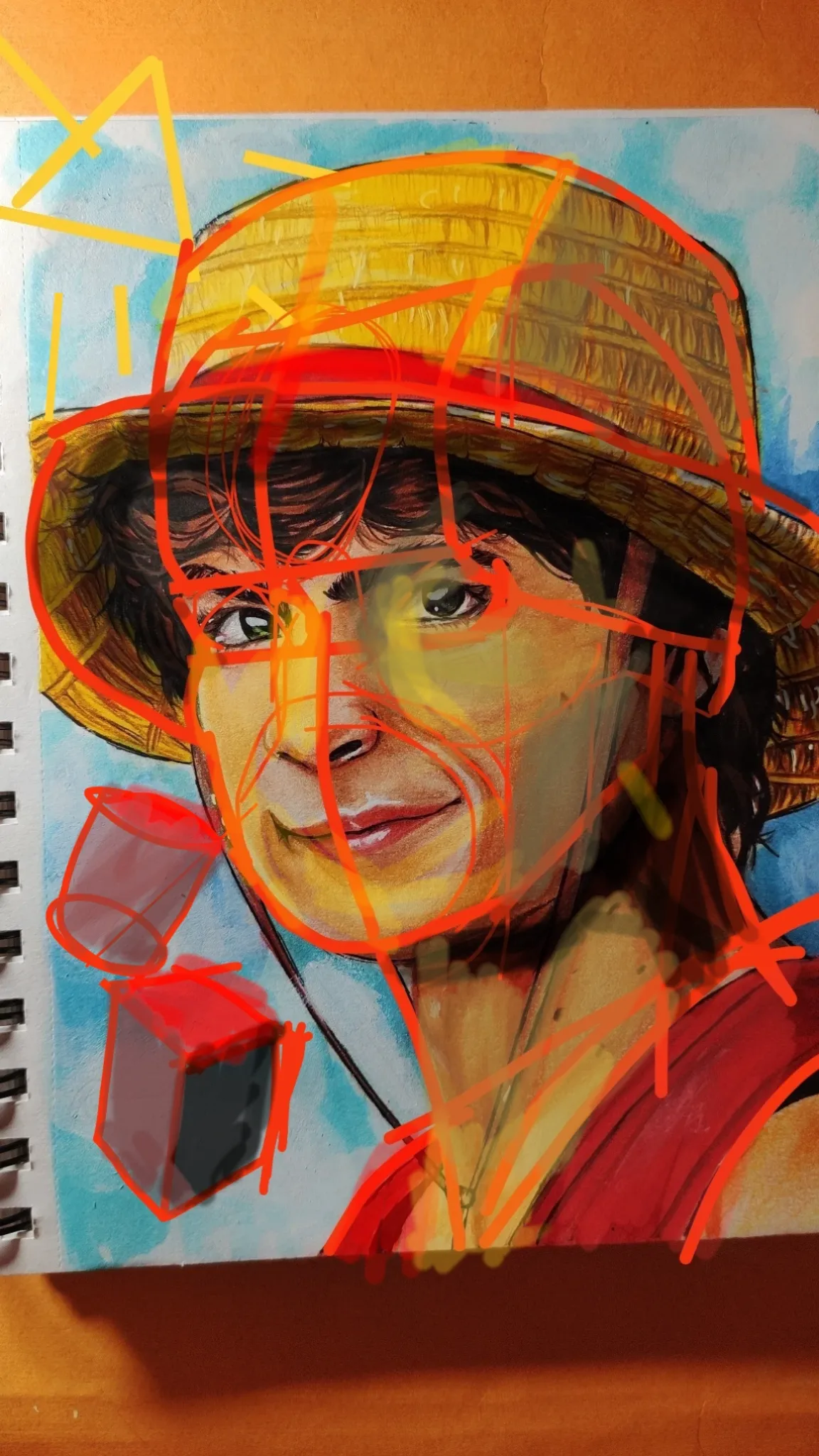
Sorry the artwod website had some bug due to which it distorted what i drew-over . Here's the fixed overlay
Participe da conversa
Assine seu feedback sobre esta obra.
Great work, really likes the painting. It is a good thing that you are trying to enjoy the process rather then focus on pin picking mistakes. If i would have to suggest some improvements in your artwork, i would suggest you to work on your shadows and values, and so i am going to explain how you could apply light and shadow principles to make your painting even more three dimensional. You can apply the principles of light and shadow on painting by first choosing a specific light source at a fixed location, and making explicit the planes of the form that you are applying the shadow upon upon. The planes may be defined by Reilly rhythm or asaro head. Now that we have both light and form, we could compare the angles between light source and form planes. For starter, limit your values to just 3 , 1. High-light area , applied on the area where light is highest, 2, Mid-value, applied on area with medium light, don't overuse for clean artworks, 3, Darkness, no colour visible at this point. And obviously complete while places where you have just white.
Participe da conversa
Assine seu feedback sobre esta obra.
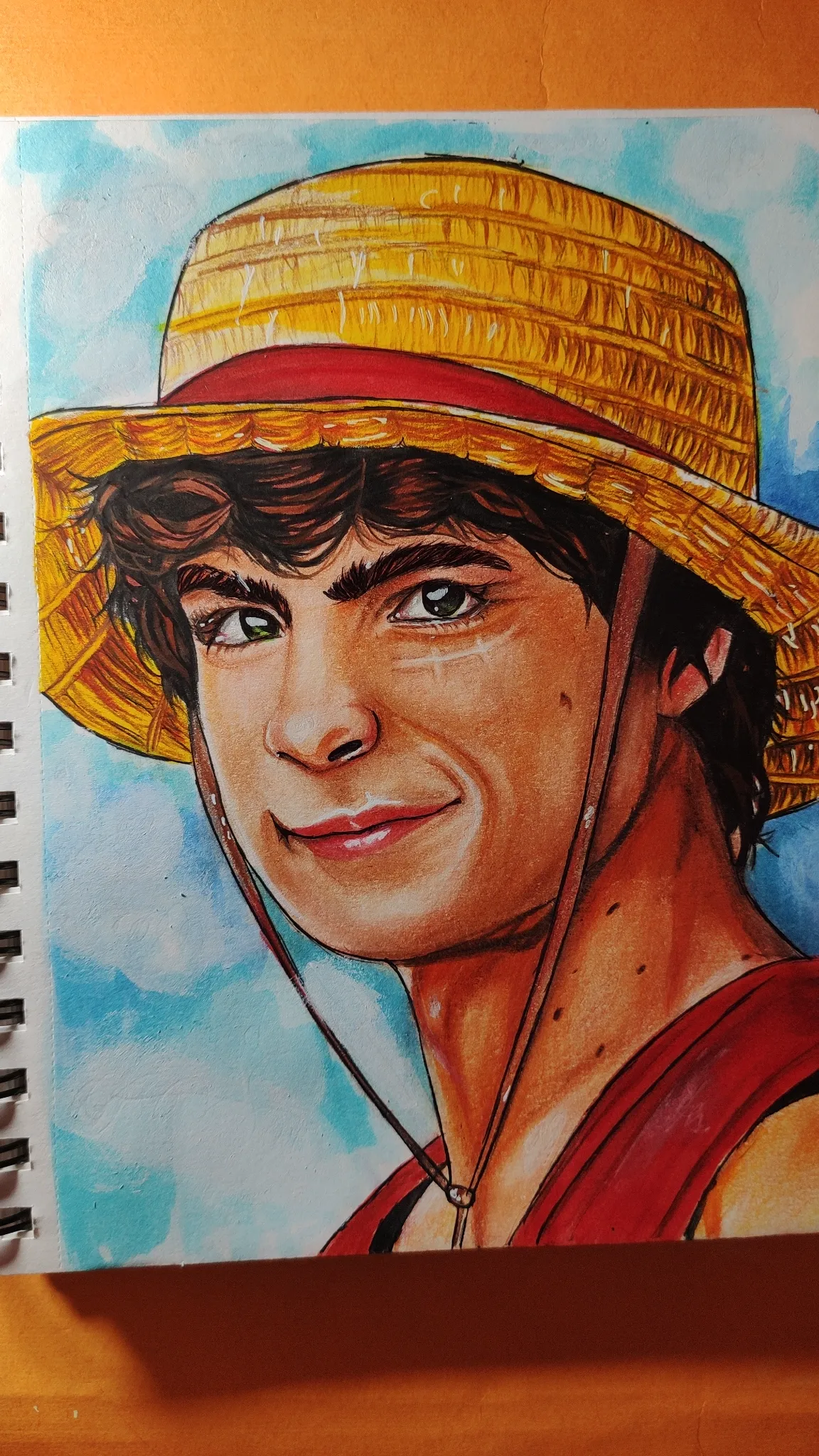
Hi hi! Drawing looks nice! You captured the actor very well! I merely made a few small adjustments that you can do in your future sketch or use digital applications to modify your photos. If there is a lot of sunlight on the side of our setup, start with a slightly stronger shadow. Our shadows will be stronger since, based on what you have here, it would be sort of a midday light. Do not be afraid to incorporate some artistic expression into your drawings. Make sure your shadows are consistent from top to bottom by following the shapes of a human body and clothing, simplifying them into geometric shapes. Readjust the mouth and iris at the end because they were out of perspective. That is it! Have fun drawing!
Participe da conversa
Assine seu feedback sobre esta obra.

way too realistic but good
Participe da conversa
Assine seu feedback sobre esta obra.
Melhore seus fundamentos, a 3 min
Master dynamic figure drawing by progressing through five fundamental techniques: simple shapes, action lines, exaggerated poses, anatomical details, and expressive character design.
Figure
Keyframe Attempt
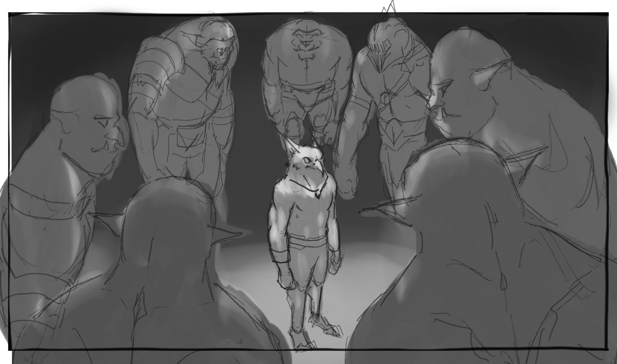
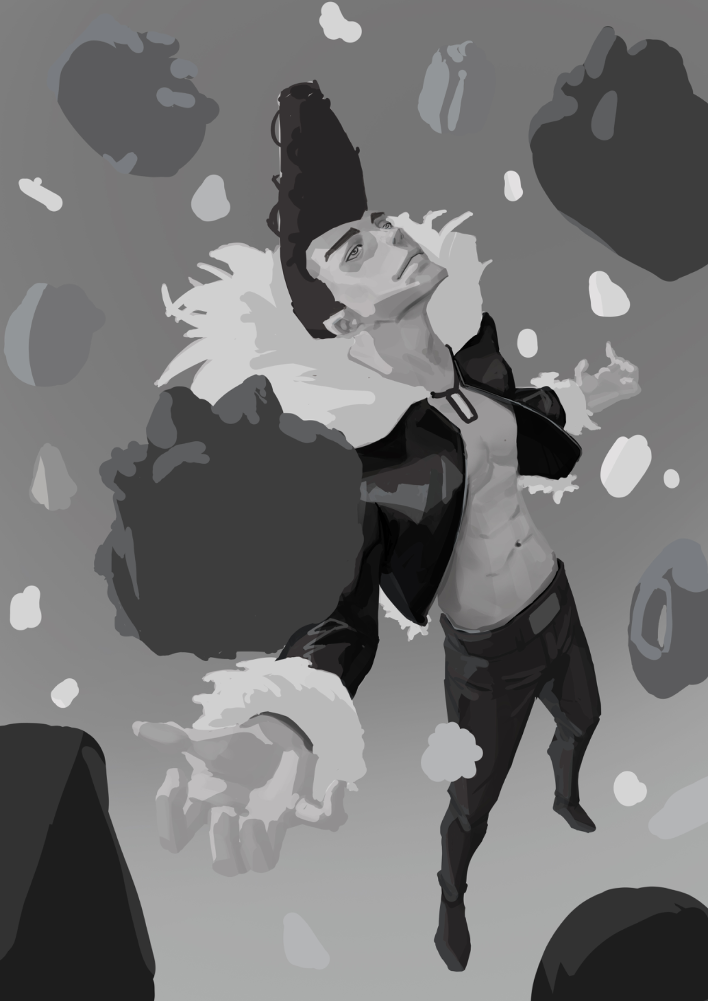
This is my attempt to do keyframing. I'm not sure how to place the values of the characters and the environment. The context is the hero about to fight off the orcs surrounding him. Attempt: - POV is looking down at the orcs surrounding the hero. - This is in a dark setting, so I made the hero have a brighter value to make it the focal point. So I wonder if this is towards the right direction? Is there any way to make it more interesting (value and thumb nail wise)? Should there be more detail of the background of where they're in rather than just dark value entirely? Feedback appreciated. Thanks!
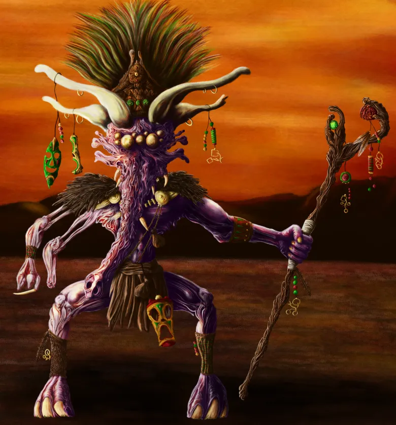
Shaman
It's my first proper colour drawing, I'm quite happy with the outcome. But. I think there are issues with lighting and hierarchies in some areas. Just looking for any feedback that could help improve it and identify anything else I may have missed. Cheers.
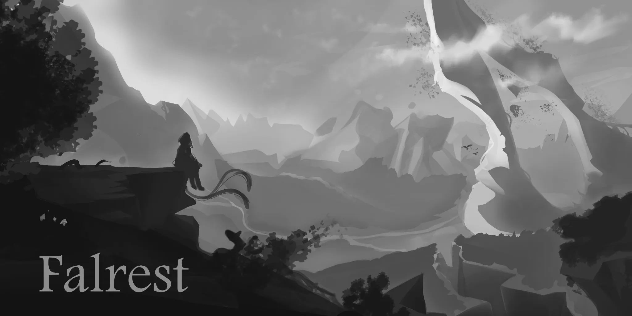
Cover Art Feedback
Can anyone help me out with this piece, environments are still hard for me and I wanted to do a landscape cover for board game box 1.Is composition pleasing or are there any mistakes that distract your eye imminently? 2.Value separation - are the planes properly separated to show distance? 3.Scale of the world - How do you perceive this zone in size small ,medium,big ,unbalanced, Not sure?
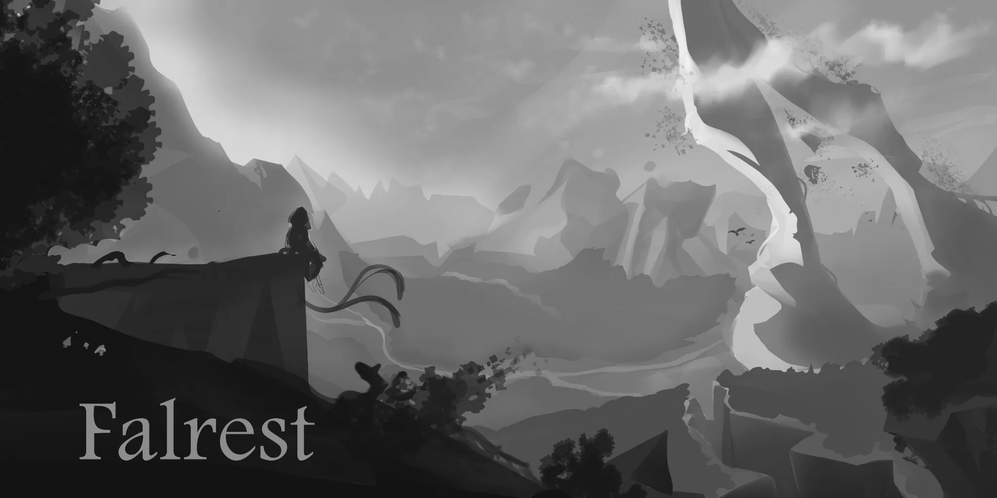
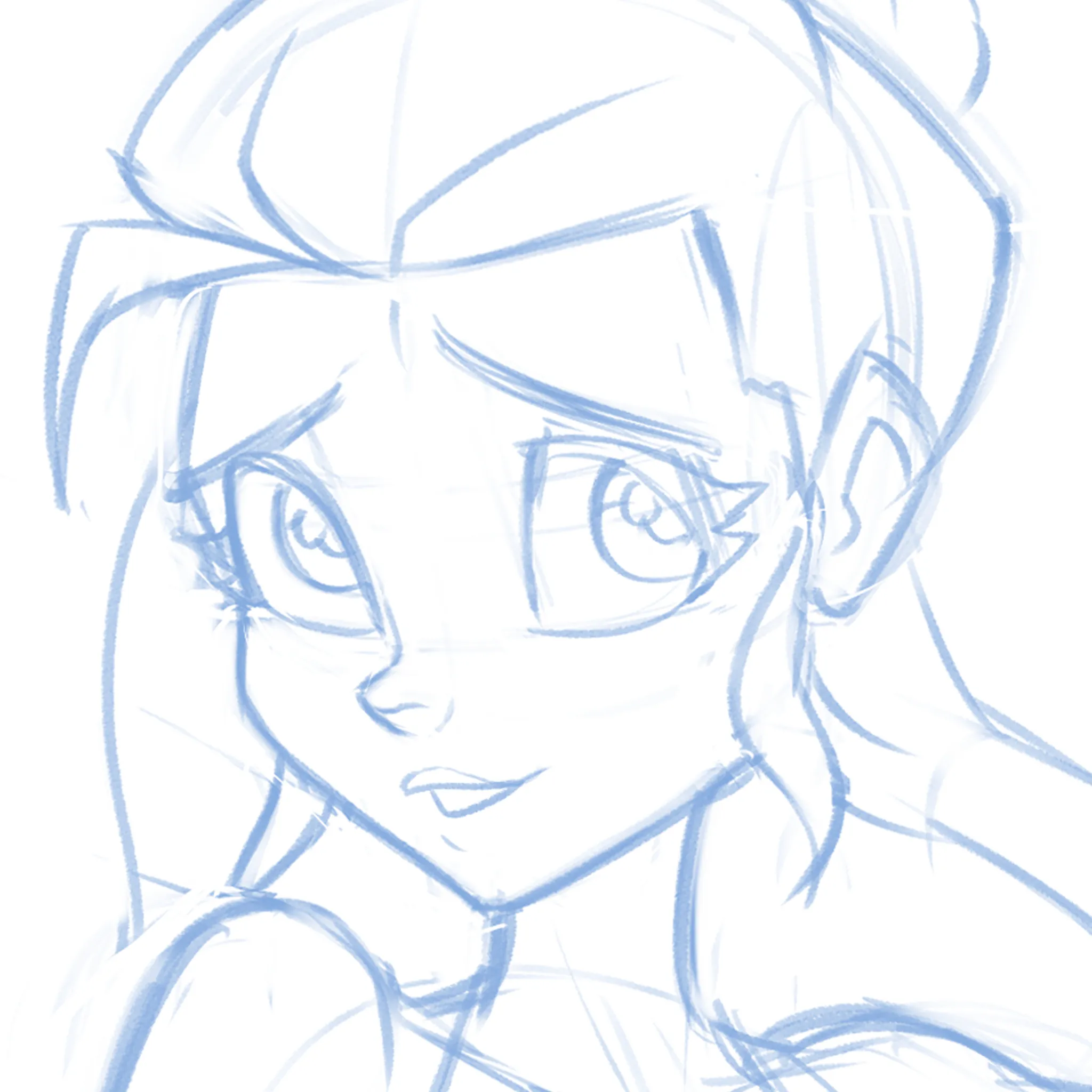
Cute-ify this Face!
Not sure if it's the eyes, the nose, the mouth or EVERYTHING but can't quite get this face pretty enough! What am I missing? I'm just moving features around randomly at this point.
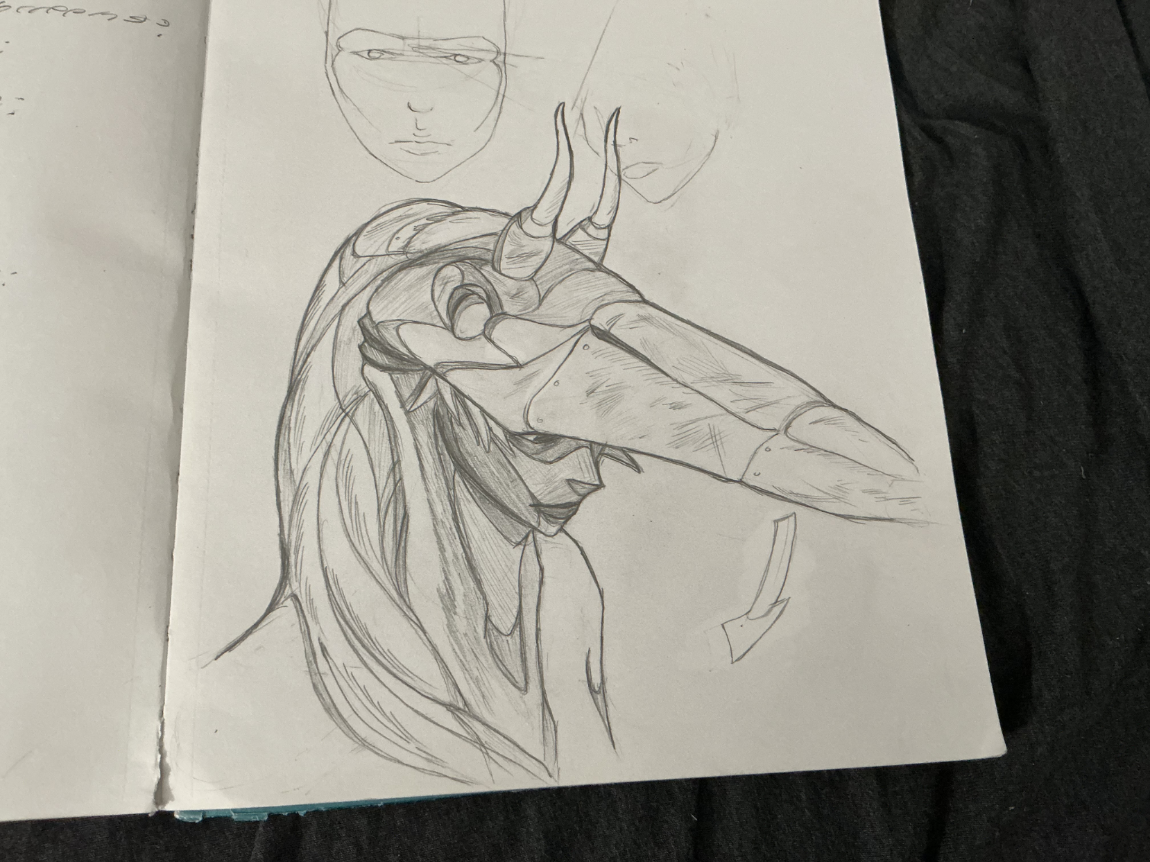
The Heron Woman
GUYS!!! remember those heron studies i did not too long ago? Well, i turned it into an idea, a concept, if you will, and came up with this heron warrior. quite proud of it! what's more is that when she pulls down her mask, the bird's nostrils act as eye holes, making it into a rad frickin' mask! anyways, i want feedback. particularly on the rendering. i feel like i didn't take advantage of the heron's plummage texture enough, or like i was a bit carelss with my light source and cast shadows. but what do you all think? any other suggestions? please let me know!
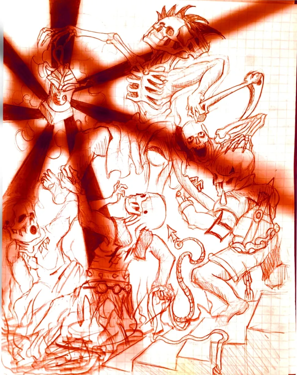
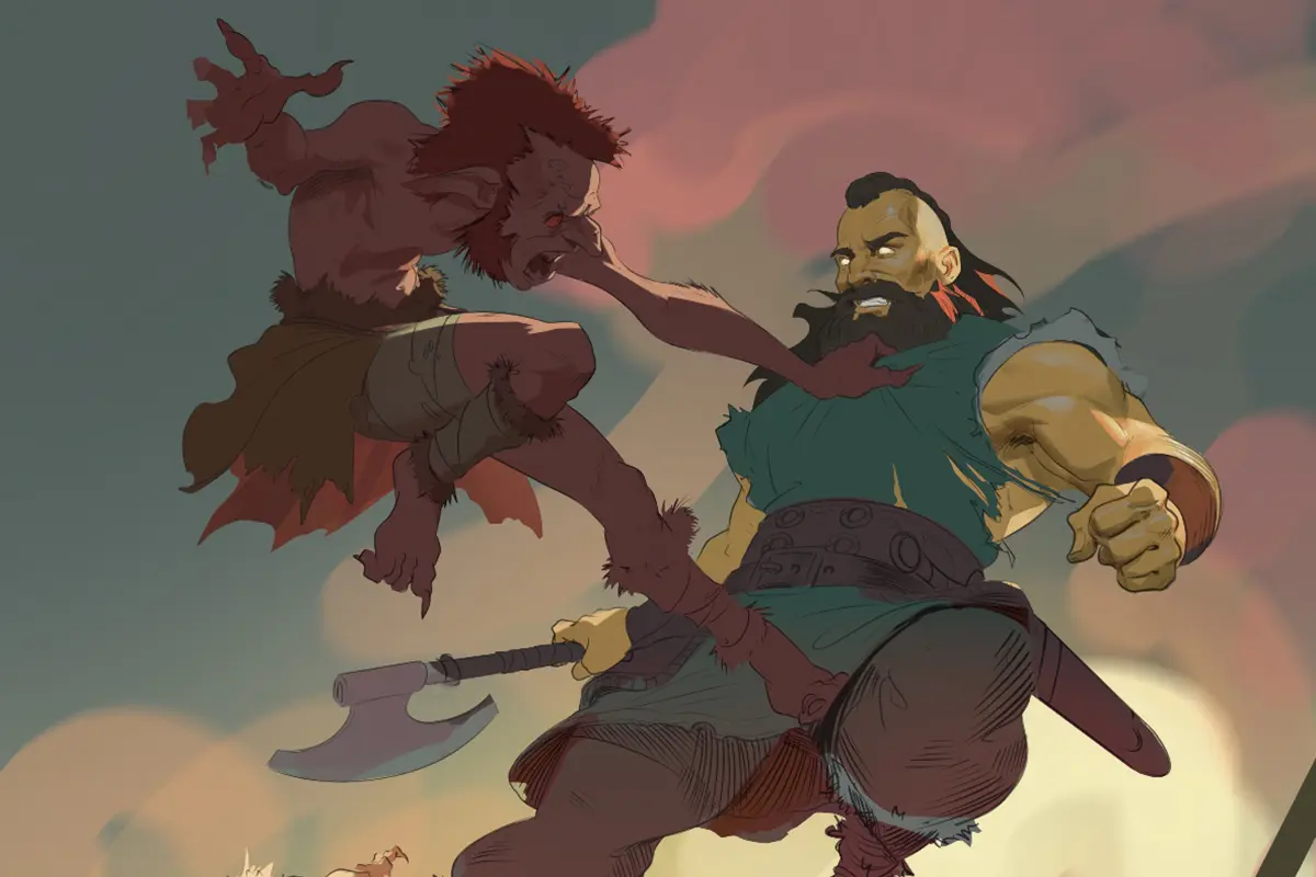
Eternal Fight of the Wicked Part 2
Im the same creator of the OG drawing in the figure drawing section, I just decided to throw the drawing on a sketchbook app on my phone and play around with it. Feel free to critique it some fun ideas to play around with.
Feeling lost with values
I tried to create an illustration of Ichigori Ryu in a rain of dessert and I feeling quite lost when the rendering part came on. Like how do you choose if you need more contrast on the skin for example or less. It’s not finished but I would appreciate some guidance
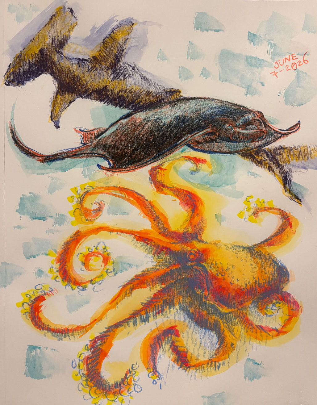
6/7/26
Day 7