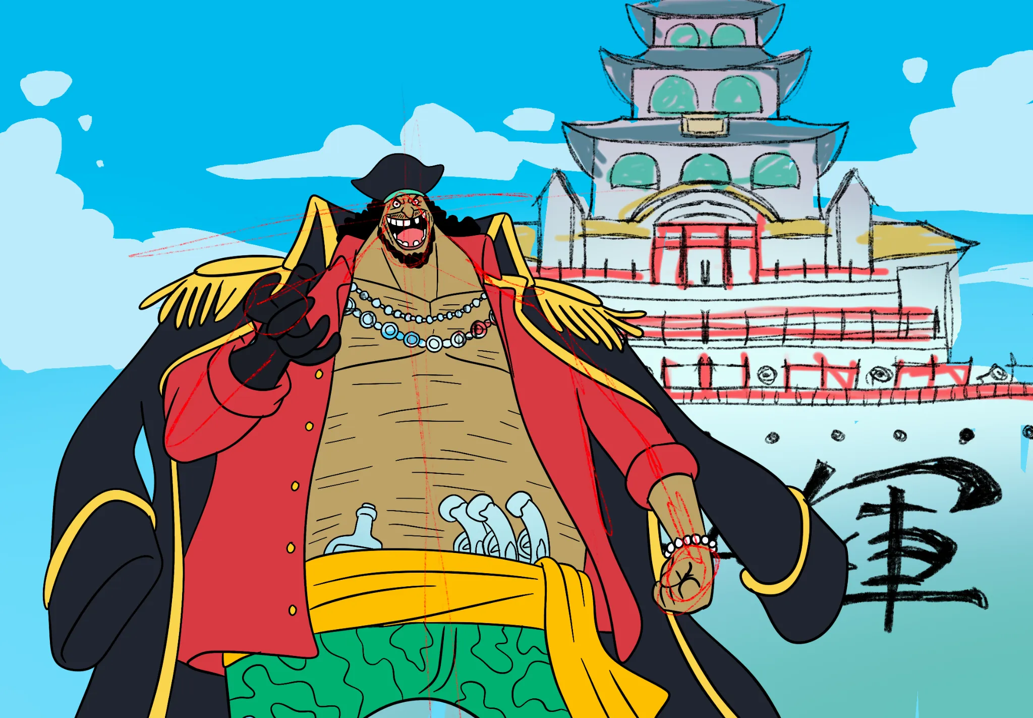
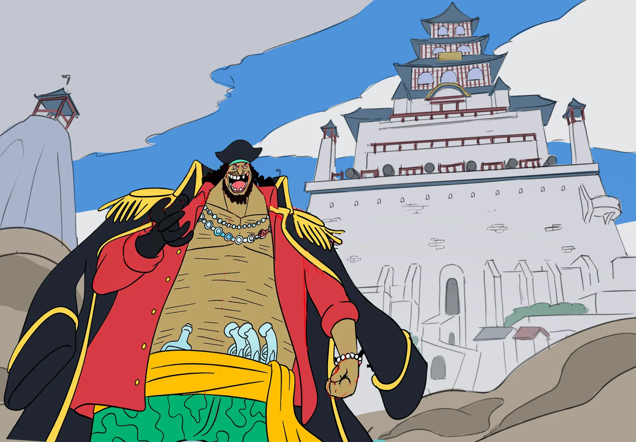

Hey there! It’s a good foundation as an idea, but here are a few things you can do if you want to push this piece further. :) First of all, the character is taking most of the attention in the illustration. That’s partly the point, of course, but I think it would be good to leave a bit more room for the background. What I did was make the character slightly smaller and move them a little to the left. This gives us enough space on the right side to place the castle. Now, try to avoid thinking in flat shapes! Your background feels very flat because there isn’t enough convergence, so establishing a vanishing point toward the top will help give the illustration much more presence and drama. In general, placing the horizon line toward the bottom will allow you to emphasize the height of the objects—in this case, the castle. Notice that I drew the upper part of the castle smaller to suggest depth and distance between the character and the building. This also gives you enough room to draw the base of the castle and some smaller buildings underneath it, which helps prevent the whole scene from feeling flat. On the other hand, adding one of the cliffs on the left side can also help suggest depth by making the castle feel farther away. You can reinforce this even more by adding some of that smoke or dust behind the character. :) I’d recommend looking for composition references from this scene. That’s what I did to solve the composition issues here; I didn’t invent anything; I simply adapted what already exists to your idea. :) Hope this helps!
Pintar (1)
how would you draw Blackbeard at Marineford? mine feels empty
Notas do artista:
Tried drawing Blackbeard at Marineford and the composition feels really empty compared with the anime scene. I dont know where to put the background details without making everything noisy. Would appreciate some feedback on the scene and character placement. trying to learn composition, share my art progress and get some proper workouts in
Comenta 2
idk if packing the background is the fix, maybe one darker mass behind his shoulders and leave the sides quieter so he still owns the frame