Pinte
i generally do seperation by half or parralele
Feb 11, 7:12 AM
Carregar respostas...
Participe da conversa
Assine seu feedback sobre esta obra.
Quer guardar seu feedback?
Registre seus comentários em um só lugar na sua conta. Seu feedback será privado e não público.
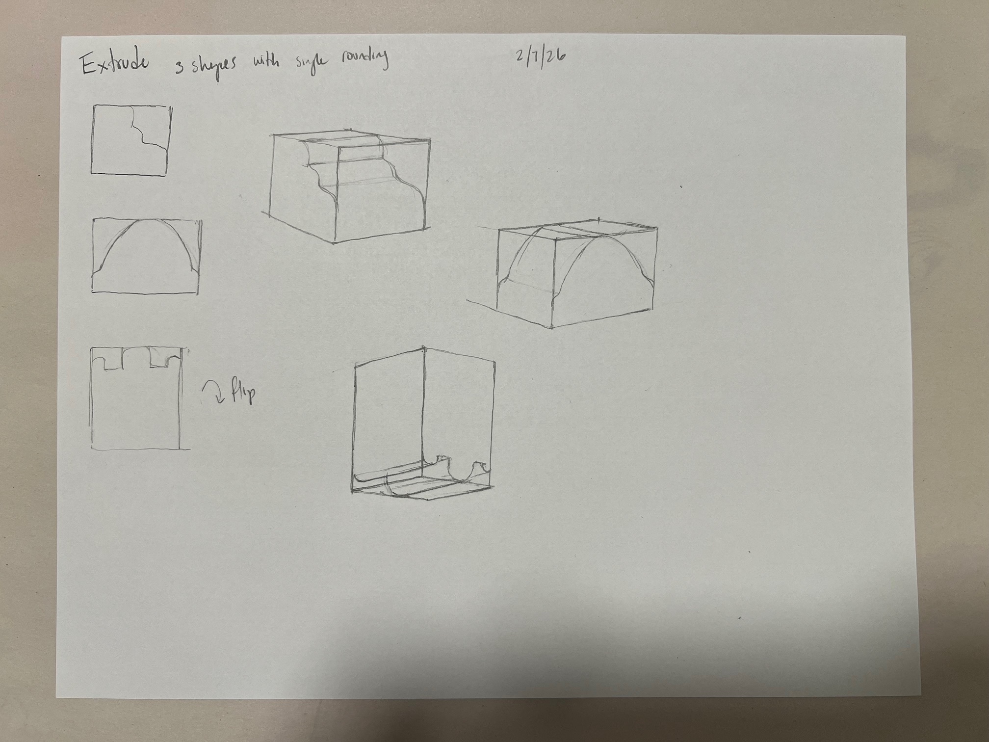
i generally do seperation by half or parralele
Participe da conversa
Assine seu feedback sobre esta obra.

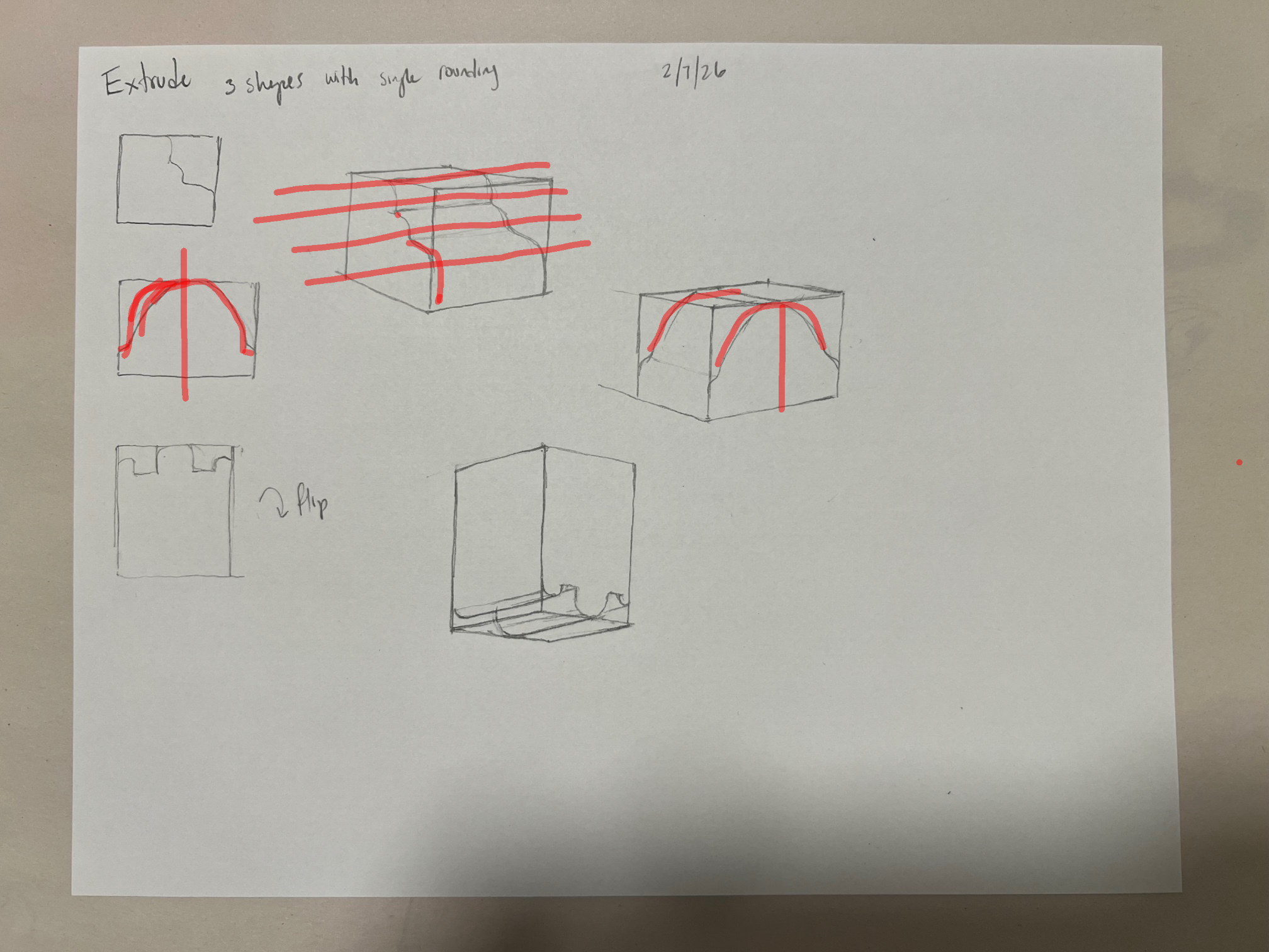
Hey there! First of all, I think you did an amazing job here already, well done! There's just one thing that came to my mind looking at this and it's more of a perspective thing: Defining the middle of your boxes in perspective might push your accuracy here even further. Taking your second box as an example, I drew over lines from corner to corner to identify the middle of the plane, then creating a line towards the top where the two corner lines meet. This way your form accurately adapts to the perspective and you avoid the form getting kind of distorted by it. I hope this helps and keep up the work!
Participe da conversa
Assine seu feedback sobre esta obra.
Melhore seu talento, a 3 min
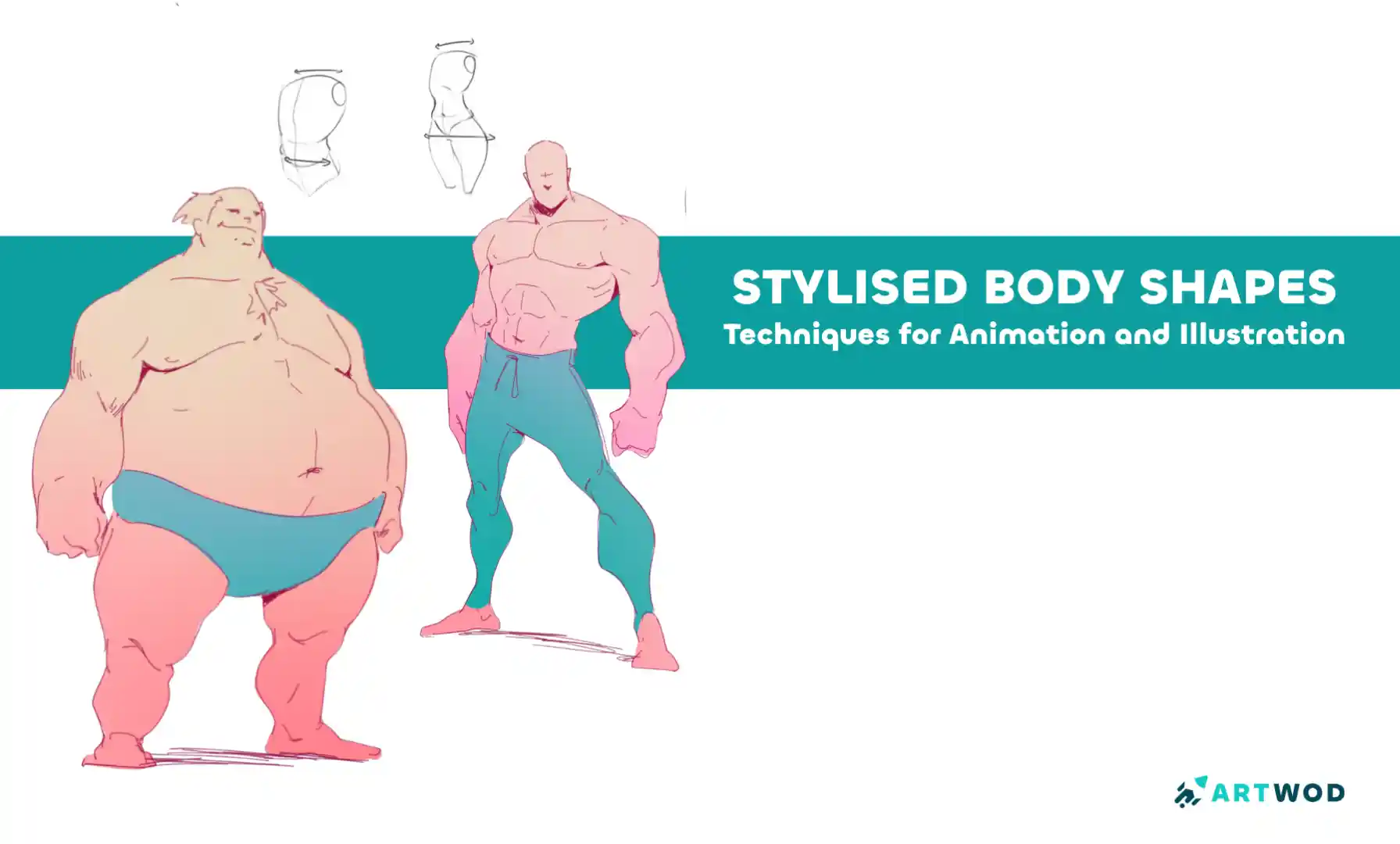
Break down stylized characters into basic shapes, experiment with silhouettes, and layer anatomy to create expressive, believable designs with personality.
Challenge-of-the-month
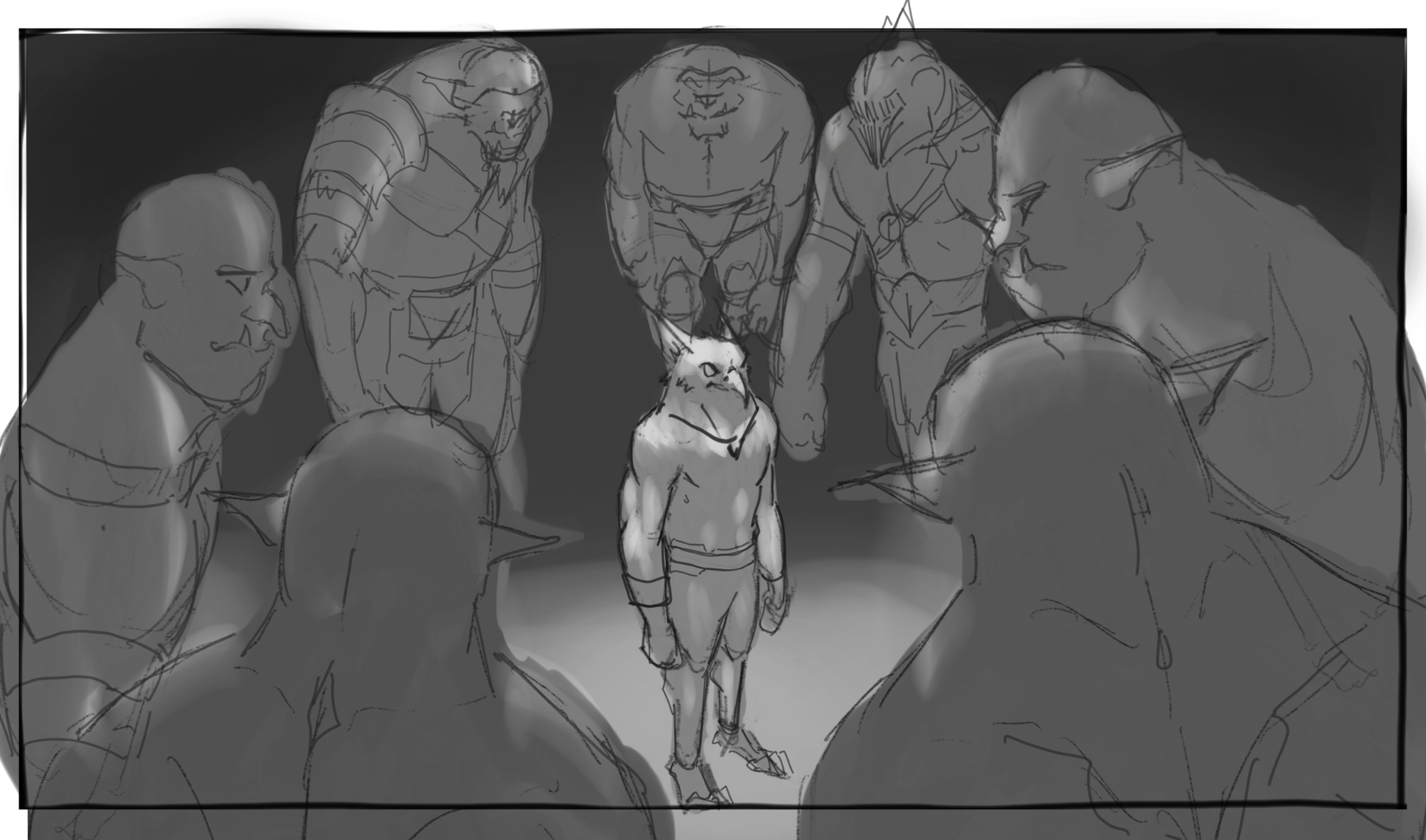
Keyframe Attempt
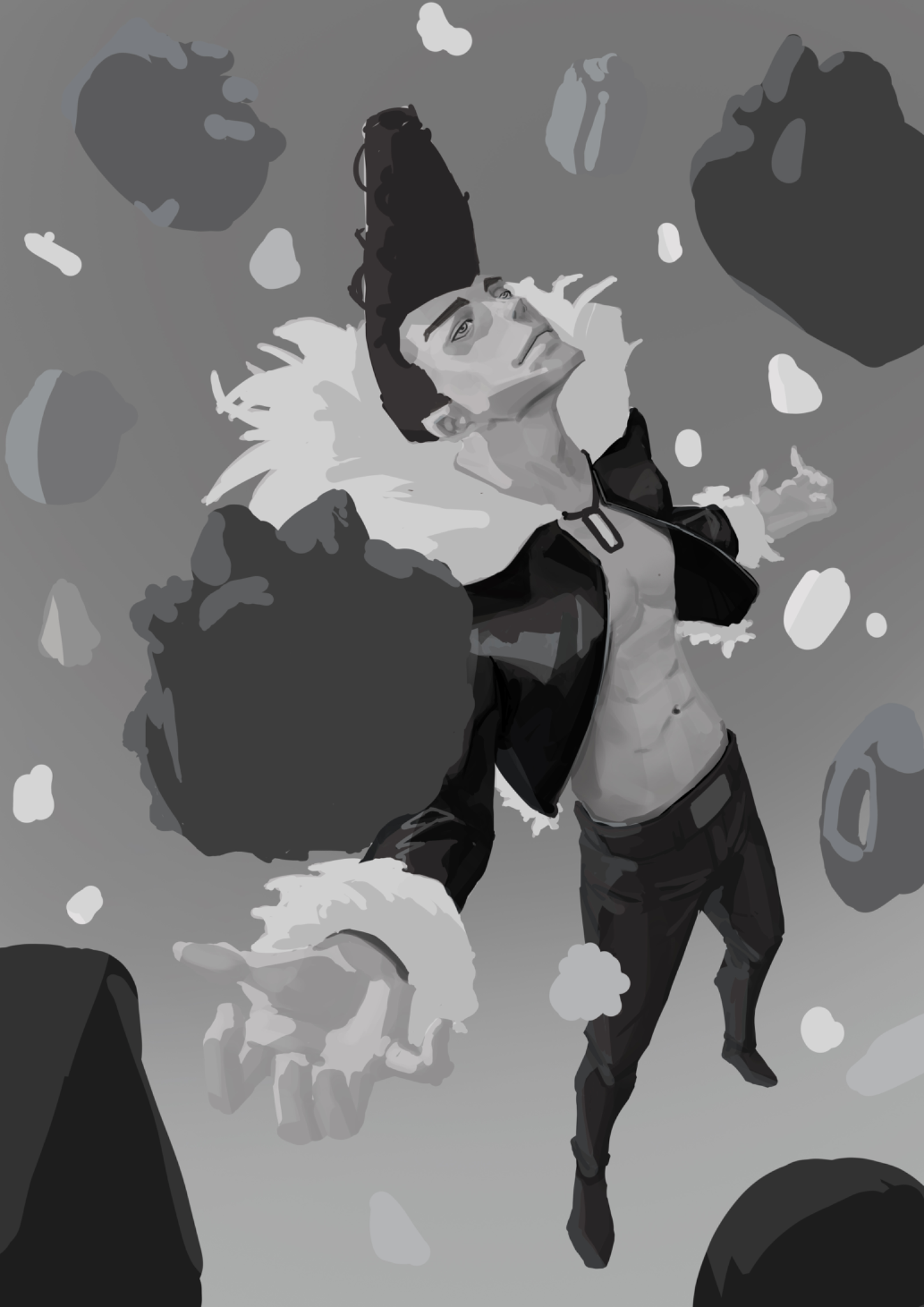
This is my attempt to do keyframing. I'm not sure how to place the values of the characters and the environment. The context is the hero about to fight off the orcs surrounding him. Attempt: - POV is looking down at the orcs surrounding the hero. - This is in a dark setting, so I made the hero have a brighter value to make it the focal point. So I wonder if this is towards the right direction? Is there any way to make it more interesting (value and thumb nail wise)? Should there be more detail of the background of where they're in rather than just dark value entirely? Feedback appreciated. Thanks!
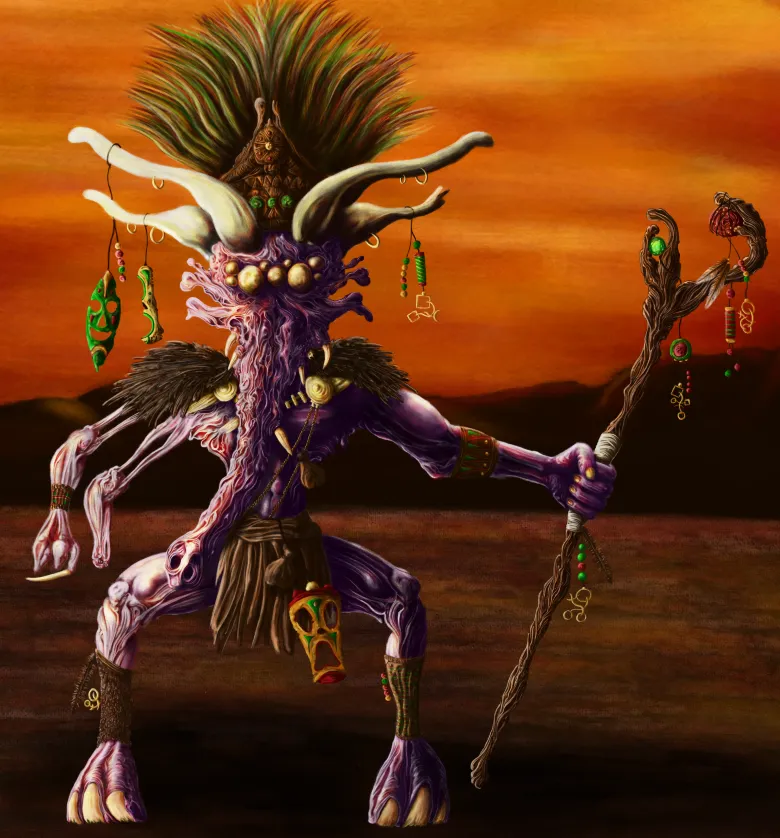
Shaman
It's my first proper colour drawing, I'm quite happy with the outcome. But. I think there are issues with lighting and hierarchies in some areas. Just looking for any feedback that could help improve it and identify anything else I may have missed. Cheers.
Cover Art Feedback
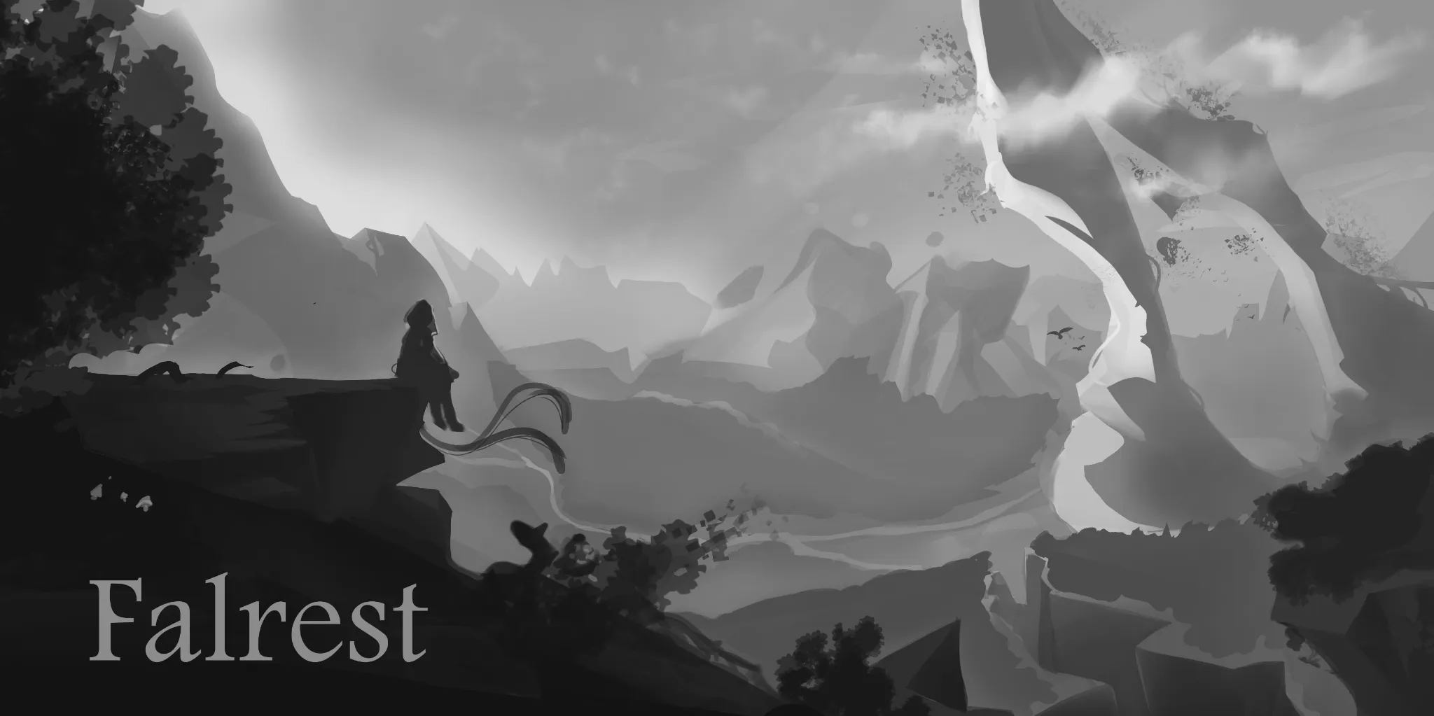
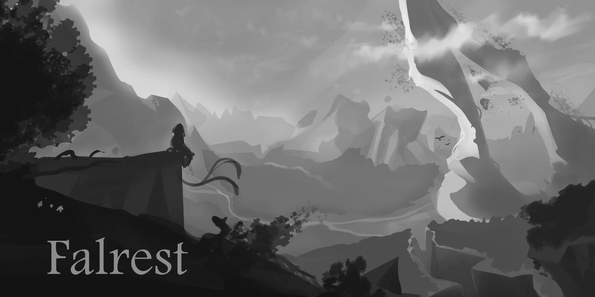
Can anyone help me out with this piece, environments are still hard for me and I wanted to do a landscape cover for board game box 1.Is composition pleasing or are there any mistakes that distract your eye imminently? 2.Value separation - are the planes properly separated to show distance? 3.Scale of the world - How do you perceive this zone in size small ,medium,big ,unbalanced, Not sure?
Cover Art Feedback
Can anyone help me out with this piece, environments are still hard for me and I wanted to do a landscape cover for board game box 1.Is composition pleasing or are there any mistakes that distract your eye imminently? 2.Value separation - are the planes properly separated to show distance? 3.Scale of the world - How do you perceive this zone in size small ,medium,big ,unbalanced, Not sure?
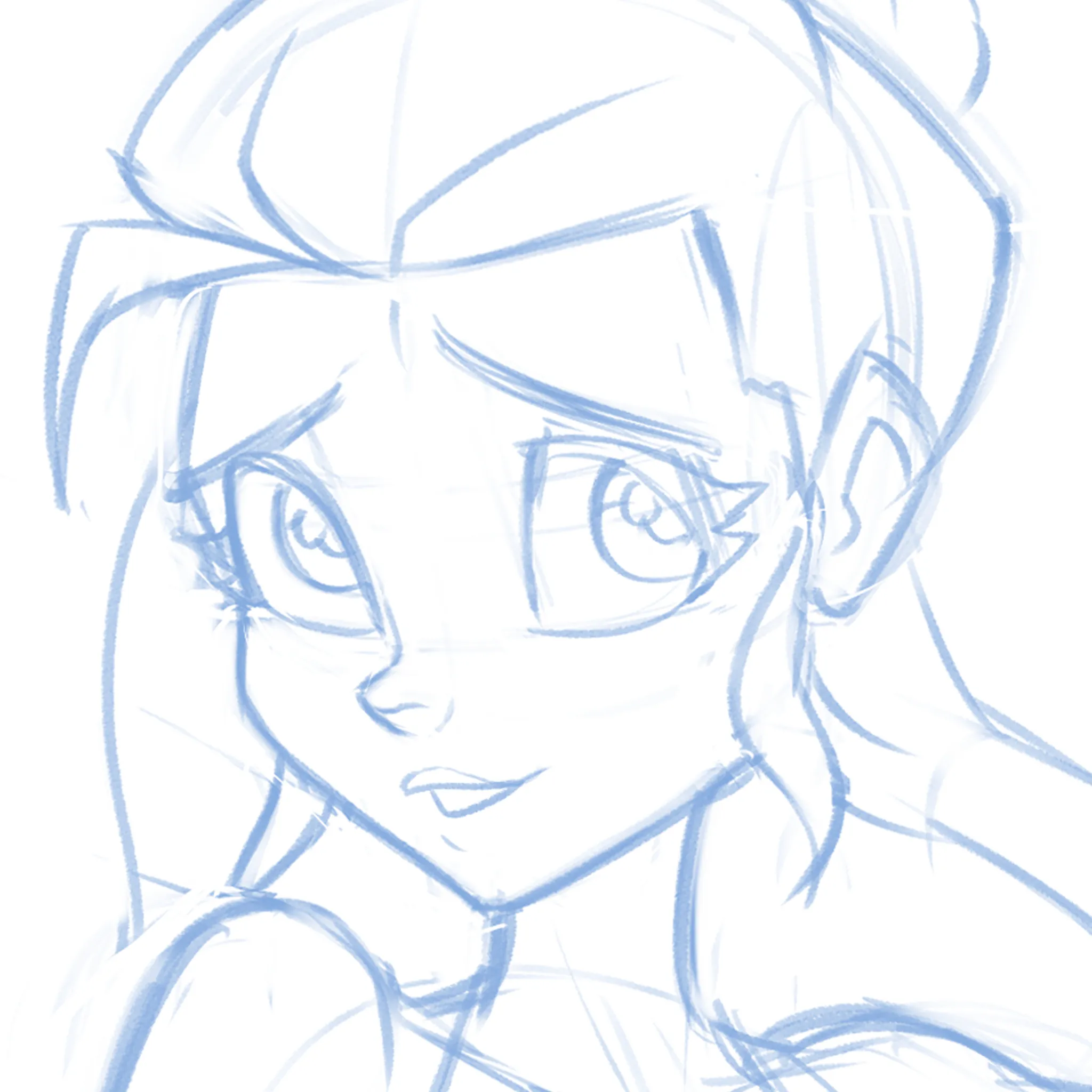
Cute-ify this Face!
Not sure if it's the eyes, the nose, the mouth or EVERYTHING but can't quite get this face pretty enough! What am I missing? I'm just moving features around randomly at this point.
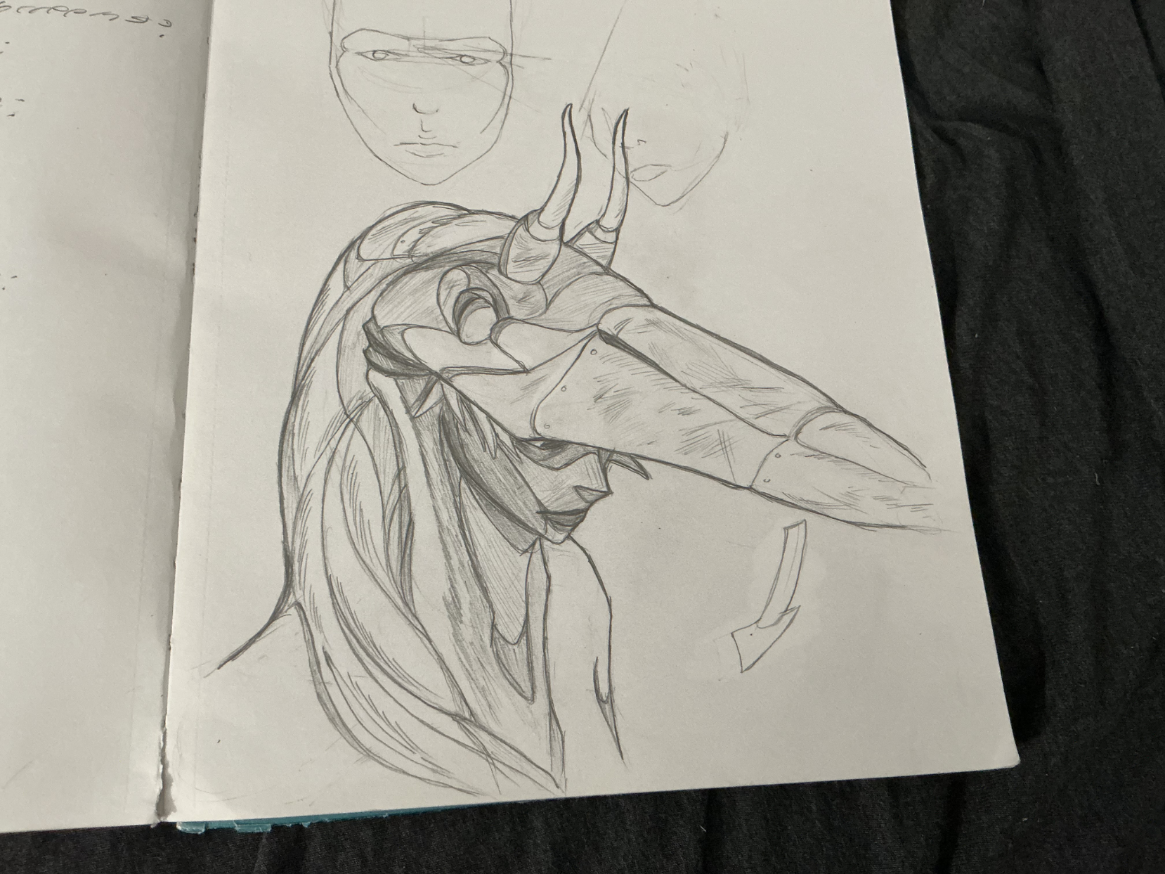
The Heron Woman
GUYS!!! remember those heron studies i did not too long ago? Well, i turned it into an idea, a concept, if you will, and came up with this heron warrior. quite proud of it! what's more is that when she pulls down her mask, the bird's nostrils act as eye holes, making it into a rad frickin' mask! anyways, i want feedback. particularly on the rendering. i feel like i didn't take advantage of the heron's plummage texture enough, or like i was a bit carelss with my light source and cast shadows. but what do you all think? any other suggestions? please let me know!
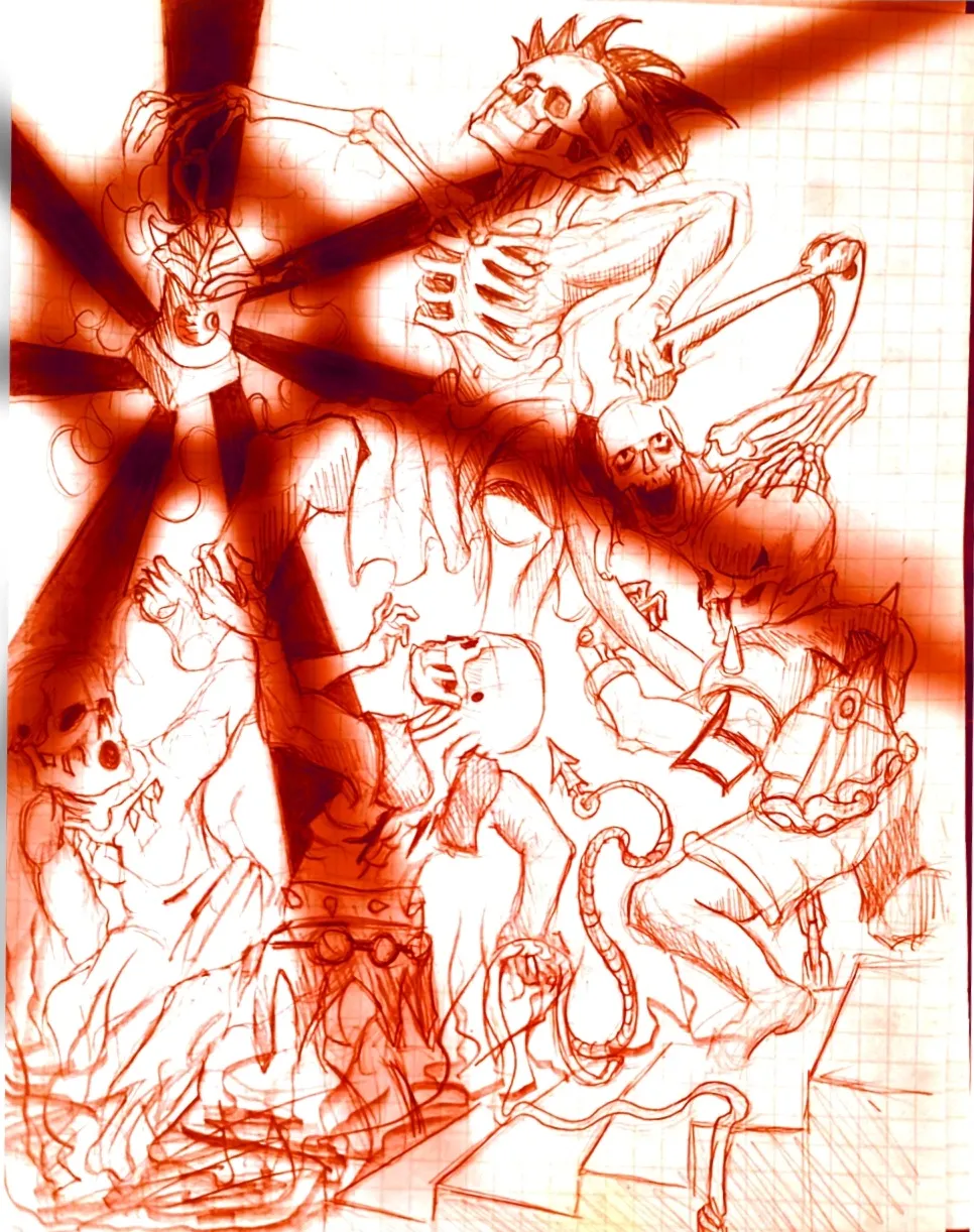
Eternal Fight of the Wicked Part 2
Im the same creator of the OG drawing in the figure drawing section, I just decided to throw the drawing on a sketchbook app on my phone and play around with it. Feel free to critique it some fun ideas to play around with.
Feeling lost with values
I tried to create an illustration of Ichigori Ryu in a rain of dessert and I feeling quite lost when the rendering part came on. Like how do you choose if you need more contrast on the skin for example or less. It’s not finished but I would appreciate some guidance
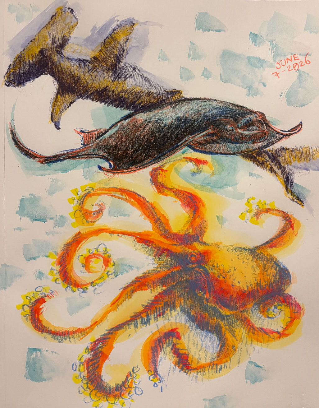
6/7/26
Day 7