Rang # 280
@olliepopart
#280
Rang
16
Upvotes
9
Feedback donné
100%
Utile

Peindre
Sur « Color and focal point feedback » de @gabriel81201
“Hey there, thanks for sharing your art! I love the expressions you pulled off here! Something I noticed when taking your image into grey scale is that a lot of your "bright" local values are very ...”
Utile + 1
Feedback
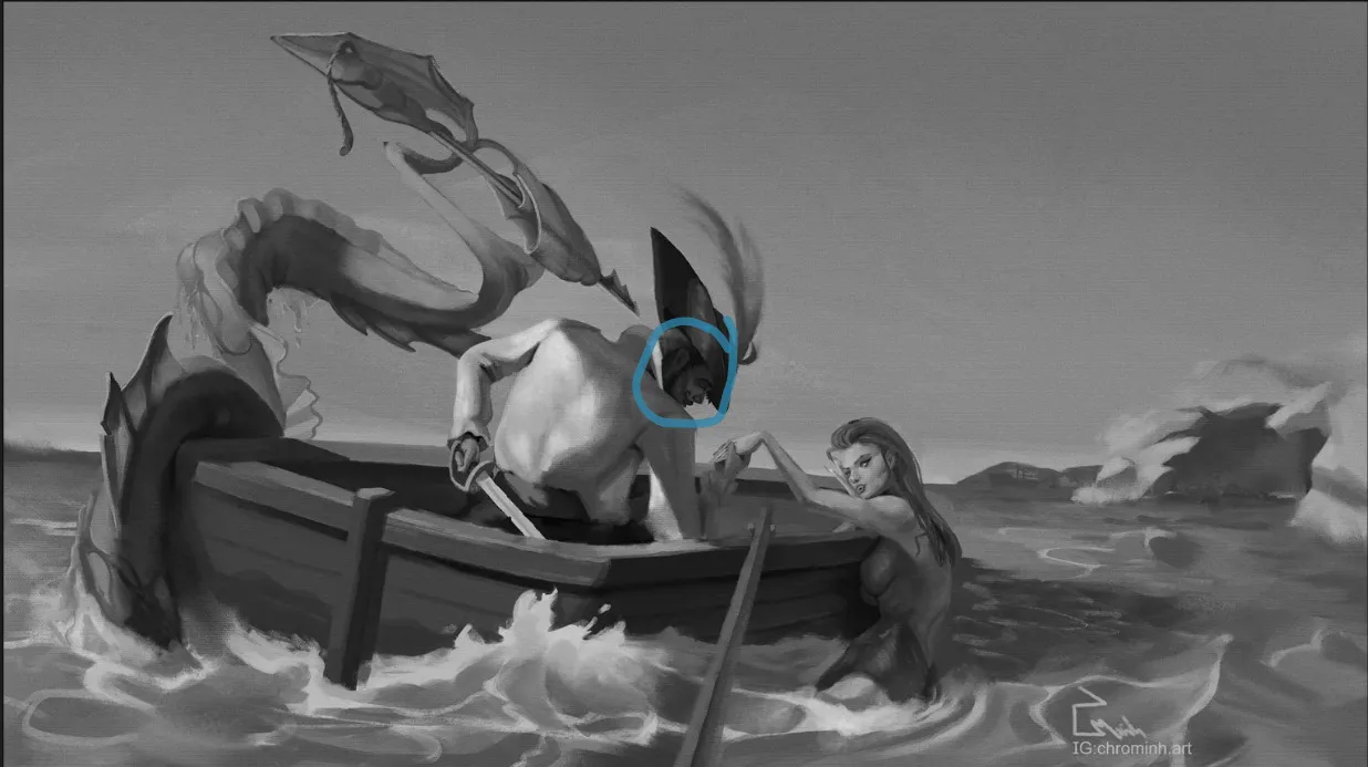
Sur « Mermay - An Unexpected Visitor » de @erunamo
“Hey there! I love the narrative that you are telling in this piece! Awesome work! That being the case, if you had a way to emphasize the person in the water above even more (maybe a little larger) ...”
Utile + 2
Feedback
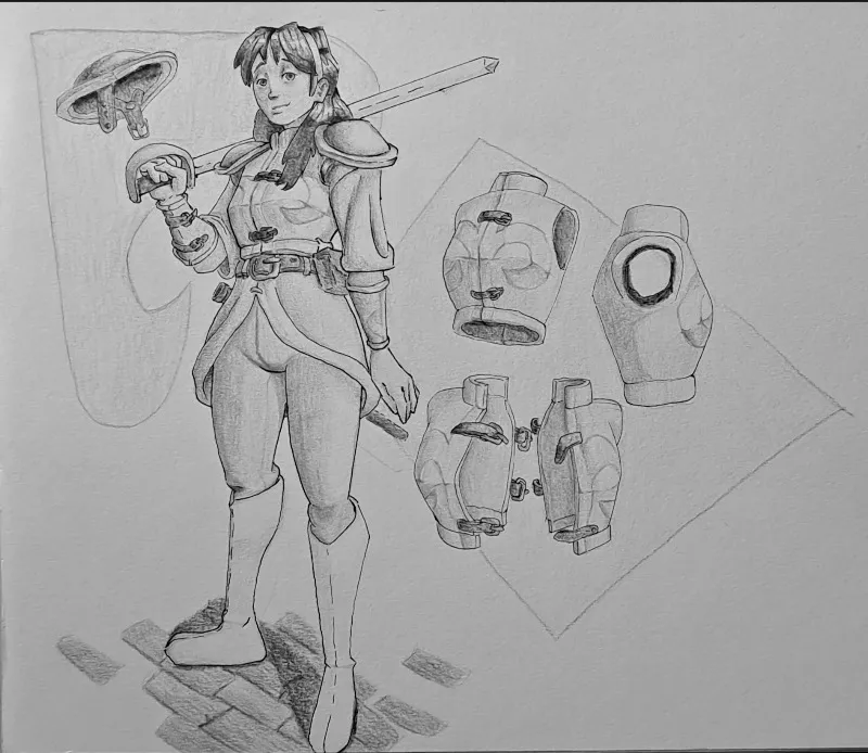
Sur « Odysseus Leaving Troy » de @michaelm
“Something to take into consideration is how far away Troy is in the background. Being further back in space, you might want to look at de saturating/ bringing down the contrast in your values fro...”
Utile + 1
Peindre
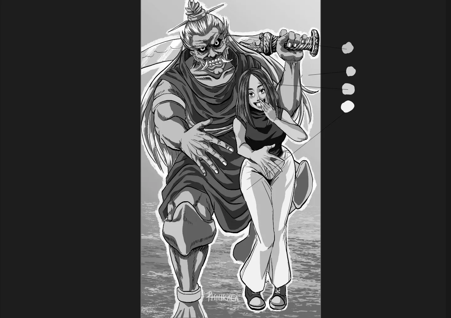
Sur « Scroll keeper » de @oscartejedor
“This is a super cool design you have going on here (especially the back scroll - love it!) I think something that could give this design even more of a "pop" would be some wear and tear in the clo...”
Utile + 1

Peindre
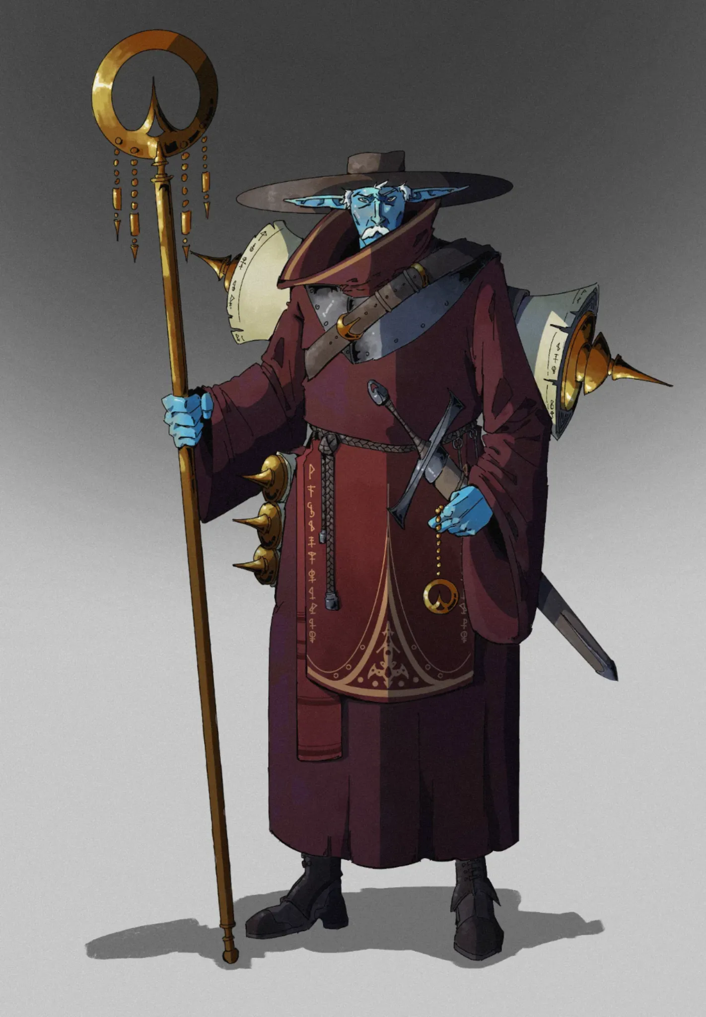
Sur « Phantasy Star Alis Fan Work » de @nathaniel50727
“There is so much charm in this piece! Awesome job! Depending on your priorities moving forward - especially if callouts are a goal, one option might be to strengthen them as an element of composit...”
Utile + 1
Peindre
Sur « Mermay Challenge - Story Telling » de @minh
“This is an awesome piece! Fantastic work! I think something that may help direct even more to some of your focal points is pushing your contrast a touch further as well as some highlights within the p...”
Utile + 1
Peindre
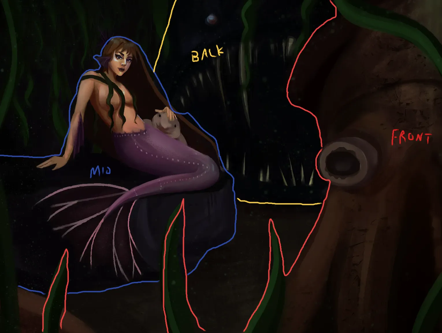
Sur « Mermay » de @kalamari
“There is awesome composition here for setting up the depth of your values! Keeping in mind how your values change in saturation as you move back in space (Front/Mid/Back) can help as you try to draw ...”
Utile + 1
Peindre
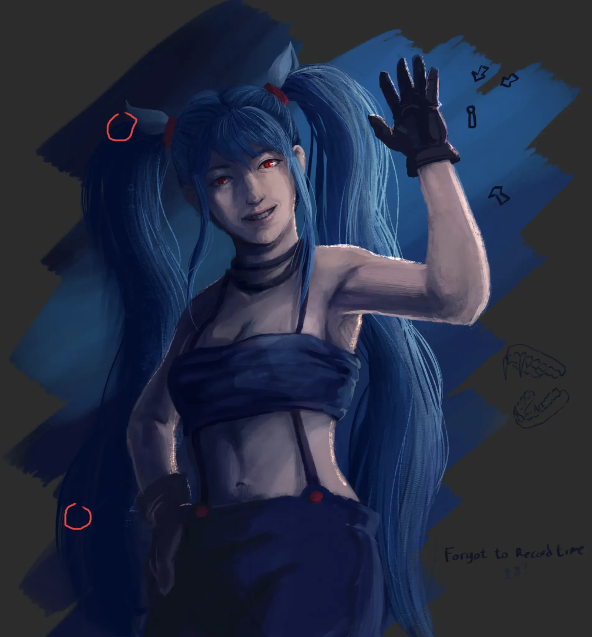
Sur « illustraion » de @nulls13808912
“Something that might help with the readability in this image is pushing your contrast. There is an awesome range of blues used in this image, but I start to lose a lot of readability in things like th...”