Nuevo: cambia aquí entre galería y vista única.
#288
Rango
31
Upvotes
17
Feedback dado
100%
Útil
“Hello! You did an awesome job for a first attempt! I think all you really need to do is go harder on the contrasts with your lights and darks to give her more 3d form. I hope this drawover is helpful!”
“a paint over for my paint over! I made a few changes that were bothering me like the head, the hands and the arms!”
“Ive definitely gotten better since then, theres still a TON more for me to learn, and im totally open to any critiques! Some things I couldnt figure out was the distance between the elbows on the tabl...”
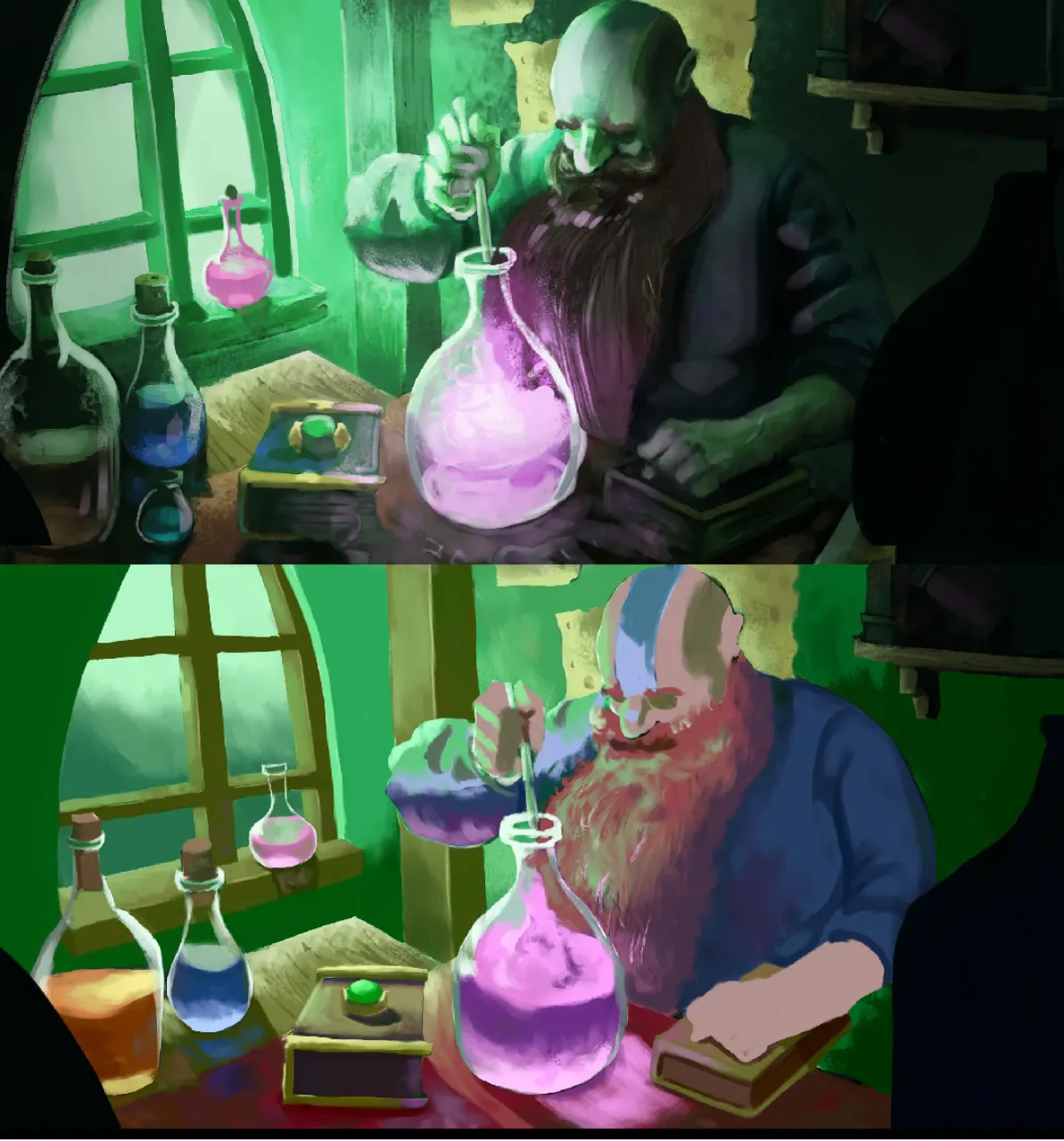
“Hello! Personally I think the first version is a lot stronger concept wise, with the purple/green color contrast working really well. All it really needed IMO is more purple into the lights and reflec...”
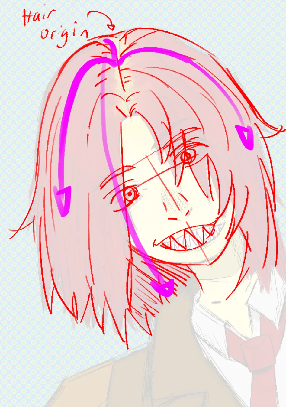
“Heyo! The hair flow will always follow the hair line. I showed a demonstration in purple! The face proportions were slightly off, mostly with the eyes. With the teeth, the cheek muscles will warp ever...”
“YOOO, Im also a huge fan of Yoh Yoshinari! I study his work and many of the other amazing animators at studio trigger and formerly at Gainax. Definitely keep up the studies, your doing a good job so f...”
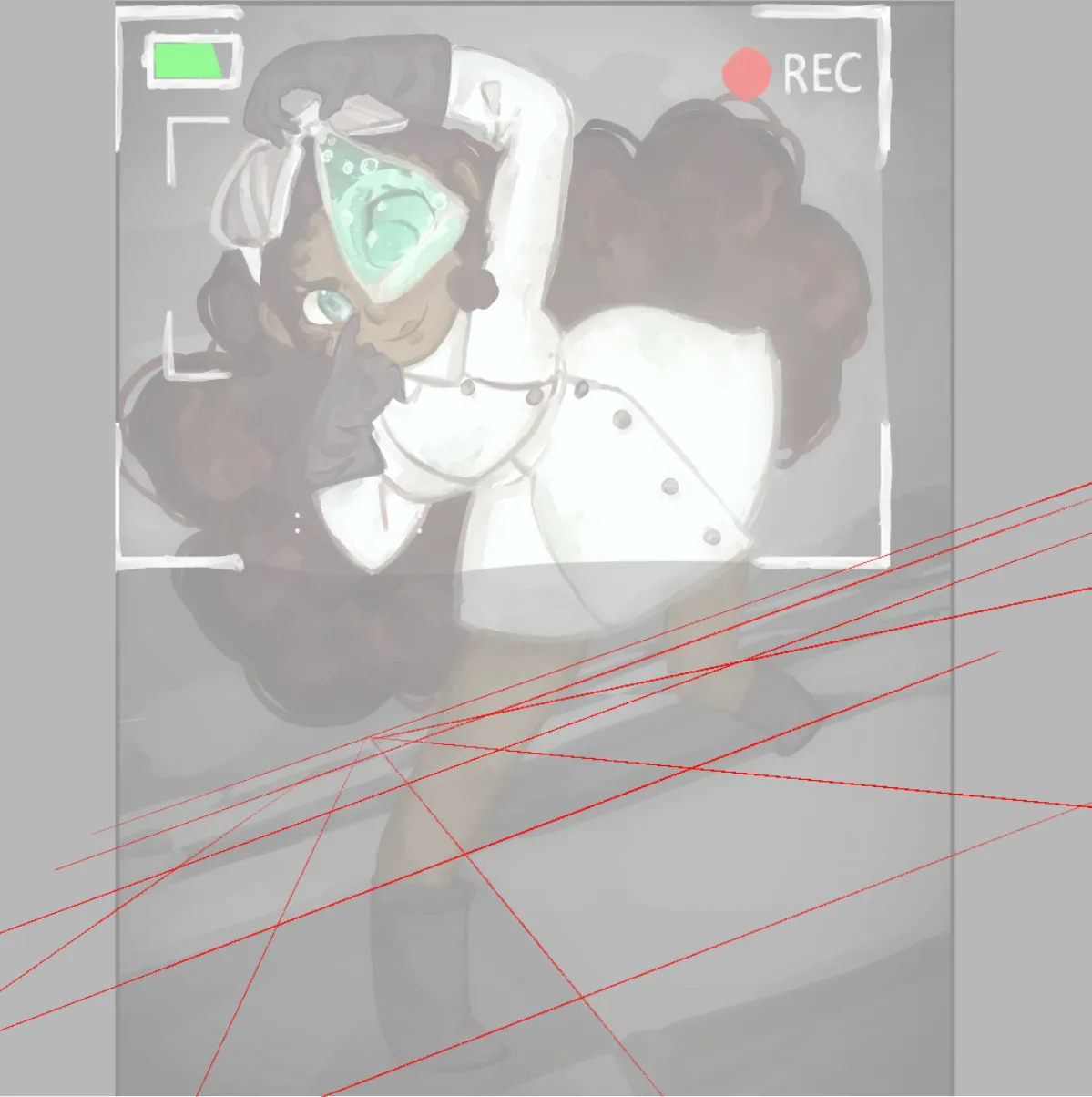
“Hello! I really like your insticts for design, I think the character is really cute, and I like how her eye gets bigger in the glass! However, the perspective grid you used on the floor is incorrect. ...”
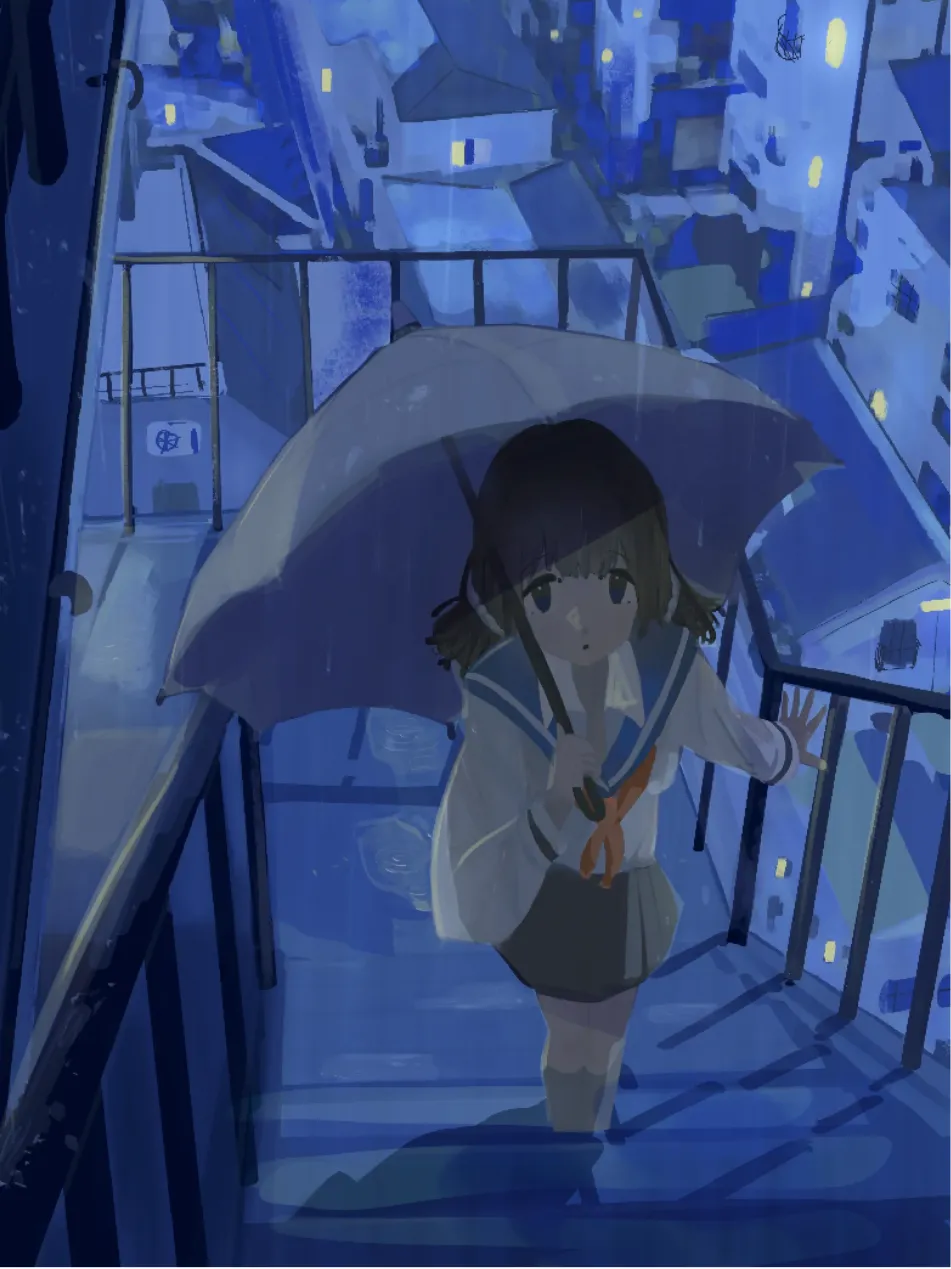
“Hello! I actually really like the dimness of the drawing, I think it works in its favor, the bigger issue im seeing is the contrast between the girl and the background. She kinda melts into the drawin...”
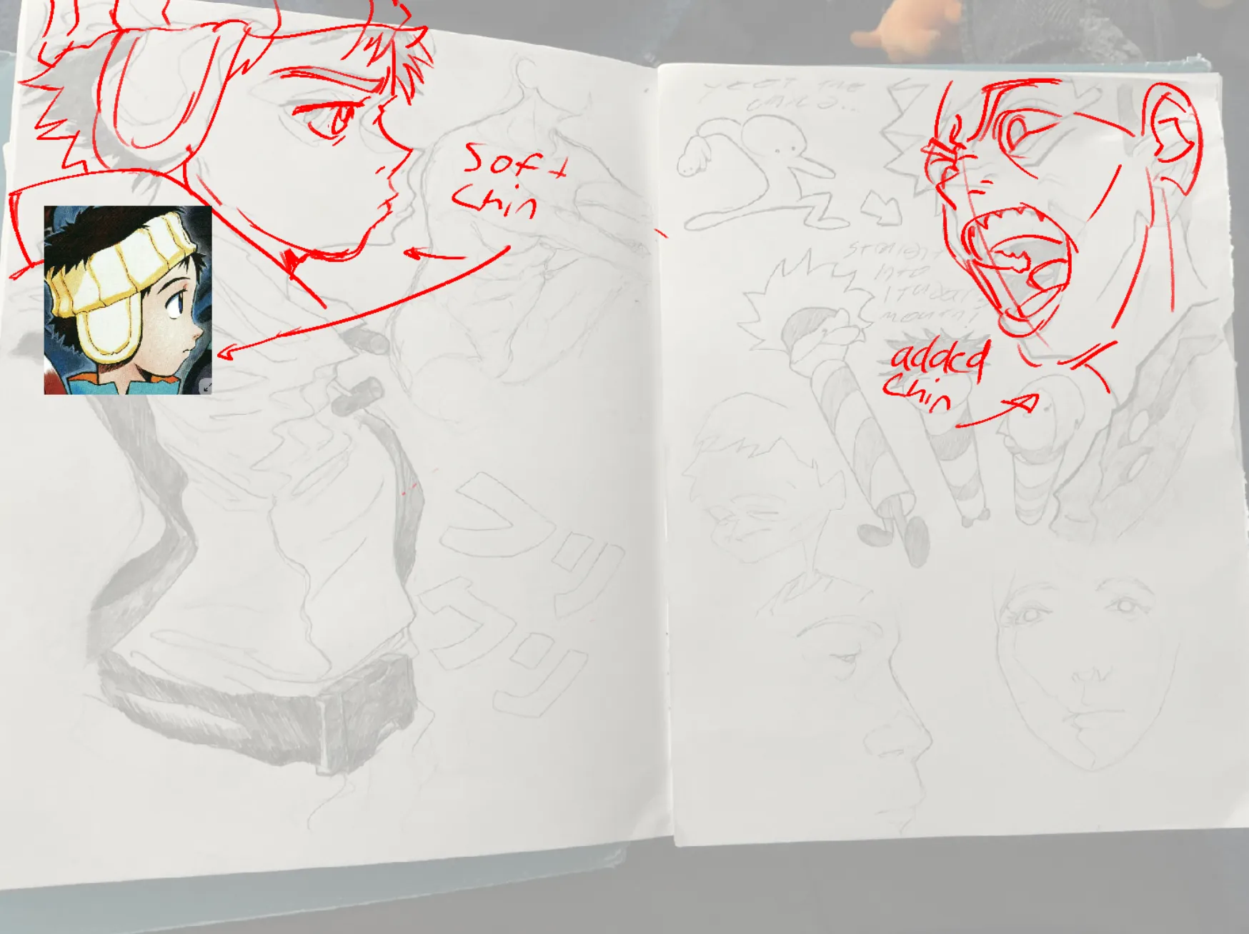
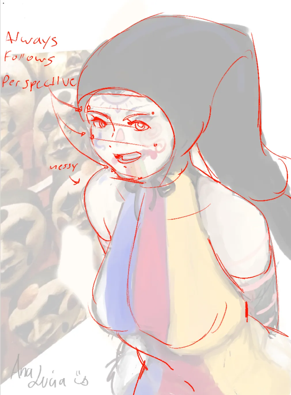
“HI! I would focus on understanding the underlying anatomy, because theres a lot of points on the face particularly that will always follow perspective, use these landmarks to determine what angle your...”
“Hi! I love this piece honestly, I didnt change much, I think it just needed stronger contrast with the shadows, dont be afraid to make them too dark! I dont even feel like I made them dark enough here...”
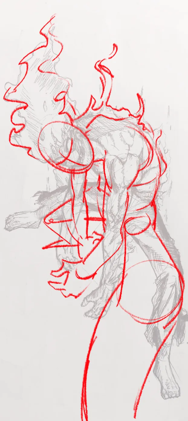
“Hiya! Maybe something like this for the foreshortening? Definitely push the drawing MUCH more than you currently are. Nice concept though, I love it!”
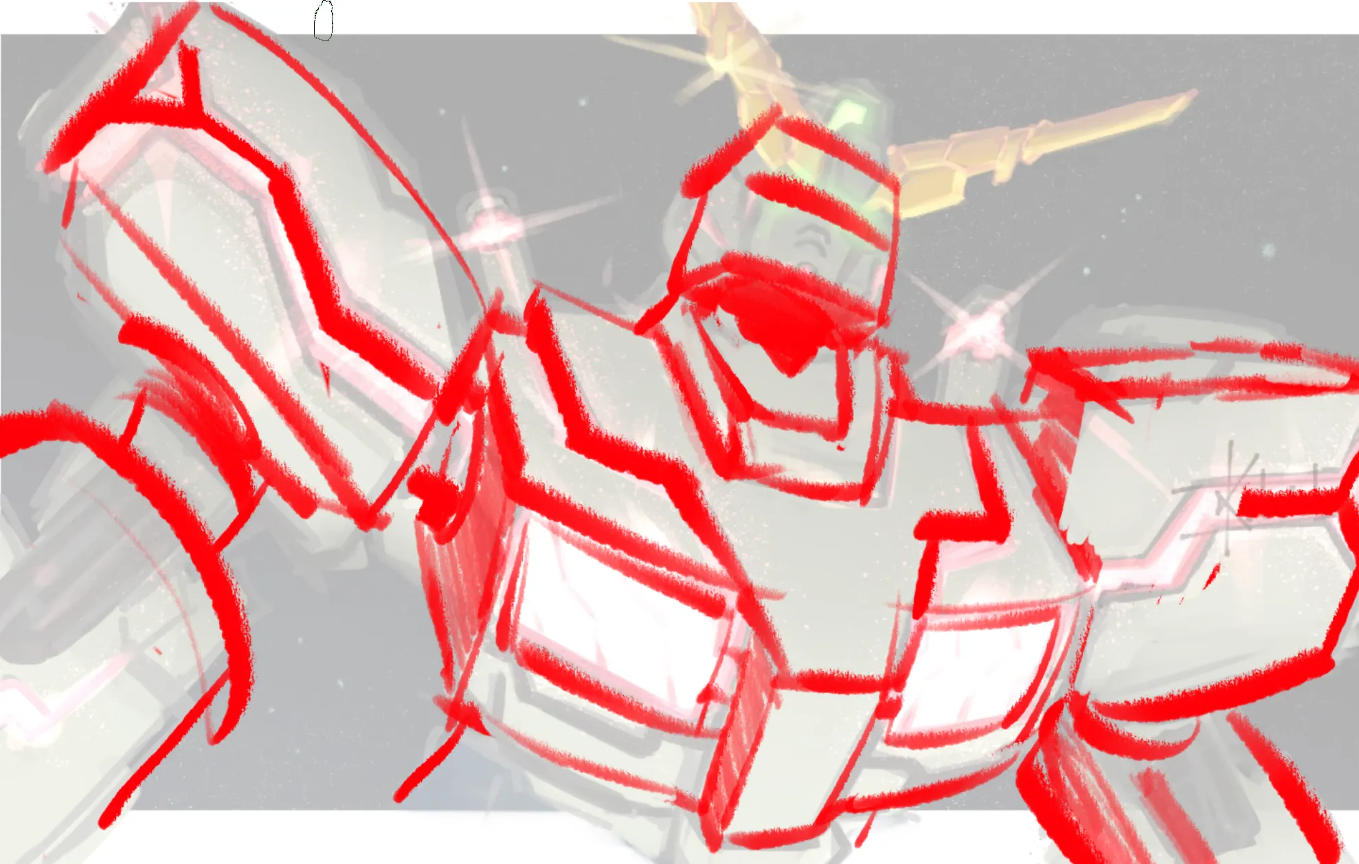
“Hiya! I dont have too much to say, its a really cool sketch! I just feel like the shapes could be a lot stronger and more obvious. They shapes are a smidgen too muddy, and it makes some of the shapes ...”
“Hello! I think the big issue here isnt your drawing abilities, its more your concepting. ALWAYS try your best to not hide hands, even if theyre not the best hands, they add a TON of expression. Your i...”
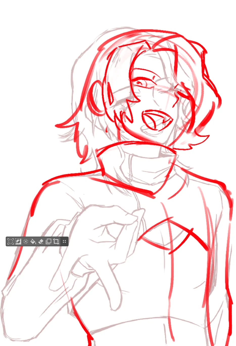
“The hand is honestly great, the main issue im seeing is the perspective and the gesture. The I changed the angle of the head so it can 1. Flow along with the gesture you implied with the chest 2. Foll...”
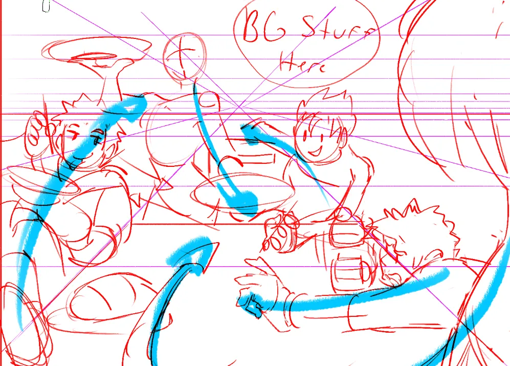
“Hello! The character placement is fine, I think the main issue is the decision on the 1 point perspective, I think this piece could be a lot stronger with a different layout, but if you wanted to keep...”
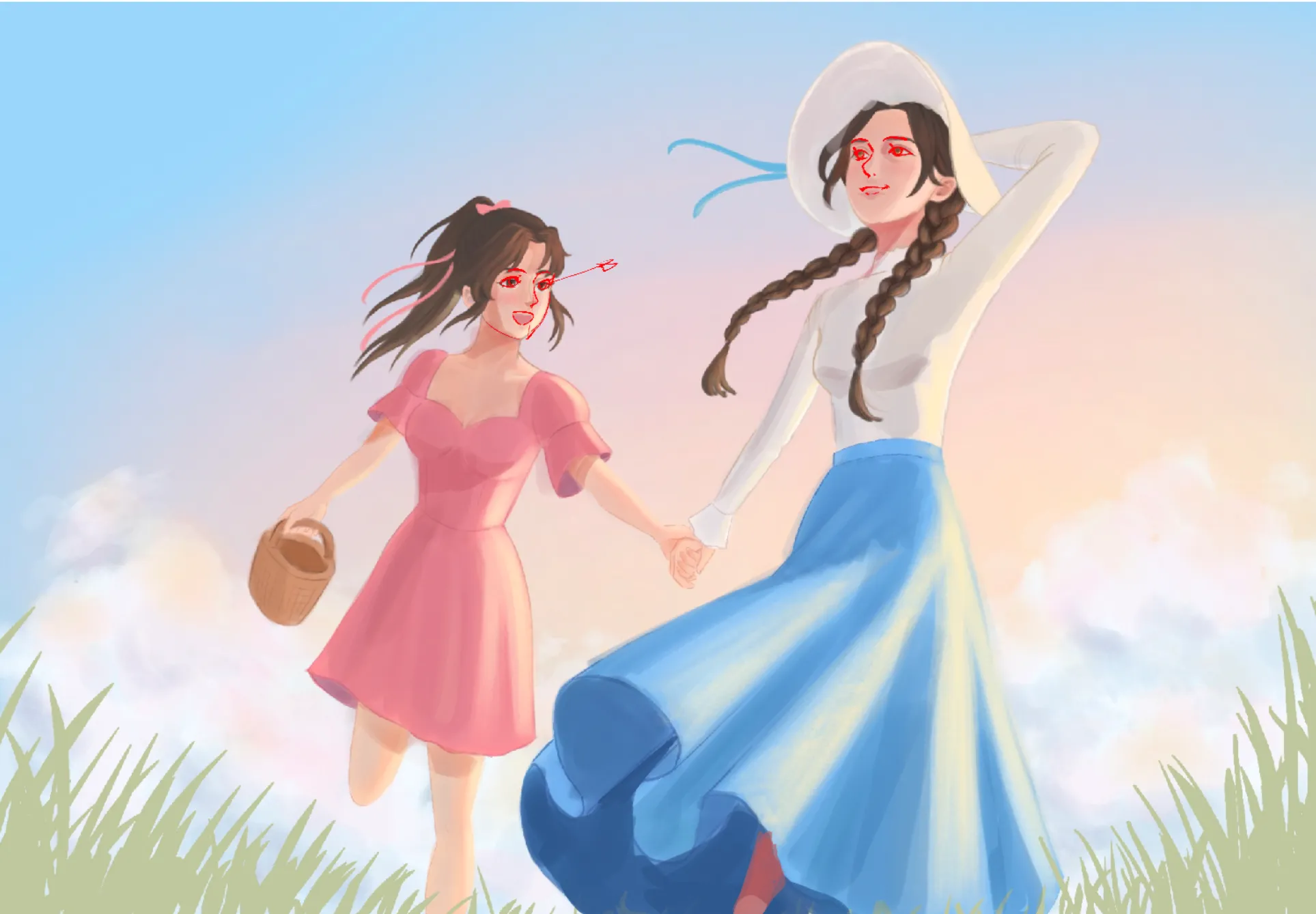
“Hello! There a few things I would change to make it feel more eastern. One small thing is that Eastern styles are actually use a lot of realism in their drawings, for example, the length between eyes ...”
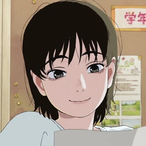
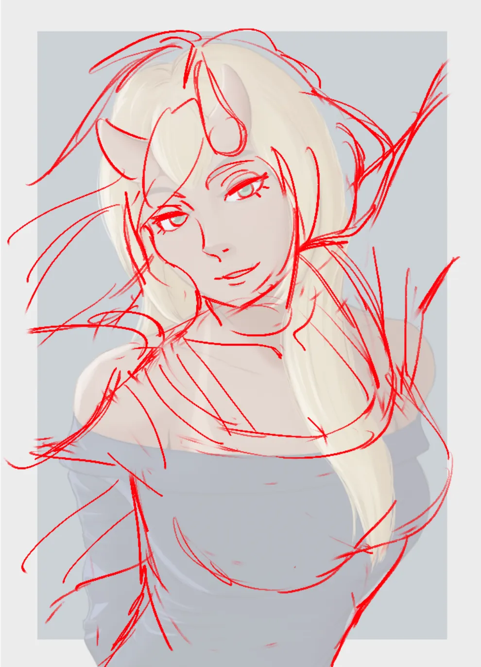
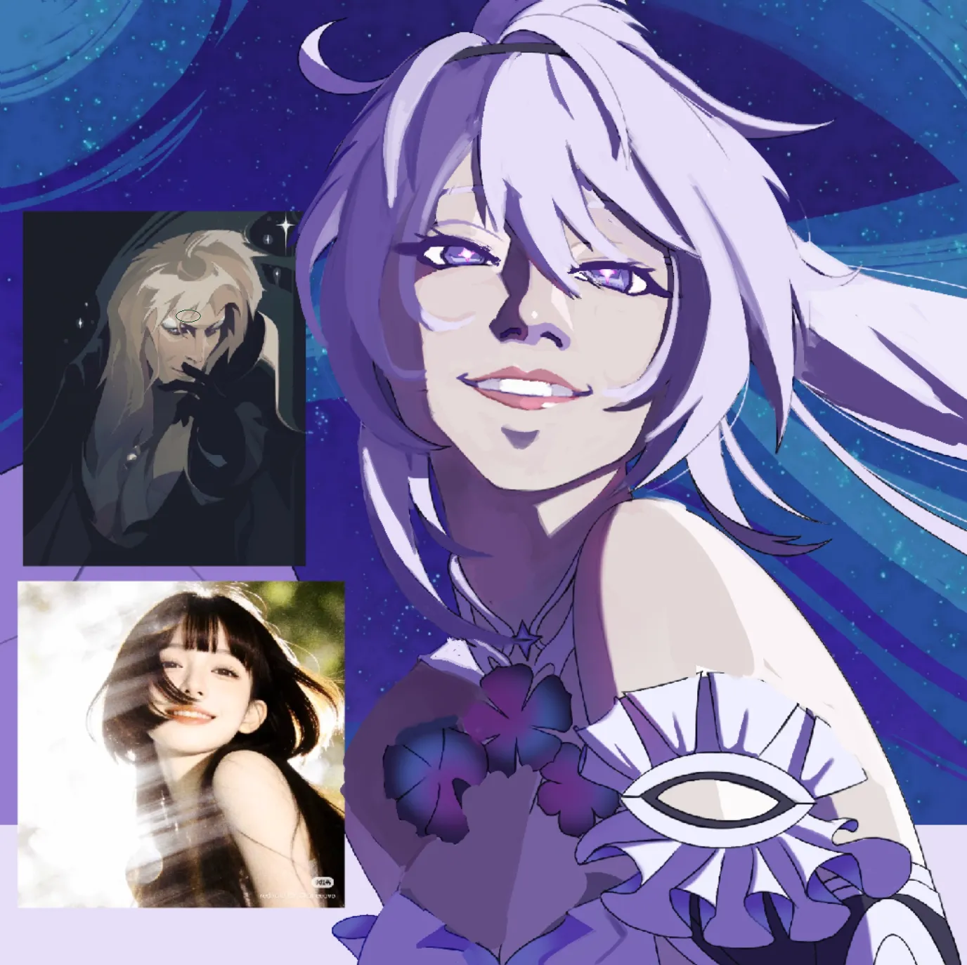
“The style in the top reference has a lot of strong hard shapes that are gradually darkened in certain parts. The original had too many smaller bits of hair and strands of shadow, when they should be v...”