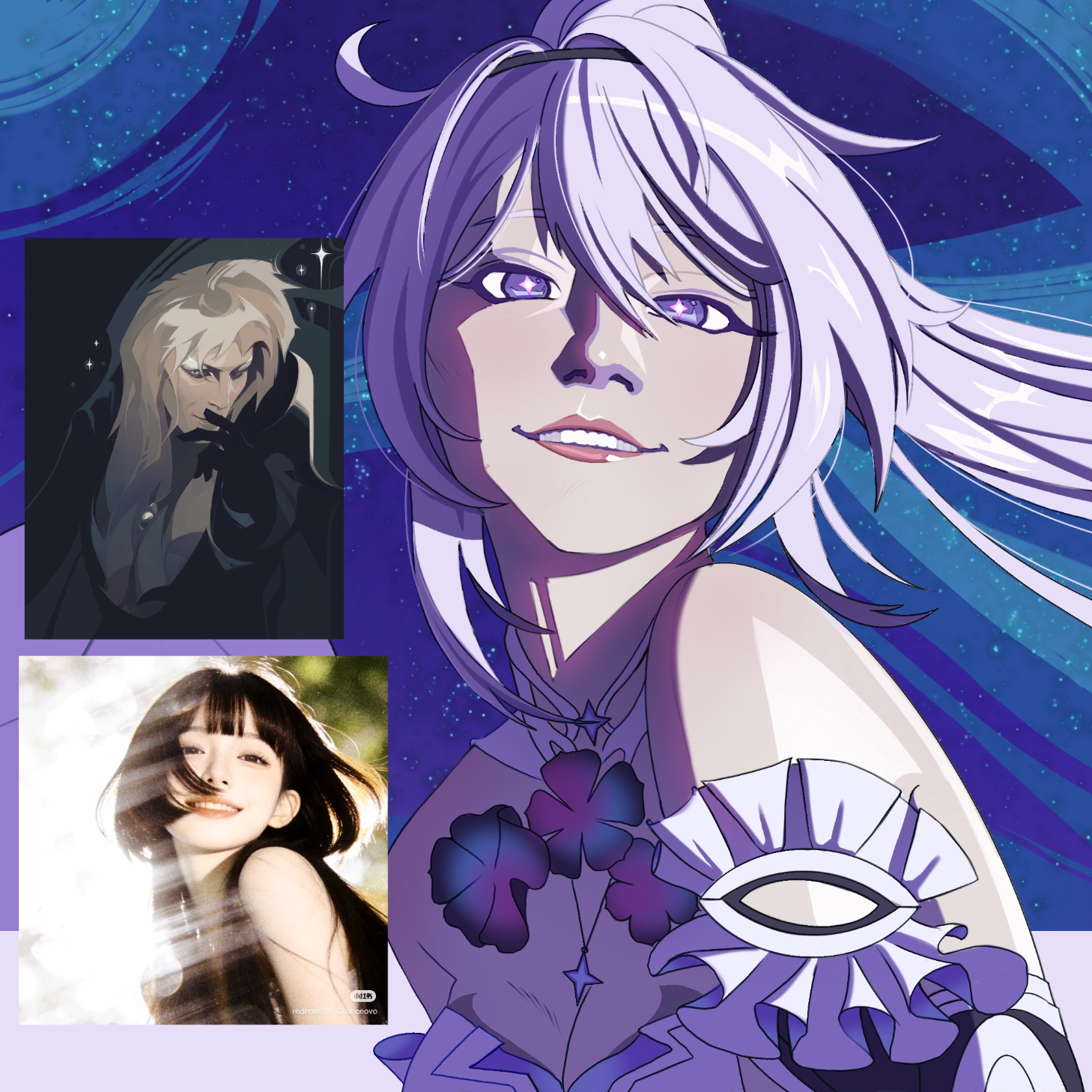
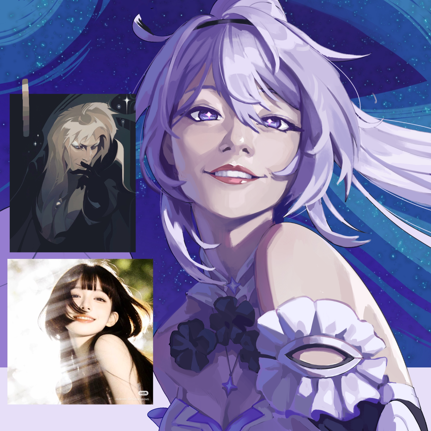
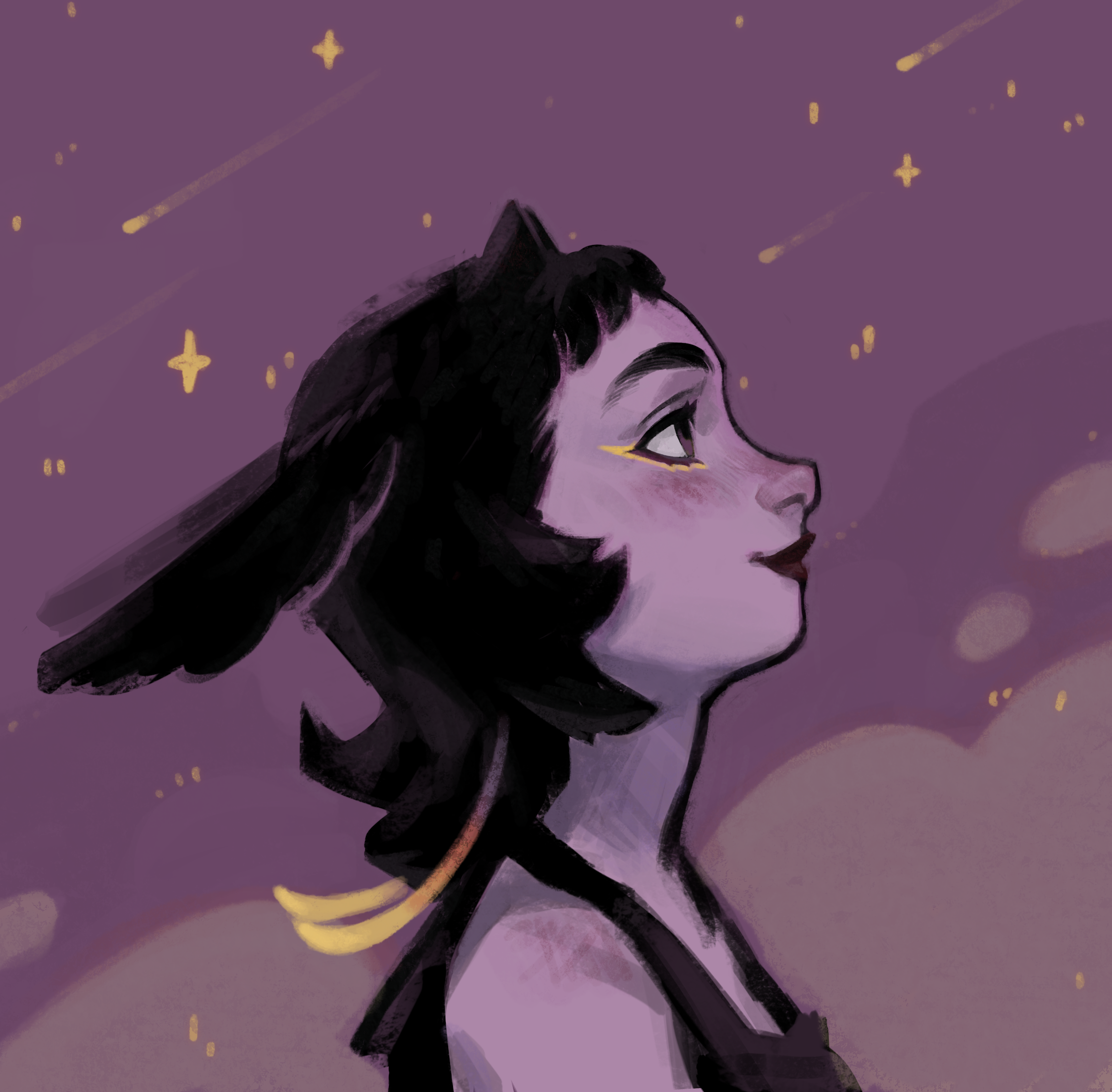
Hi! I really love how you captured the vibe of the reference style. I had a couple of small suggestions that might help bring the piece even closer to the reference. The shading: On the reference, the hair has very smooth transitions with multiple subtle gradients of shadow. Right now, the shading on the hair uses about three distinct colors, which creates a bit of a high-contrast look. Adding a few transitional mid-tones would help soften the contrast and match that smooth reference style beautifully. The linework: In the reference, the outlines are incredibly soft, invisible in some places. On the drawing, the contour is quite prominent. If the outlines are made to match the neighboring colors more closely, it will instantly give the artwork that same delicate, seamless feel. What do you think?
Thank you so much for the critique AND the paintover. I definitely see what you mean with the contrast and the lineart; I’m definitely going to pay more attention to that the next time I paint. Lineart and shape design are two struggles that I plan to study until I have more confidence and competence to paint them properly, but I think I’m going to try and push the semi realistic more cause I have a feeling that that sorta-posterized style isn’t exactly meant for manga-leaning artworks. On a more personal note I can’t get over how pretty she looks in your paintover TuT <3 thank you for that, too!