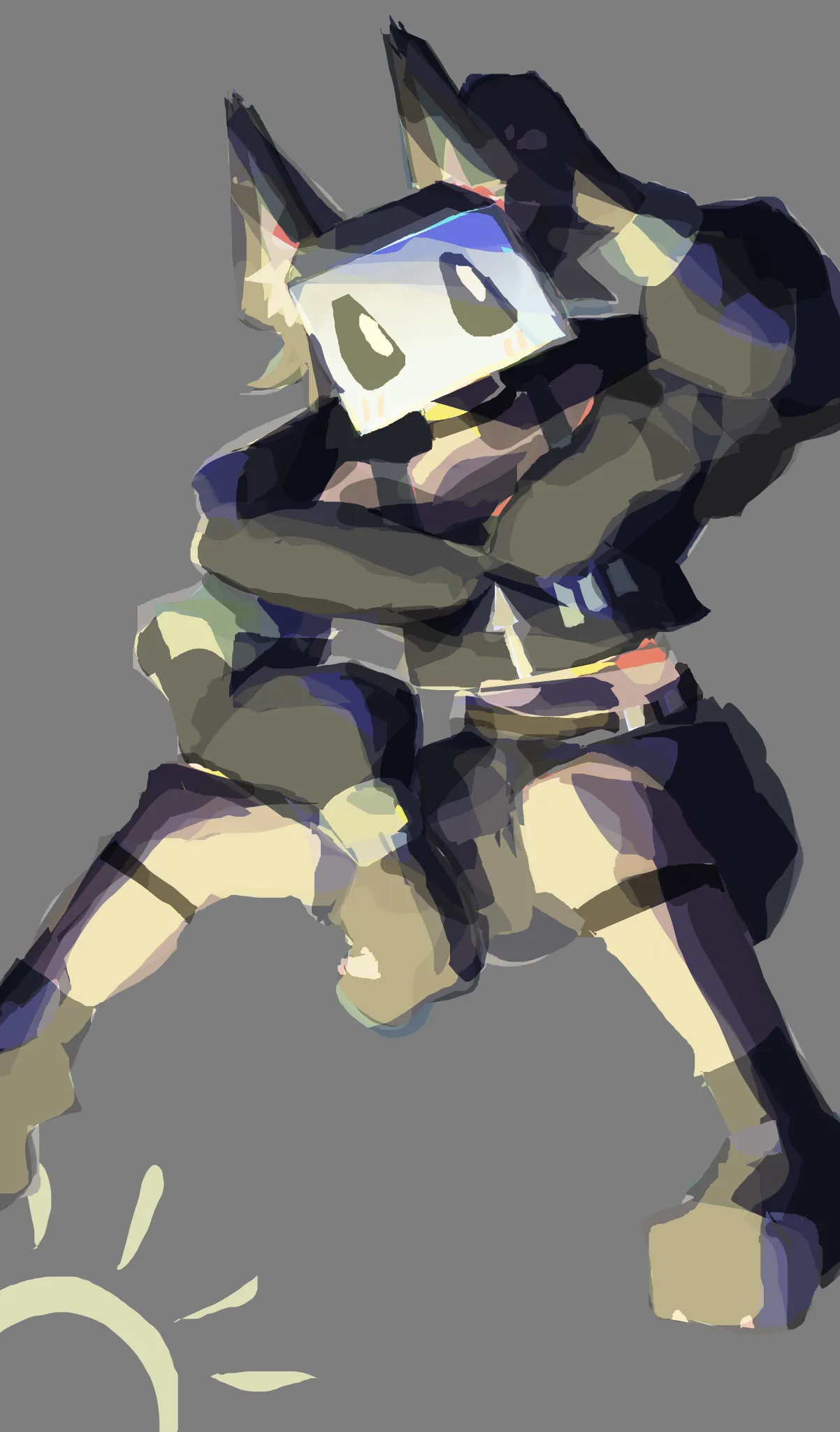
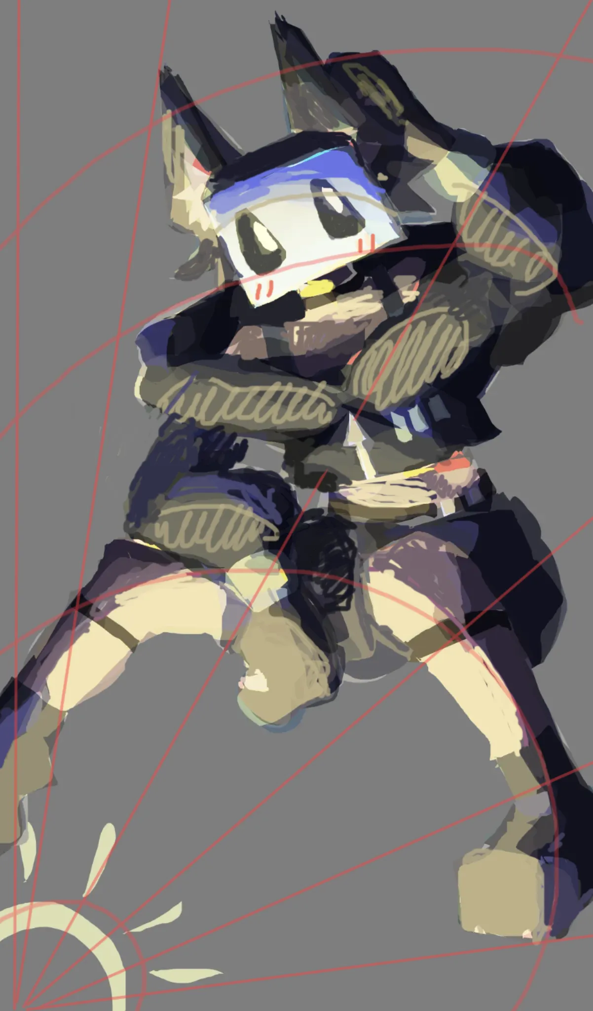

The reason your drawing still looked flat, despite the detailed light and shadow, was that your light and shadow were incorrect in how the light spreads from the source and in the intensity of light from that source. In the corrected drawing, I tried to show with lines how light spreads from the light source you marked; with similar lines from the light source and circles, you can make it easier to understand where the light should fall and where the shadow should be. I also changed in some places the cast shadows from different parts of the clothing, so I darkened the right ear more than the left, because the character’s head blocks it from the light coming from below; and on the chest the shadow became larger because this down/collar creates a larger shadow behind it due to the light directed at it. Also, to better indicate volume, you should reduce the number of colors used in the shadows; because of the large number of colors, many shadows made the light and shadow harder to understand. For greater clarity, the light area/half-tone/shadow should first be marked out with large shapes and color, and only afterward should transitions and gradients be added. Also, despite the spread of light, I would still advise clearly marking the details on the character’s face, because the viewer always looks at the face of any character, and clearer features allow the character to be read more easily by the viewer.
Thank you, I shall try and practice this ^^