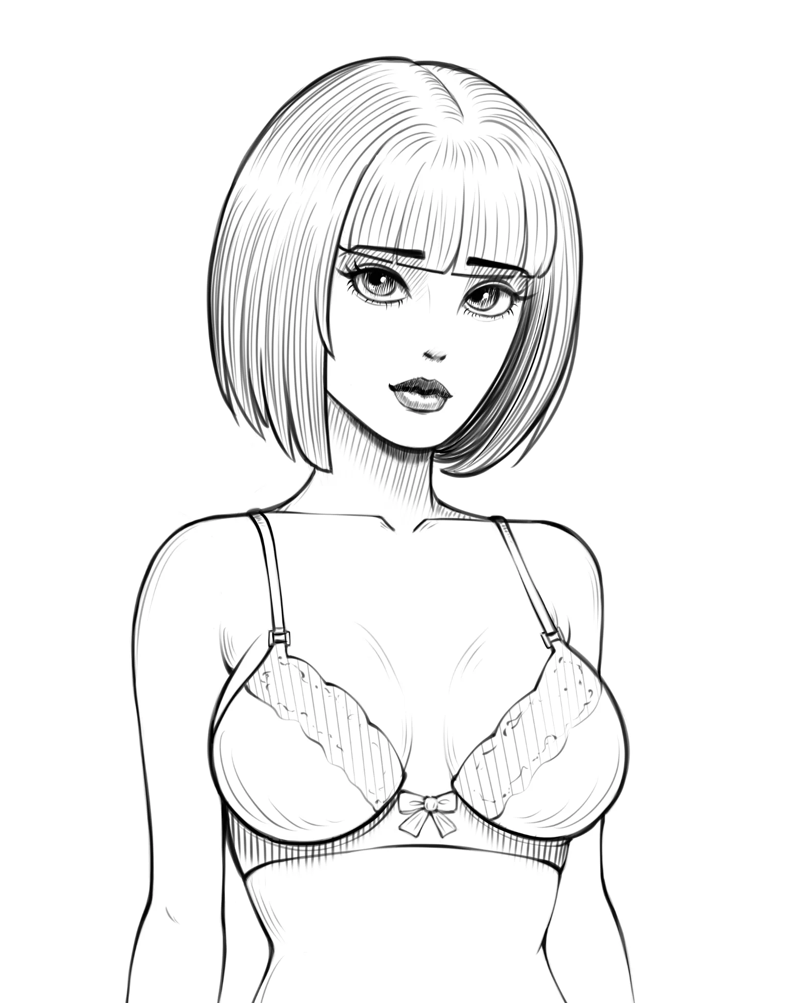
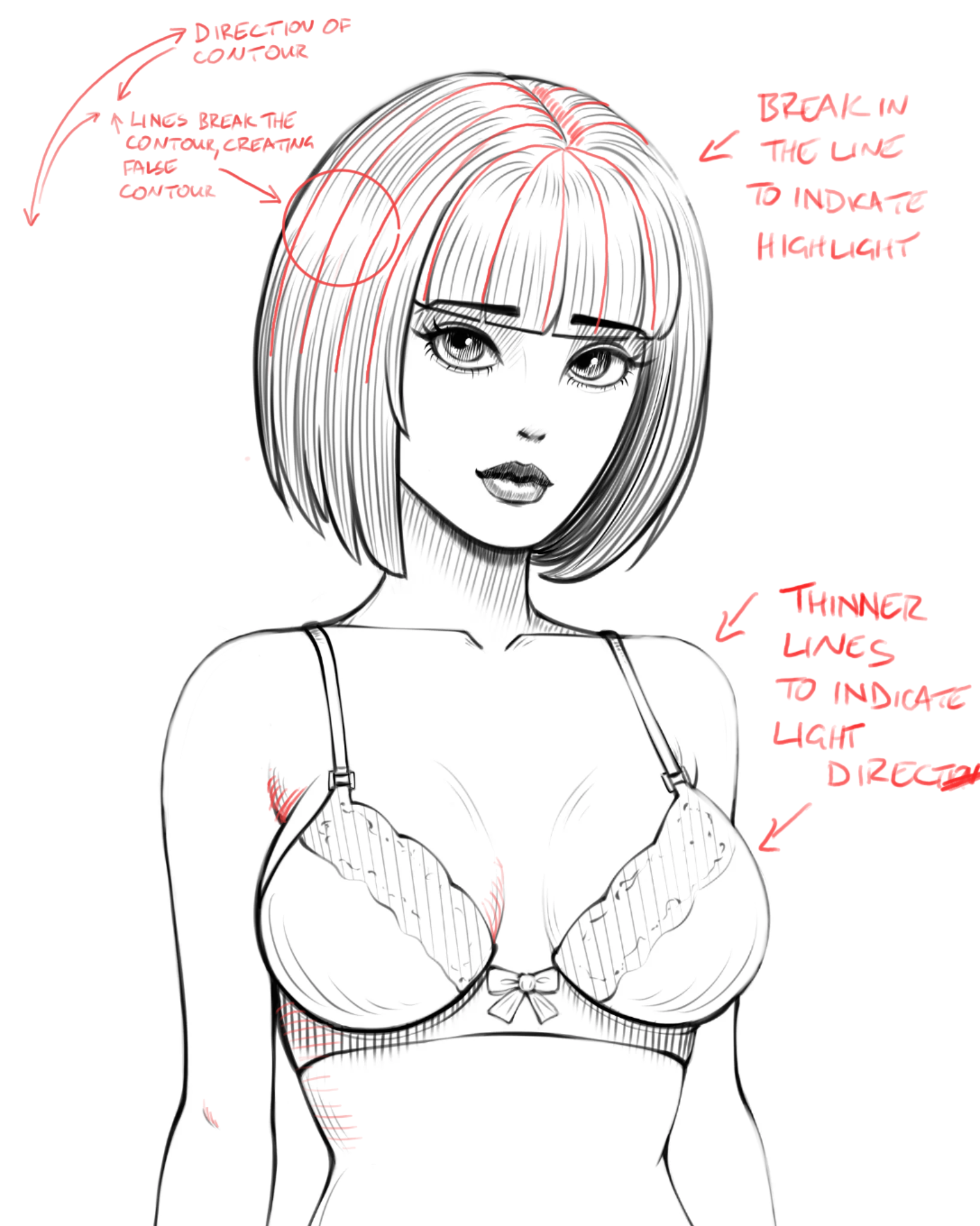

Very nice illustration. A couple of things I would point out. The first is to follow the contours of the form. The lines don’t just indicate shadow but also the shape of an object. So the area around her armpit I would change the direction of your lines. Also note that in the hair around the highlights, the hair itself has a large shape. I’ve used long lines to indicate that form and contour. Your lines have a tendency to curve in and away from that contour, this makes it seem like there’s a groove in her hair. The second thing I would point out is that the thickness of the line also helps indicate light and shadow. So the upper surfaces, like her shoulders, which point towards the light should normally have a thinner line weight than surfaces that are in shadow. This could be a stylistic choice to use a thicker outline, but that’s up to you. Also you can break up the outline. So for example, I’ve created a break in the outline of her hair to indicate where the light is hitting it. You also had some lines which felt a little unnecessary, like the lines around her shoulders. If you want to include those additional lines I would use them in areas that are away from the light.
Thank you, brother!