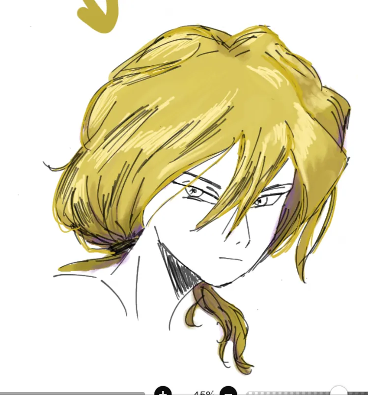
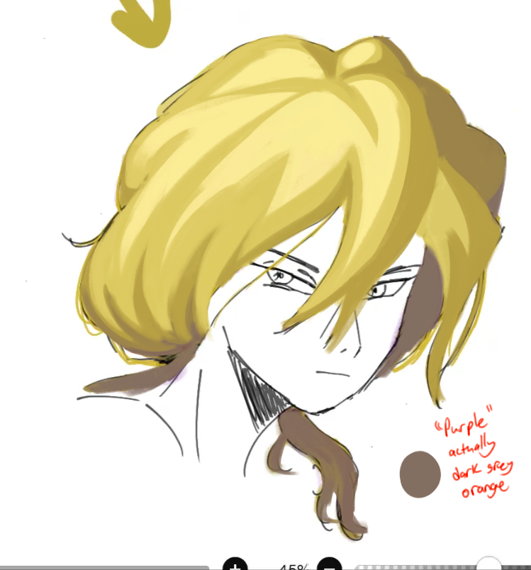


Your highlights and shadowsdidn’t seem to make sense with the light source. The highlights should be closer together. Treat hair as if it were simplified forms of ribbons to make more sense of the lighting. The purple stood out too much because you used straight purple rather than using a greyish tint to give the illusion of a purple accent (relative colors). I tried to stick to your characters general hair forms and color scheme.
Paintovers (1)
First try on rendering
Artist's notes:
Hello! This is my first try on rendering and colour theory. The problem Is the Shadow ( my character Is blonde and I used the complementery colour, but It looks likes her hair is dyed) . Even the light seems off. Can you give me some advice? Thanks ❤️