Want to store your feedback?
Sign up to store all your feedback in one place on your account. Your feedback will be private instead of public.
Paintovers
Paintover Notes
Choose a paintover
Pick a user avatar to see their paintover notes and discuss them.
Also struggling with rendering?
Improve your shading and light control, a 3 min read
Beginner's Guide to Storytelling Through Comics: Easy Steps for Your First Comic
Master comic storytelling by blocking shapes, simplifying forms into mannequins, imitating professional styles, then creating your own narrative-driven panels.
Rendering
Would you like to help someone who's still waiting?
Anime
No responses yet
My Artwork
I'm struggling with perspective, form&depth, composition, values, light/color, anatomy, design
7 minutes ago
View
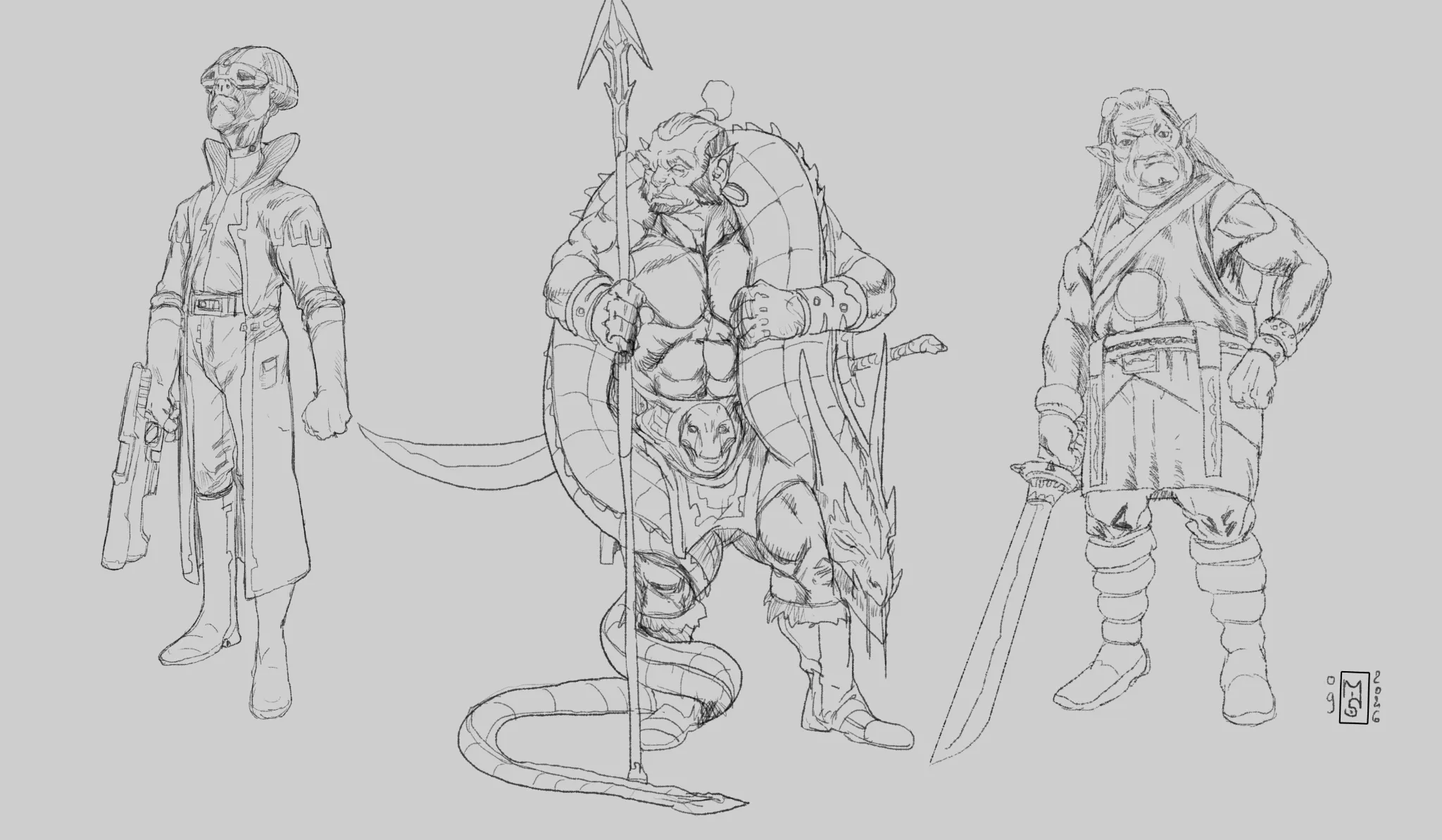
Anatomy
No responses yet
Mon œuvre
Je suis aux prises avec anatomy, design
8 minutes ago
View
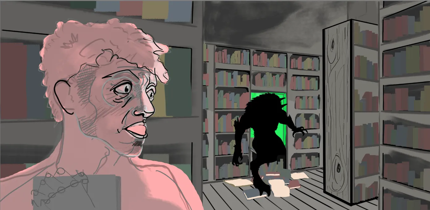
Perspective and Form
No responses yet
Unexpected visitor
I want the person on the left to exhibit fear. Mouth is giving me a hard time. other side of the face finally feels right but I expect it could be "shallower?". The rest of the perspective feels right I am just double checking my perspective and form before I proceed.
15 minutes ago
View
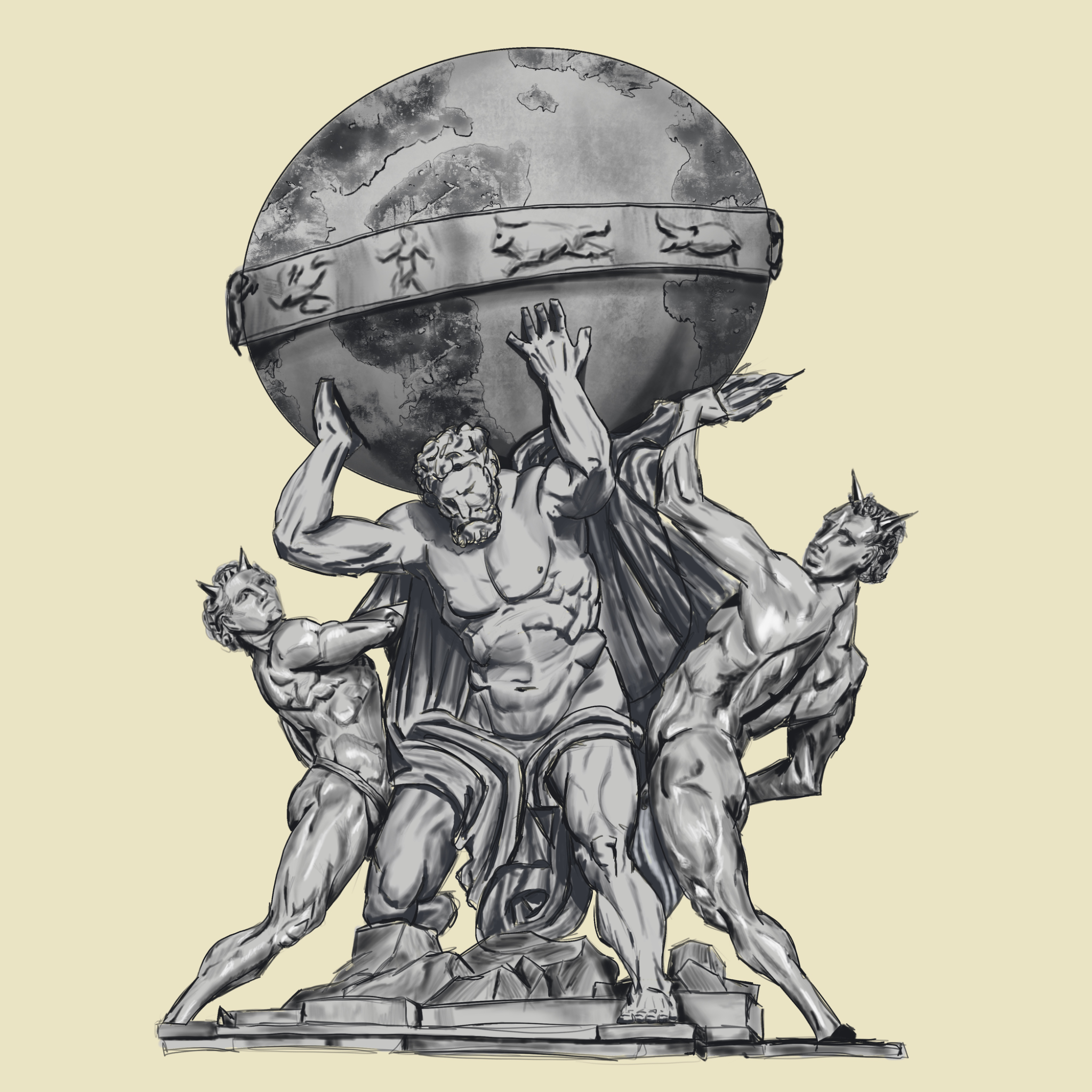
Figure
No responses yet
Mi obra
Estoy luchando con values, light/color, anatomy, line quality
39 minutes ago
View
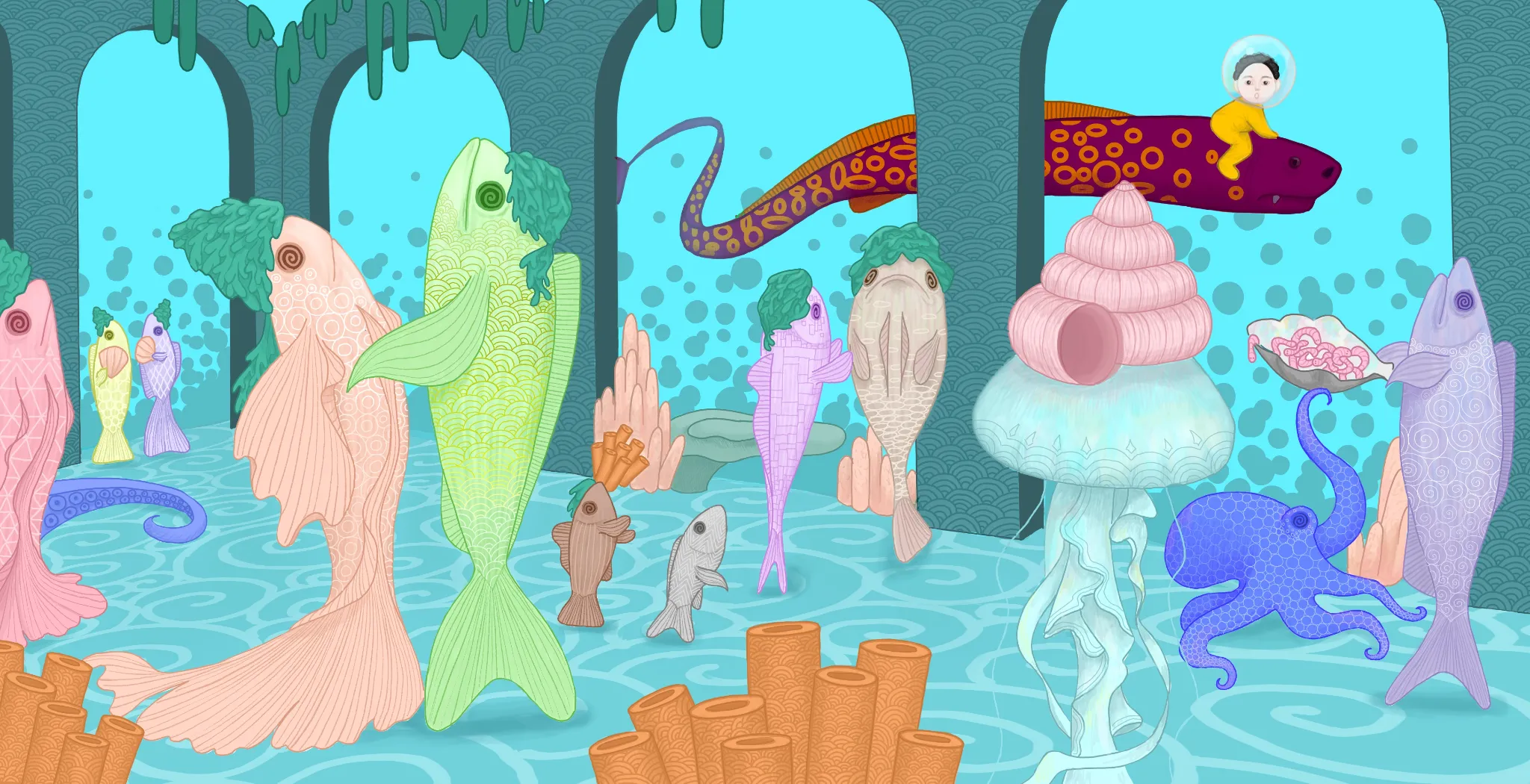
Animals
No responses yet
My Artwork
I'm struggling with perspective, form&depth, composition, values, light/color, anatomy, design, line quality, other
54 minutes ago
View
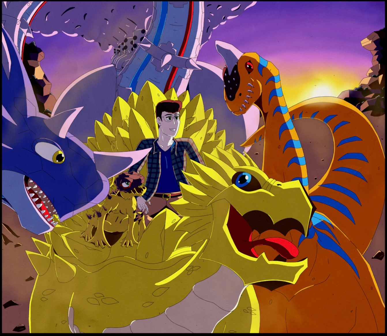
Anime
No responses yet
My Artwork
I'm struggling with perspective, form&depth, anatomy, design
1 hour ago
View
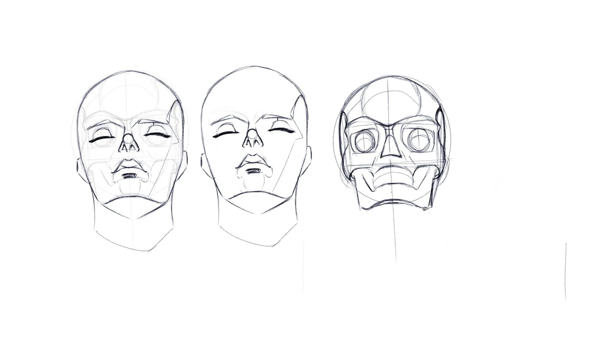
Portraits
No responses yet
Face drawing practice
How did I do? Was attempting to do a more harder angle, I really struggle to draw the forehead and the jaw plus chin in this angle. Any critique on what I can fix and improve upon? Btw, I wasn't using any reference except the skull.
1 hour ago
View
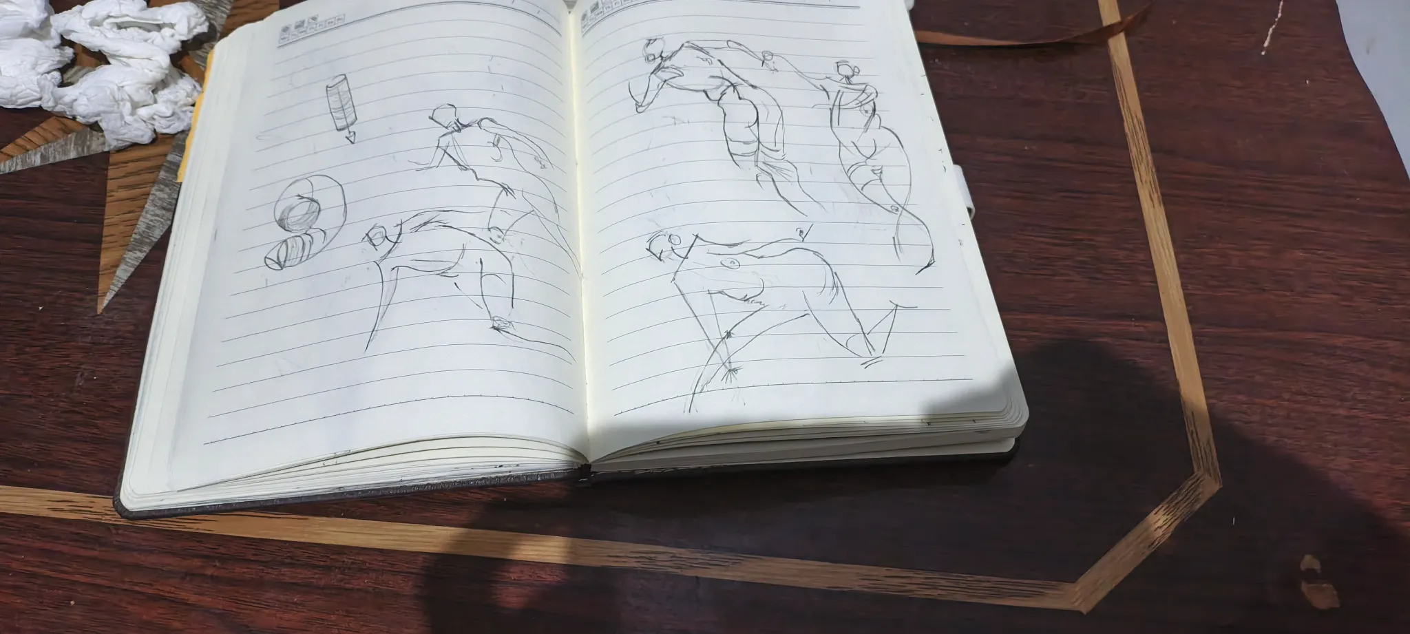
Anatomy
No responses yet
My Artwork
I'm struggling with perspective, form&depth, composition, values, light/color, anatomy, design, line quality, other
2 hours ago
View
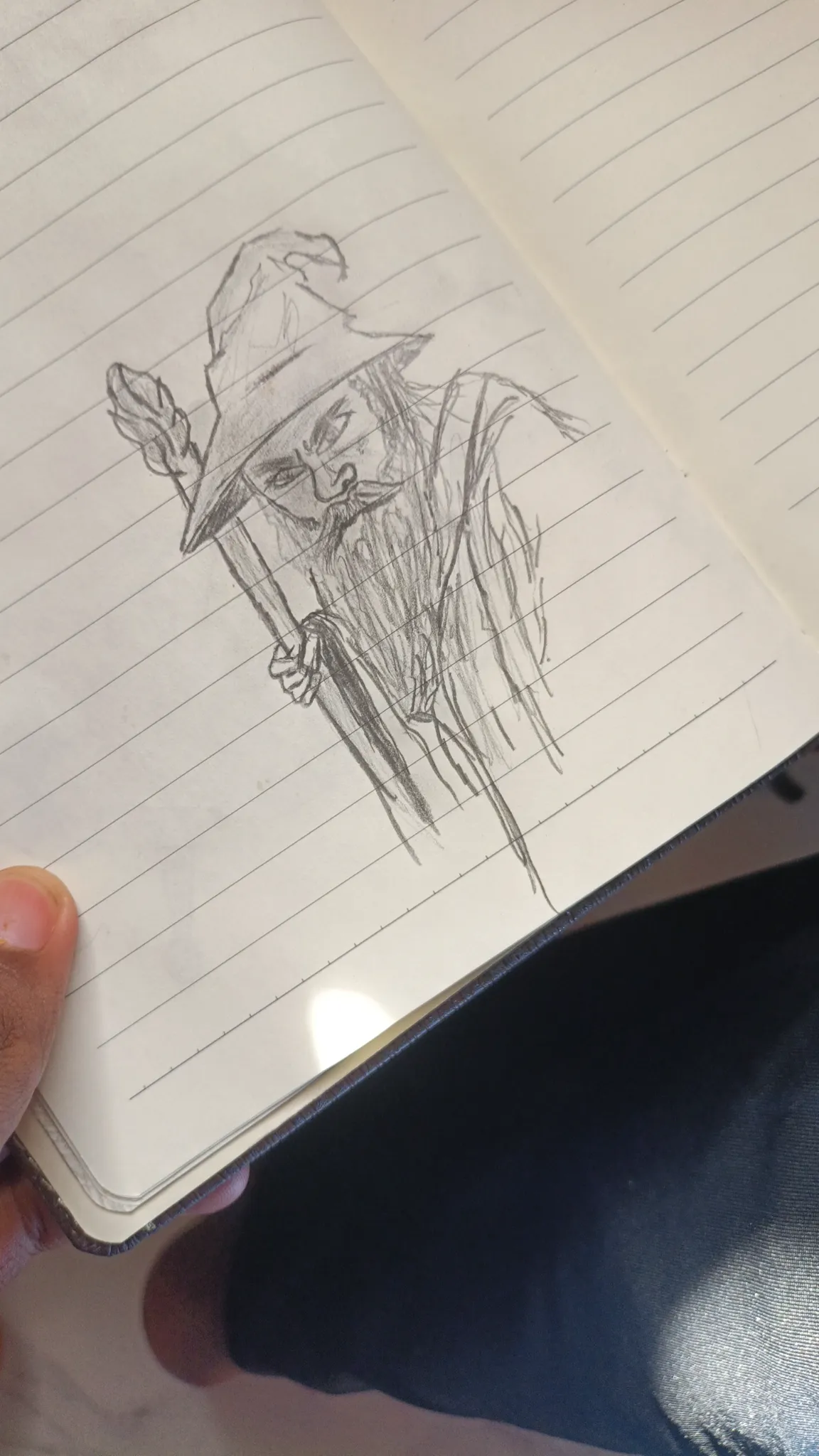
Anatomy
No responses yet
My Artwork
I'm struggling with perspective, form&depth, composition, values, light/color, anatomy, design, line quality, other
2 hours ago
View