Want to store your feedback?
Sign up to store all your feedback in one place on your account. Your feedback will be private instead of public.
Paintovers
Paintover Notes
Choose a paintover
Pick a user avatar to see their paintover notes and discuss them.
Also struggling with rendering?
Improve your shading and light control, a 3 min read
Beginner's Guide to Storytelling Through Comics: Easy Steps for Your First Comic
Master comic storytelling by blocking shapes, simplifying forms into mannequins, imitating professional styles, then creating your own narrative-driven panels.
Rendering
Would you like to help someone who's still waiting?
Rendering
No responses yet
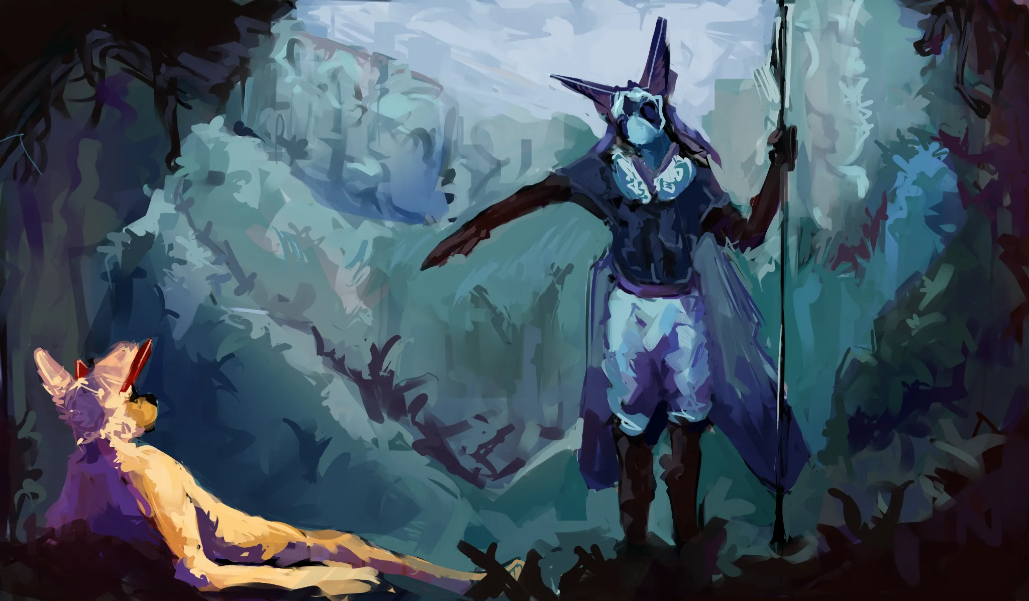
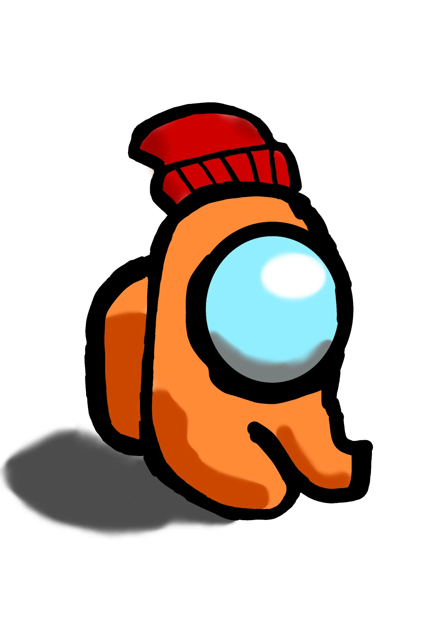
jungle
any feedback would be appreciated, this is one of my first backgrounds, so there is a lot to improve on.
8 minutes ago
View
Portraits
No responses yet
My Artwork
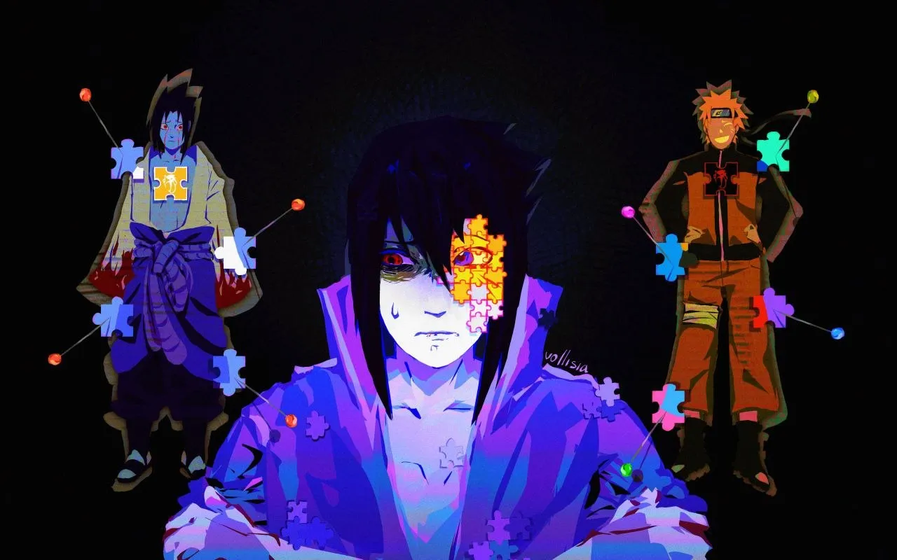
I'm struggling with perspective, form&depth, composition, values, light/color, anatomy, design, line quality
2 hours ago
View
Anime
No responses yet
My Artwork
I'm struggling with composition, light/color
2 hours ago
View
Rendering
No responses yet
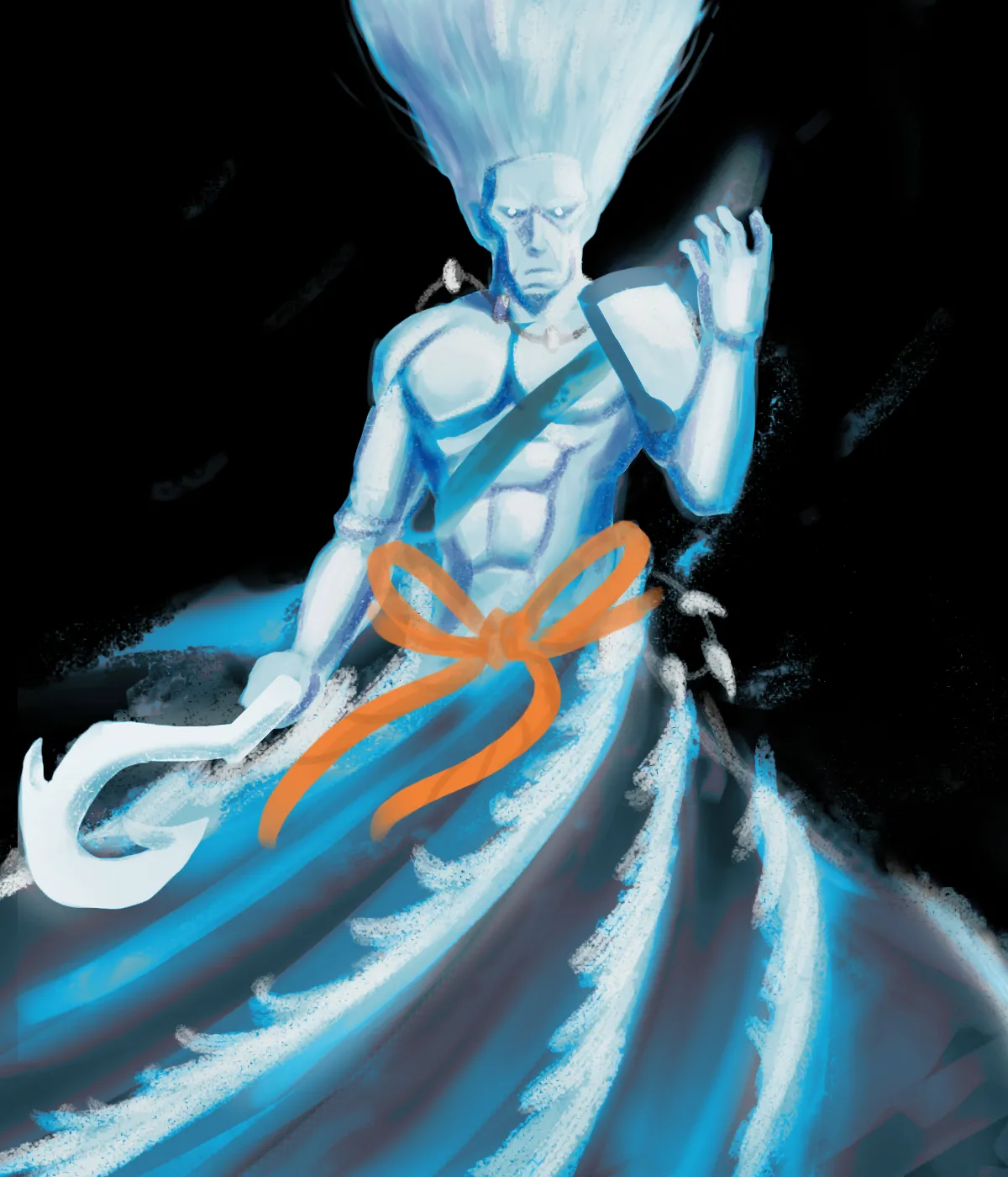
Need help about coloring
I try to make the lower part an look like the wave robe that spiraling around him (the orange rope is part of the robe) but i don't think I did the wave color right. Please help me about color. If you see other spots please feel free to correct me I really need guidance.
2 hours ago
View
Portraits
No responses yet
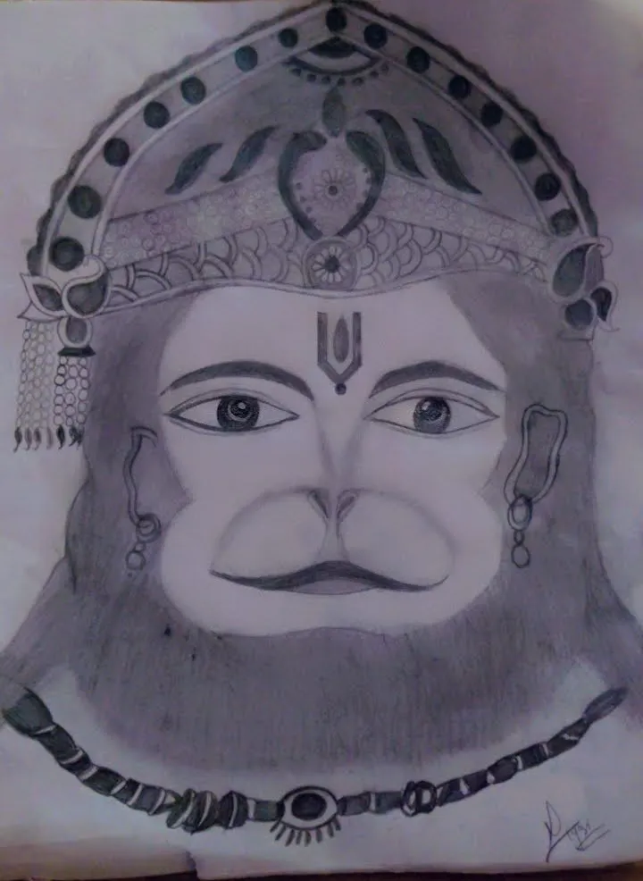
Beginner and looking for feedback on picture
I have drawn this by taking reference from instagram. I'm posting it here to know whether i can learn painting or portrait making or not , only then i will enroll for diploma course if i have the caliber to become an artist . I have no professional degree in art
2 hours ago
View
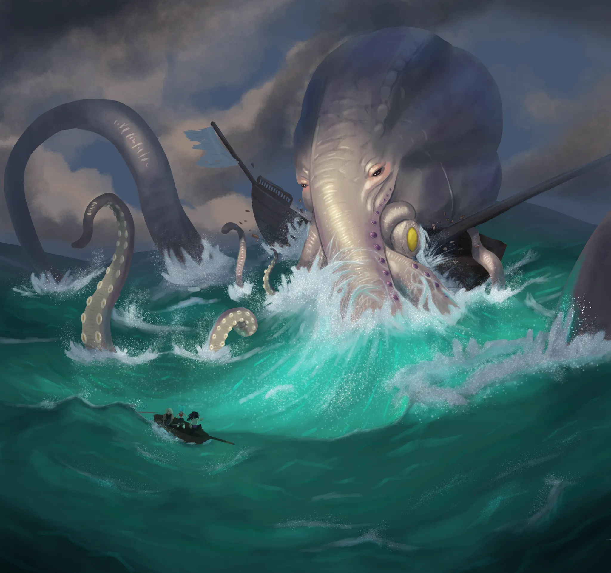
Rendering
No responses yet
Painting waves and splashes
Trying to get better at painting and I can't figure out how to draw/paint waves and splashes.
4 hours ago
View
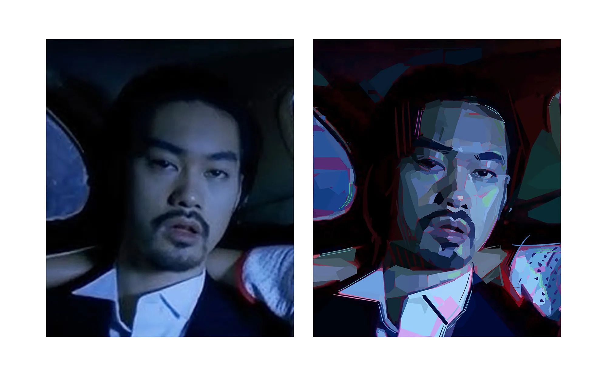
Portraits
No responses yet
Style and Painting Technique Exploration
Exploring style with no pressure brush and lasso rendering. Need help with this style! I don't know how to paint efficiently and with nice shape design. Any form of feedback welcome!
4 hours ago
View
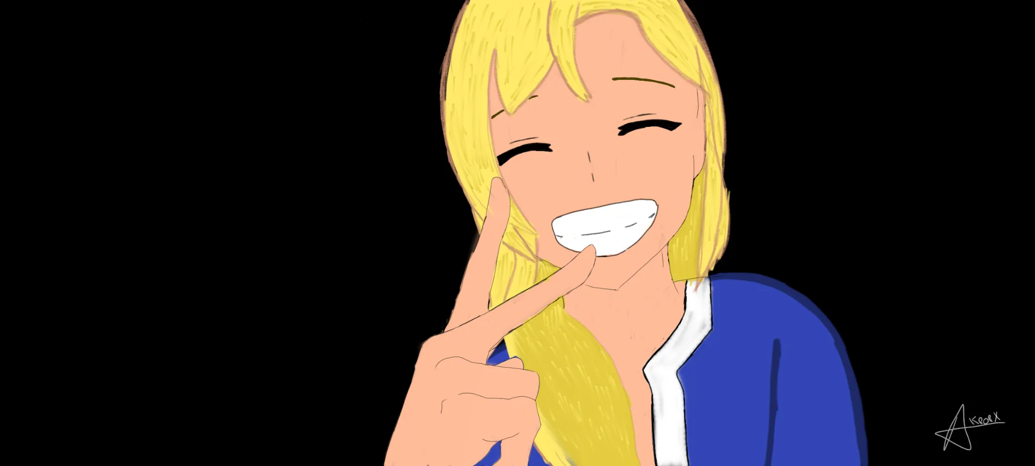
Anime
No responses yet
Mi obra
Estoy luchando con perspective, form&depth, composition, light/color, anatomy, design
4 hours ago
View
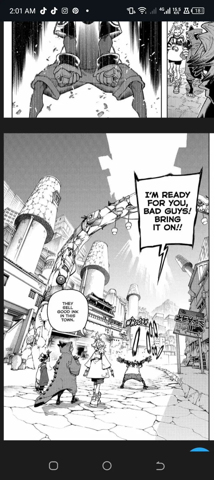
Anatomy
No responses yet
My Artwork
I'm struggling with perspective, form&depth, anatomy, design, line quality, other
5 hours ago
View