

Beautiful painting! I’d love to see the revised final version ❤️
Paintovers (1)
Viking House
Artist's notes:
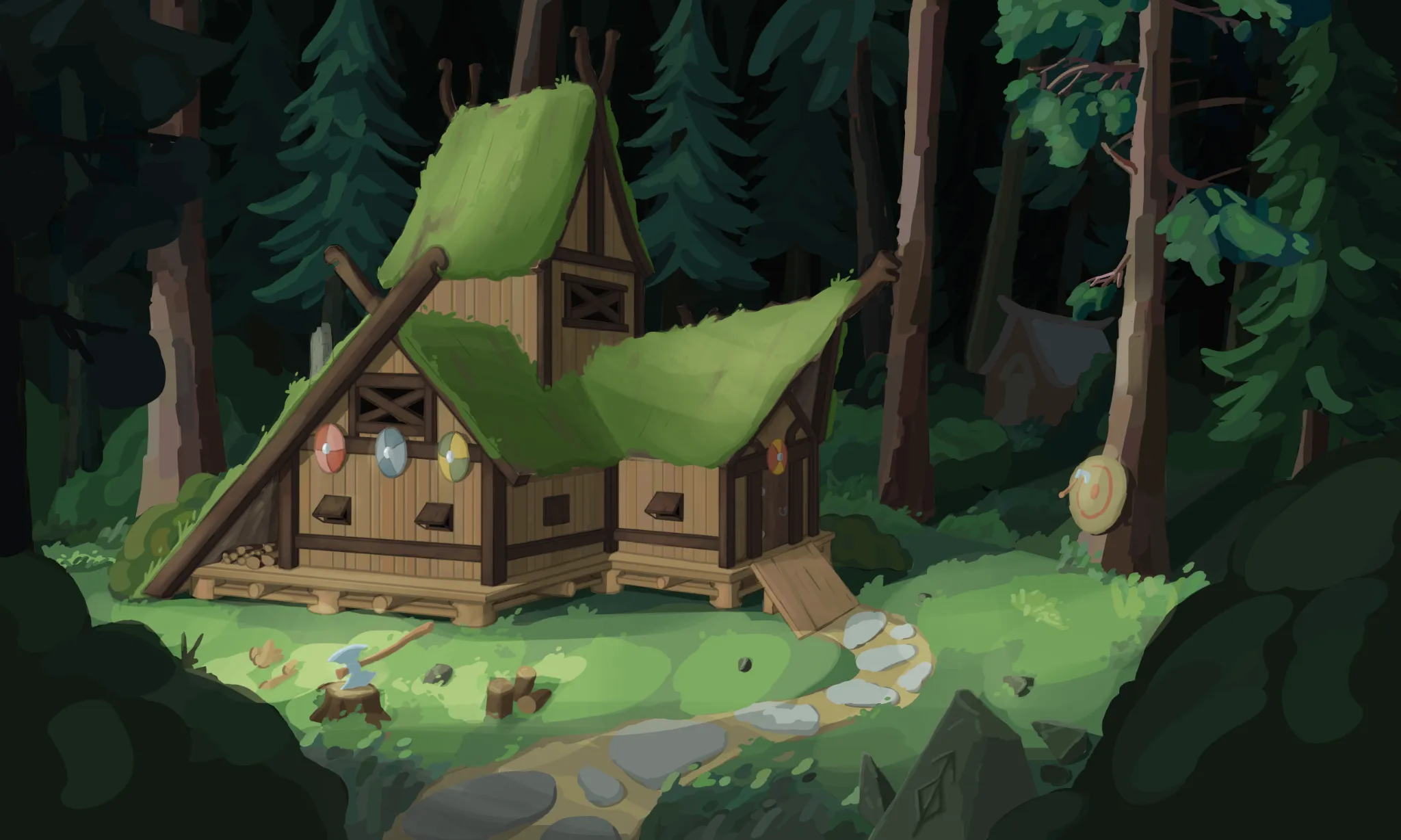
I'm struggling with rendering and want to improve. My goal is to achieve a rendering style similar to this reference: ibb co / V0DHD6d9 I would really appreciate an overpaint or any advice on what I'm missing in terms of light, edges, and material definition. What should I focus on to match this look? Thanks for any help!
Comments 2

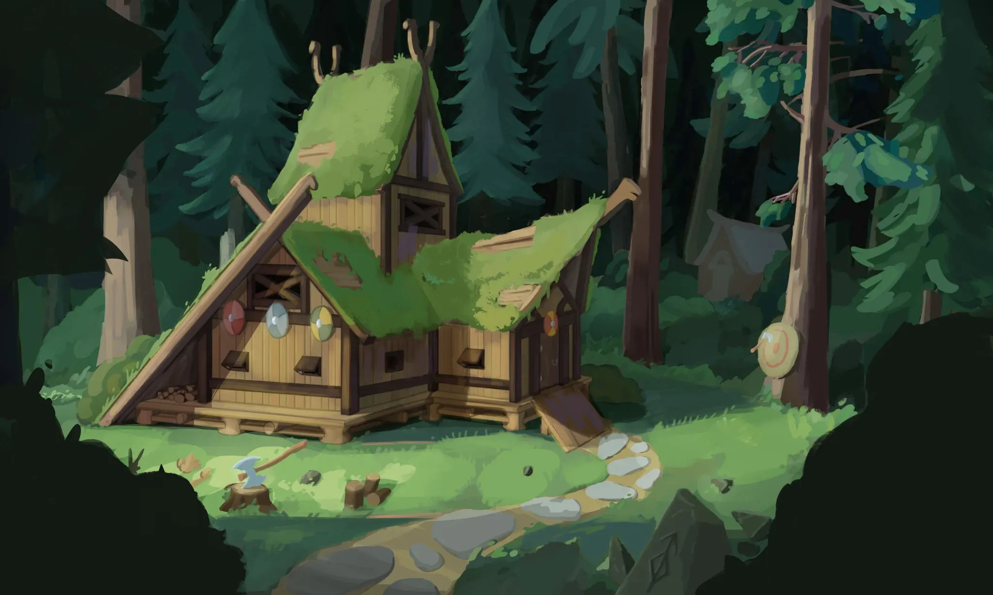
Hey there! Great work so far! Unfortunately, images and links can't be shared here, so I'm not entirely sure what rendering style you're aiming for. I'm assuming it's something more stylized, though. I'd highly recommend doing studies of the styles you'd like to achieve. You don't need to repaint an entire illustration; just pick specific sections from artists you admire and analyze how they handle textures, materials, edge control, and so on. It's often much more effective to study and understand these elements first, rather than simply trying to imitate someone's rendering by only copying what you see. Overall, the scene feels a bit too dark. The background is very dark, and some areas are approaching pure black. Even if the forest is in shadow, daylight scenes usually still benefit from some atmospheric perspective, so I'd avoid using near-black values unless you're painting a night scene or something similar. I slightly brightened the background and simplified the tree shapes. Since the house is the main focal point, it's not necessary to include so much detail in the leaves. I also darkened the foreground a bit more to create better separation between the planes and adjusted the lighting on the house. Areas directly affected by the light are now brighter, while the shadows are slightly darker. Notice how this creates a stronger contrast between light and shadow. :) Try introducing more color vibrancy; this is very common in stylized paintings. For example, in the shadow areas of the grass, you could introduce cooler blue tones to avoid a monotonous green. The same applies to the wood, adding subtle purples can give it a lot more life. Just make sure the colors still respect your overall value structure. As for the roof, grass isn't completely flat. Try adding some volume between the layers and look at references of grass-covered roofs. I also exposed a few patches underneath to break up the large green mass and add a bit more visual interest. Lastly, adding a few birds in the foreground, or animals in general, could help make the illustration feel more alive and immersive. It's a subtle touch, but it's an important part of visual storytelling. Hope this helps!