Want to store your feedback?
Sign up to store all your feedback in one place on your account. Your feedback will be private instead of public.

Also struggling with rendering?
Improve your shading and light control, a 3 min read
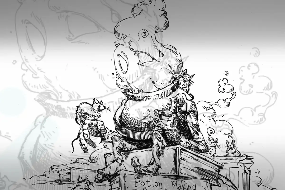
Easy Art Pen & Ink Rendering Techniques
Master pen and ink rendering through four progressive exercises: build value scales, shade basic forms, study organic objects, and create imaginary inventions using texture and light.
Rendering
Would you like to help someone who's still waiting?
Portraits
No responses yet
Art
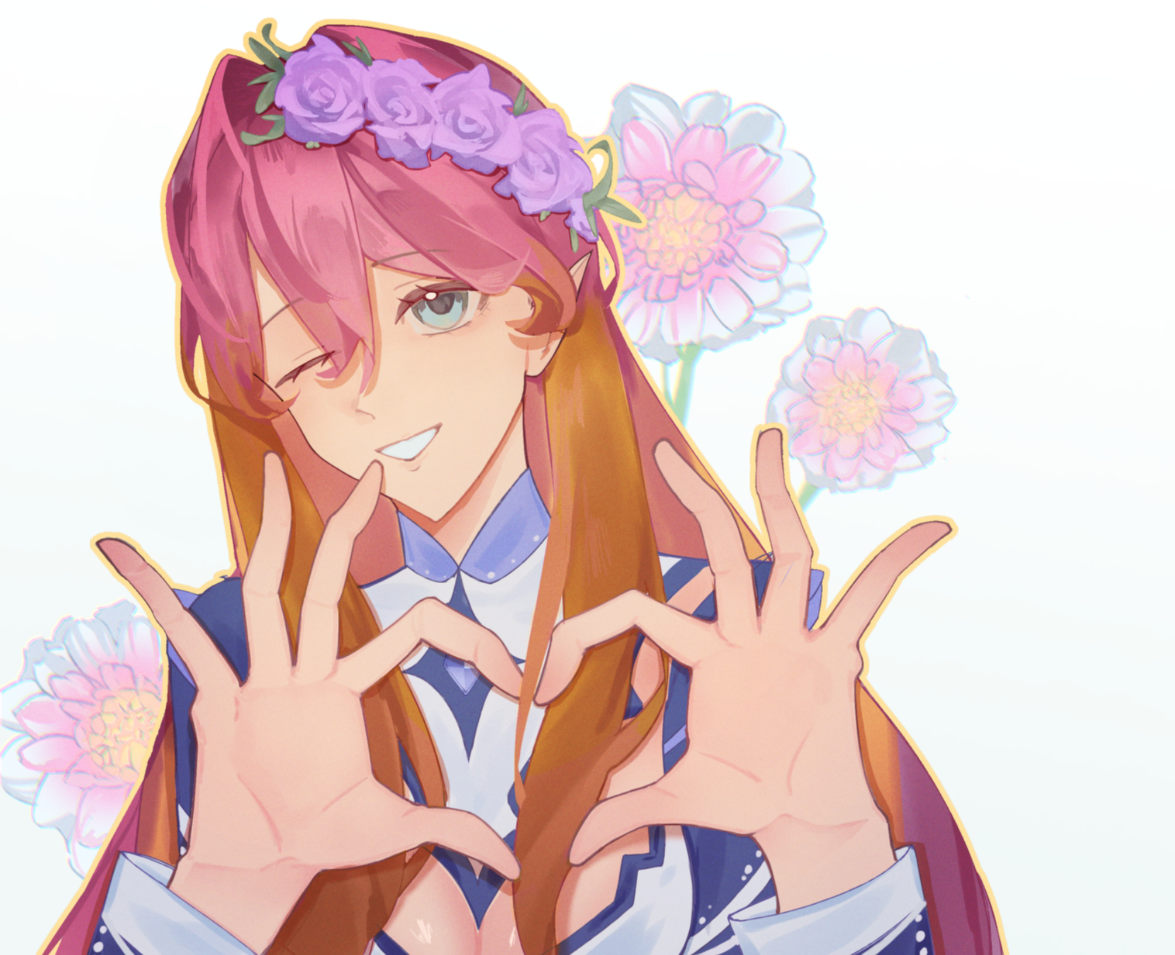
is there any way i can make this more interesting? i also need help with the flowers please
46 minutes ago
View
Perspective and Form
No responses yet
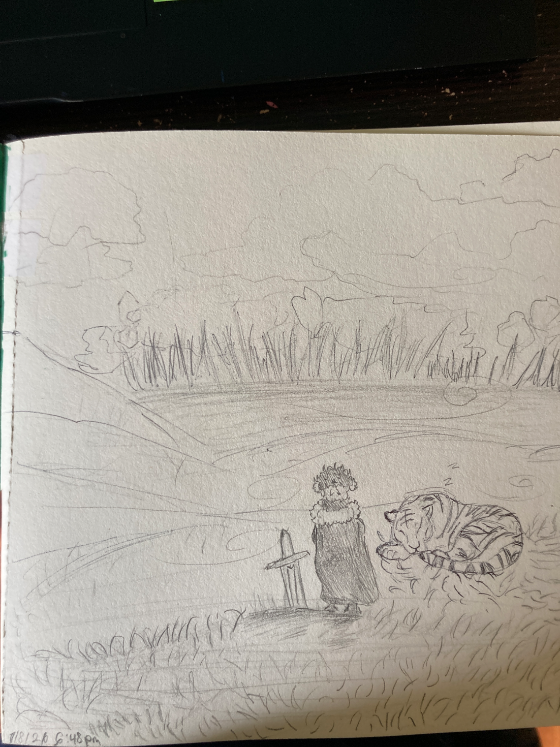
Oc gazing at upcoming storm
I think my character and the tiger looks stiff and also I feel like the forest and storm doesn’t look far away? in my opinion would love some help on how to improve it
1 hour ago
View
Perspective and Form
No responses yet
Oc gazing at upcoming storm
I think my character and the tiger looks stiff and also I feel like the forest and storm doesn’t look far away? in my opinion would love some help on how to improve it
1 hour ago
View
Rendering
No responses yet
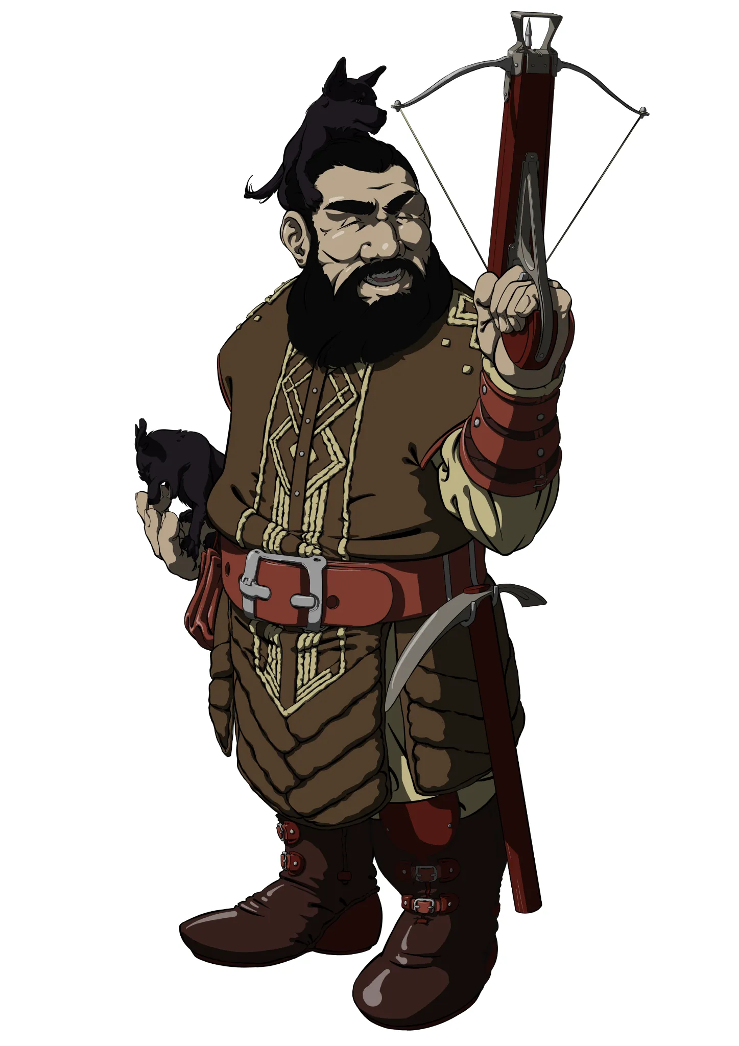
Life enjoyer dwarf
Hi ! I want to first thank you for helping us. Truly. Now, I wanted to keep this simple (what, laziness ? pfft come on, no way right ?). Simple like anime style ? Only base colors, low opacity black layer for shadows, and lineart on top with some quick strokes for highlights. But... it feels kinda flat ? Lacking ? Is the mapping of the shadows right ? Not enough colors ? I'm also thinking of adding some bits of environments like grass, tiny rocks or something, to make it more grounded, make the character more believable, because you'd see he's part of something bigger.
1 hour ago
View
Rendering
No responses yet
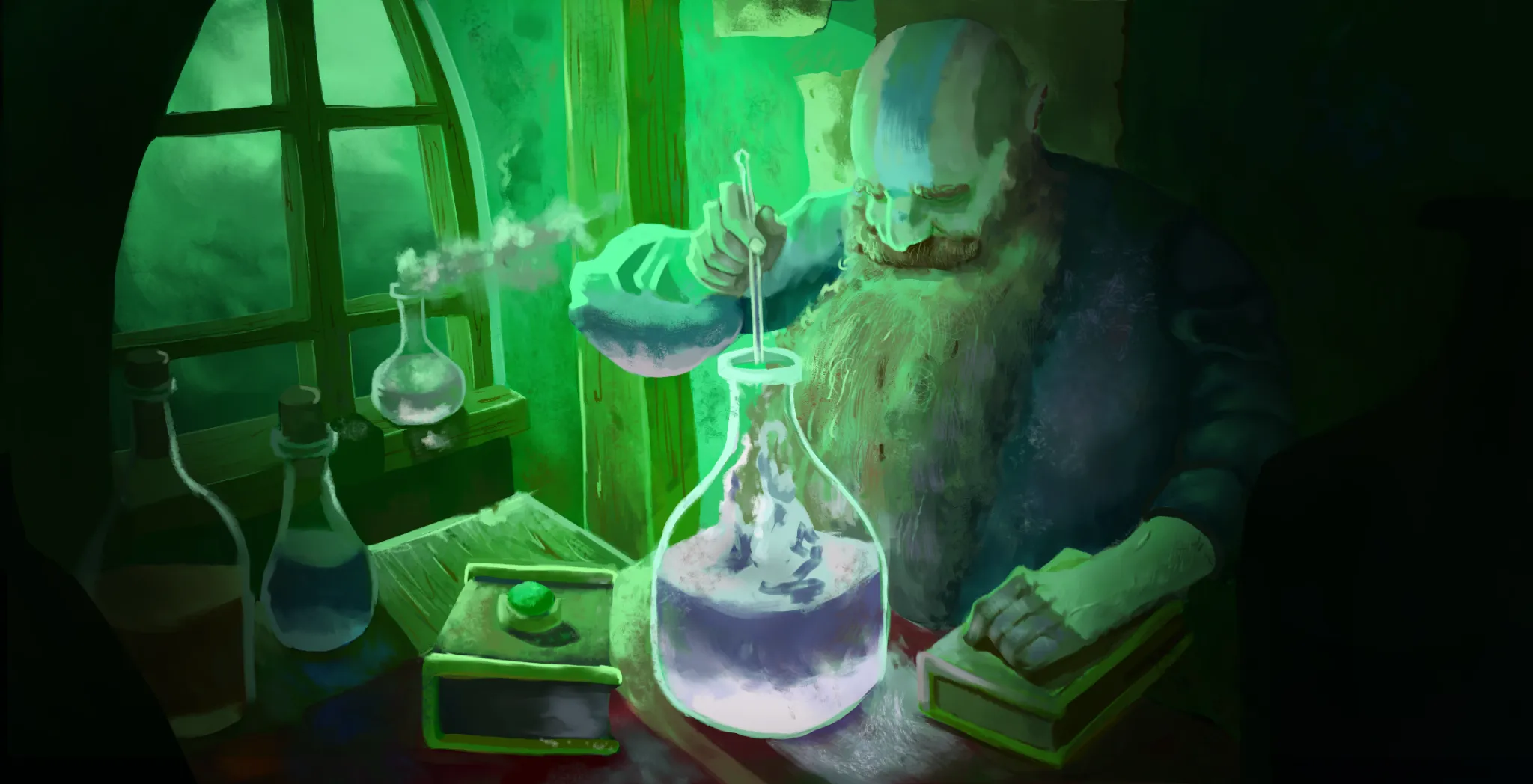
illustration
What do you think of it?
2 hours ago
View
Rendering
No responses yet
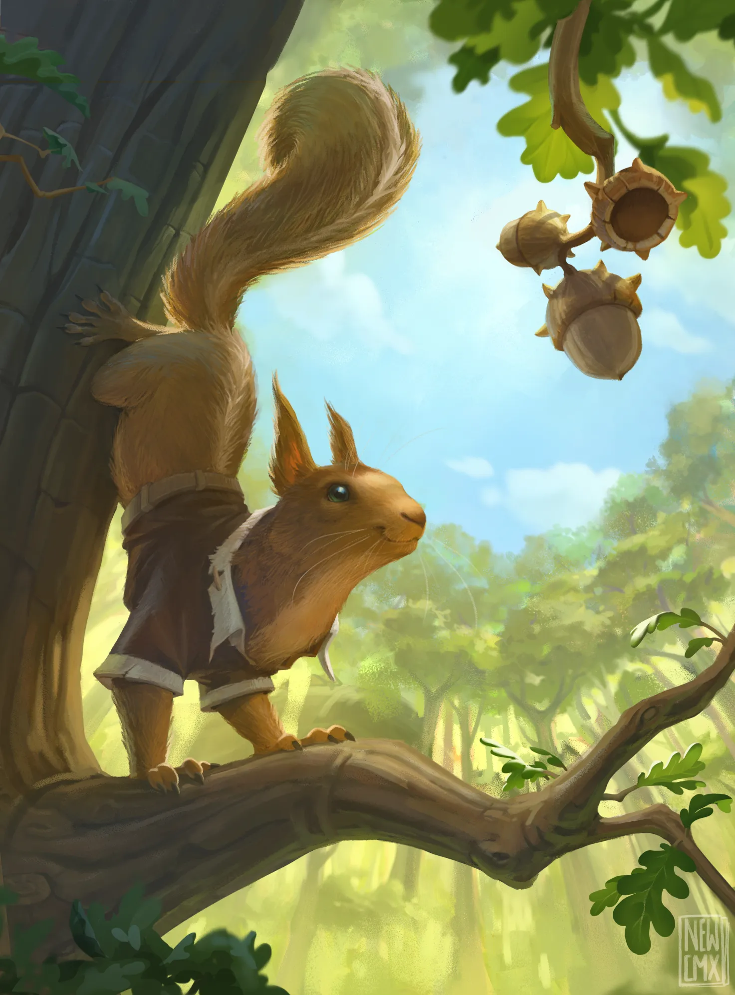
Squirrel token MTG card WIP
Tilted the squirrel to look more to the acorns. Added some overlap and tree details. Added some color variations because it all felt quite orangy
3 hours ago
View
July Before & After Art Challenge
No responses yet
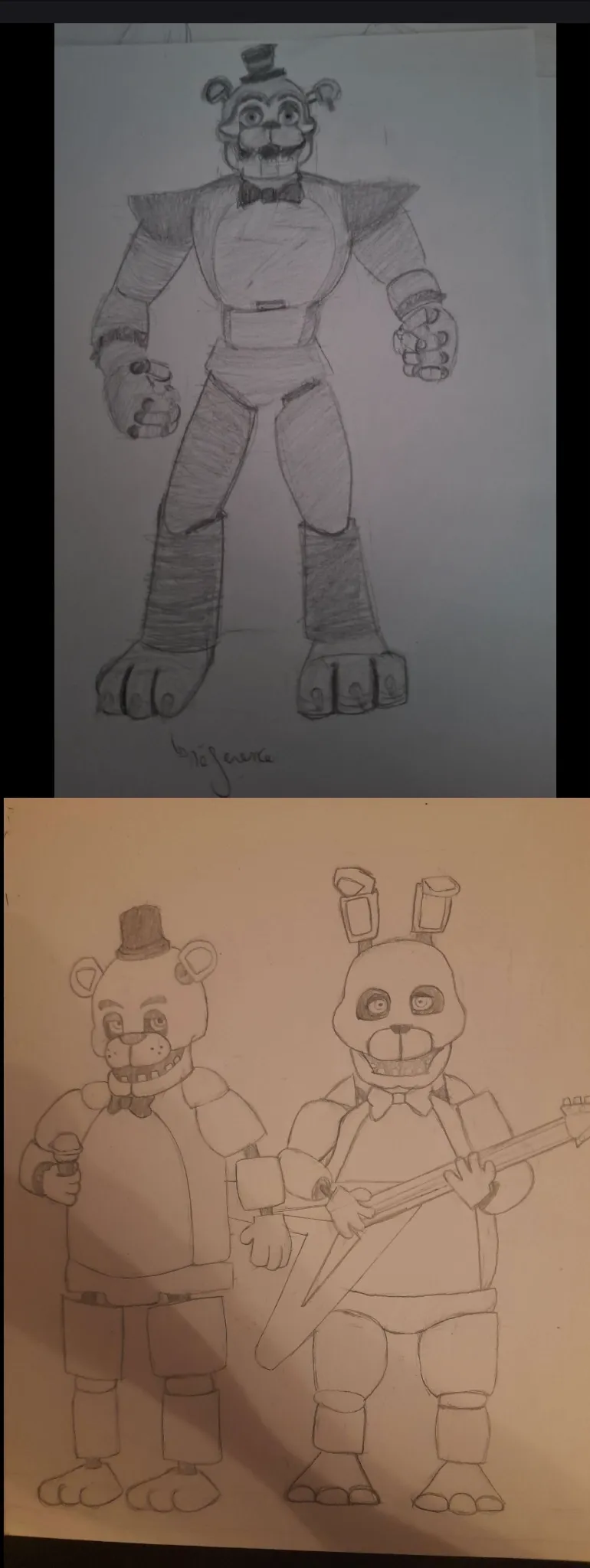
First attempt at the July challenge
here is an attempt at the July challenge im probably going to redo it though I want to try to do a more dynamic pose! ( I might also use referencefor that.) The two of them were made using a reference (basically copying) the bottom one is from today the right is from 2024. I couldn't find the specific drawing I was looking for, I actually did a glamrock Freddy in 2021. If you have any advice I'll gladly take them! I think I still struggle with my forms and my line readability (and symmetry)
3 hours ago
View
Anatomy
No responses yet
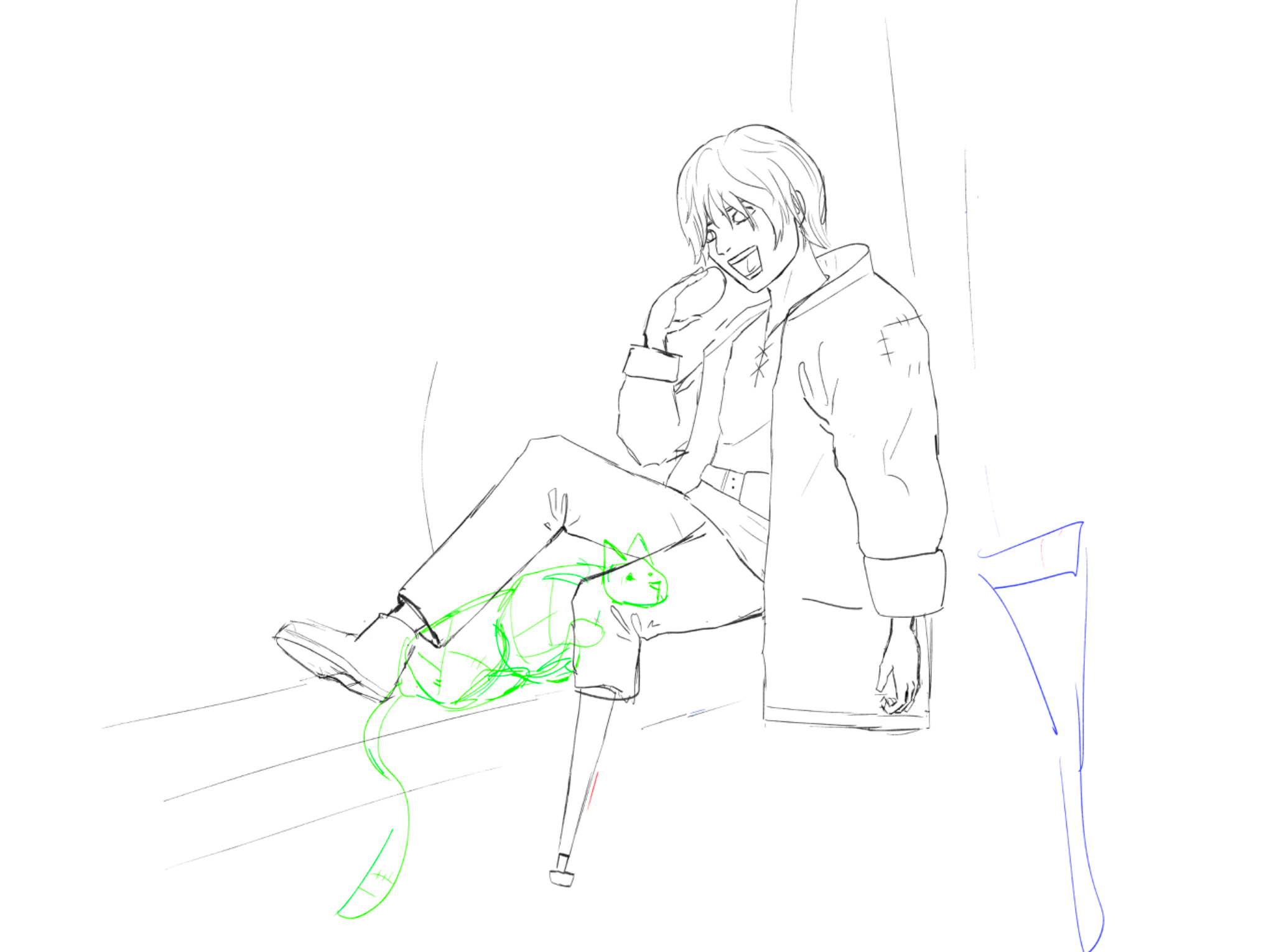
Coin and Patch
This is currently a sketch for a drawing I’m planning, but the pose seems off. I don’t know why I’m struggling so much with this one, but any advice would help, before I start finishing the drawing and beginn with the color and rendering process. Thanks
3 hours ago
View
Figure
No responses yet
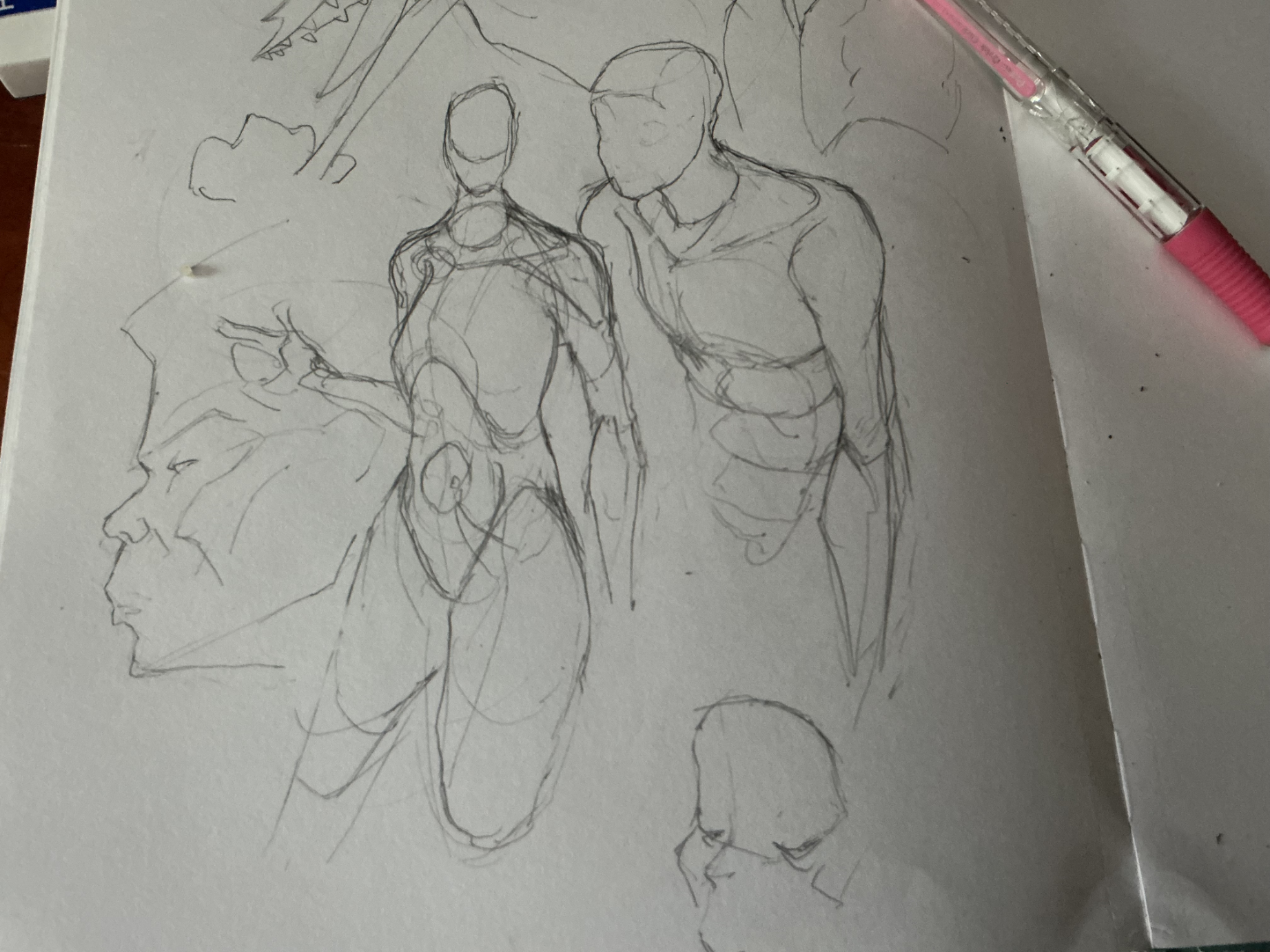
proportionately proportional proportions
more figures. With the one on the right, i tried to capture what happens when the arm passes over the trapezius which connects to the clavicle. Everything else looks fine, but i think i got the proportions wrong on the female figure to the left. Maybe the ribcage is too big? Could be it. And for some reason, the right one looks off, it could be a matter of construction. If anyone has any solutions, please let me know!
3 hours ago
View