Want to store your feedback?
Sign up to store all your feedback in one place on your account. Your feedback will be private instead of public.
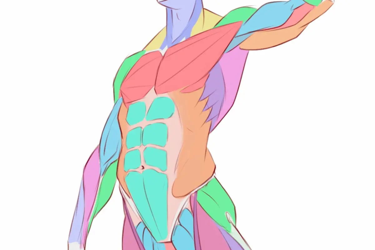
Also need help with anatomy?
Improve your proportions and landmarks, a 3 min read
5 Steps to Drawing Anatomy on Easy Mode: A Beginner's Guide
Master figure drawing by manipulating simple forms, studying anatomy compartmentally, simplifying concepts, gradually increasing complexity, and practicing abstract shape exercises consistently.
Anatomy
Would you like to help someone who's still waiting?
Rendering
No responses yet
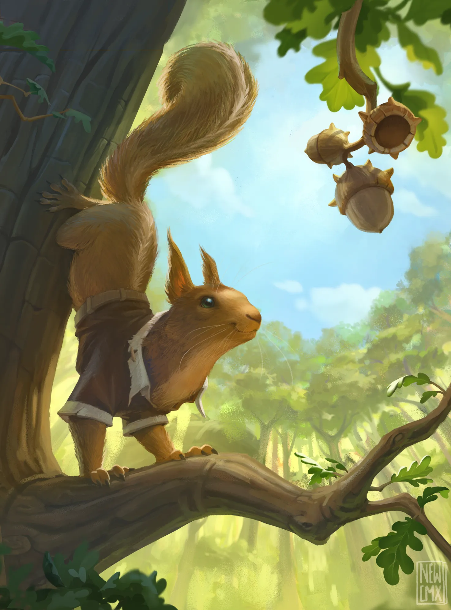
Squirrel token MTG card WIP
Tilted the squirrel to look more to the acorns. Added some overlap and tree details. Added some color variations because it all felt quite orangy
44 minutes ago
View
Portraits
No responses yet
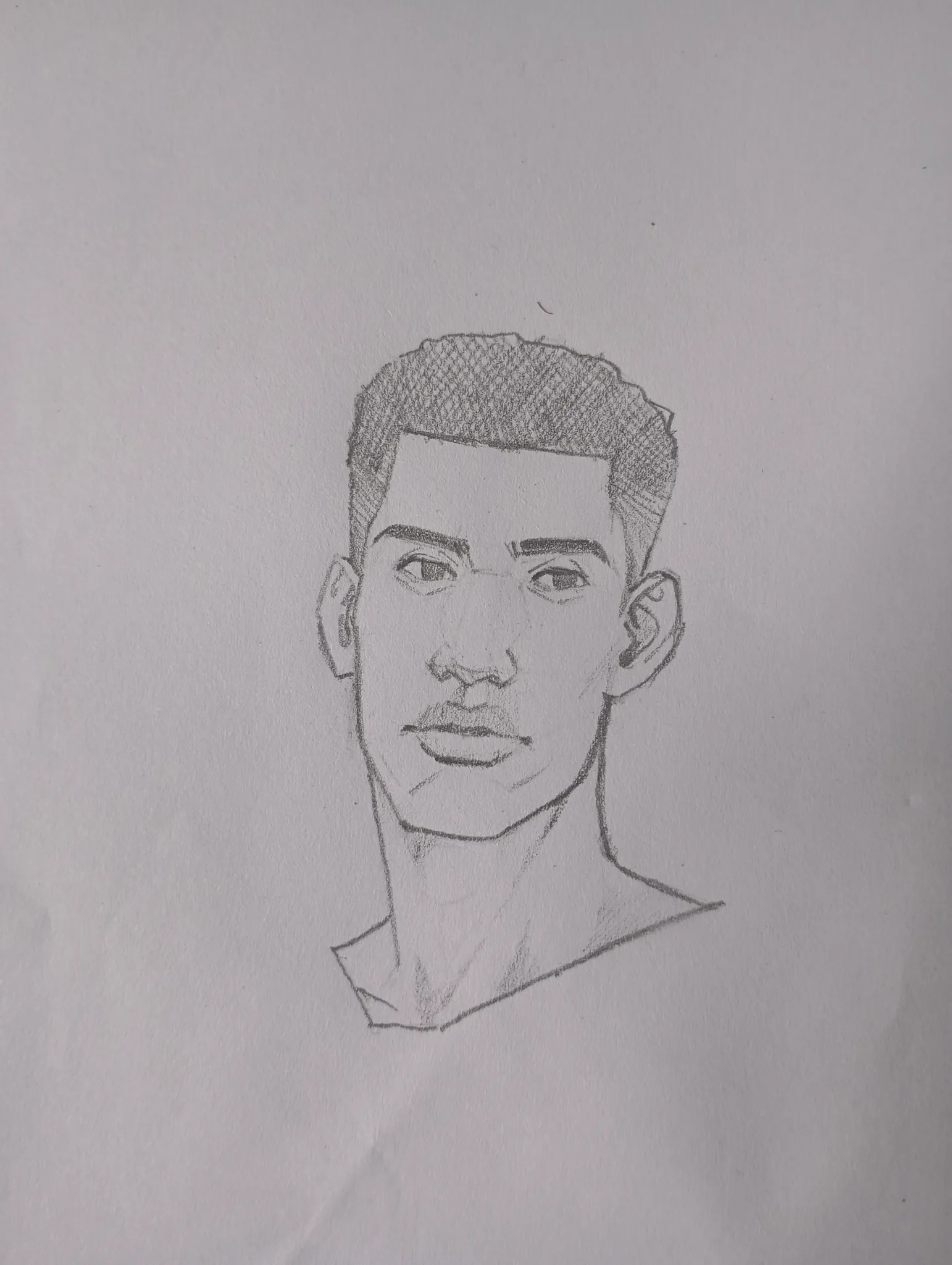
Head portrait.
I just made this portrait I can't really pinpoint the problem I have with it, but I feel it's lacking in its perspective I feel the face is too flat and the features feel like it's been stamped onto the face, I have also noticed similar issues with some other drawings of mine, I need help
52 minutes ago
View
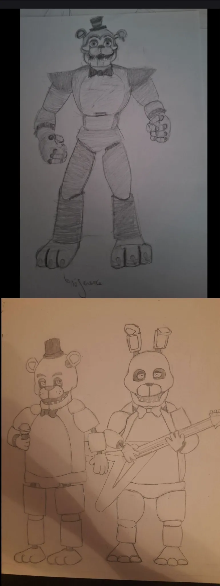
July Before & After Art Challenge
No responses yet
First attempt at the July challenge
here is an attempt at the July challenge im probably going to redo it though I want to try to do a more dynamic pose! ( I might also use referencefor that.) The two of them were made using a reference (basically copying) the bottom one is from today the right is from 2024. I couldn't find the specific drawing I was looking for, I actually did a glamrock Freddy in 2021. If you have any advice I'll gladly take them! I think I still struggle with my forms and my line readability (and symmetry)
55 minutes ago
View
Figure
No responses yet
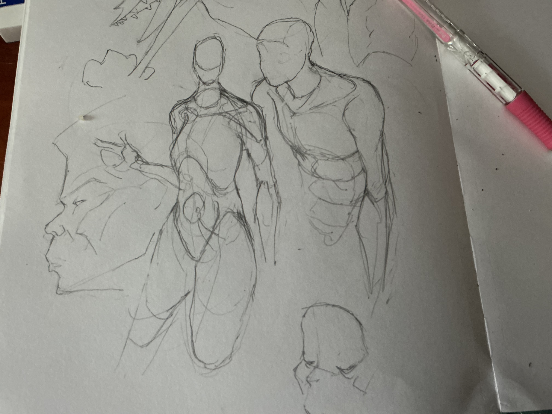
proportionately proportional proportions
more figures. With the one on the right, i tried to capture what happens when the arm passes over the trapezius which connects to the clavicle. Everything else looks fine, but i think i got the proportions wrong on the female figure to the left. Maybe the ribcage is too big? Could be it. And for some reason, the right one looks off, it could be a matter of construction. If anyone has any solutions, please let me know!
1 hour ago
View
Rendering
No responses yet
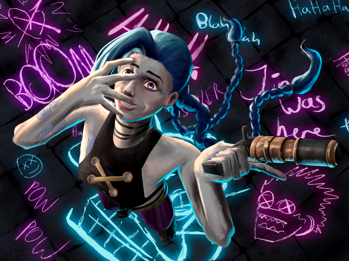
Jinx (Arcane)
Honestly. Just tell me anything, that would be good to improve the image. I do think it’s a bit cluttered, but that fits with her emotions. Any rendering, composition, lighting or any other critique is welcome.
2 hours ago
View
Environment
No responses yet
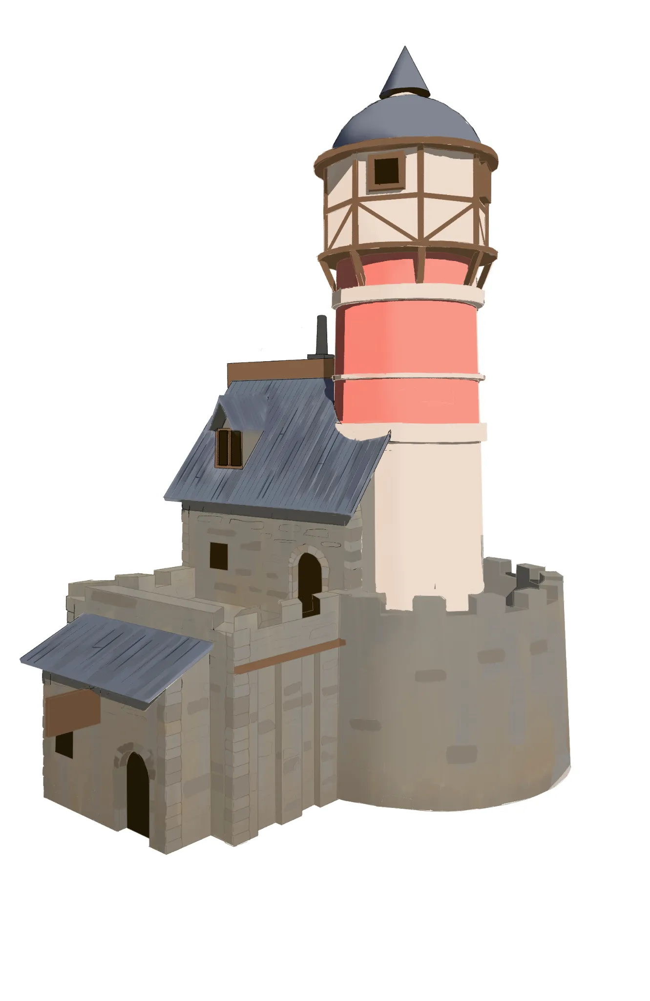
Crimson Neck Tower
I'd love some feedback on how to add more details and make this place feel more realistic.
2 hours ago
View
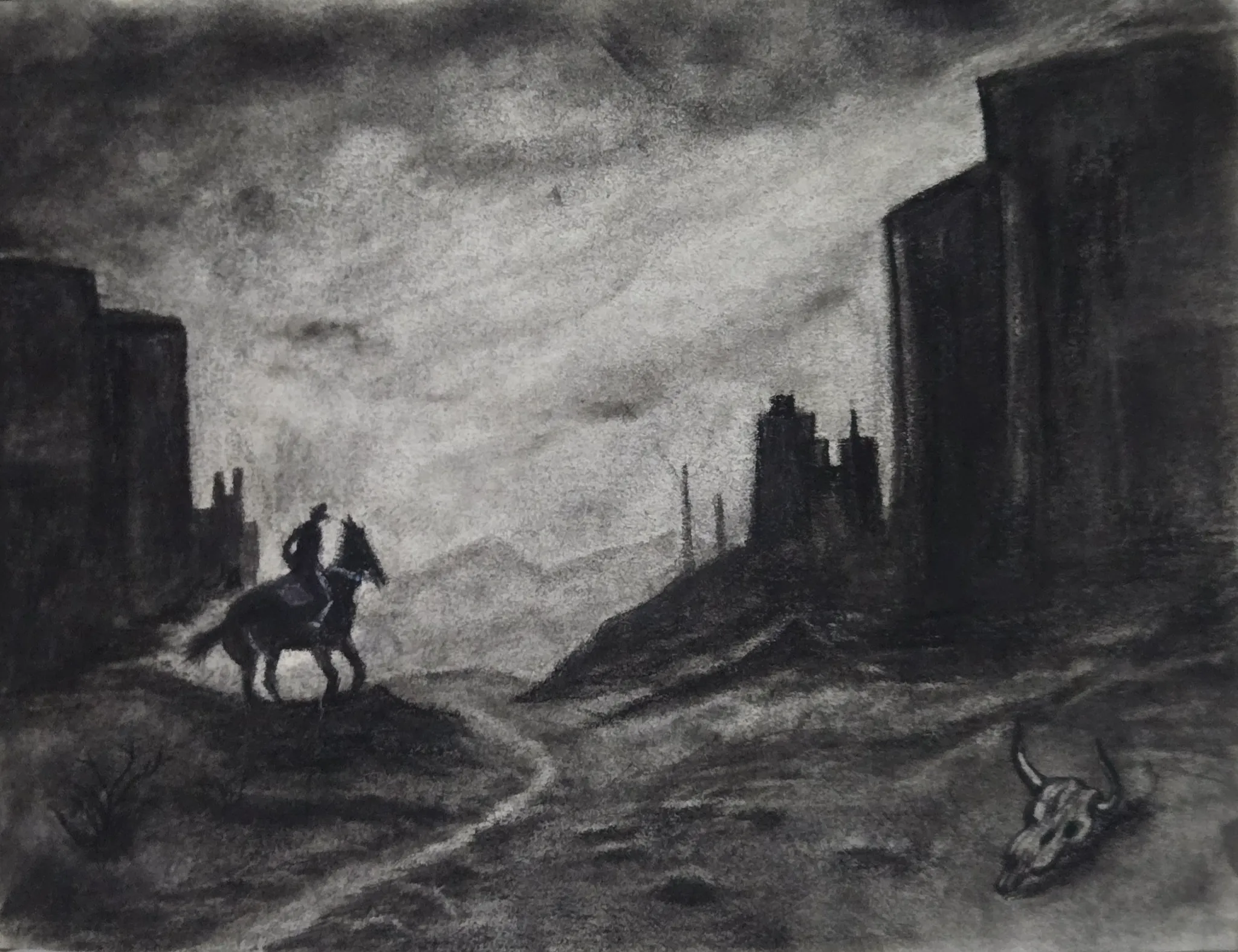
Environment
No responses yet
Death valley
Texture
3 hours ago
View
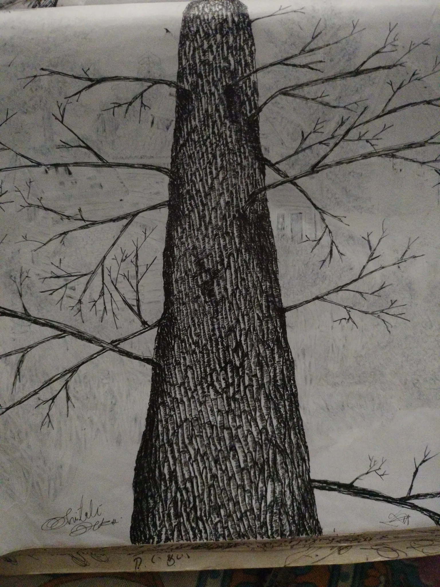
July Before & After Art Challenge
No responses yet
Little forest in my area
About background,
4 hours ago
View
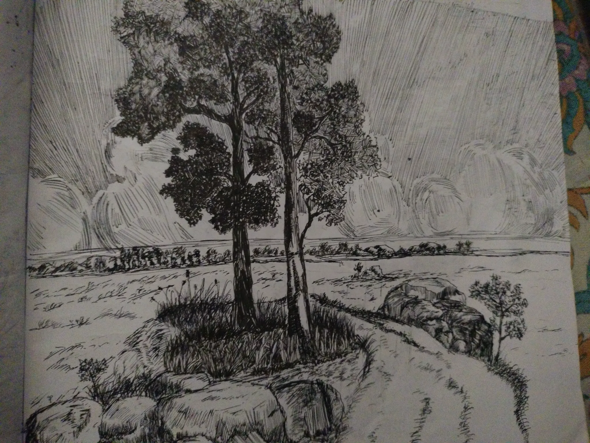
July Before & After Art Challenge
No responses yet
Little forest in my area
I don't go to art school, all my sketch is my self learner. Sorry for My poor english
4 hours ago
View