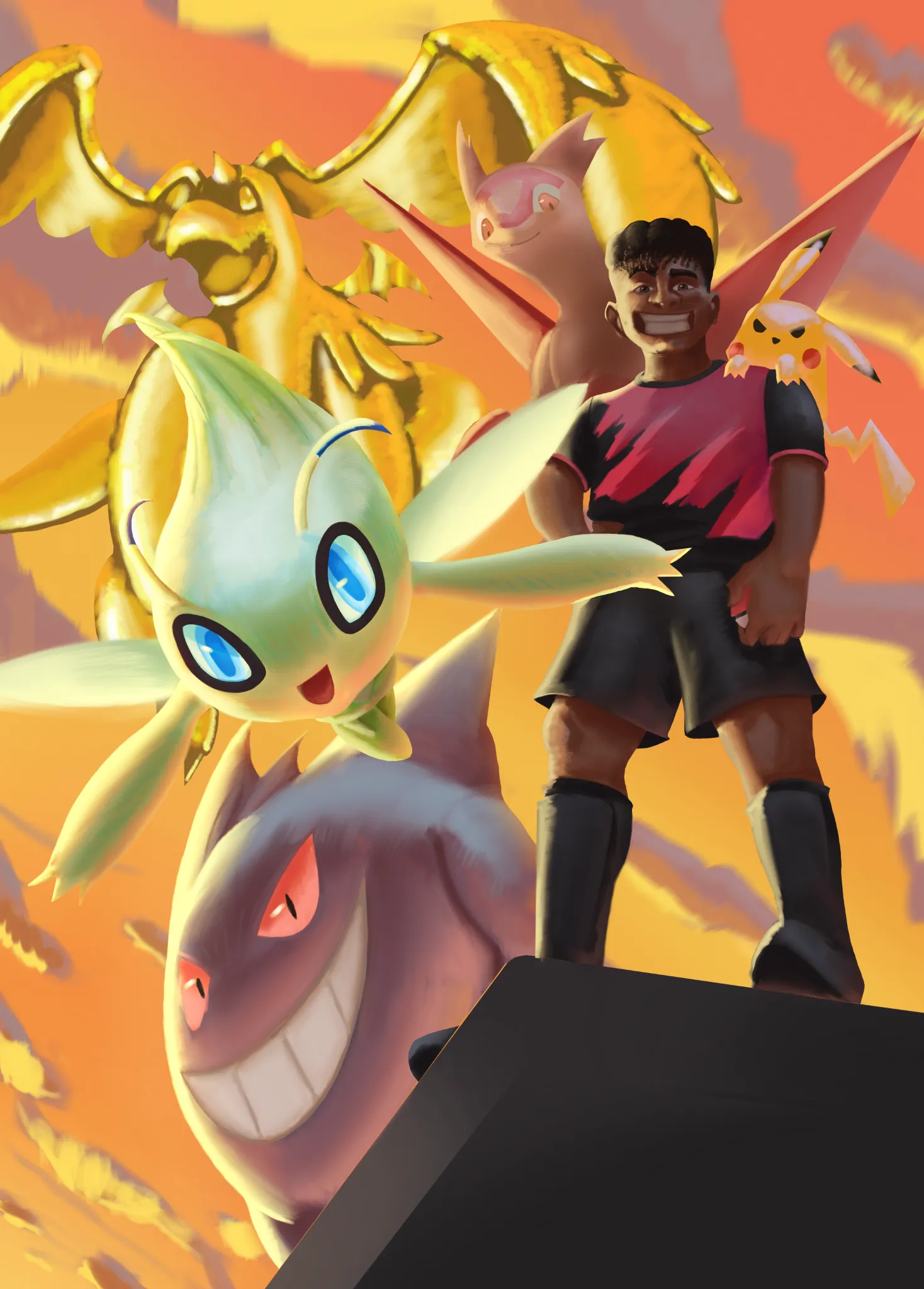
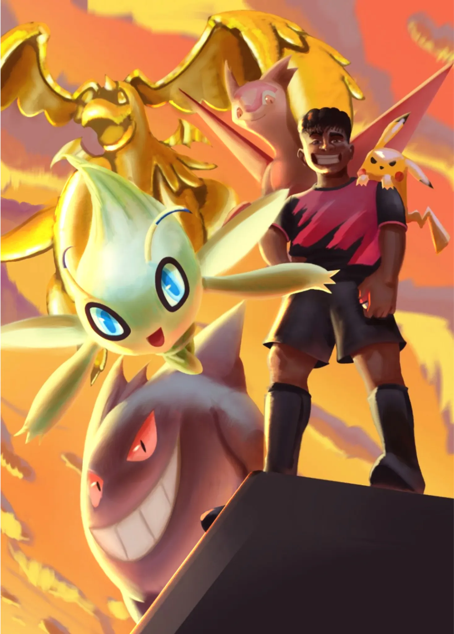
Hi! I'm also still getting a handle on values, but I wanted to take a shot at helping you out. Take all that I say with a grain of salt. The main way that I try to address my values is to create a layer at the very top, set it to Color, and fill the entire canvas with pure white. Doing this will turn your image entirely black and white, so you can more easily see when values are bleeding into each other and where you need more contrast. When I did that for this piece, the biggest issue was the gold dragonite. They get lost in the background due to a lack of contrast. So what I did was punch up your shadows and highlights to help the Pokemon stand out from each other and from the sky. You could also try adding more clouds behind the dragonite and increasing the gradient's contrast for the sky. Make the top right darker and the bottom left brighter to sell the intensity of the light source and give the lighter-colored Pokemon more to stand out against. I hope this helps!
Want to store your feedback?
Sign up to store all your feedback in one place on your account. Your feedback will be private instead of public.
Feedback Thread
Paintover
Apr 6, 1:05 AM
Also need help with rendering?
Improve your values and blending, a 3 min read
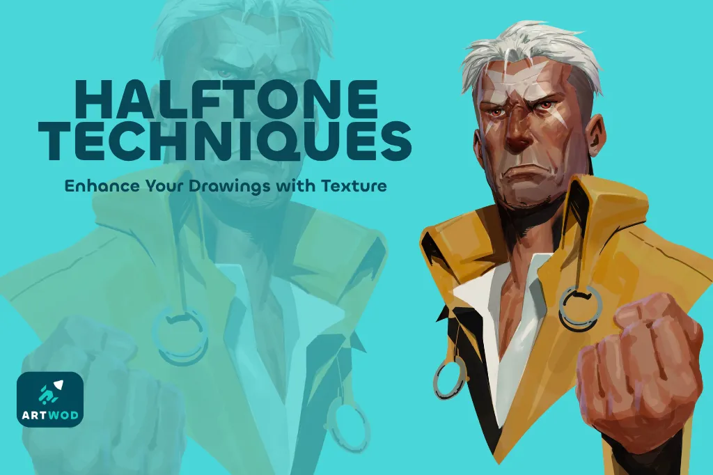
Halftone Techniques: Adding Texture and Depth to Your Artwork
Master halftones by establishing shapes, volumes, and shadows first, then practicing on beans, noses, portraits, and posters to add texture and depth to your artwork.
Rendering
Would you like to help someone who's still waiting?
June 30 Sketchbook Pages Challenge
No responses yet
06-02-26
Hi everyone, I am participating in the June 30 challenge to help me build a habit, become more comfortable with sharing my work, and receive feedback! I've never really taken myself seriously as an artist, and I've always doubted myself, and that is why I am here.
25 minutes ago
View
June 30 Sketchbook Pages Challenge
No responses yet
6/2/2026
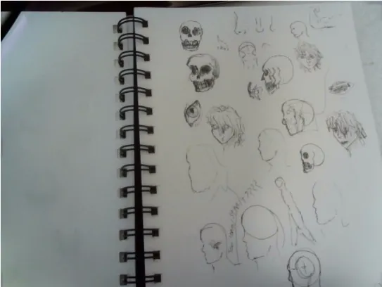
trying to draw with pen only so i can't erase or use guide lines i realize that many of the side profile siluets are to long
30 minutes ago
View
June 30 Sketchbook Pages Challenge
No responses yet
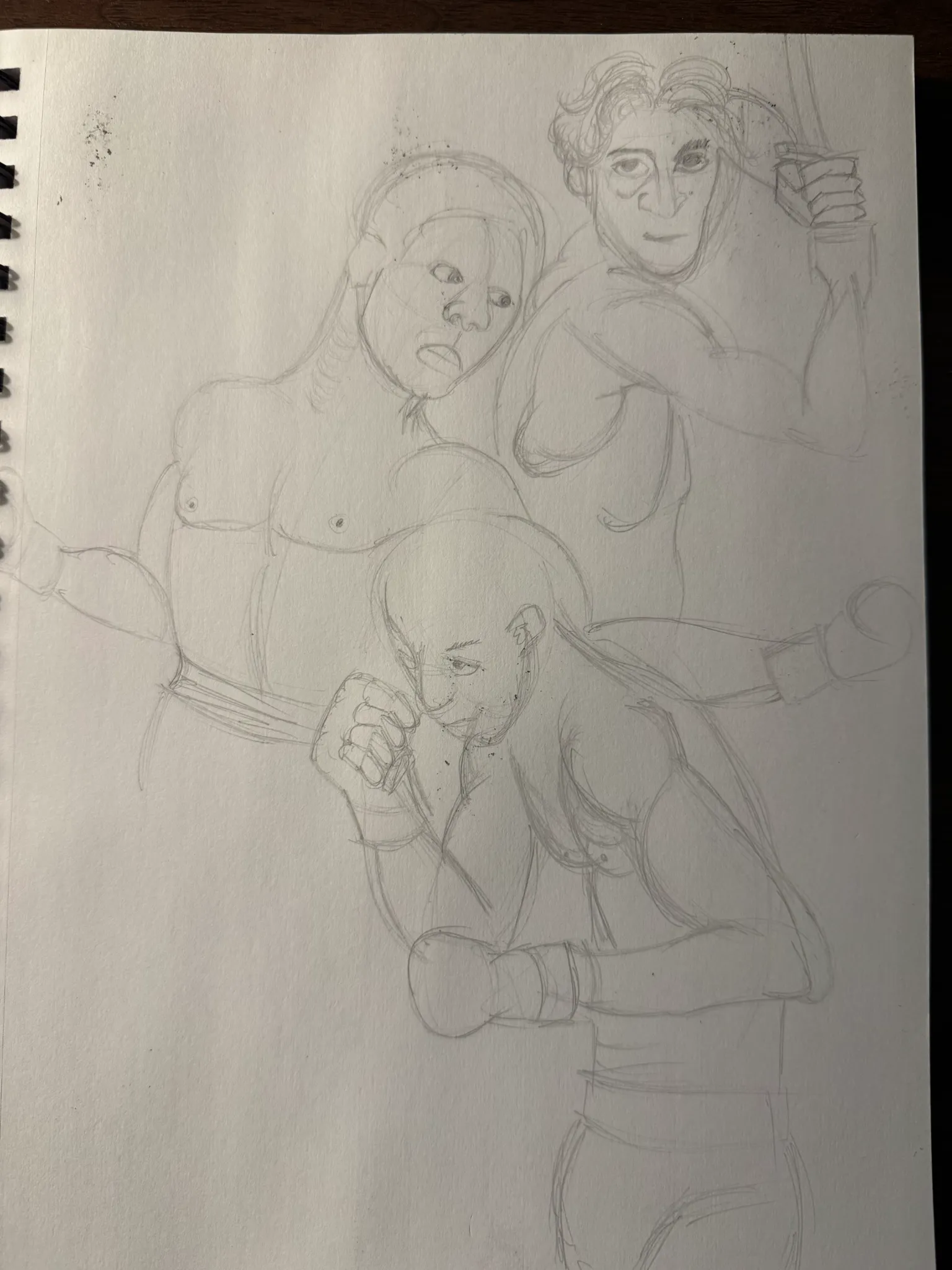
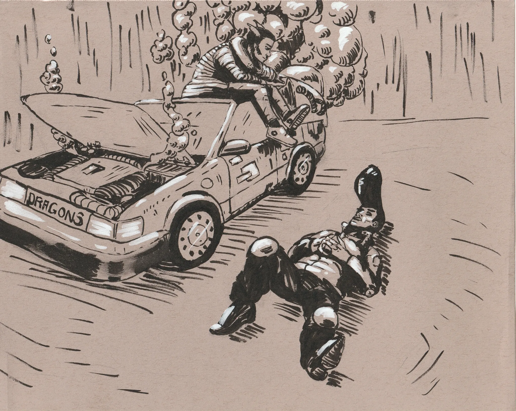
Sketch 01 - The Dragons
Hey! I had a lot of fun making this sketch and I'm looking forward to putting in another entry soon! My biggest challenges were controlling the line weight with the brush pen and smudging the ink likely due to my current brush pen. This is my first upload to the site and would love some feedback! Thank you!
1 hour ago
View
June 30 Sketchbook Pages Challenge
No responses yet
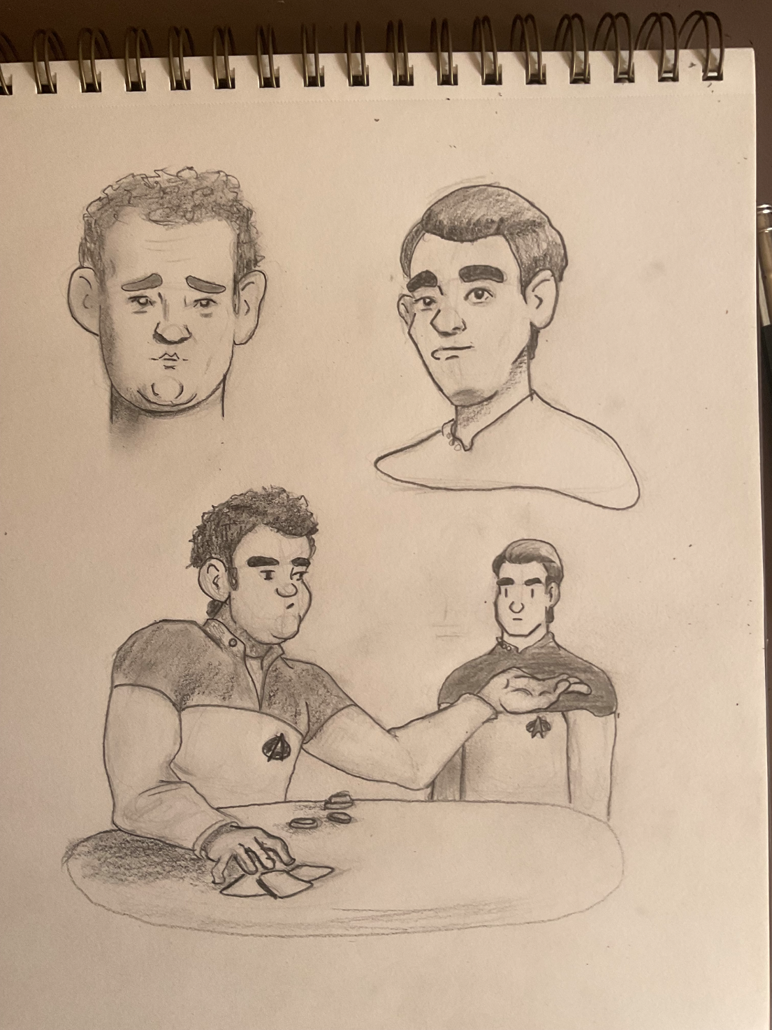
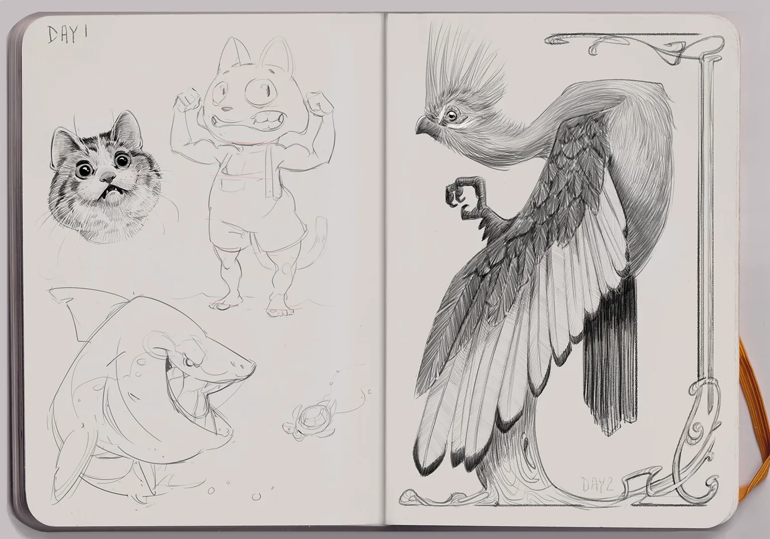
June 30 Challenge - Day 1
Practicing Trek characters and attempting illustrating a scene from a book.
2 hours ago
View
June 30 Sketchbook Pages Challenge
No responses yet
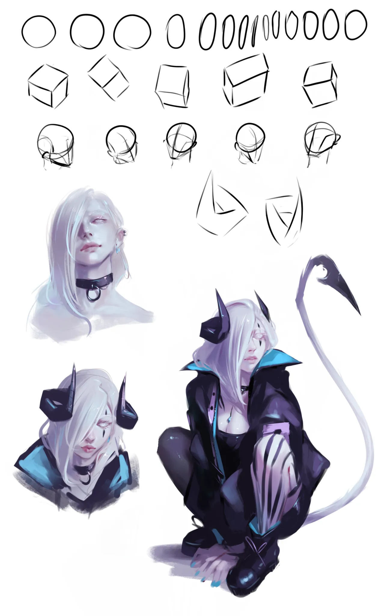
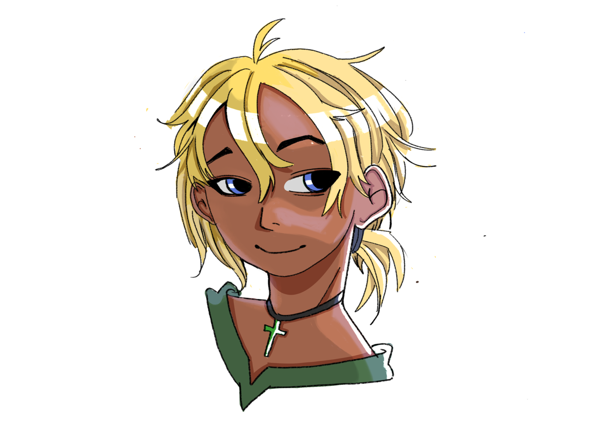
Daily sketch page, day 2
Trying to incorporate stuff I learned from portrait road. Drew my OC this time. Struggling with keeping face looking the same in all angles (and fail :x)
4 hours ago
View
Rendering
No responses yet
David
One thing I constantly struggle with is rendering it always feels as if I’m missing a step or theirs a gap between my knowledge. Feel free to critique my lighting, shading, and etc.
5 hours ago
View
June 30 Sketchbook Pages Challenge
No responses yet
Day 2 Jacqueline's Sketchbook
A Knysna Turaco bird in Art Nouveau style
5 hours ago
View
May Mermay Art Challenge
No responses yet
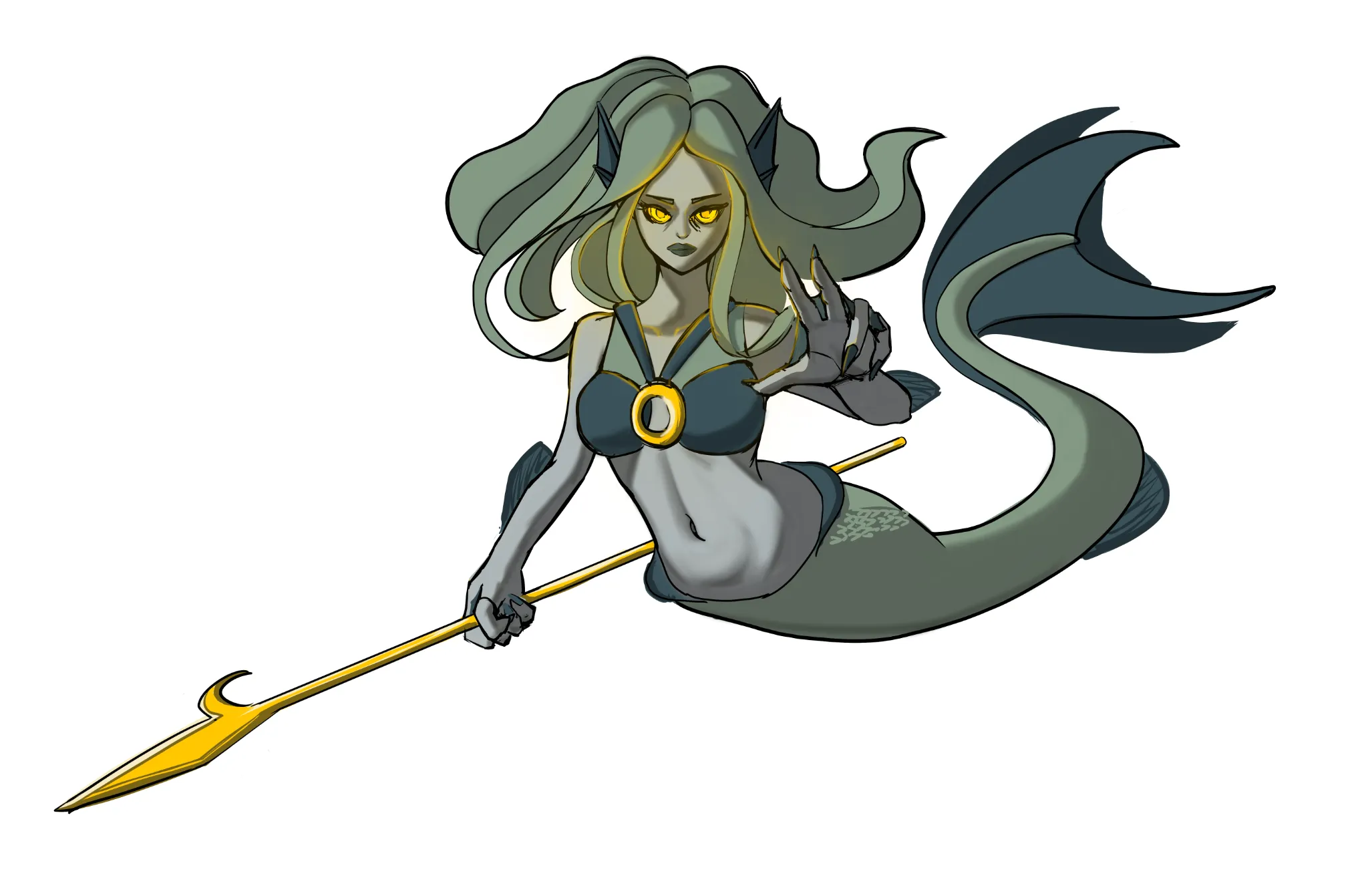
Mermaid
Made improvment of the hands.
7 hours ago
View
Challenge of the Month
No responses yet
Page 2 (day 2)
Page 2 (day 2) Trying to be consistent with the challenge. In this drawing, can someone teach me how to make simple backgrounds? ( Other adivces is good too!)
8 hours ago
View