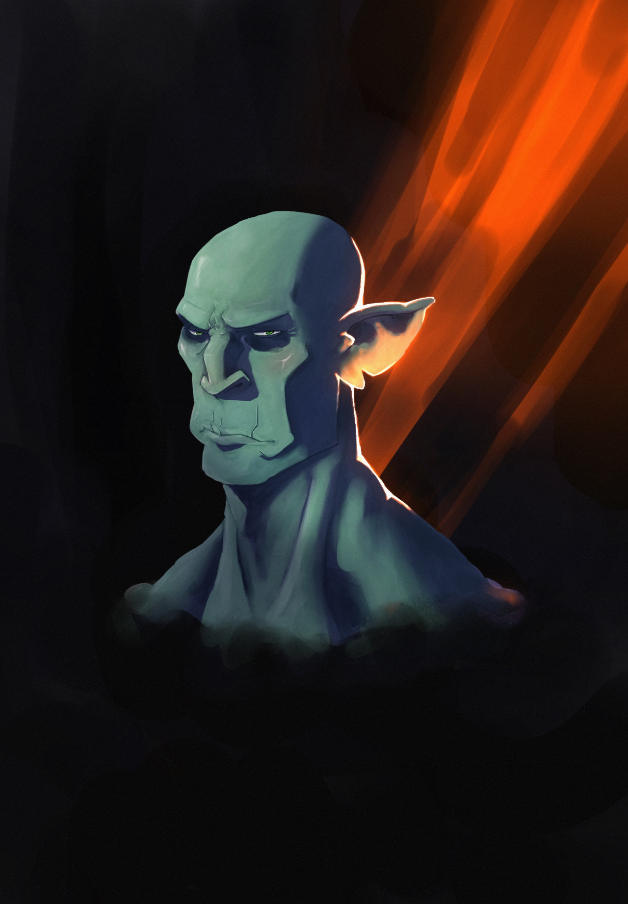
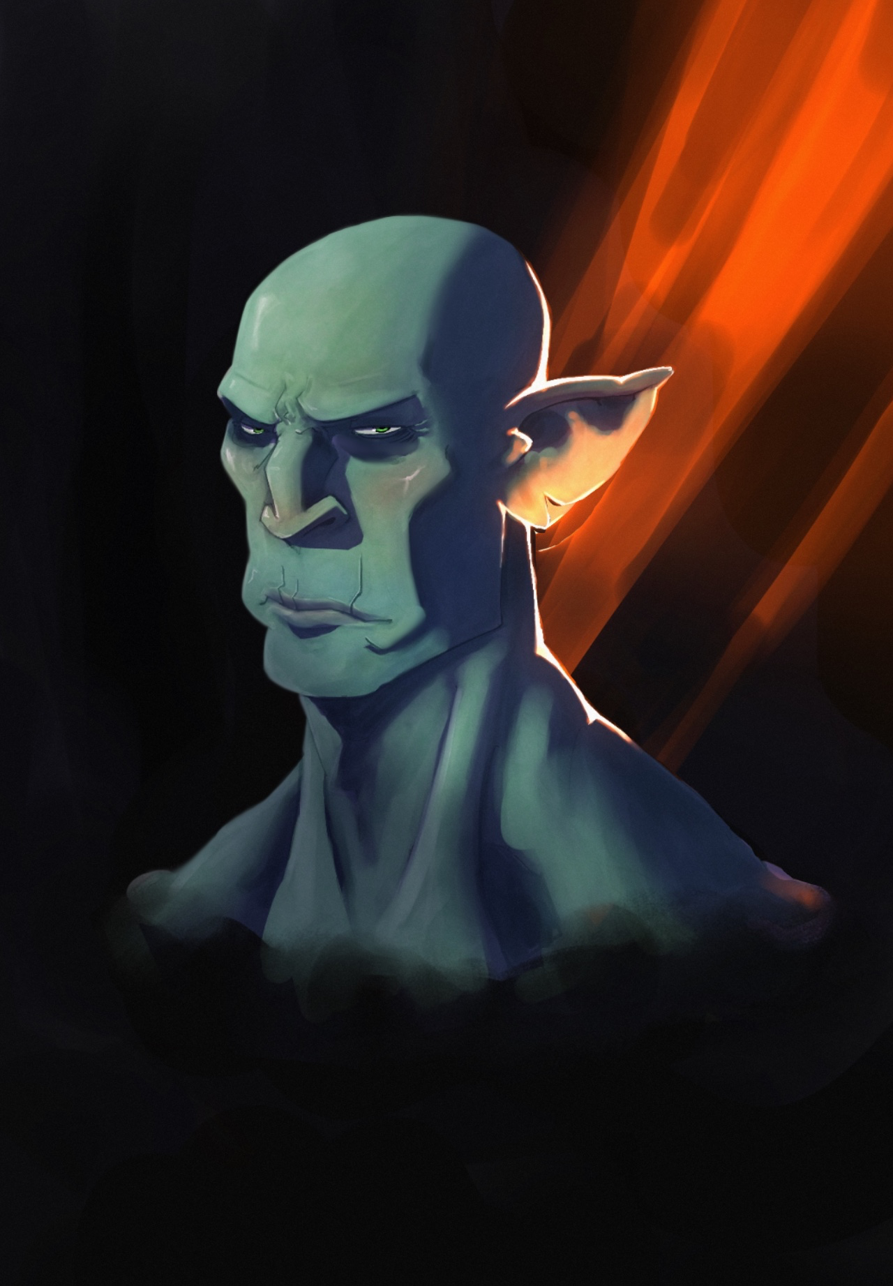
I’d add some more color variation to the face. Think about the color zones of the face. It usually adds more life to a portrait. Also just try experimenting with varying hues a bit in other ways. I made the dude bigger so he could fill the composition more. I also softened the edges on the left side. Softening some of your edges can help make some parts feel a bit less “in focus” and prevent the look of something being cut out and slapped on top. I’d also recommend using some more soft edges in the face. I like your design of the nose.
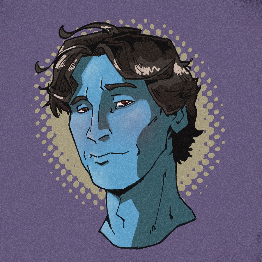
Thanks. I tried the color sones but maybe i want to hard with the opacity and it didnt show. I will keep color variación in mind. Thanks a lot!