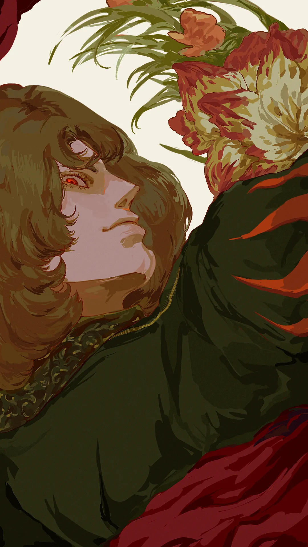
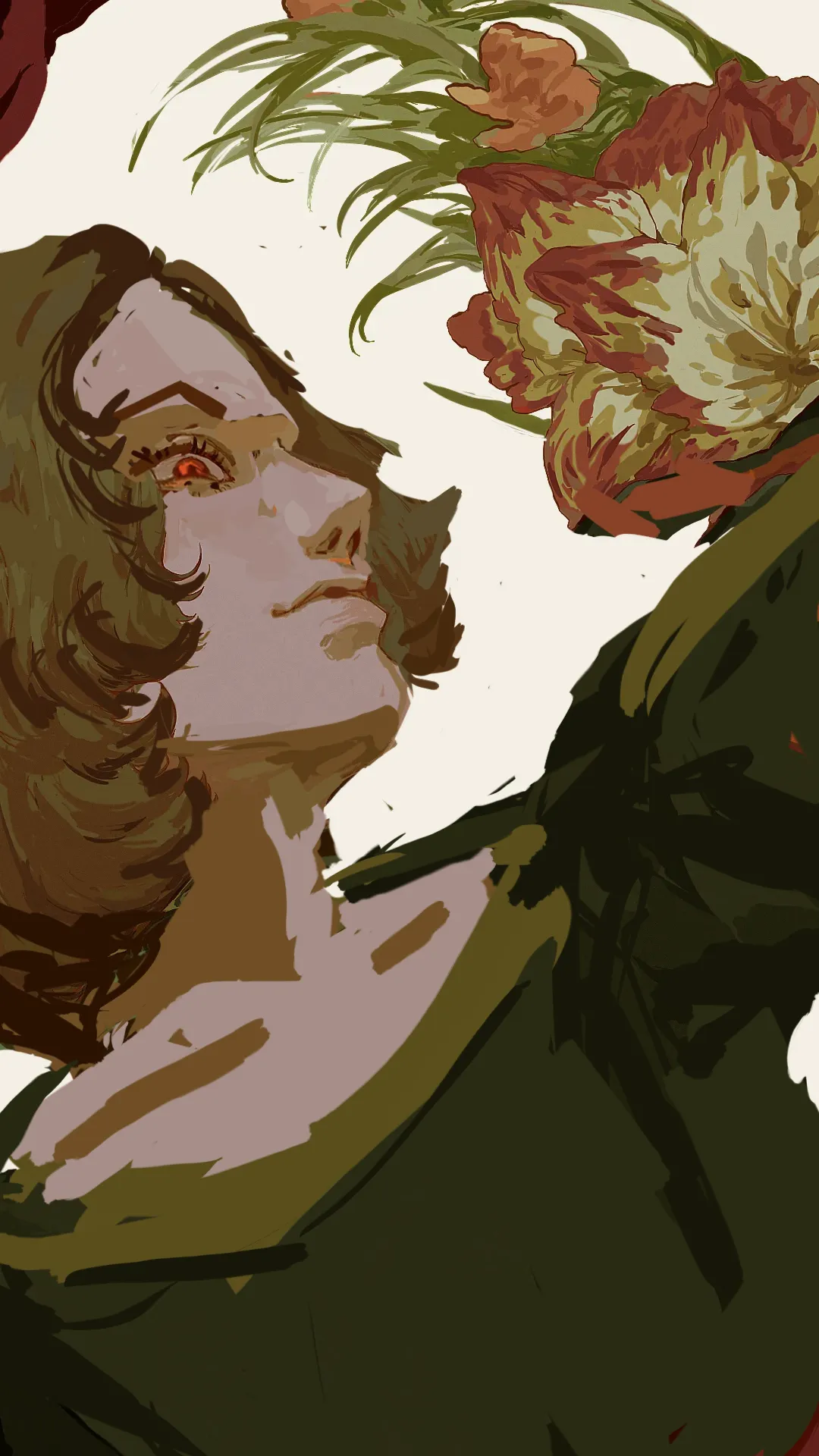


Hi, I like your rendering style, you did well in that department. The simplest anwer to what is missing in your illustration would be : correct perspective and form indication. First is the face, even though I can understand that he is looking over his shoulder? We are looking at hium from the bottom of the image, soo the top plane of the hair can't be visible. Than is the back and shoulder volume. Back in that kind of gesture would have more emphasis of a scapula, and shoulder muscle and joints are now to close to the head The red cloth under his shoulder pit creates a feeling that it is his torso we are looking at, as well as over all rendering indicates more of a front side of a torso rather than back. I have relaxed and turned his ribcage to move the tension towards his face. I have reworked proportions of the face in perspective to match a 3 point perspective. Postioton of eye and its roundess Forhead and hair direction Added more negative space around to make compostion breathe more. Hope it will give yyou some ideas, keep up the good work!
Thank you so much!! I will keep this in mind with my next artwork