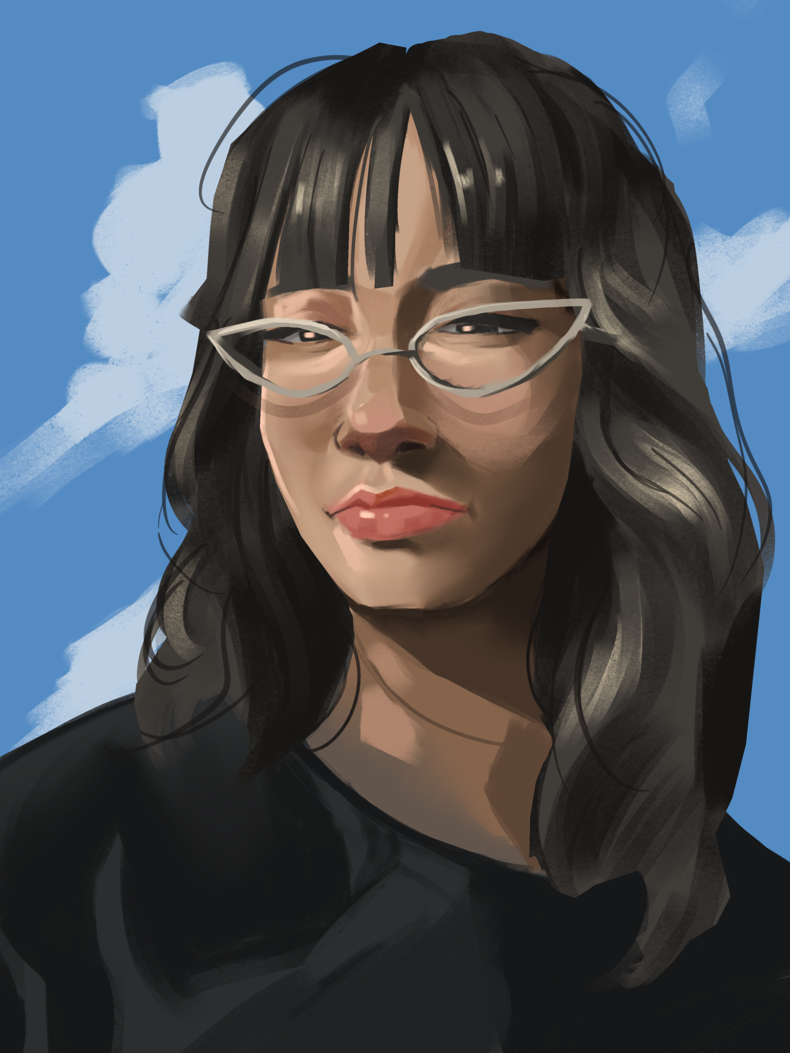
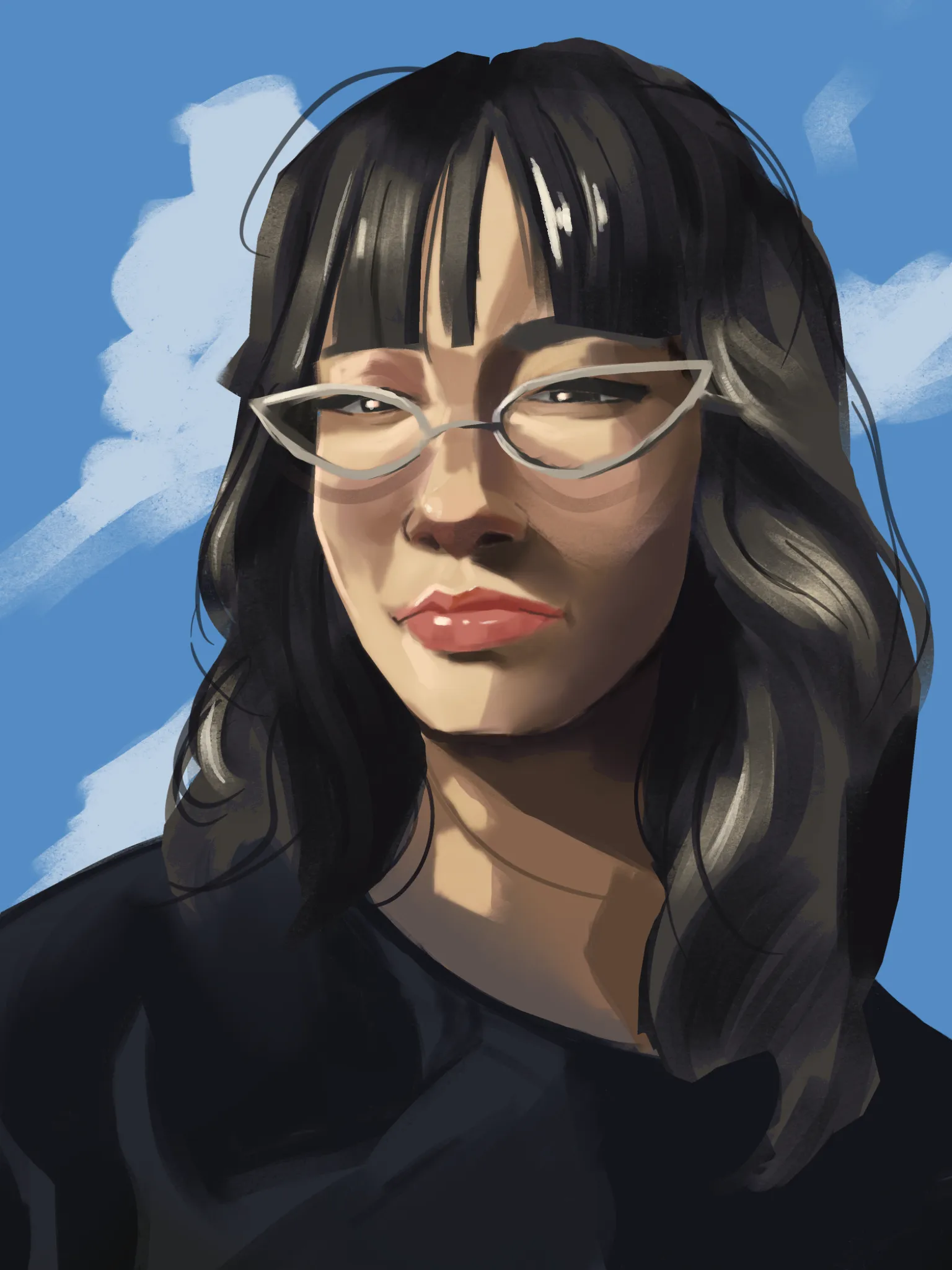

Hey, that's a great drawing! And you were almost there with the rendering of the shadows and highlights. The muddied look here comes from two things: First, for the shadows especially, you shifted to a rather flat, darker value of the skin tone. That makes it look like she's got coal dust in her face. It's always a good option to shift the hue of the shadows too and retain some color in them. In my drawover I gave them a subtle blue shift. The same is true for highlights. I shifted them more towards yellow/orange, as the picture seems like she'd be lit by natural sunlight. I also made the highlights generally brighter and the shadows a little darker still to increase contrast. In digital painting it can be a good idea to create a layer that lets you check your pure values. In procreate that would be a full black layer right on the very top and setting it to "saturation". So you can check easily if your picture has good contrast and isn't just all around middling values, which would add to the muddy look. Another, very easy contributor is the smudging. The more you smudge out all of your value shapes, the muddier the image will look. Try to not overblend your picture, and reserve the blending for areas where you really need the softness most. Sharper edges in many case will read better. I tried to add a few more harder edges here and there, but it's difficult to do that on top of an image. I do hope the idea gets across though!
Paintovers (1)
Girl selfie
Artist's notes:
i cant get the colors correctly it feels muddy and dirty kinda frustrates me. i wanna copy arcane style rendering but the colors are what breaks me tbh any tips toapporach this better