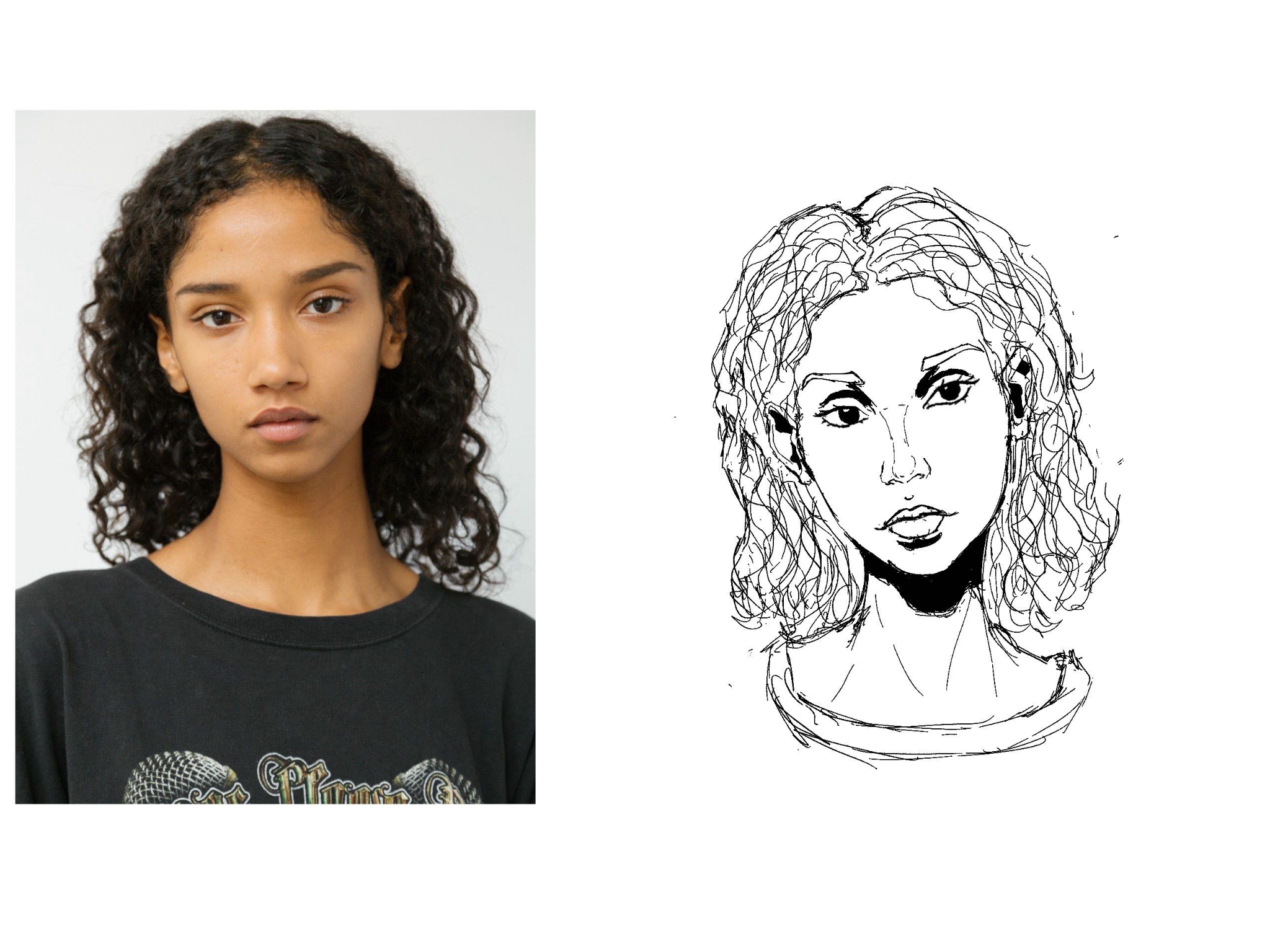
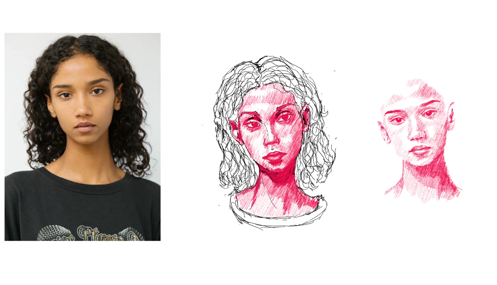

Hey there, this is a really good portrait so far. You've already identified a few key shadow shapes that indicate important plane shifts and volumes. In your reference picture, the woman left side of the face (our right) is in slightly more darkness than the left. As long as you work withut color and only values, I'd suggest exaggerating the difference a little. Because to create volume, you need to show plane shifts by having softer and harder edges between shapes of different values / brightness. With purely lines it is very hard to describe certain volumes, as for example the shift from frontal face plane to the side of the cheeks will look really off if there's sharp lines. Mouth and nose also will benefit a lot by fewer outlines and more indication of value. So what I did was exaggerate the values, and try to group them into coherent masses where applicable. The darkest values we'll find in the eyes, the nostrils, and in between the lips. Underneath the chin and around the eyes in the folds of the upper lid we also find very dark values, and naturally for the dark hair. You can think of the head as a rounded shape, and if you shine a light on it more from the left side, you will gradually get more shadows the further you go to the right. I've put a values only version too, as it is easier to see how the volume of the face emerges even when using no lines - or especially when. In that version I also slightly shifted the position of the mouth (because yours sits too low and far from the nose) and the angle of a few features, as you let the head a little tilt more than the reference does (which is not an error per se). For the hair, I can only suggest trying to simplify it a lot, as a general shape and then trying to find the areas that get hit with more and those with less light in darkness. The curly nature often doesn't need to be captured in detail but can just indicated with a few extra lines that break out of the general shape. o/
Thanks a lot for the help, Im going to try another portrait with that in mind. Its really helpful thanks