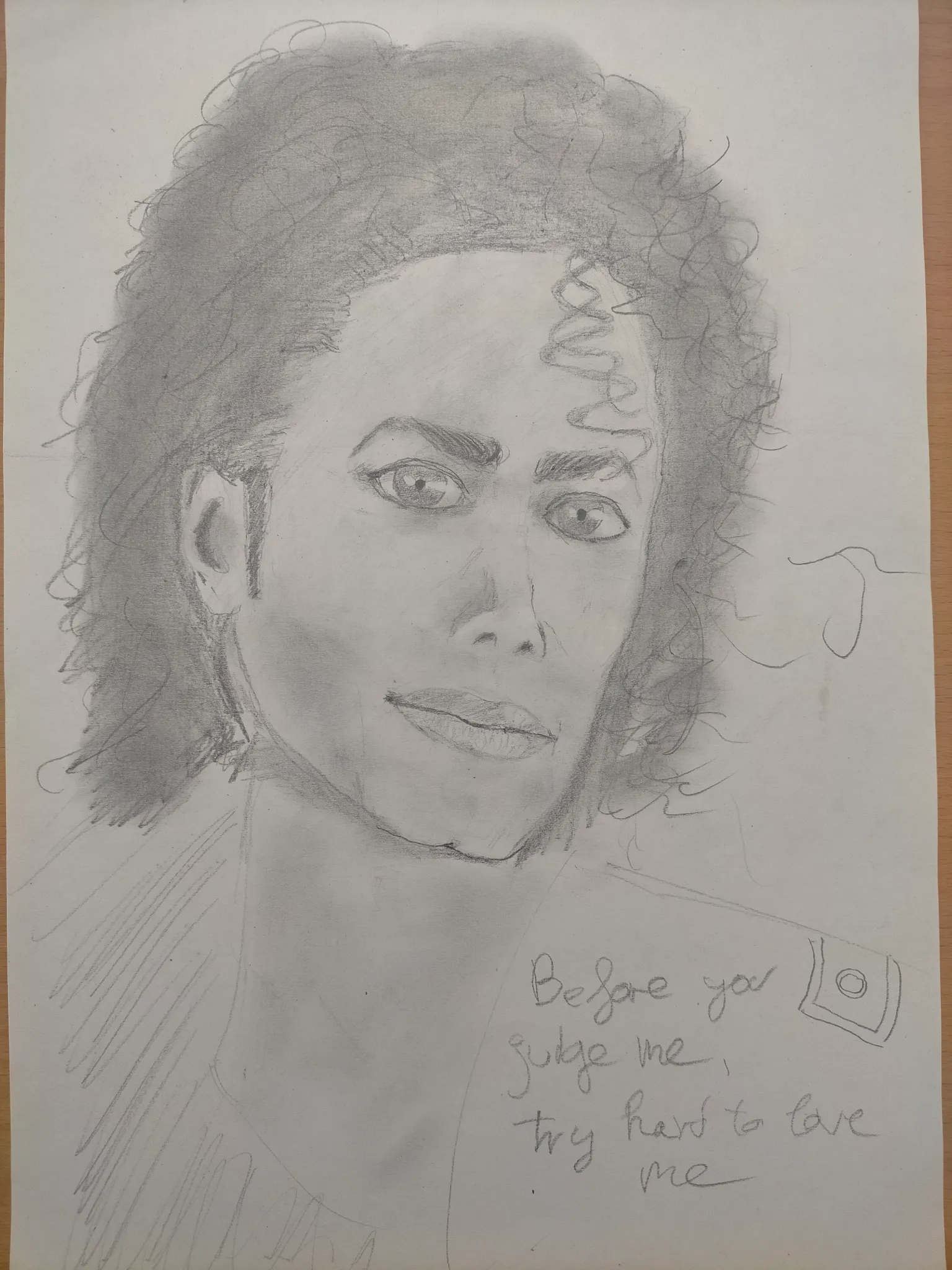
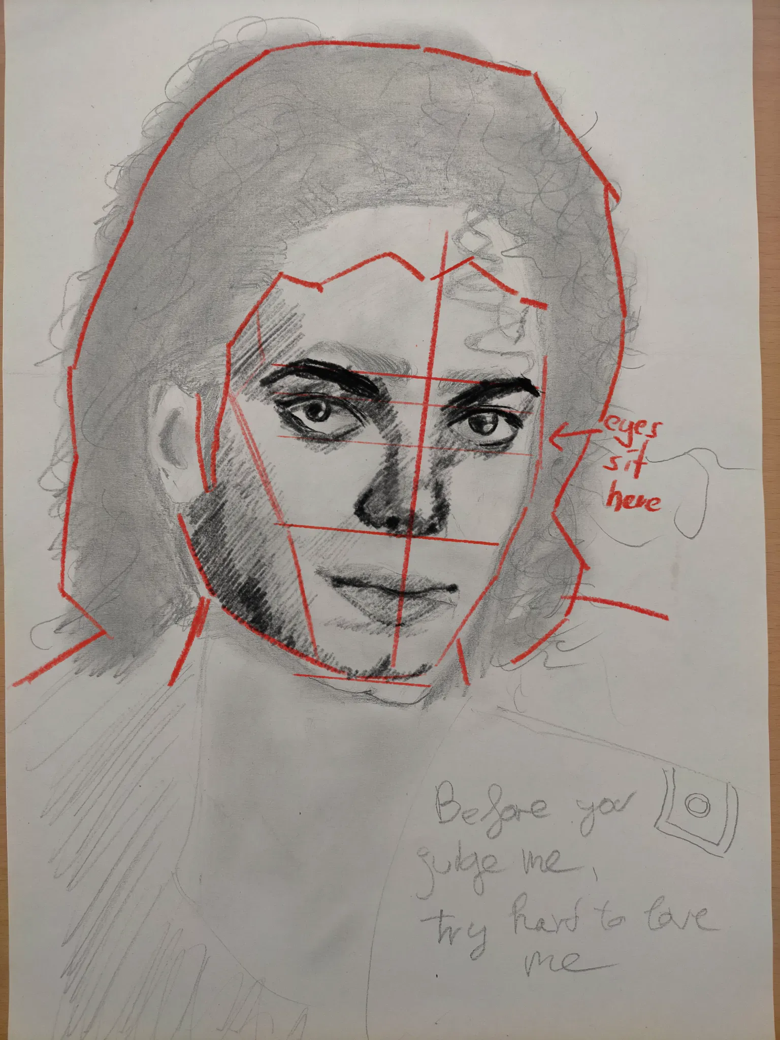
Hey, you were already so very close with the proportions, good job on that. You only stretched the upper part of the face a little bit, having the eyes drift a bit too far up. Is it possible that you did measure out loomis head proportions and tried to construct Michael over those? Because the distance from his hairline to brow ridge, then to the bottom of the nose, and then the bottom of the chin measure up very equally. If that is the case, you might have run into a trap, as the loomis construction works for a 'standardized', average head, but the real trickery comes in capturing likeness, and in real humans, these distances do often not measure up that perfectly. And likeness is mostly about getting the relations and proportions right, rather than rendering out details. So, if we push the eyes lower, same as the eyebrows, we're already almost there. His hair also occupies a lot of space, and with the lowered eyes, I push the hairline lower as well. I also think you gave him a smidge too much chin, but that is such a tiny difference. In terms of shading, you already began shading in the left side of the face where we have a plane shift from frontal face to side plane. That is exactly right. There's also the beginnings of very correct shade placements around the eyes and eyebrow ridge, I just emphasized them a bit more. The underplane of the nose if very bright in your portrait, but as it recedes back from the tip of the nose, it should be darkened. That also lets you give the entire nose more volume as this will contrast with the rounded tip. The shape of the mouth is already quite well done, but with the outlines for the lips mouths tend to feel more like stickers than real volumetric shapes that flow into the face. Your shading for the lips is already thinking the right way though, getting darker near the corners and in this case also overall a bit darker to the left. The overall shape of his face though is already mostly there, and the outer shape of the hair as well. Keep it up. o/
Paintovers (1)
Michael in graphite
Artist's notes:
Shading, edges and proportion