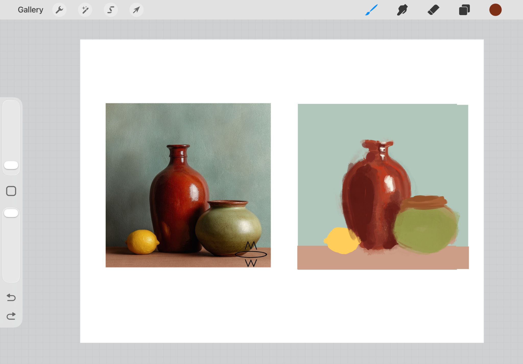
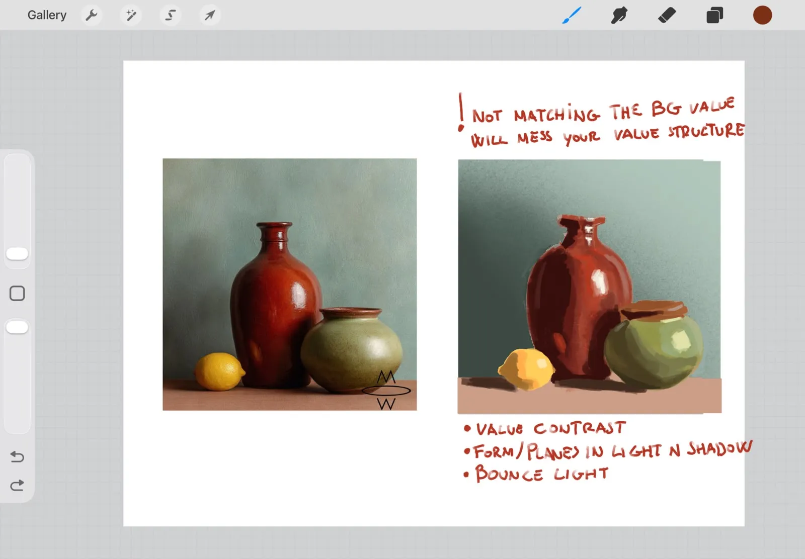
You already got great critique on this one, but I just think there are a few things more to comment on. Mainly, when doing studies, you want to make the value structure having the same amount of contrast as the reference, otherwise the values might get too confusing for your eyes and won't be able to make them accurate or close to accurate. Values are really important but the thing about them is as long as you get the contrast right, you can make the image darker or lighter and it will still work. Lastly I believe that although it's not that important of a thing, bounce light helps a lot to show form, get cool looking hues in there and help to sell the overlaps of similar value forms being overlaped.
Paintovers (2)
Timed study
Artist's notes:
Colours look flat and muddy, not sure what I’m even learning from this study. How do I do studies more effectively ? How do I make the colours pop instead of looking flat ?
Comments 2
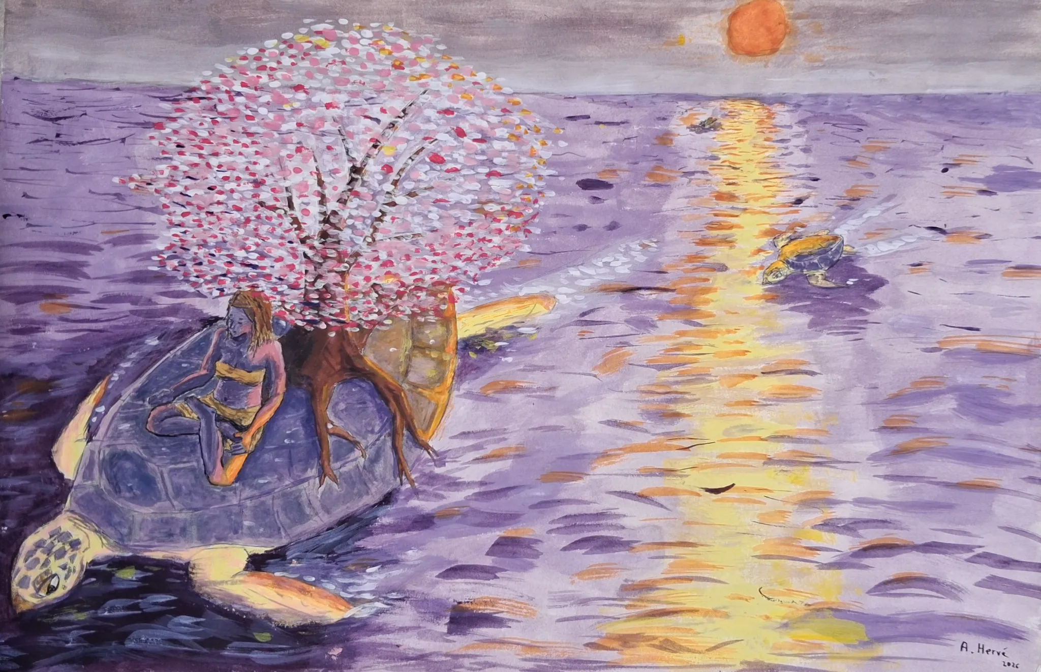
I think you did well for a timed study. To make the colours pops I would: - add a bit more contrast in the dark. - think of overlapping forms and values. The goal of this kind of studies is to train you observation and question the image. Where does the light hit ? where it is the darkest ? why ? which details should I keep and which can I drop ? How can I indicate the form of the object ? So the fact that you find your colors flat and muddy is a good sign : you are more critical. That is the only way to improve :) Hopes it helps. Good luck in your studies.