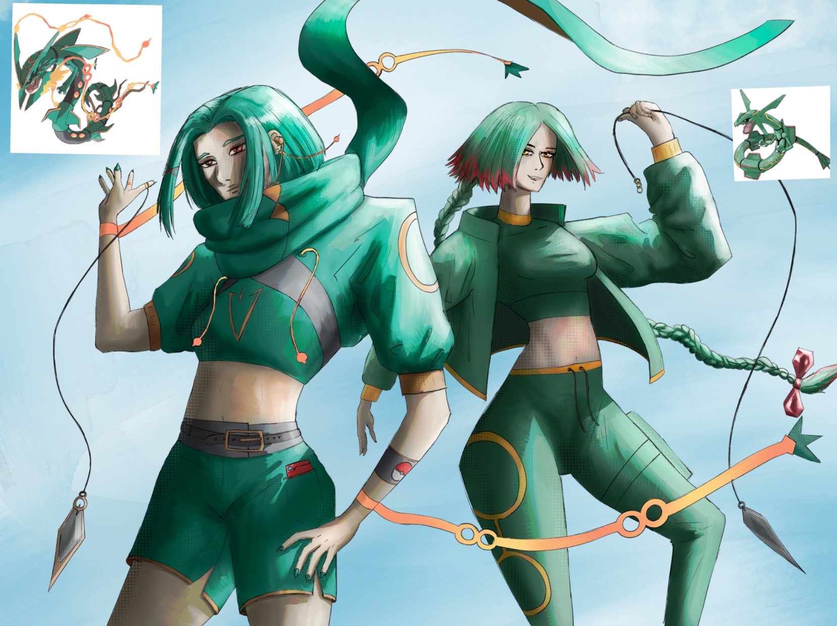
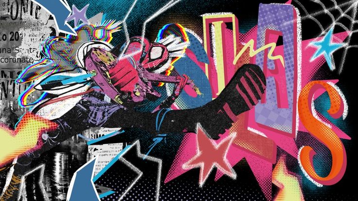
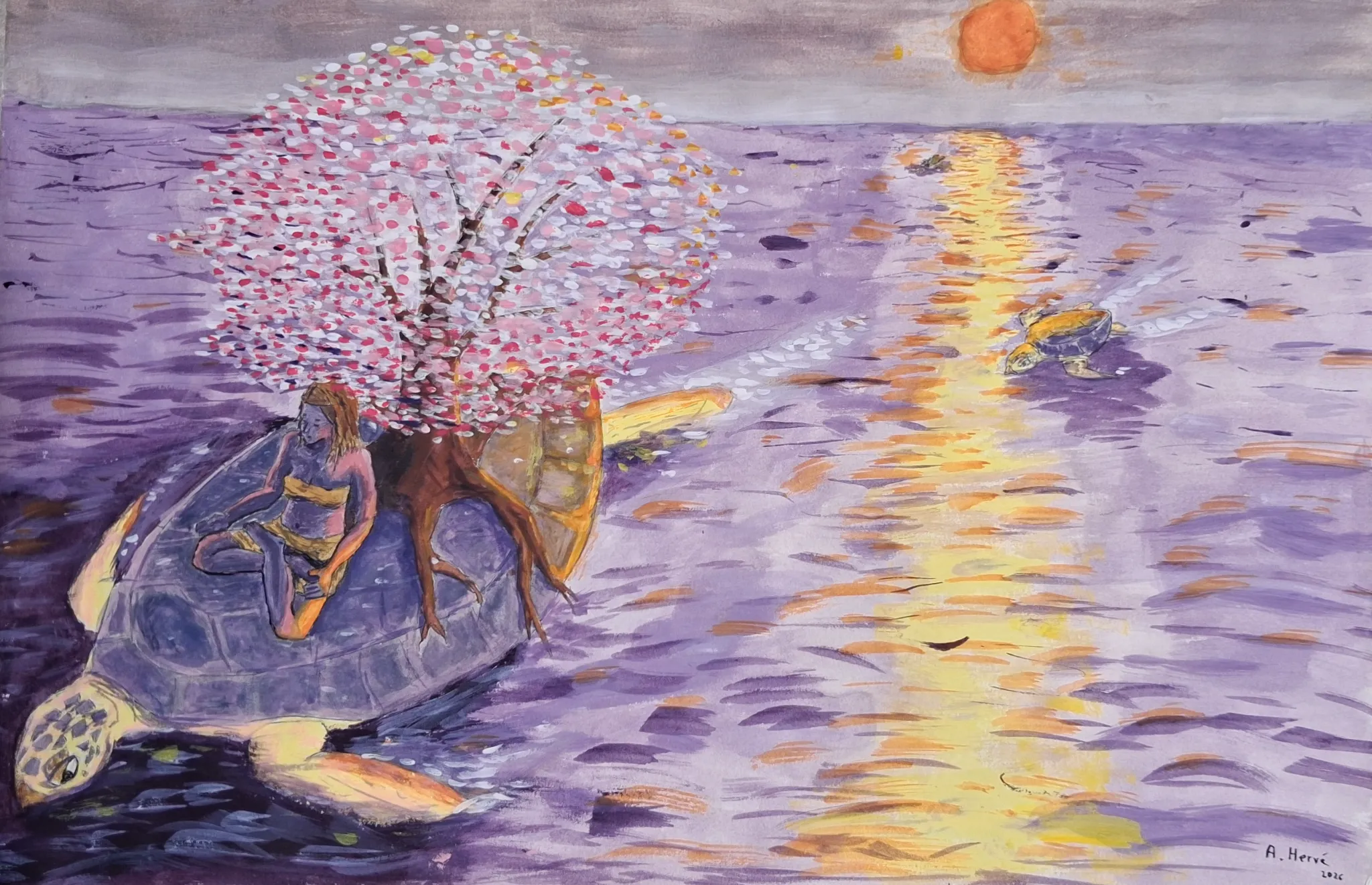
The revision and revamped concept. I did the after as a draw over, but now i am resubmitting this as a revision, just to make it easier to understand and see and stuff. More details on the drawing are on the revision
I love the new Character design; it's very unique!
I would, however, recommend using a reference for the anatomy. At some points, the shoulder is too high up, or the face is kinda squashed.
With a few tweaks, some anatomy studies, and a focus on proportions, etc., your art could improve even more.
Hello,
First, cool character design !
Second I would focus more on the basic mannequin shapes before doing all the rendering, you could avoid some structural mistake that make the painting weird.
For exemple the shoulders are too far away from the torso, the eyes are facing use but drawn on a 3/4er face.
Good shading ! You could improve the impact by having a more darker background to avoid light on light.
PS: You should submit the new version as a "revision" instead of a "paintover". I is simpler to draw over this way.
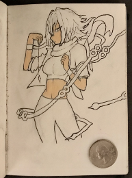
While I am not happy with this result either, it was interesting to revisit and remake old ideas. Since i couldn’t decide on a single sketch I instead used two different sketches and drew mega and normal rayquaza. I worked a lot closer to the reference and tried to make the clothing more interesting, while sticking mostly to the original design choices. I also wanted to focus on the characters (since the focus is originally on the characters) The main aspect I kinda messed up on with the new design, is the rendering. But I do still think this drawing shows the progress I’ve made in 4 years. It was fun to revamp an old concept