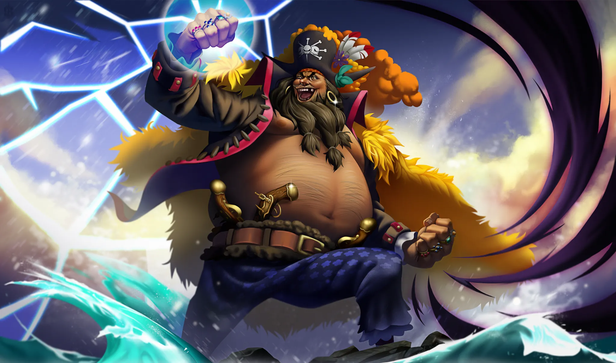
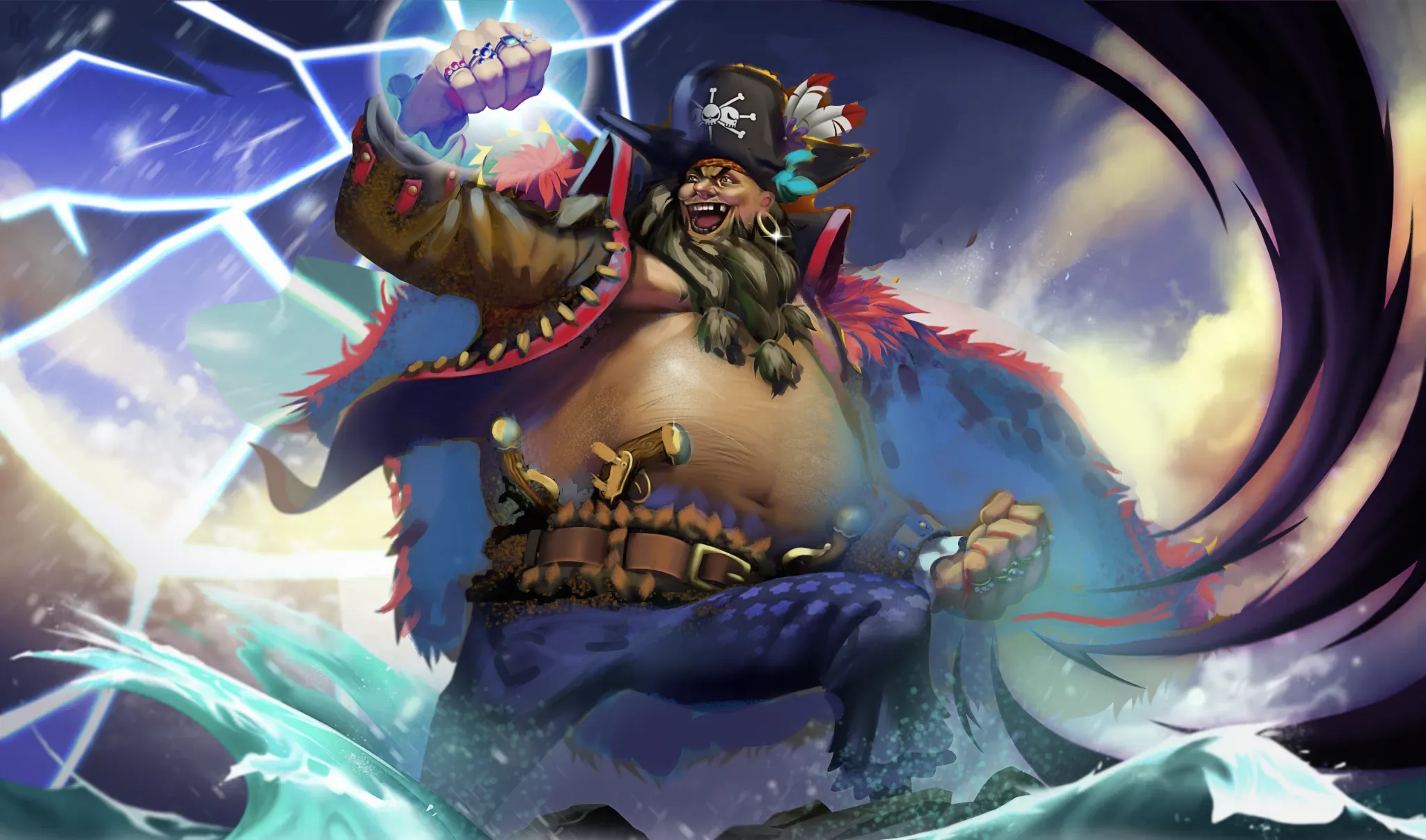


Hi, this is a great illustration, you did a good job rendering. In terms of achieving more three-dimensionality here is a overpaint and some explanations of thought process behinf it. Key to move forward are Values. In order to your piece have better read you need to limit your vaule range in places where it is not that important, for example not use pure black in every shadow shape across the character. There are many reasons: skin is refractive material, that have subsurface scattering. Metal / gold is very reflective, and will not fall into so dark value range. Secondly rather to indicate form change by darkening a color with darker value, use a concept of hue shift, where you leave a a base value intact and play with color and saturation change, it can happen up to 40% of form change. Third thing is a atmospheric prespective: Water splashes prosuce a lot of haze that can be used to add atmosphere to parts of painting that need to fall back, hence build more dimension. Talking about fur, I think it is necely painted, although the main problem is it's color, because yellow in your illustration carries the most contrast it takes the whole attention form face and hand, your main focal points. I have made it the same color as other parts of pirate clothing, and pushed the sadow shape into nerly the smae value, to make the sillouhette of pirate pop more. Also I gor rid of yellow forms abouve his hat, they were obscuring too much of his archetype shape. Hope that wil give you ideas how to move this piece further, keep up the good work!
Thank you for the feedback! I get a lot of your points. Stuff like changing the design/colors, is not really something up to me since this is an already established character not created by me. I'll give it a quick paint over and take your feedback into consideration.
Gosh, I feel so embarassed right now, somehow missed that is a OnePiece fan art. Absolutely understandable, I am not familiar with one piece, the character didn't rang any bells. Absolutely do not change the design, treat the feedback as a critique to a standalone illustration, rather a critique to the design itself.