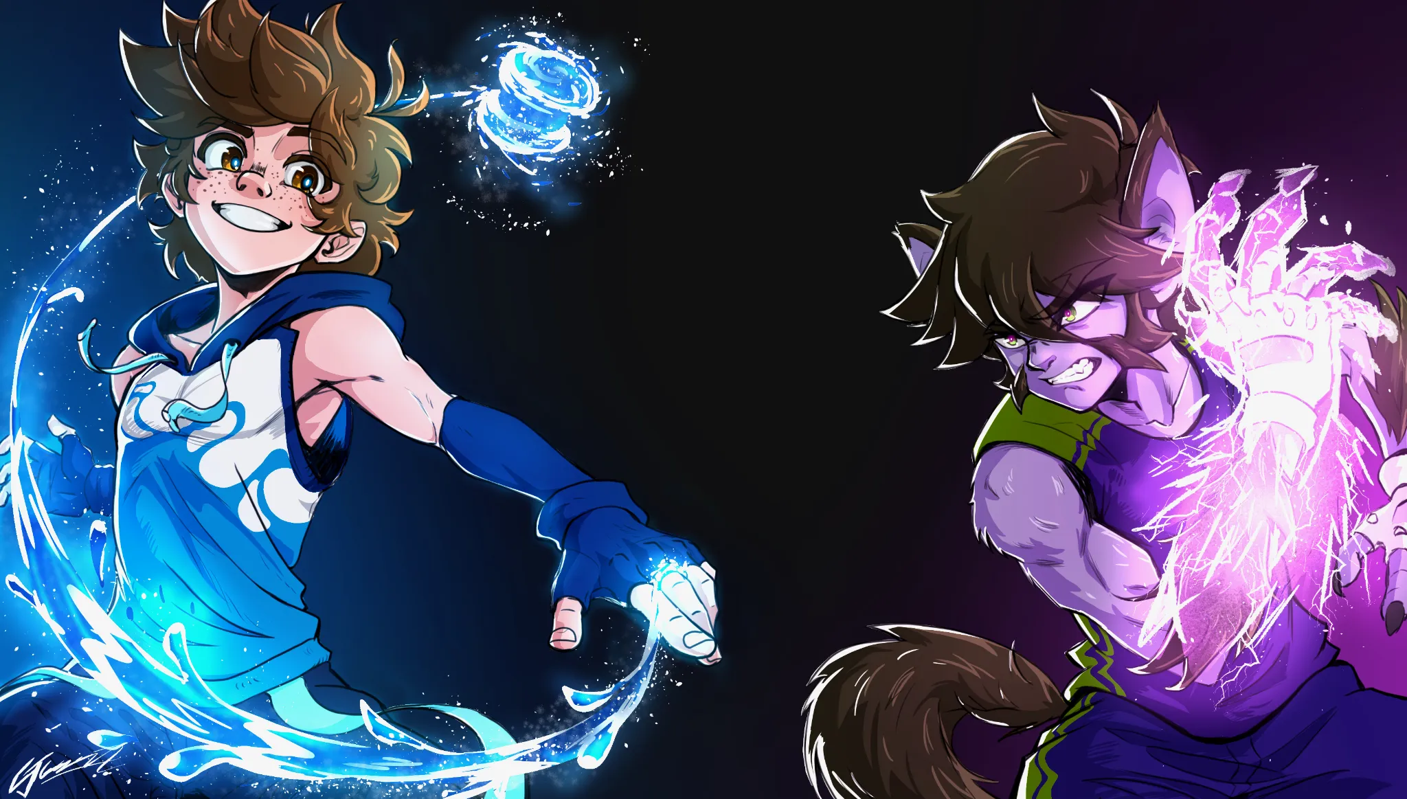
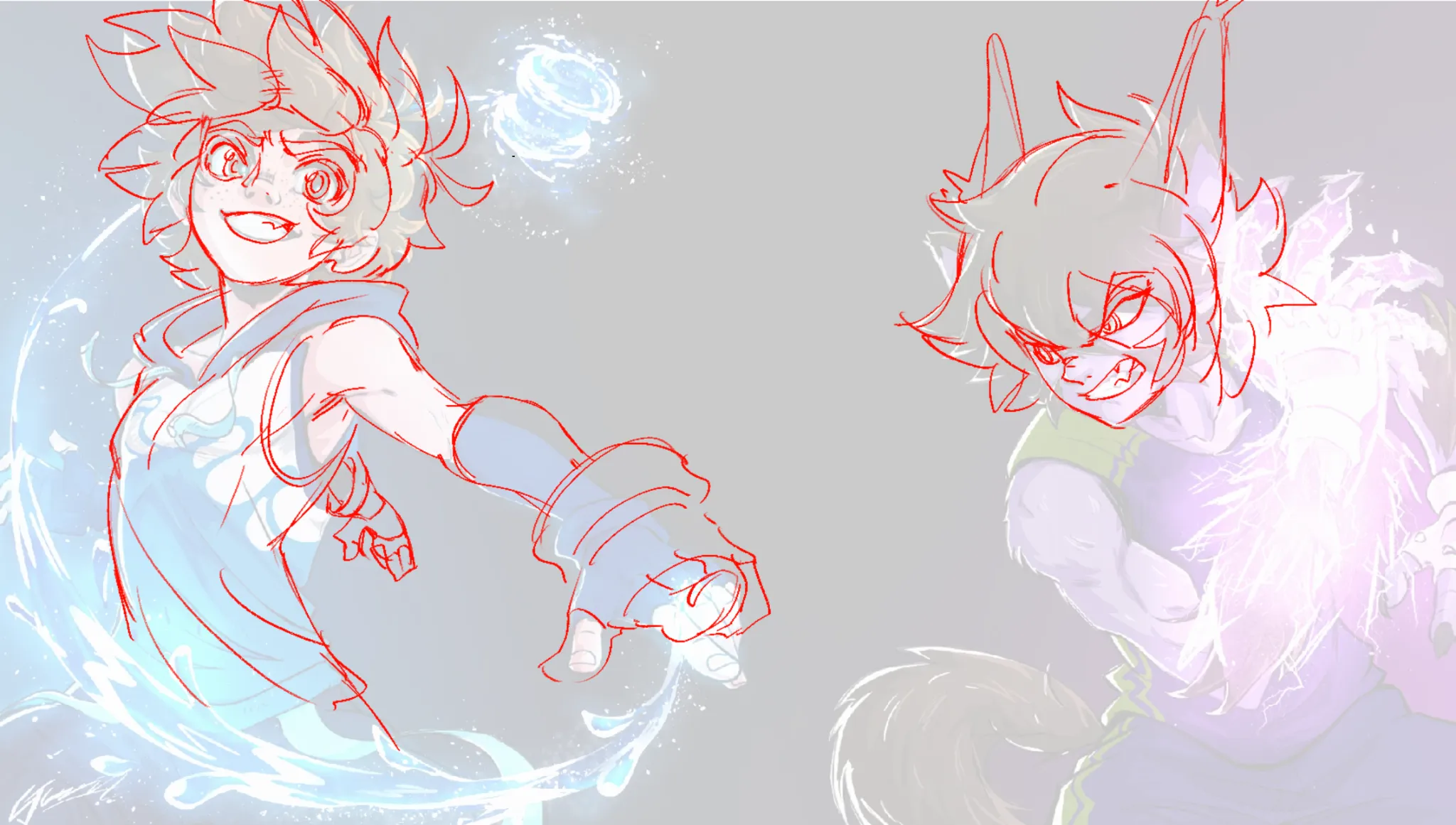
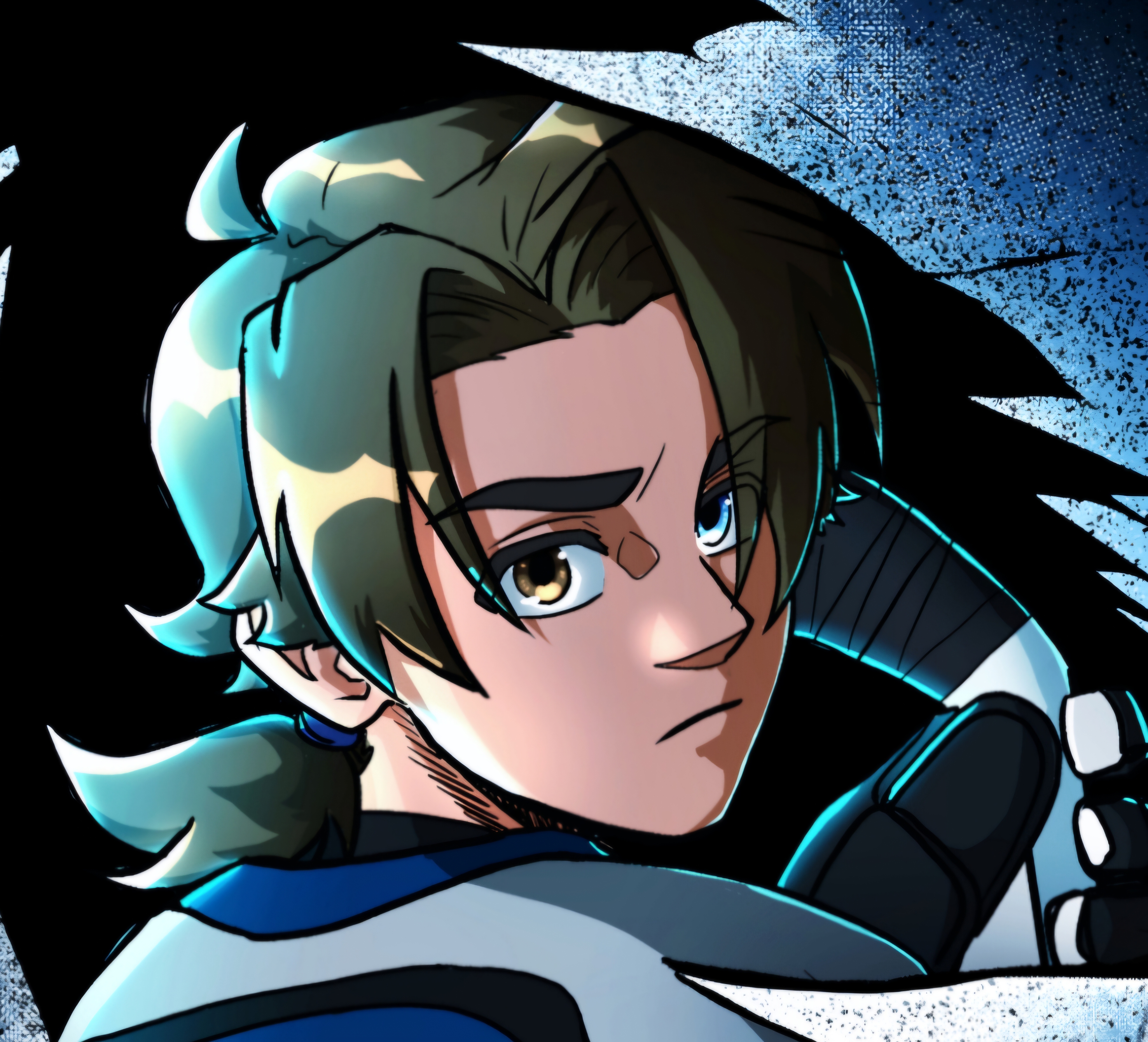
Hi there! What an epic submission! I don't think there are any major things that need improving other than what has already been said in the other great feedbacks, so I'll be nitpicky! I think implementing a bit more of the colour their magic casts onto the characters would be great to tie the piece further together. Other than that I also drew 2 red cirles on the character on the right, one is to soften that bicep a little bit as the harsh line feels like the form is a bit too extreme, and the other is to slightly seperate the hair shape from the sideburns. They felt a bit like one shape before, which could bring along confusion in depth. It's an absolute brilliant piece though, thanks for submitting it, I would definitely read this comic!
Paintovers (3)
Original characters VS Piece
Artist's notes:
I like drawing in a comic/Manga style, at least thats the goal and hope I get skilled enough to do in the near future, making my own comics. I feel there are areas in anatomy, design, clothes, 3d forms, or making thing look interestingor believable, (did complete the beginner course) and many other areas i'm not at least 90% good at yet, I can't tell if my art is messy or what im missing. NOTE: the characters in this piece are young teens, not adults.
Comments 3
Hello! There a few things I would change to make it feel more eastern. One small thing is that Eastern styles are actually use a lot of realism in their drawings, for example, the length between eyes are typically farther apart than in western cartoony styles. Look at Steven Universe vs Kill la Kill or something. Another small thing is just how the hair bunches together and where the decided to place certain details like the ears. Eastern styles tend to put the ears on top of the head rathar than the sides like people ears. Theres also a bit of stronger foreshortening on the arm going towards the screen, thats just for added effect. I would highly suggest if your wanting your style to feel more like manga/eastern. Do STUDIES!! Study your favorite anime/manga and take close attention to how far apart the eyes are, or how certain details are draw, ect. Im still not quite there personally, but ive been studying anime/manga myself, so I hope this helps! Id highly reccomend looking at Studio Trigger artists, I think thats closest to what your looking for in your art!
This feedback is so cool!

Looks pretty good!! Amazing work. I think I would draw the tail on the right character a bit thicker so it doesnt look lit its coming out of his hips and maybe adjust the angle of the wrist of the right character because the arm is not in an 90 degrees angle