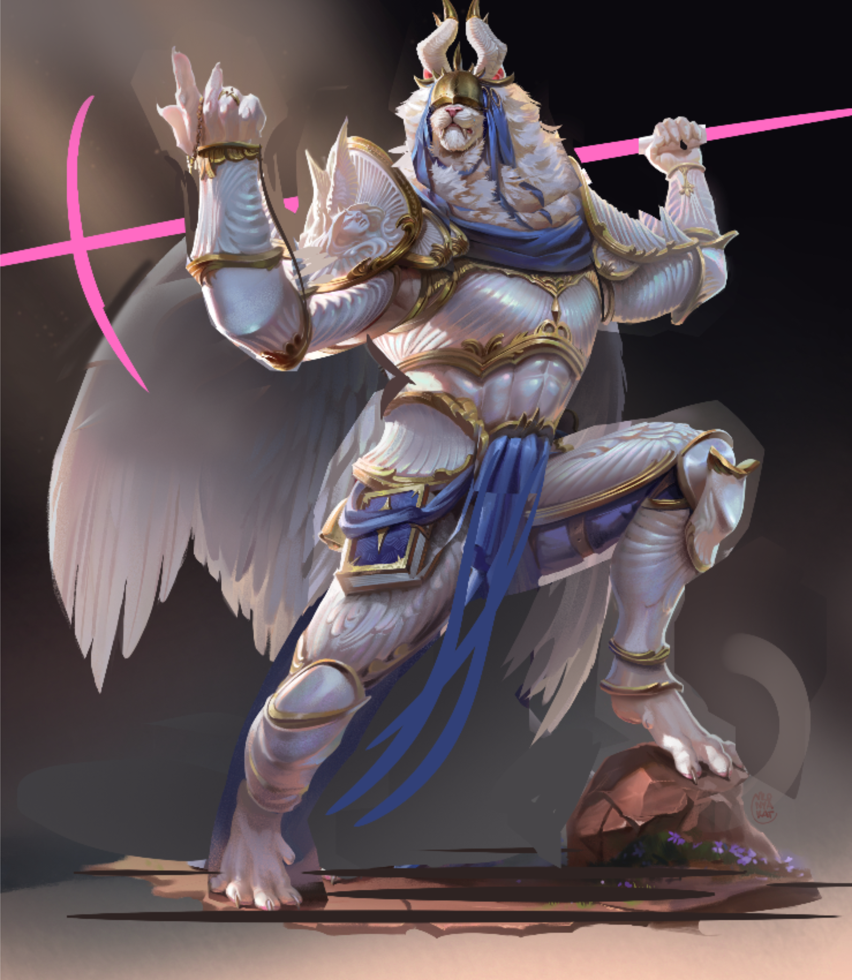

Edit - My paintover got cropped (changed image dimensions to add a breakdown). Here's the paintover:
Viewing paintover by @jeremy59277920
Paintovers (0)
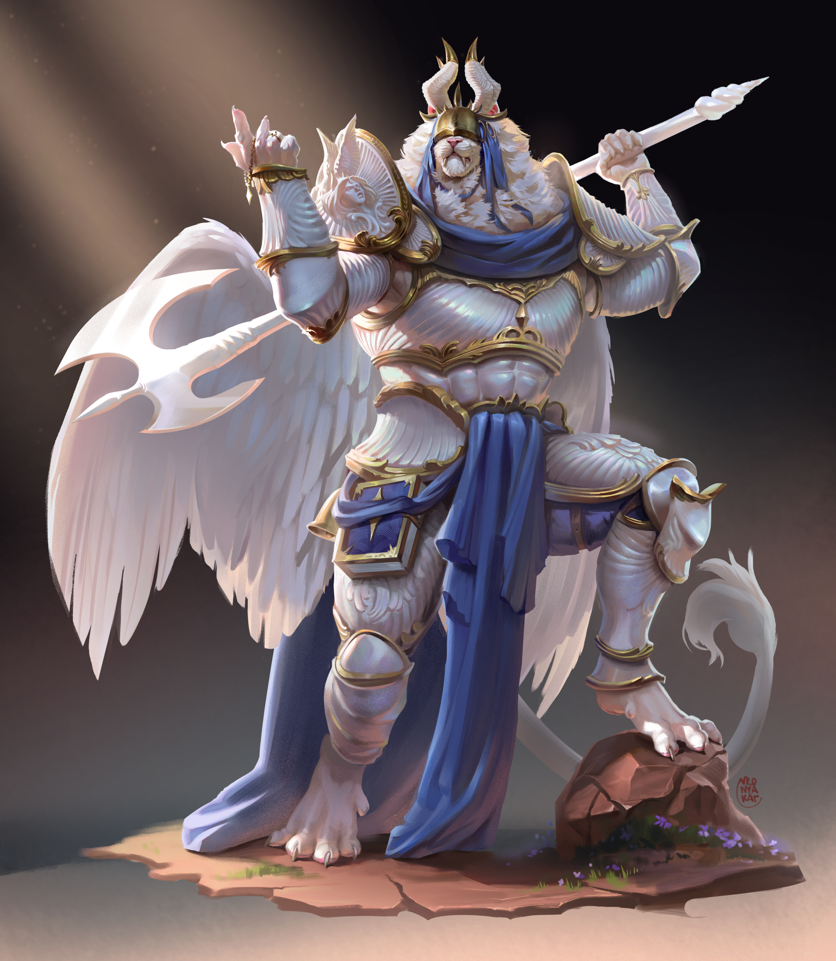
Something is off, looks flat and boring :(
Artist's notes:
Something is off, looks flat and boring :(
Comments 7
Morning! First off: awesome character + rendering. Nice job. It depends on what you want the pose to embody - but with some tweaks you can push the line of action a little more to give you a bit more dynamism. I drew a quick line of action that contained a little more coiled energy in it. Then chopped each body piece into a separate layer so I could manipulate each one to match the line of action. I also scaled a few elements to emphasize the pose. The weapon position is tough in this one - it felt like it was sliding down the back in the original, so I moved it up over the shoulder. Hope this helps.
1.- This is better than anything I could draw right now, excellent job. 2.- I think it feels "flat and boring" because of the "flat and boring" angle of view + how far we are of the character But we need to think about "the objective" of the piece too. This piece lets us see the whole character and imagine the lore behind him, for example.
Not needed7 months ago
The rendering, and colouring is great , and the anatomy used is also great. As for concern of flatness, i thinks there is just some subtle things that i can see are off and you can improve upon : 1. This is less about perspectives and more about the posing. I think that the pose if just too symmetric in its forms. Specially around the rib - abdomen and pelvic , if you simplify it to boxes, it's just box onto box . Try making not only the hands , but also the body more unsymmetric, like a arrogant guy puffing his chest up or down. Humans anyways have bit of a curve in the ribcage which is observable and adds a nice unsymmetry even in flat poses 2. Another subtle thing is that the proportions are about the same for limbs. You can further push the forshortning into more daring part
Rendering skills surpase mine greatly, I come from Animation and can provide some input. How can we be more specific to the themes and nature of this character? Posing! This guy looks like a strong Being that is quite mighty and masculine in his silhouette and armor. you can argue that his stiff pose is a testament to his stature, but Id push the pose more by introducing elements of WEIGHT. E.g Plant his feet, have him lean onto one leg with his pelvis shooting to the sky on one side due to the Weight bearing leg. His hands show a sense of cockiness have the chin point up. Push the dynamism by twisting his body. front plane of pelvis pointing screen right whilst torso facing more towards Camera in the magic 3/4 angle rule. Of course these examples are for the conceptual stage of the Illustration and therefore should be considered for your next piece! as for rendering tips, There is a lack of depth perception on his weapon and parts of his body. The parts that are in the foreground could remain in the same value, with parts in the background slightly lower in value or you could introduce more grays to allow the background pieces harmonize creating a blend/fog effect. overall this looks so cool and i want to achieve this level of render one day.