Paintover
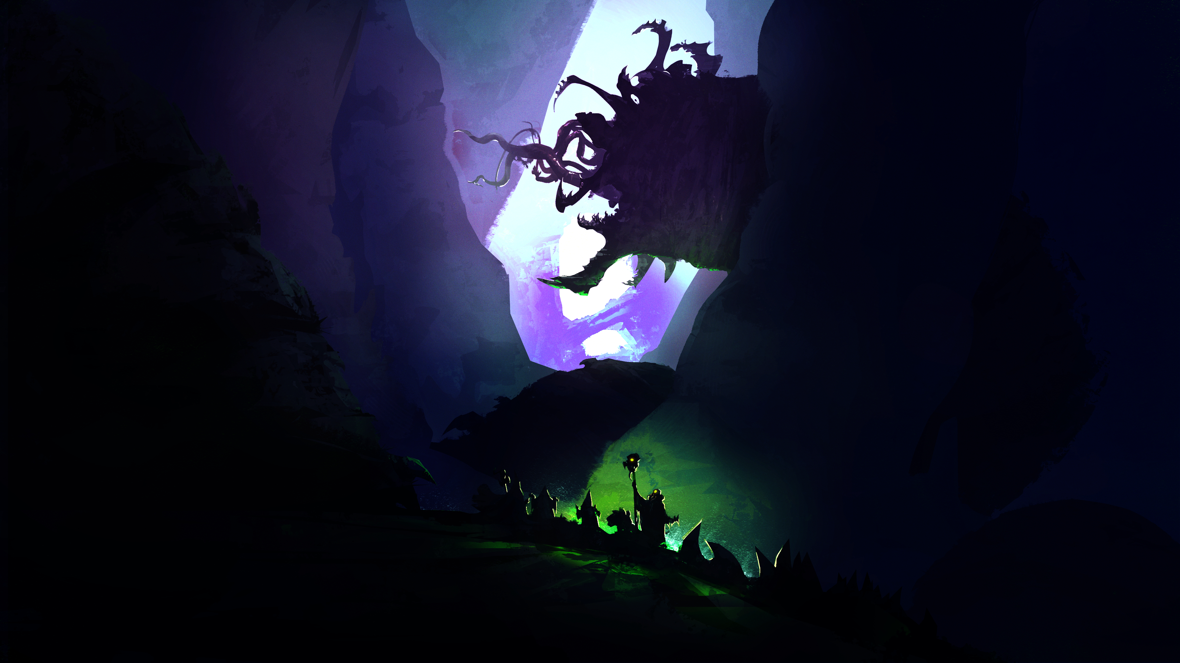
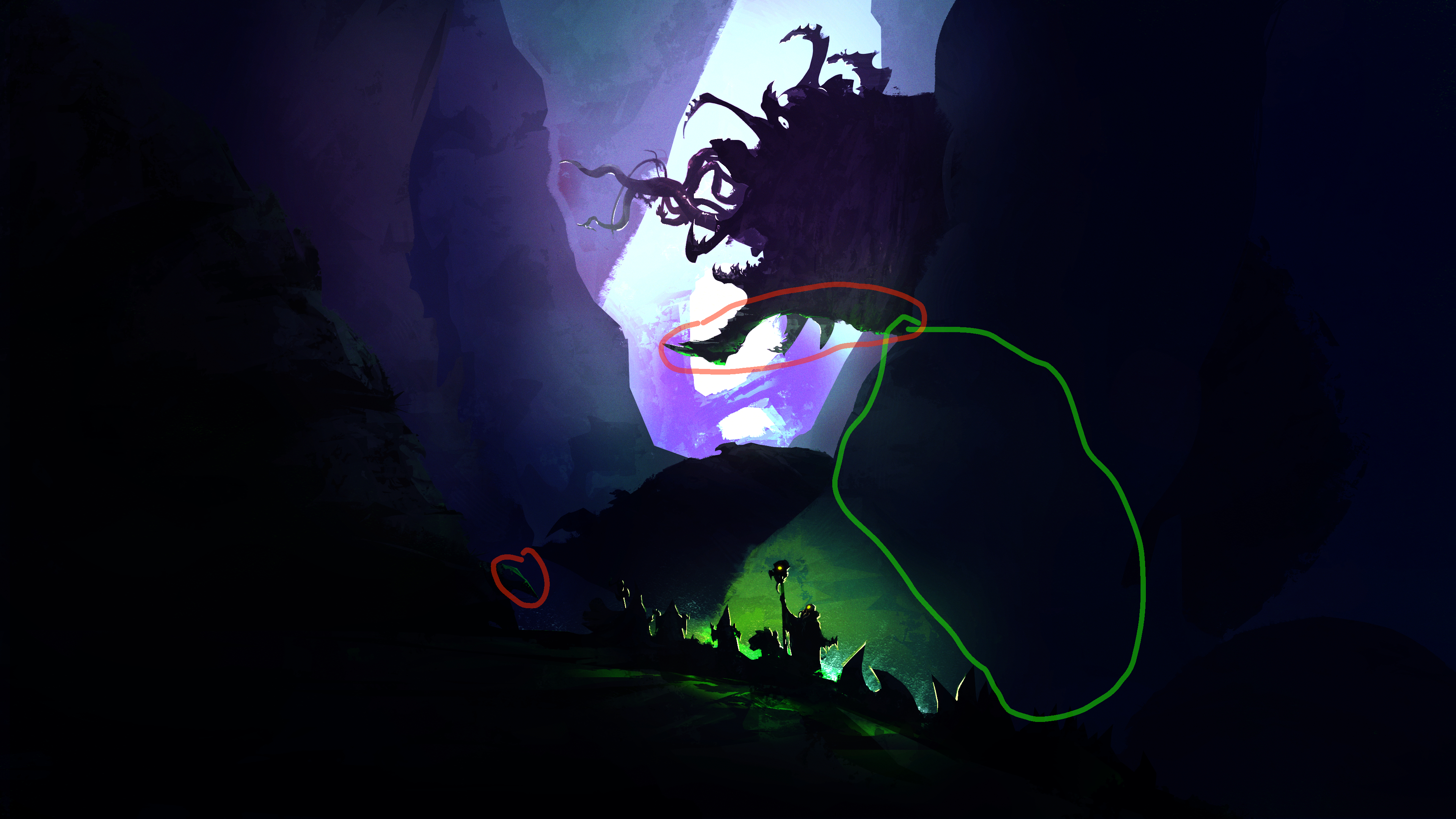
Overall the piece works well, good atmosphere and the dual light sources are consistent and don't contradict each other. The silhouettes read clearly. I really like it! One thing to improve IMO: The mid-ground rocky ledge (highlighted in green) could use some subtle green light like you did in the red area. It's in direct line of the green source but currently reads too dark, which slightly flattens the depth. A soft green rim or gradient there would make the lighting more consistent and help separate that layer from the background. Hope this helps :)
Feb 4, 1:13 PM