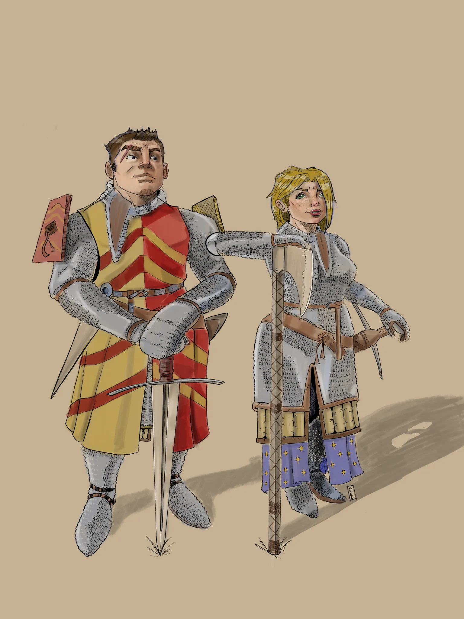
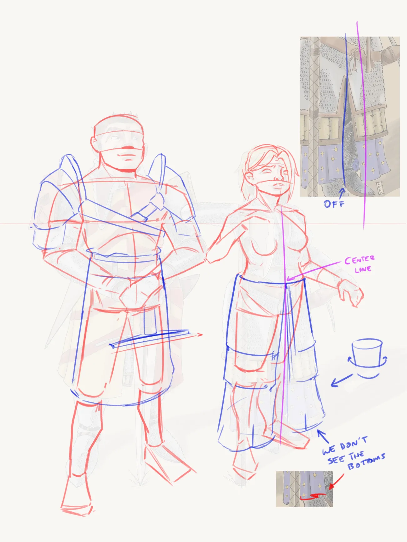
Hello there! Good job with the characters! However, their perspective feels a little odd, particularly the female character. On one hand, it looks like the angle is supposed to be from a slightly top-down view, but at the same time it also feels somewhat frontal. The armor looks flat because it lacks volume, as it doesn’t seem to be wrapping around the body. At the same time, the opening of the chainmail and the garments underneath aren’t following the center line of the pose, which makes them look a little off. On the other hand, the connection between the head and torso looks strange. The head is positioned slightly too far to the left, and the position of the arm looks uncomfortable. It doesn’t feel like a natural position, especially considering that this is supposed to be a tired pose, which is why I think it feels uncomfortable. Notice that, first of all, I established the horizon line to keep the perspective in mind and maintain a more consistent drawing. I also drew the center line to keep the opening of the clothing aligned with the perspective of the body. Also, notice that the bottom edge of each garment follows the cylindrical form of the body instead of being drawn as a straight line. This gives the clothing a stronger sense of volume. :) I also changed the position of the arm resting on the axe. As for the male character, the first thing I thought was: Where are the shoulder pads attached? They look like they’re simply attached to the chainmail. Look at some references and notice that shoulder pads usually have some kind of “strap” to keep them in place. You need to pay attention to these kinds of details to create more believable designs. I would also draw the character’s hips a little narrower to keep the upper chest wider. Hope this helps!
Anstriche (1)
Main Character Energy
Künstlernotiz:
I'm looking for honest feedback and crit from other artists. This is a character concepts for a indi comic that I'm looking to drop soon, but I don't think that my character acting and polish is where i want it to be. I'm using KRITA an awesome platform, but still learning a lot about digital. Thanks.
Kommentare 2
Really cool character design ! For me they don't give main characters videos though. I think their poses is too passive for that. I would place them as parental figures of the MC. If you want to change that, try drawing them in action and not just standing there. Also I would have draw them looking at the same thing, not completely different gaze like that. I hope it helps.
Right on, thanks for the feed back.