Neu: Wechsle hier von Galerie zu Einzelansicht.
#2
Rang
47
Upvotes
43
Feedback
100%
Hilfreich
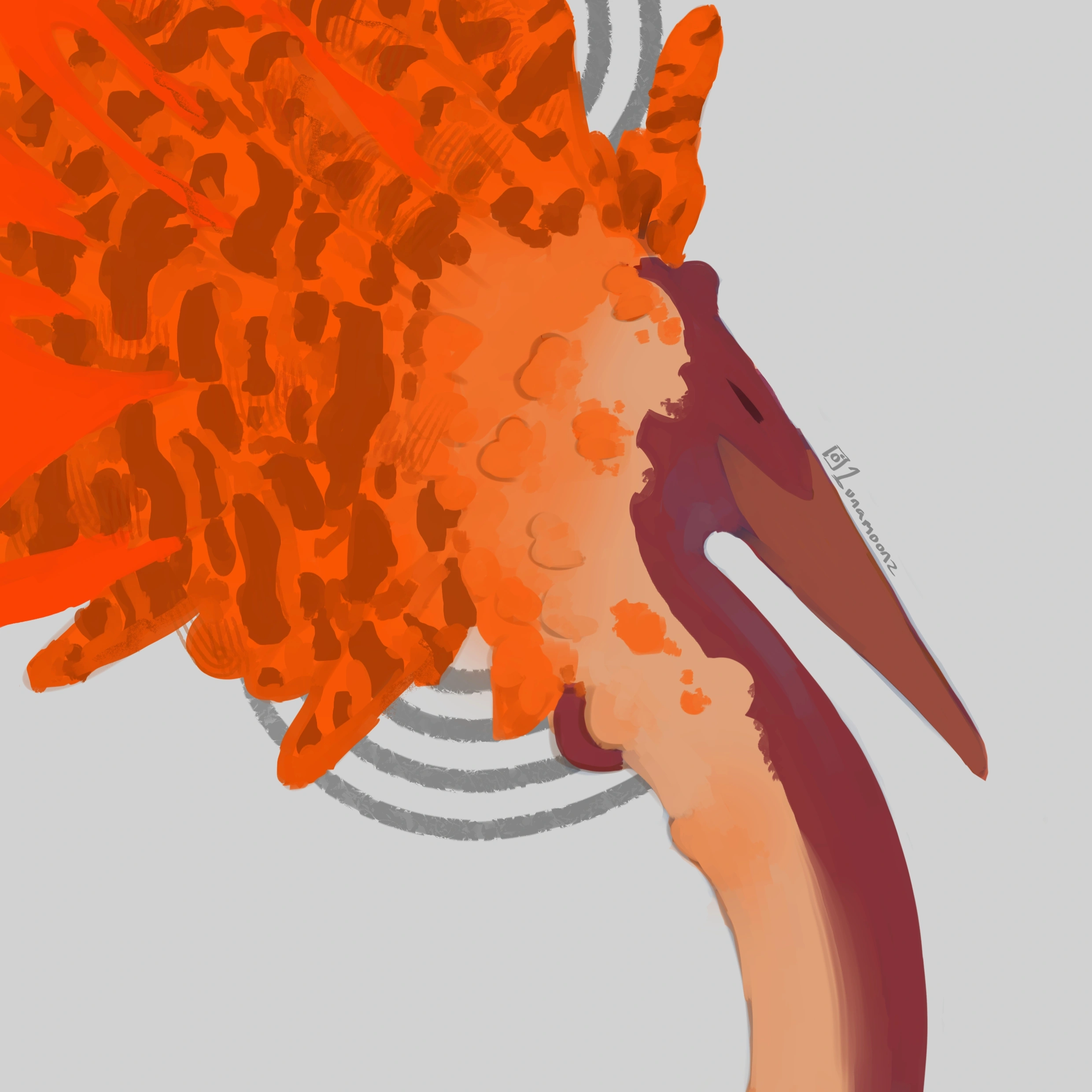
“What a cute cover ! My personal opinion is to keep the lines :p. What I would rework might be the values. They are really similar. I tried something to illustrate my point but it is far from ...”
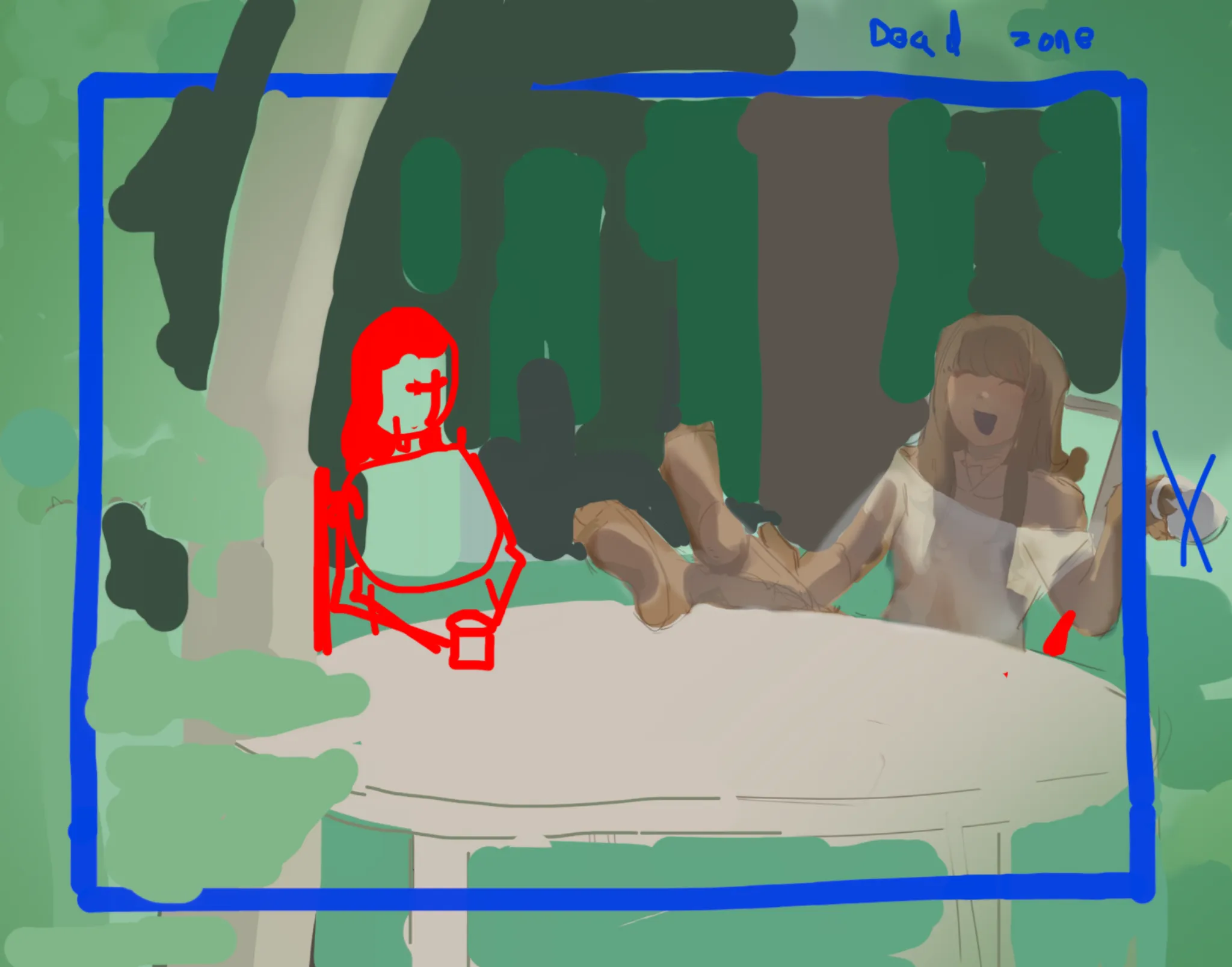
“Hello, this illustration seems fun :) I think it depends on what you want the composition to convey. This currently put the focus on the character on the right. The left one is put out of focus...”
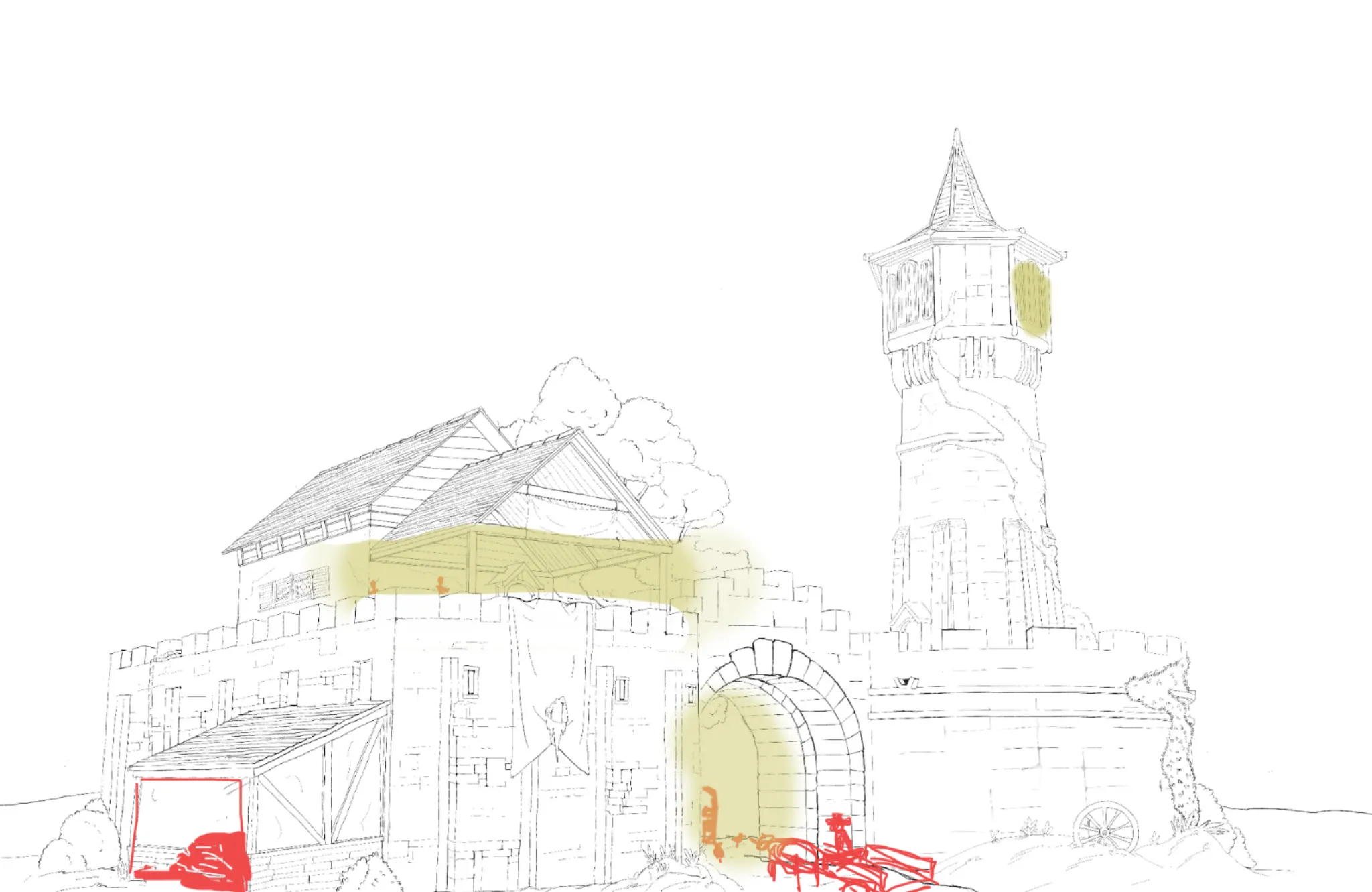
“Really cool building I am not sure what you want exaclty ? architectural advice or construction RP ? I find the building on the left side strange => a military outpost whould not put an "extra r...”
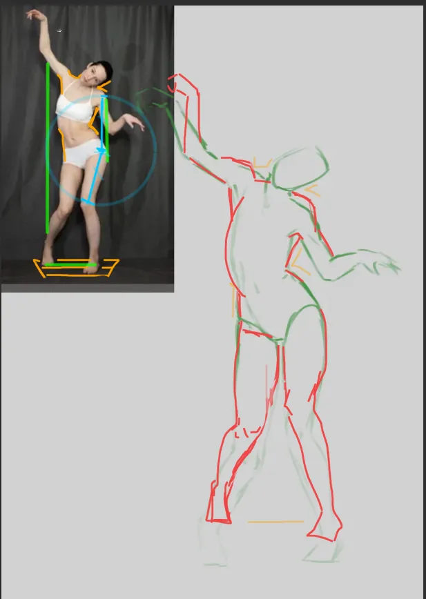
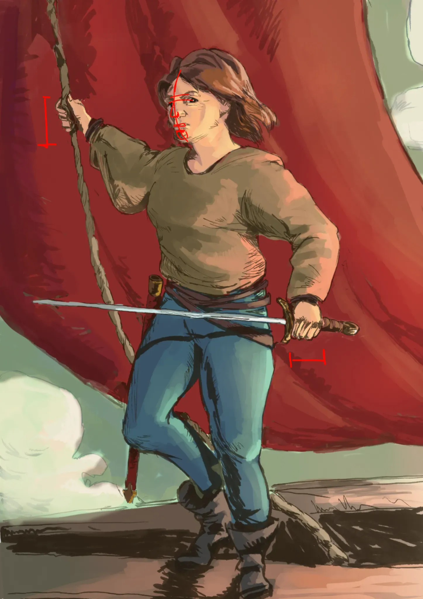
“Hello, I find the pose practise really promising ! For proportion : It was quite right except the legs. What I did was check the distance from the knee to hips, they match hips to shoulder on the...”
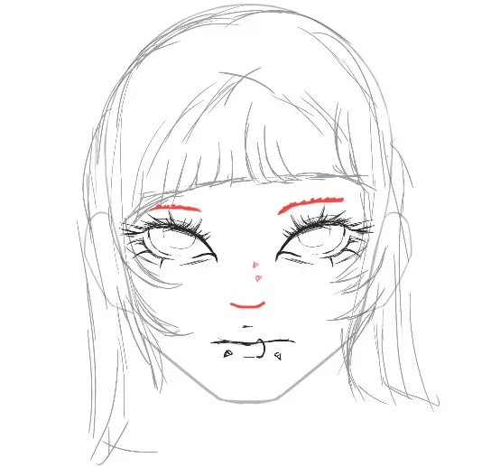
“Not bad at all ! I disagree with you : it is not pretty bad, especially for a first drawing. Basic proportions are here: eyes at the middle of the face, 1 eye space between the eyes, the hairs are g...”
“Hello ! Good work ! Here is some feedback to go a step further : The question to ask for each section is: do I put it in dark, medium or light. And then you have to be consistent: * One of ...”
“Hello, Really cool pirate ! 2 point I found: * The right hand (on our left) is bigger than the other even if it is far away. * The nose and mouth are nealy facing us but the face is more turn...”
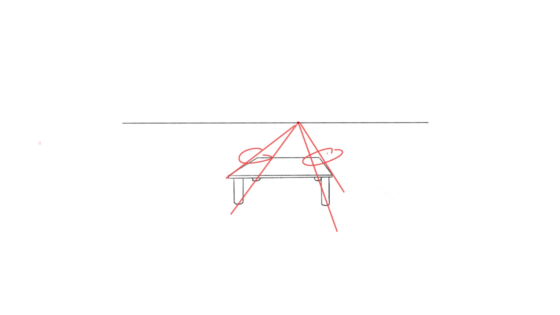
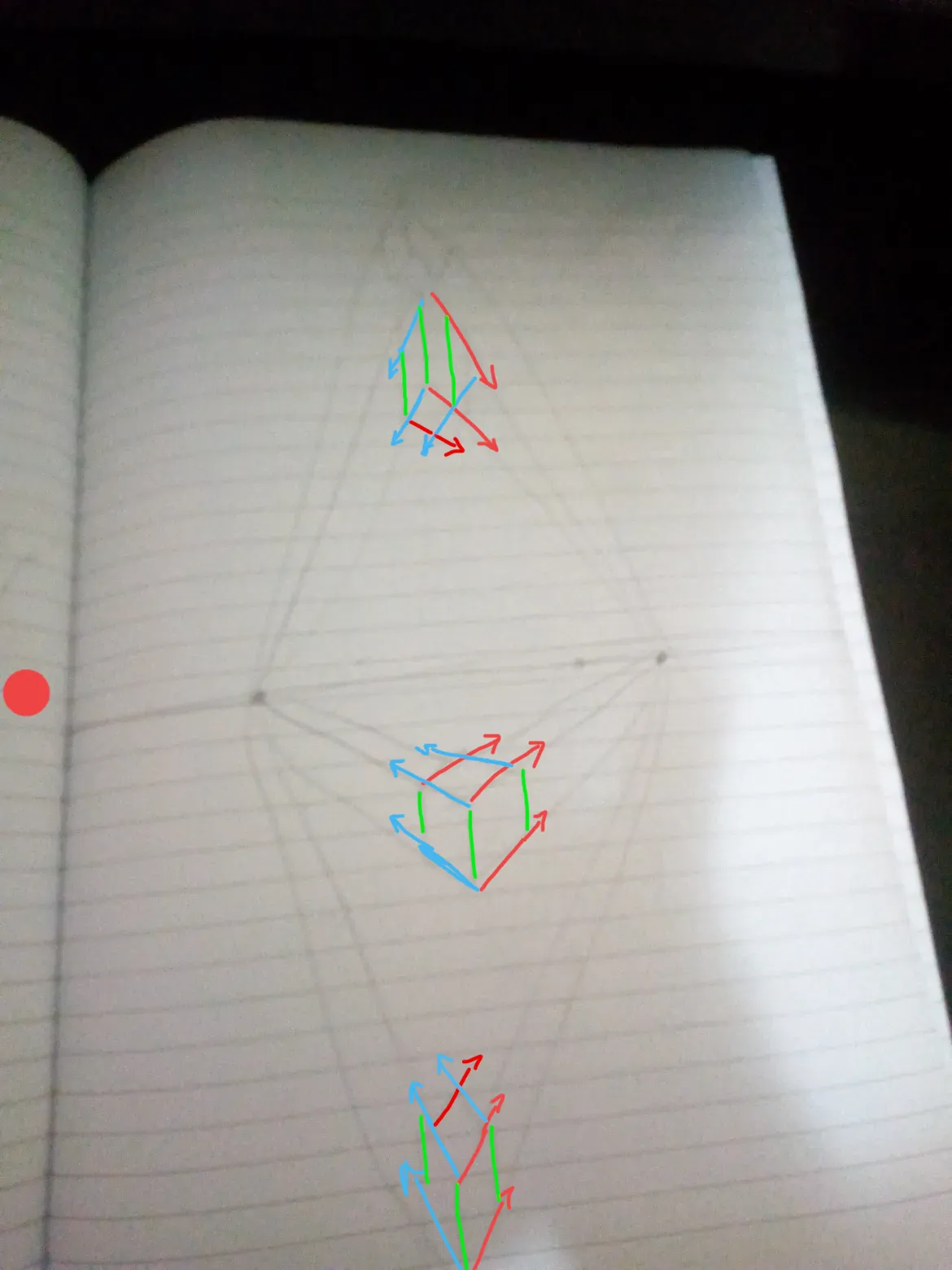
“Hello You did find the right vanishing point. You just fall for the brain wanting to display all sides. Here the left side is practically invisible since the side is nearly above at the vanishi...”
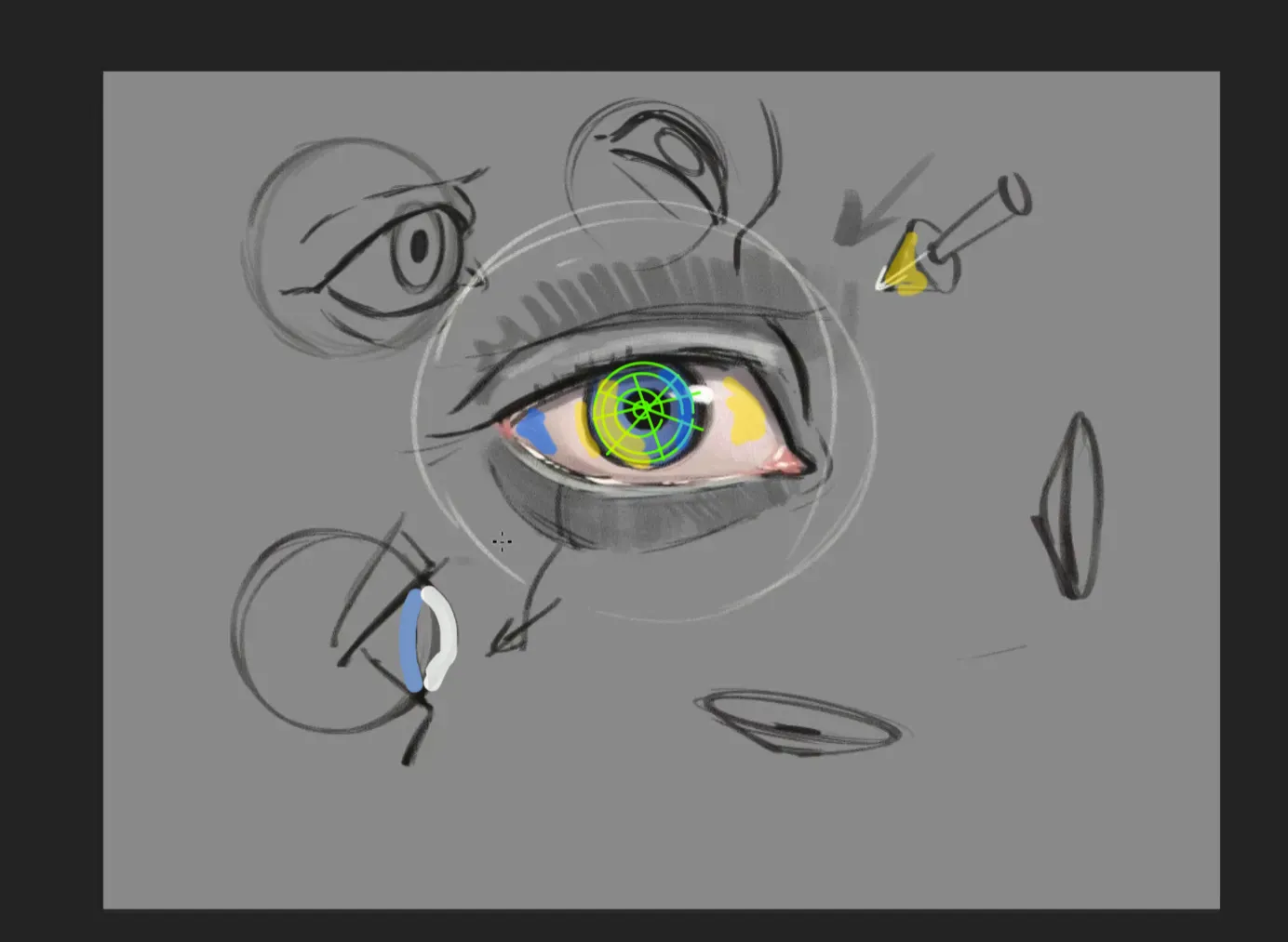
“Hello, I'm not an expert of the subject but what I understood is that the iris don't pop out, it's pop inward. BUT the transparent cornea pop outward. So the light is masked by the right border an...”
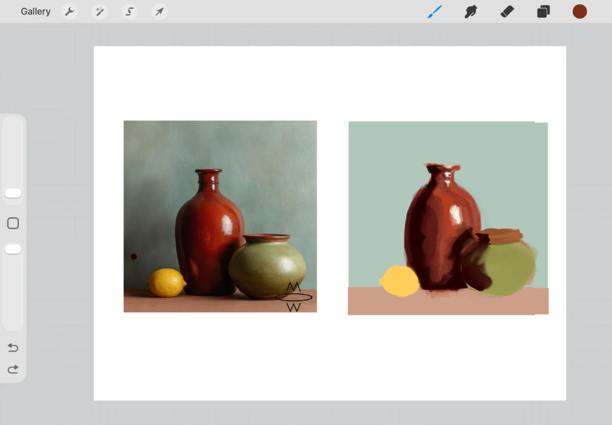
“I think you did well for a timed study. To make the colours pops I would: - add a bit more contrast in the dark. - think of overlapping forms and values. The goal of this kind of studies is t...”
“Why not :) I feel a bird is missing :p”
“Hello, Great painting ! From what I understood : you want to create an effect of light coming from behind and left. I would move the window to be clearly in the background for that to work. The...”
“I really like this drawing ! I would work on the value to focus more on the figure. PS: I assumed you wanted to only use yellow tone. If not, I would add a blue light coming from the window to ...”
“Hello. First I would say it is a really good drawing for a freehand one ! There is indeed a mistake with the verticals (in yellow) => It would be a 3PT perspective if they all converged to the sam...”
“Hello, cool design ! Small nitpick : the feets are a bit weird (to small and 2D ?). The main point for dynamisum is the symmetrical pose : you have to break it if you want it to be less robot. F...”
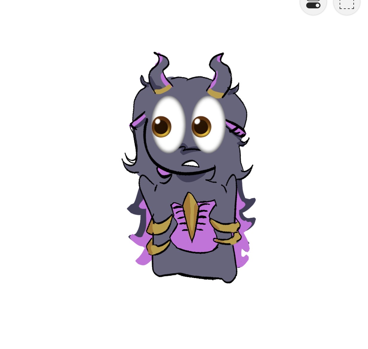
“Hello Really cool OC. I love the silhouette and vibe ! It's hard to say what to improve, I find the anatomy good (except maybe the waist is a bit small relatively to the leg/foot). But to real...”
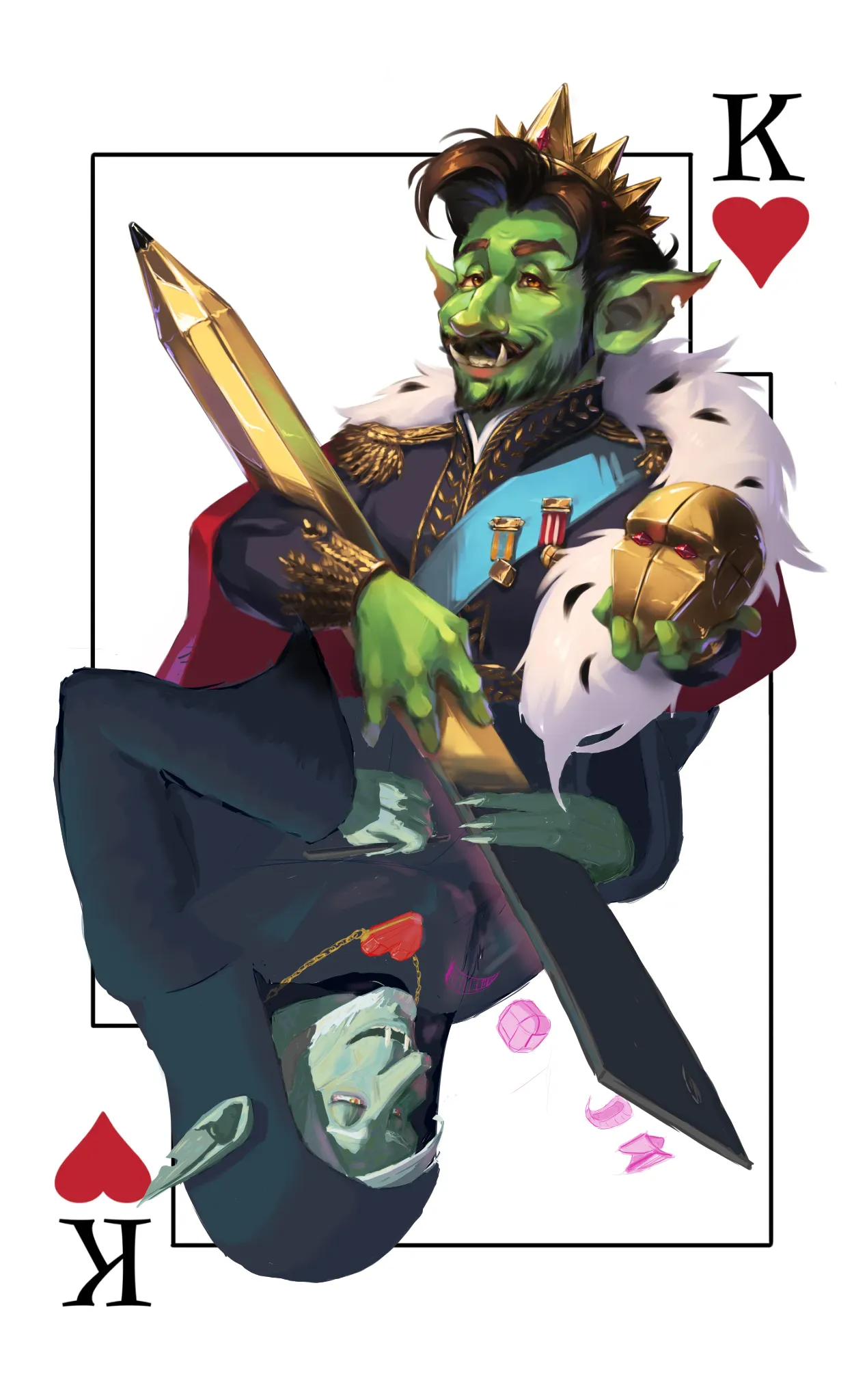
“Hello Really cool goblin ! I think the shadows are good (for a top light). I would put a bit more contrast and add a bit of highlight on top parts. What do you think of it ? PS: I push the con...”
“Hello :) The main point I found is you have to see the box of the extrusion before doing it and have it follow the same parallel than the hammer. That lead to some portion overlapping with the ex...”
“Hello , Scary drawing ! I don't know exactly what you mean by "the effect of terror by humans which affect a normal family." But to add in the terror, I would add more red shadow and do more con...”
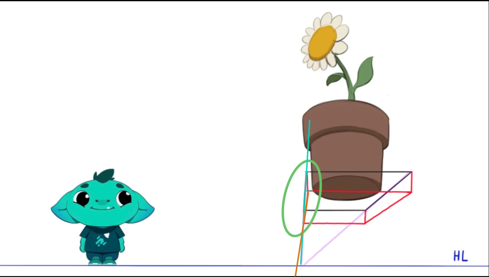
“Hello :) Indeed you still need to find parallel line that cross to find the horizon. Here the green lines cross at the HL, same for the cyan ones. The difficulty is that the horizon line is no...”
“Hello :) Cool Jedi ! Yeah the pose is a bit flat-rigid indeed. If the light-sabers are ignited there is probably danger, so no straight back pose. You could use a martial artist picture as referen...”
“Hello ! If you can spot 2 parallel lines (like the doorframe) they always cross at the Horizon line. You can also check for horizontal surface : - If you see them from above -> your eyes are o...”
“Hello, Really nice design ! I tried to do something with the shadows and highlights. What do you think ?”
“I find your drawing awazing ! I see what you mean with the nose, I would push it a bit down (same with the chin) in order to keep the general pose of the face. I would highlight a bit more the lig...”
“Great work ! I don't find much to say on rendering or anatomy. If I would nitpick, I would ask : Did you choose where the light is coming from ? I would give more depth by making that more clear...”
“Hello ! What a fun character :) That's a good start, I would shorten a bit the arm that are a bit big. I would also choose the tilt the head (since both the hat and the eyes are bended). If ...”
“Hello, First, cool character design ! Second I would focus more on the basic mannequin shapes before doing all the rendering, you could avoid some structural mistake that make the painting weird. ...”
“Really good drawing !! I find it hard to say something. I have an hesitation on the tail, It seems too on the side to be this tense and rigid. BUT drawing it more behind would hurt the silhouette...”
“Hello ! The pose seems more dynamic and fun this way indeed. Some feedbacks: I tried to place my feet like that, it hurts. I would change the pose slightly. Also I the arm in front is bigger and...”
“First, great drawing ! I'm still an amateur but I find option B more interesting: - More asymetrical => more energy, - The interesting parts (body + face + knife) are on a third line of the pic...”
“First thanks for the art tips you provide ! I think I have seen a lot of melee fighters amongst the mermaids so what about going ranged ? We could change the weapons from double swords to bow and h...”