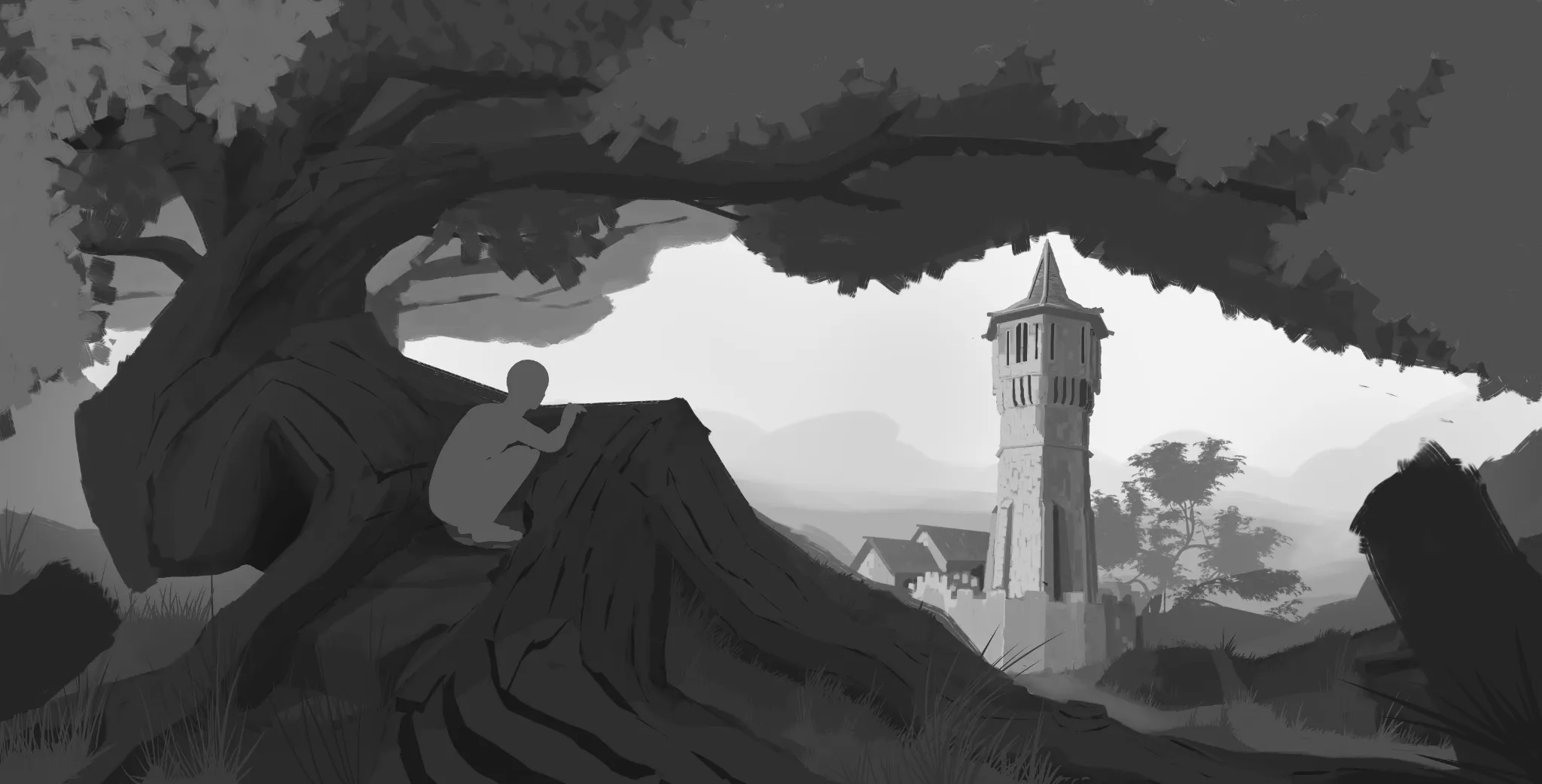
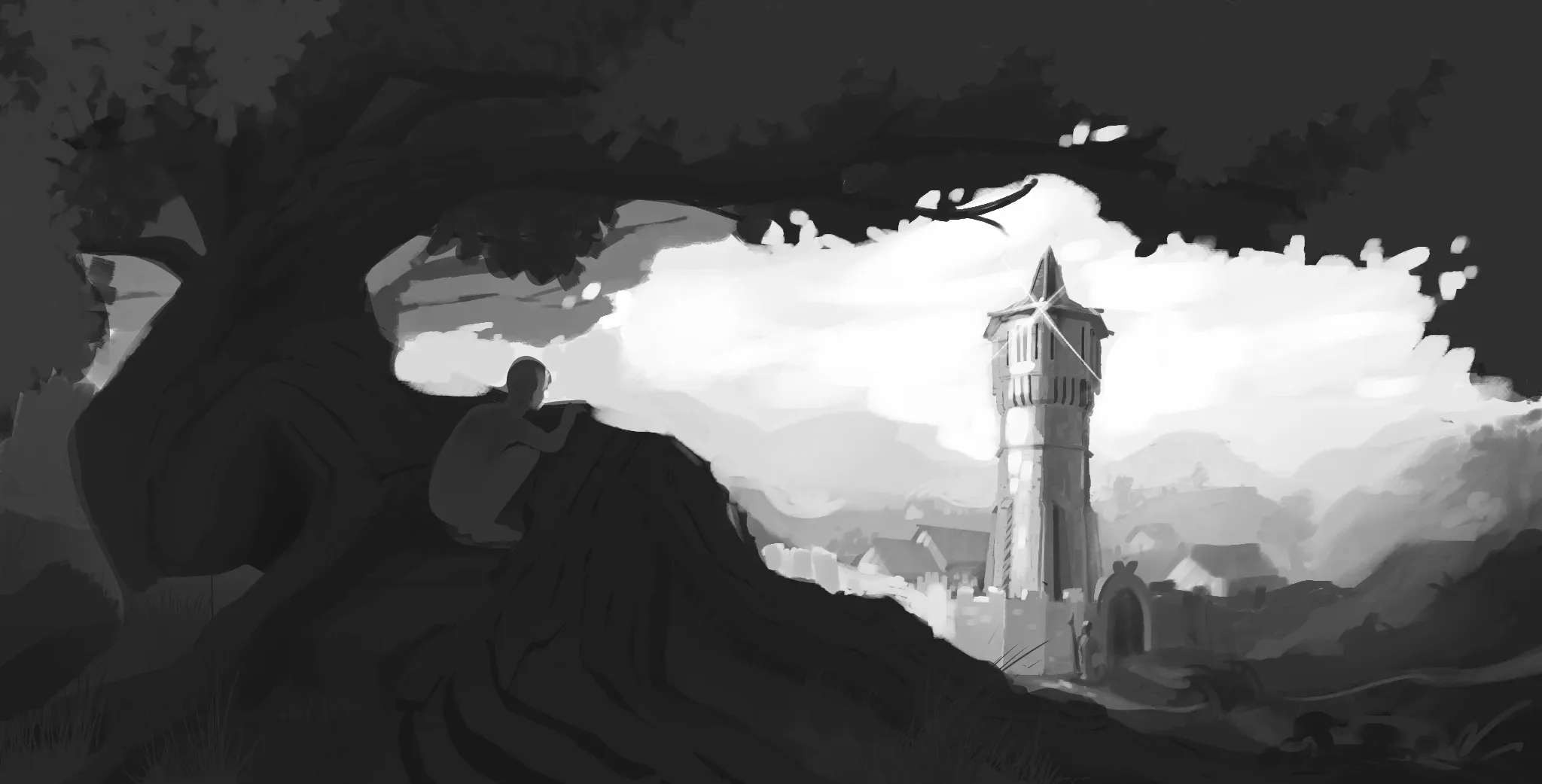
Hey there! Great job here! I really like the composition! :D I’d only make a few small adjustments. First, I’d move the tower a little farther to the right and make it slightly smaller so it feels more distant, also give the tower a bit more space to breath. You could also add a few more tree shapes in the background to create a greater sense of depth. I’d also add a small patch of light on the ground beside the tree to make the lighting feel a bit more interesting. On top of that, I’d lighten the background on the left side so the tree’s silhouette stands out more clearly. Finally, you could move the character slightly higher, so the silhouette of the head separates more from the tree’s silhouette, making it easier to read. I hope this helps!
Forgot to add this, but make the FG a bit darker, especially the top of the tree :))
You made the drawing look 100% better with just a few additions. Amazing! Did you change the area on the right to make it look like a river? Is it actually a river? I wanted to add a river there, but I didn’t know how. Now I think I can add one. Thank you! Also, you’ve given me so much advice and help since I first started using this platform, so thank you for that. But do you think I’ve actually improved at designing and drawing environments since my very first post here?
I’ve uploaded the final version so far, if you want to see it.
Hey there! Sorry for the late reply hehe. So glad the feedback helped! :D Regarding your last question, yeah! I can say you've improved. Just compared your first value painting you shared with this one you've done. There's a great improvement :D