
my dadgum image will not show
Anstriche (5)
Last year sins
Künstlernotiz:
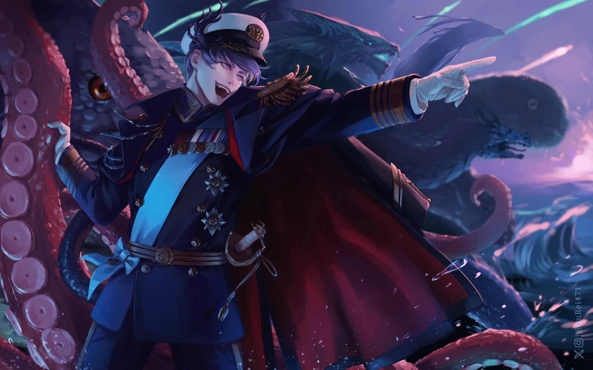
This is a painting I did last year. There are things that could be improved (e.g. his face) but what bothers me the most til this day is how flat his body looks like. Even if I move lines it is still flat. It doesn't help that uniforms in general tend to be very flat/boxy. Perhaps it is even composition issue. I thought I will upload it in hopes I could learn something for the future. Thank you!
Kommentare 6
part 2
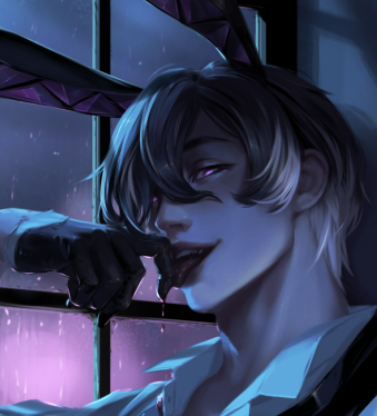
what I saw when looking at this r/limbus company
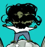
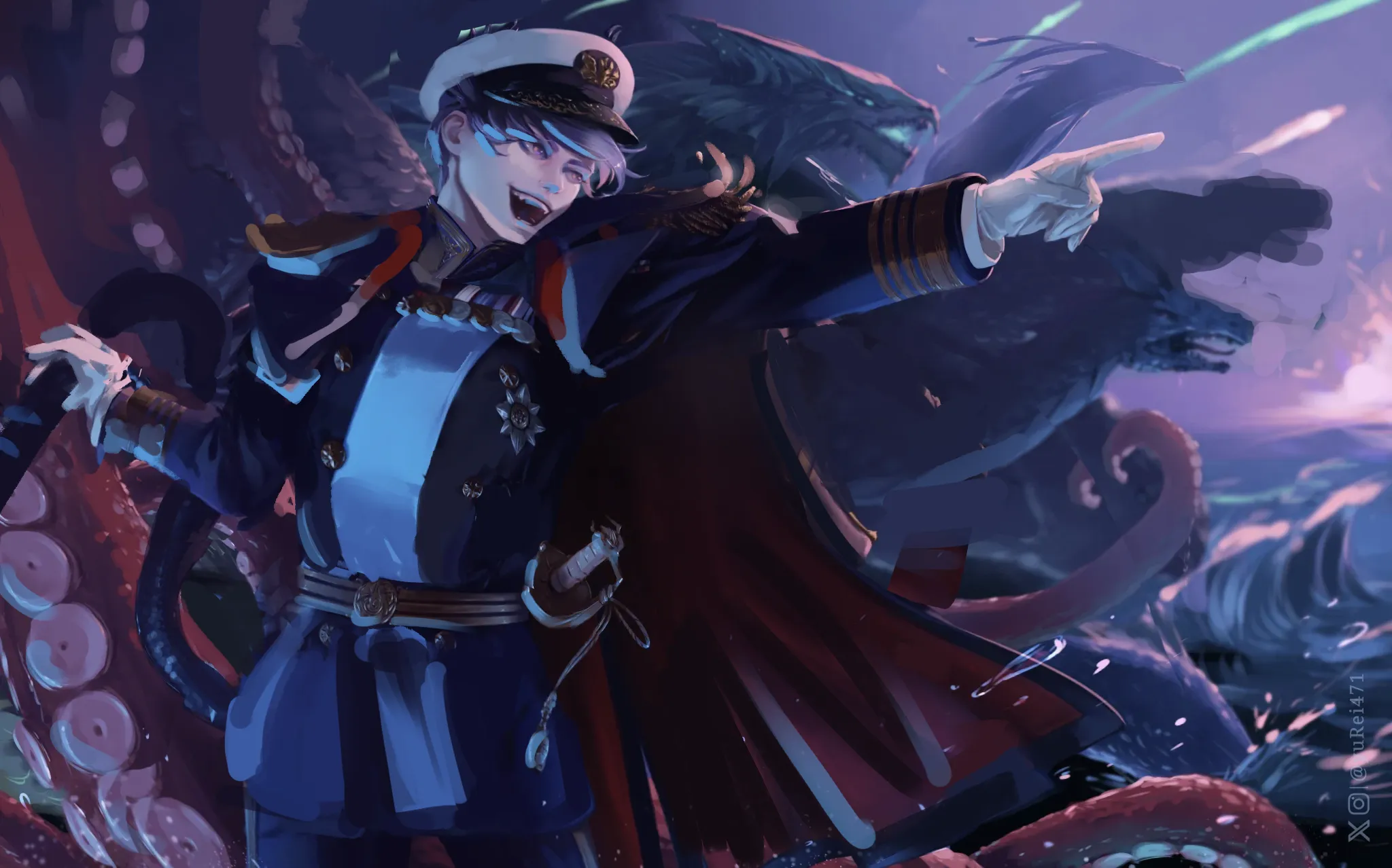
And regarding the pose... I also wanted to draw a simple base here to better show what I mean. What feels particularly off to me is the position of the head and how it connects to the body. The head was tilted a bit too much (at least for my taste), which made the upper torso feel a little awkward. I adjusted the tilt of the head and also made some changes to the overall pose, giving it a more pronounced "C" gesture to create a better sense of flow and avoid having the body feel completely straight and rigid. Hope this helps! :)
Omg, Fosco, my hero! 🧎♀️🧎♀️🧎♀️ Thank you for taking your time to fix this... thing 😭 I definitely need to work more on gestures >.< Also, for some reason I can't see values paintover 😭 - could you DM it to me perhaps if possible? Would be forever grateful.
The great Yurei! Amazing illustration! I've never dared to make illustrations this complex, haha. Really admirable. :) Despite what you mentioned... I can't help but talk about the values, lol. I'm sure it's something you've already noticed, but I think it's still worth mentioning. The character isn't fully separated from the creatures in the background because they share a very similar value range, so there isn't enough contrast between them. What I did was simply add a Soft Light layer to the background to reduce the contrast and make the background values slightly lighter. :) On the other hand, the character feels a little flat because of the lighting. The secondary light on the face flattens the form a bit because you're not leaving enough room for the shadows created by the main light source. So I darkened the side of the face and kept the rim light mostly along the jawline, assuming that the secondary light is coming from below. I also adjusted the lighting a little overall. I think it looks better this way. :)