Neu: Wechsle hier von Galerie zu Einzelansicht.
#4
Rang
47
Upvotes
27
Feedback
100%
Hilfreich
“I won't comment on anatomy but structural issues also can be the reason why rendering is not working. It is however something that can only be fixed with studying fundamentals/anatomy/fabric and takes...”
“While humans come in all forms and sizes, there are few proportions to consider, especially when drawing idealized comic figures. The distance between the eyes is usually about eye width (see blue...”
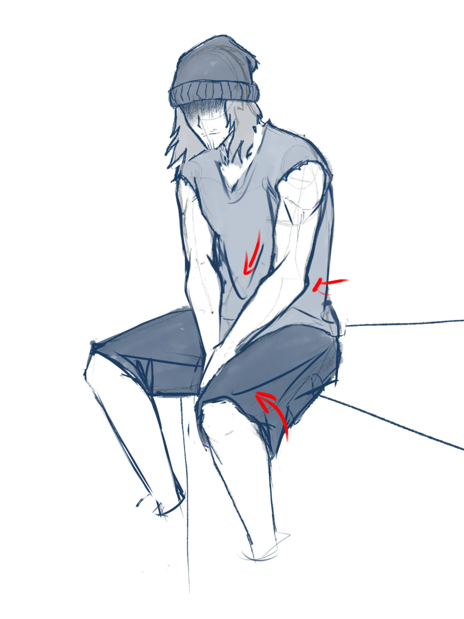
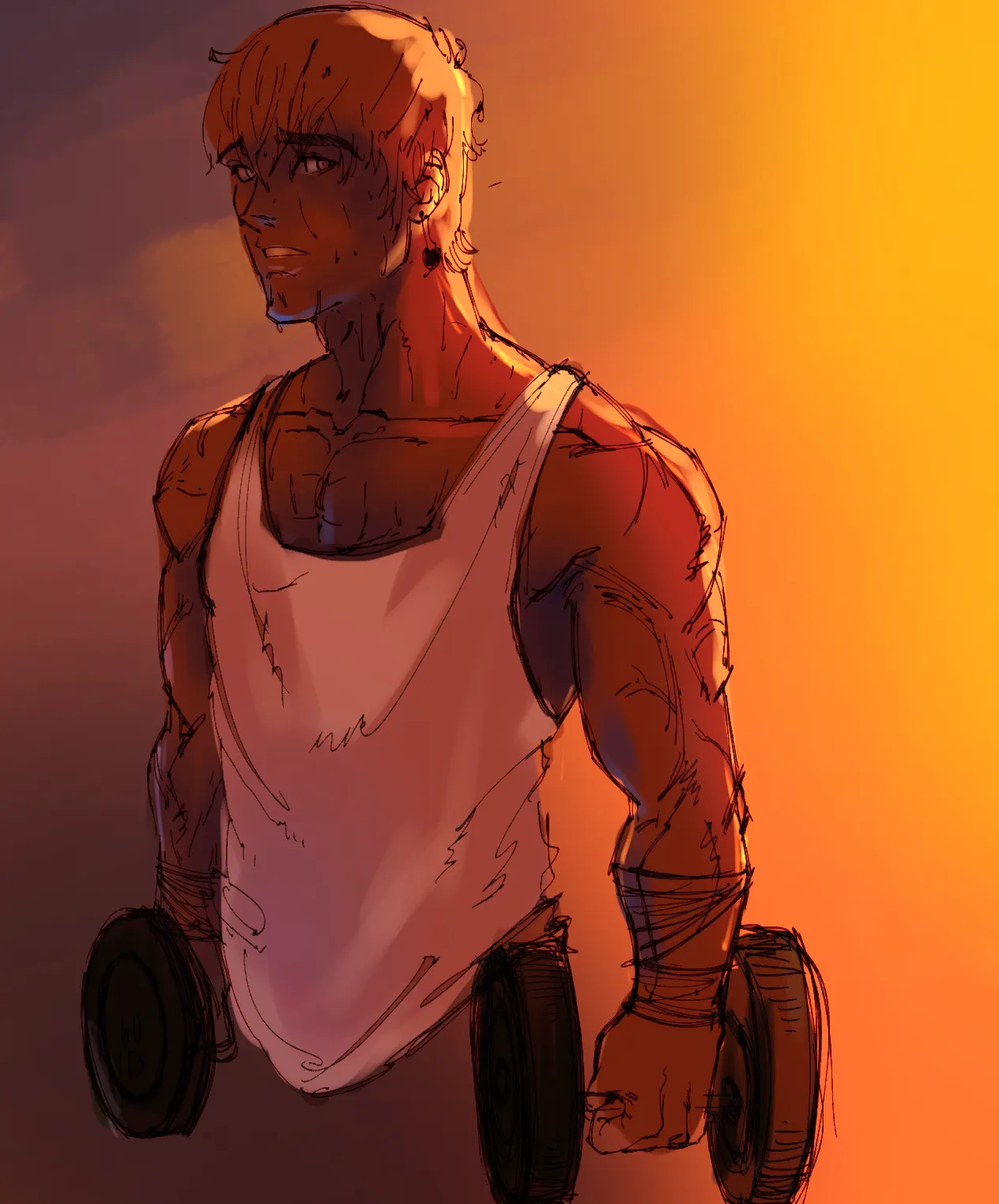
“I think the biggest issue is with his upper body. His rib cage is cut off and is flat (see red markings) that is why his arm looks so disproportional compared to the body. Try to use construction meth...”
“I think the colors on the figure itself are pretty nice. I really like how the yellow changes to orange as well as reflected light on the arms. The shading of the main figure suggests that the sun ...”
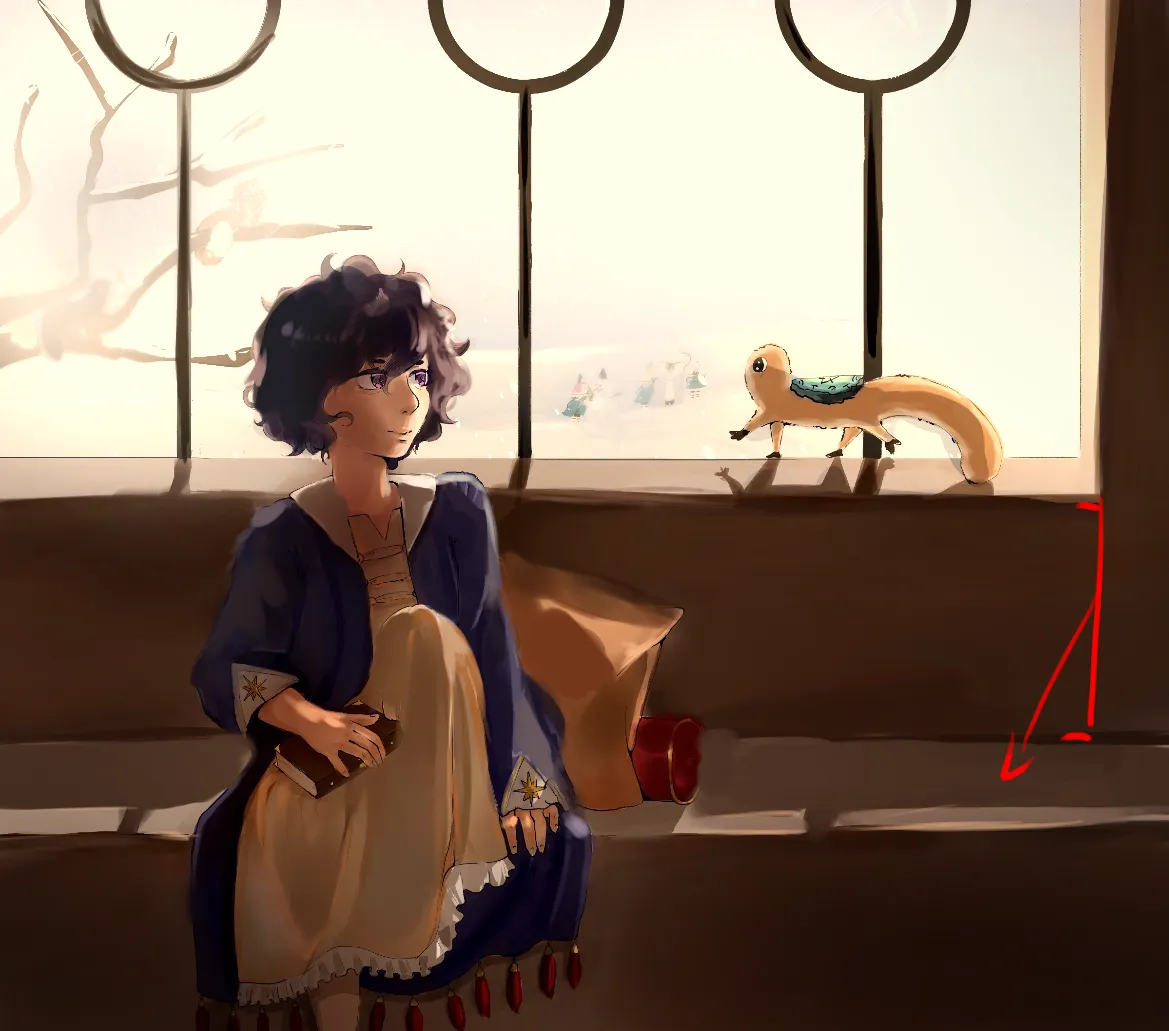
“I think this is more a question of graphic design but from composition pov you could apply a trick often used in comics where elements (objects, shadows) and (motion) lines point toward the main subje...”
“I think the composition is actually more than fine. I would suggest try out dramatic lighting like in old (Disney) cartoons.”
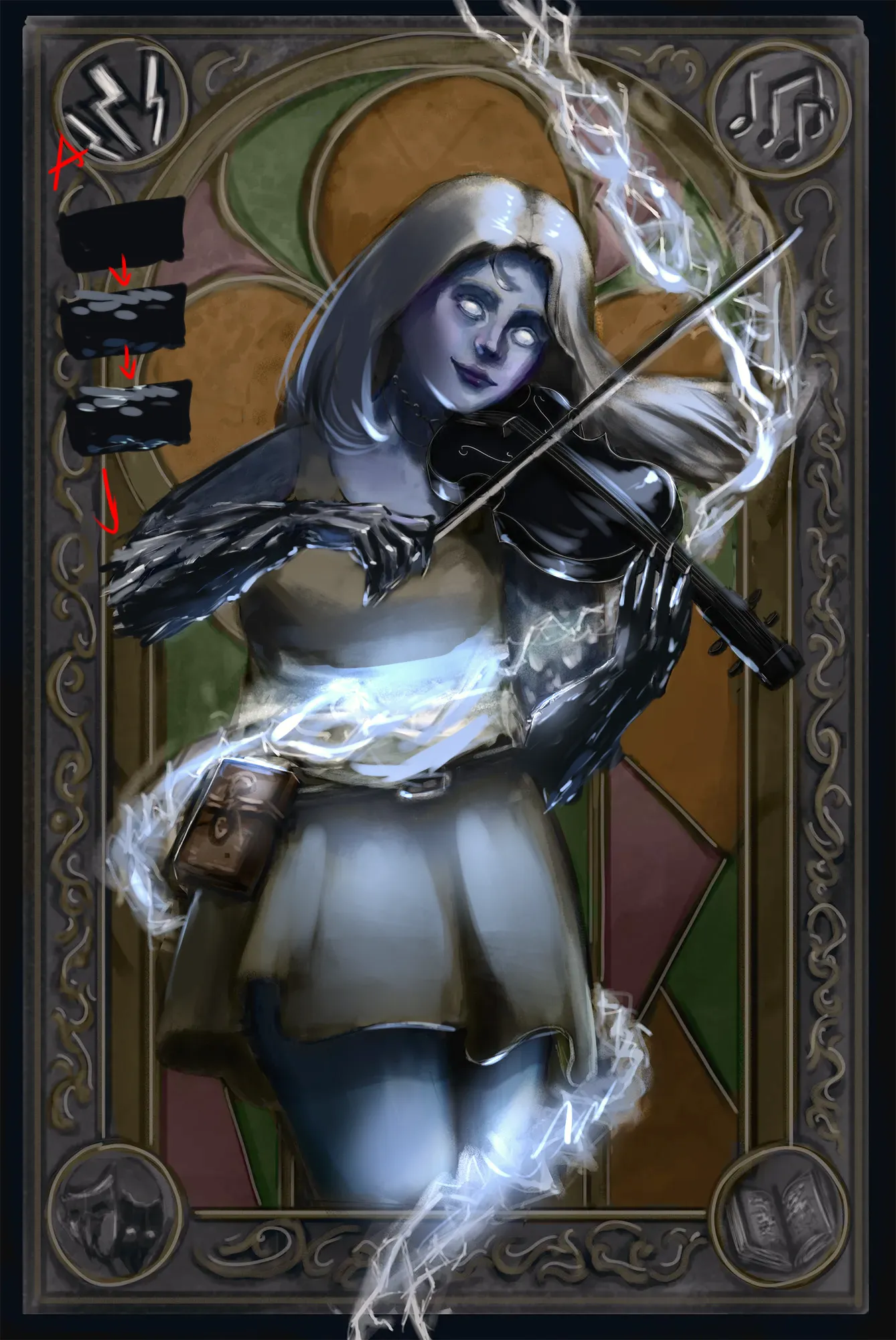
“1. Try to use hard round brush on low opacity for shading. Look up manual blending (use color 1, paint over it with color 2, colorpick result between them, use that color, rinse and repeat, see A). ...”
“I think this already has interesting lighting that can be expanded upon. 1. Unless you are going for white background, I would suggest to always start with mapping rough colors for the background. ...”
“1. If you struggle with colors I would suggest to try to render in grayscale and then use color layers with blending modes and/or gradient map (there are tutorials on YT for it). Values are way more i...”
“I think you got expressions pretty good but definitely should work on fundamentals (basic shapes/anatomy, Artwod roadmap is great for it). 1. More confident lines would definitely improve overall l...”
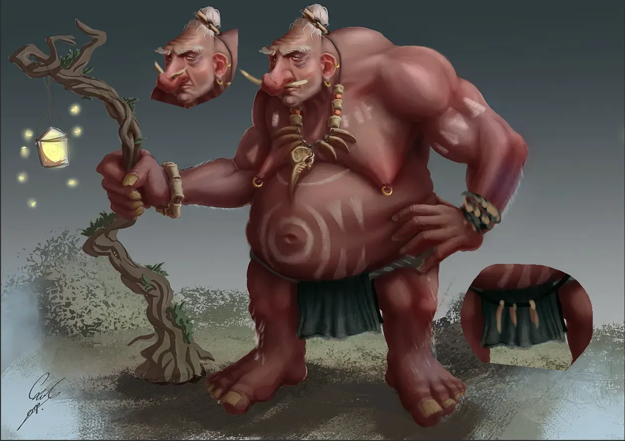
“Badass granny! 1. I think giving her apron with pockets for potions would empathize her being a granny and healer even more. She already kind of cool design for it? Just extend it with few pockets....”
“I think it already looks pretty good. Things that are noticeable and could be looked at: 1. Her ears seem to have different size and tilted even though the head is not. I would check ear anatomy a...”
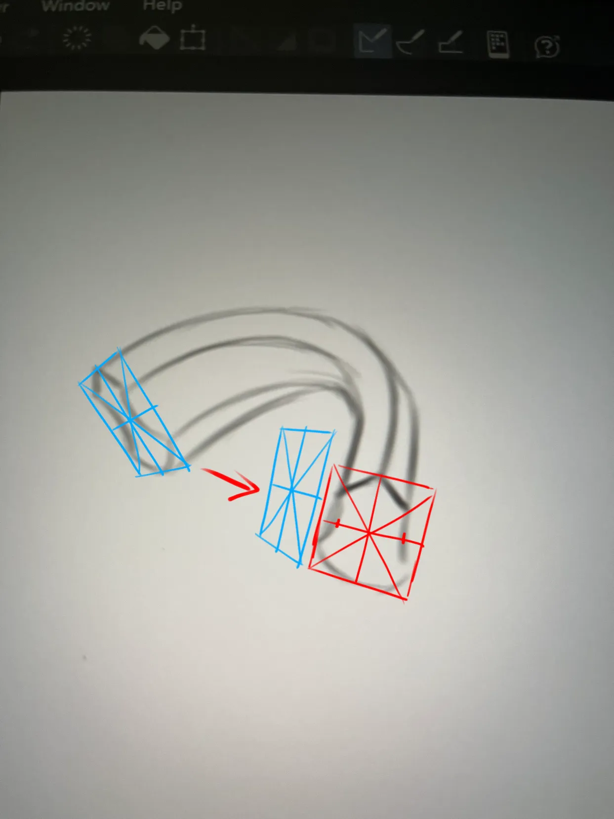
“1. For perspective break down the body into basic shapes (boxes, cylinders). Draw those shapes in perspective before adding details like clothes. The intro road of Artwod focuses on this very subject....”
“Hi. I am using Ibis Paint as well. 1. One issue is values. You have the same value for everything that is why it looks so flat. 2. It heavily depends on style and what you are comfortable with b...”
“I think working with stronger values and reducing number of colors could improve this drawing greatly and push it more towards stylized one with a single focus. Considering working more with silhoue...”
“I won't comment on anatomy since this post is in the rendering section but anatomy issues are also one of the reasons why rendering is suffering (try to flip canvas to chrck anatomy). Considering f...”
“1. The reason why it looks flat is because the underlying construction either wasn't done or was ignored later. Look up Loomis head for base construction. Roughly, the head is a sphere/cylinder, so yo...”
“Jesters are fun! I really like the ragged cape, if it moves - even better! (If it indeed does, adding extra drawing conveying the idea would be great as design should speak for itself). For design:...”
“The shapes and lineart are really nice! For colors: I think the issue is that you picked darker value of the same color when painting shadows. Shadows however are often not just grey, depending ...”
“This is a very cute drawing of Chopper. The pose fits him well. For hat: Try to think in basic shapes. If you look at official art, his hat seems to have a shape of a slightly squished and elonga...”
“I like her cheerful expression and the pose. Instantly gives good vibes. Anatomy: 1. Her shoulders/head face left, torso faces right, legs face left again. Shoulders should be moving with torso, o...”
“For values keep in mind: 1. The closer the surface is to the source of light the brighter it becomes while closest shadows become darker. While there is highlight in her forehead, her hair is nearly ...”