Environment Art Mistakes Artists Make and How to Fix Them
Common Environment Art Mistakes Artists Should Fix
You’ve spent days modeling every brick, texturing every piece of moss, and scattering props across your digital scene. Yet, when you look at the final render, it doesn’t look like a living, breathing world. It feels flat, artificial, or like a video game level from 2005 where everything is just a bit off
.Creating a compelling environment is a massive balancing act. It requires you to be an architect, a director, and a storyteller all at once.
The problem usually isn't your technical skill or your software knowledge. Instead, it comes down to foundational design traps that break immersion before the viewer even notices your textures. Let’s look at the most common environment art mistakes and how you can fix them to build worlds that feel truly alive.
Before we begin: The hardest part of environment design is seeing the forest through the trees. When you spend 40 hours on a single scene, your eyes trick you. Getting professional eyes on your layout is the ultimate shortcut. Check out Artwod’s centralized art feedback platform to get your perspective, layout, and lighting critiqued by industry veterans before you waste days rendering the wrong things.
Why Environment Art Feels Flat or Empty
The primary reason environment art often feels flat or empty is a lack of clear separation between your spatial planes. Beginners often place all their assets along a single parallel distance from the camera, creating a shallow "stage curtain" effect.
Real spaces have depth layers that overlap. If a viewer can see straight to the back of your wall without any objects breaking the sightline, the scene loses its scale and grandeur.
How to fix it:Force depth into your camera view by systematically organizing your shot into three distinct blocks:
Foreground:
Midground: This is your stage. Place your primary structures, assets, and action here.
Background: Use distant mountains, skylines, or massive architecture to provide an epic sense of scale.
Overlapping the silhouettes of these planes is the secret to instantly creating 3D depth on a 2D screen. If you're struggling with this step, check out our Environment road!
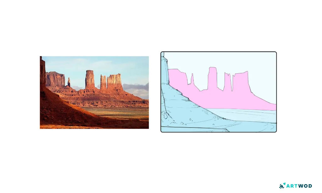
an example of clear division in foreground background and midground, digital 2d drawing
Perspective Errors That Break Realism
Nothing destroys a viewer's immersion faster than perspective errors that break realism. Even in stylized, sci-fi, or fantasy environments, the human brain is highly sensitive to gravity, architectural alignment, and spatial logic.
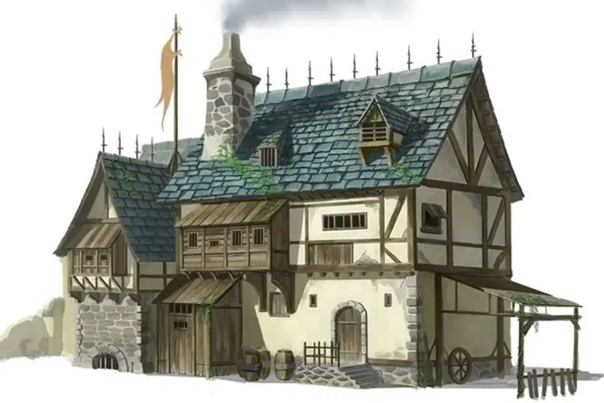
The most common perspective mistake in environment design is failing to align all assets to a unified grid and horizon line. When you kitbash or place props manually, it is incredibly easy to accidentally warp their vanishing points. If a table, crate, or building is leaning slightly to a different vanishing point than the room it sits in, the object will look like it’s floating, sliding, or completely disconnected from the world.
How to fix it:Always establish your horizon line and main vanishing points before you build or place anything. Every door, asset, and stone tile must respect that mathematical truth to feel grounded in reality.
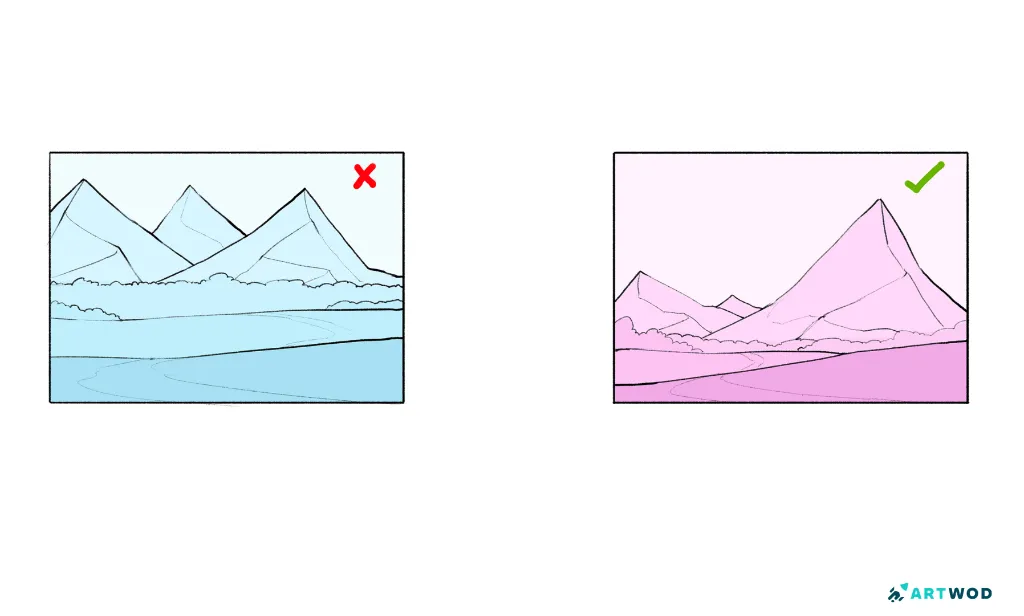
En example on how to structure your composition - don't use the same size for everything (ex.1), use different sizes and overlaps (ex.2) to make environment art look more organic
Muddy Composition: Poor Division of Values and Focal Points
A beautiful layout can be completely ruined by poor lighting and value problems in scenes. A classic mistake is making the lighting too uniform, which washes out the forms, hides your depth planes, and destroys your composition.
If you turn your environment completely grayscale and it looks like a muddy, gray soup, your values are broken. You need a clear division of light, mid-tone, and dark to structure your foreground, midground, and background values effectively.
Mastering Visual Hierarchy (and Knowing When to Break It)Where is the viewer supposed to look? If your lighting is scattered everywhere, the eye gets lost.
The Standard Rule:
Breaking the Rules: Once you understand the basic FG/MG/BG division, the secret to creating truly unforgettable, cinematic compositions is intentionally flipping these value blocks on their head. Try throwing your foreground into blinding light and silhouetting your midground focal point against it. Or, wrap your background in deep, low-value shadows to make a brightly lit midground object punch forward.
By strategically reversing your value planes, you can instantly move obvious focal points anywhere you want in the frame, creating high-level visual tension that forces the viewer to look exactly where you want them to.

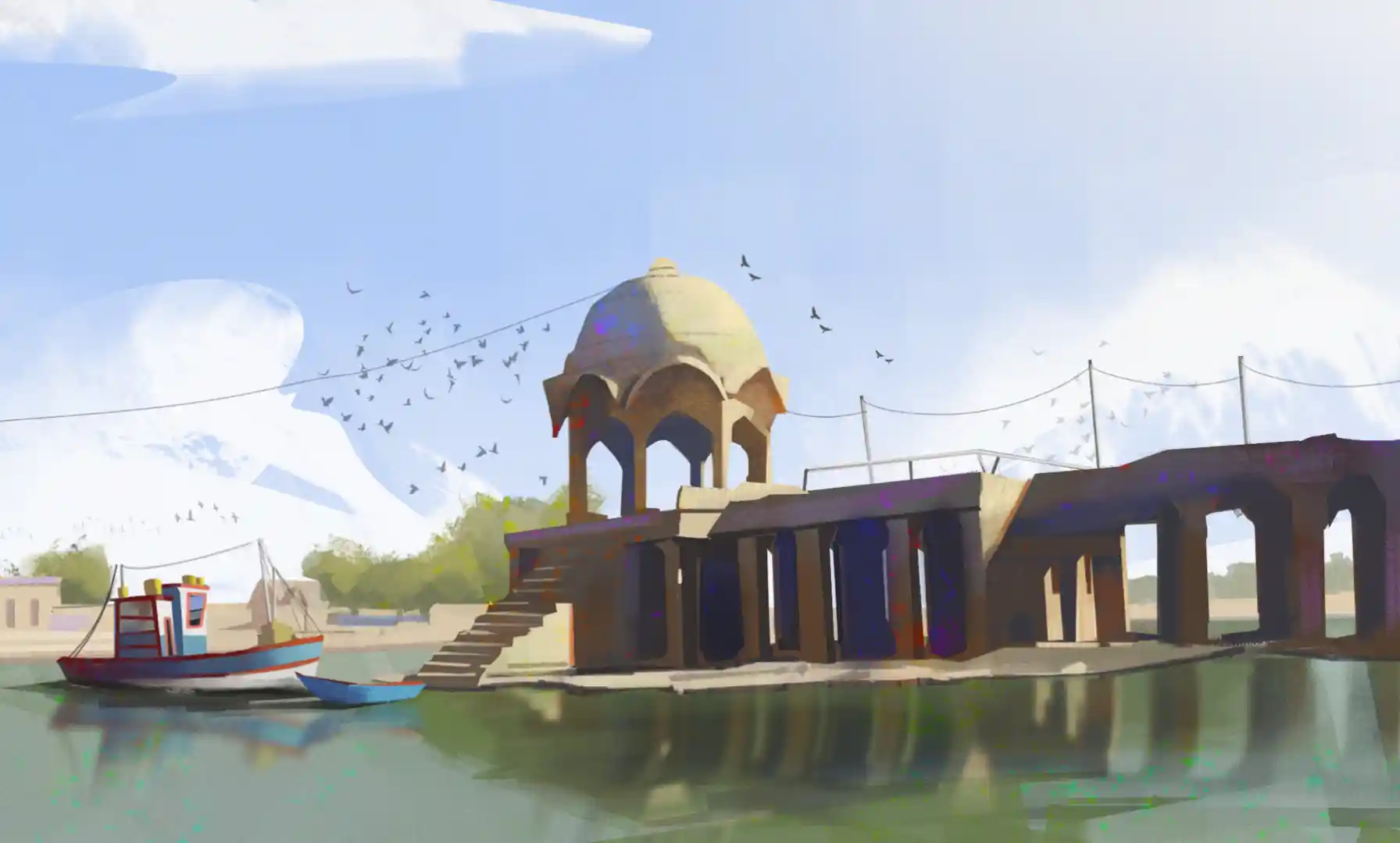
a 2d digital sketch by Fosco, celtic stones, river and giant swords in the background, winter 2d painting
The Detail Vomit: Over-Detailing Without Structure
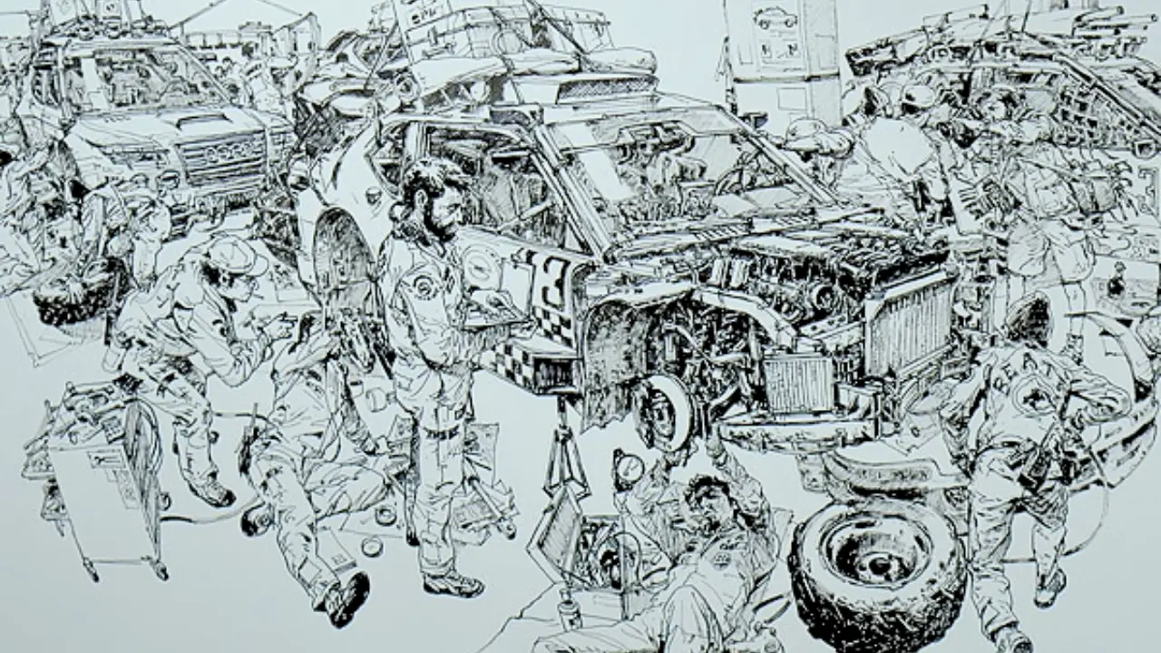
Many artists try to fix a boring environment by throwing more "stuff" at it. They add cracks to every stone, debris on every tile, and wires on every wall. This leads to over-detailing without structure
, which completely blinds the viewer.When every square inch of your environment screams for attention, nothing stands out. Your eye needs a place to rest.
The 70/30 Rule of CompositionTo fix visual noise, apply the 70/30 rule.
70% of your scene should consist of clean, simple, resting areas (large shapes, smooth walls, negative space).
30% of your scene should contain high-density detail (greebles, damage, complex props).
This contrast naturally pushes the viewer's eye away from the noise and straight toward your structured focal points.
You can watch infinite tutorials on lighting and composition, but improving environments through critique is the fastest way to take your portfolio to a professional standard. When you work on a map or a scene for weeks, you become completely blind to your own scale, value, and perspective errors.
Don't wait until you post your project on ArtStation to find out your composition is cluttered. Get professional, directional environment art feedback from the industry mentors at Artwod. Having an expert analyze your focal points and draw over your lighting setups will completely transform how you build digital worlds.
Related Posts