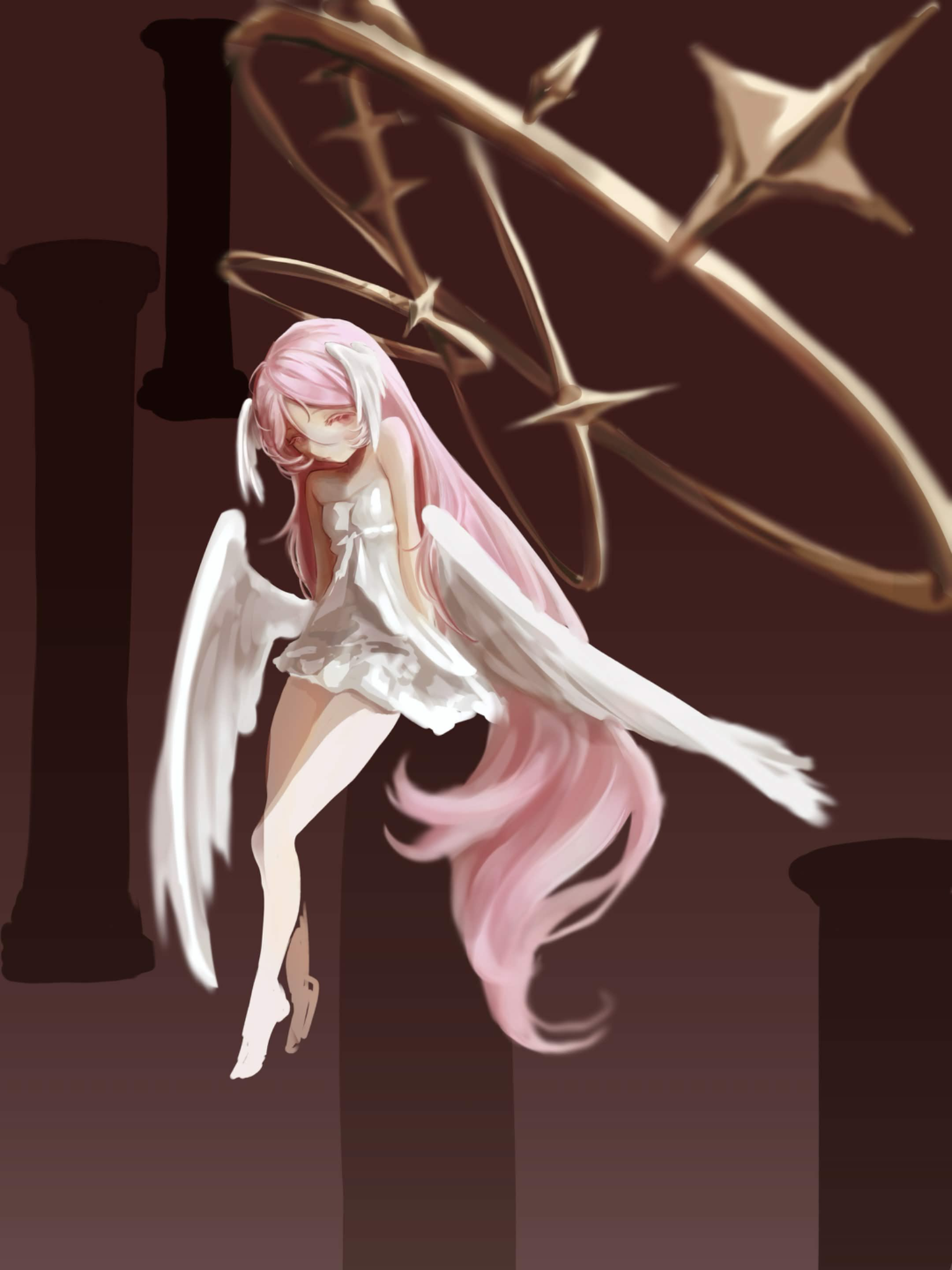
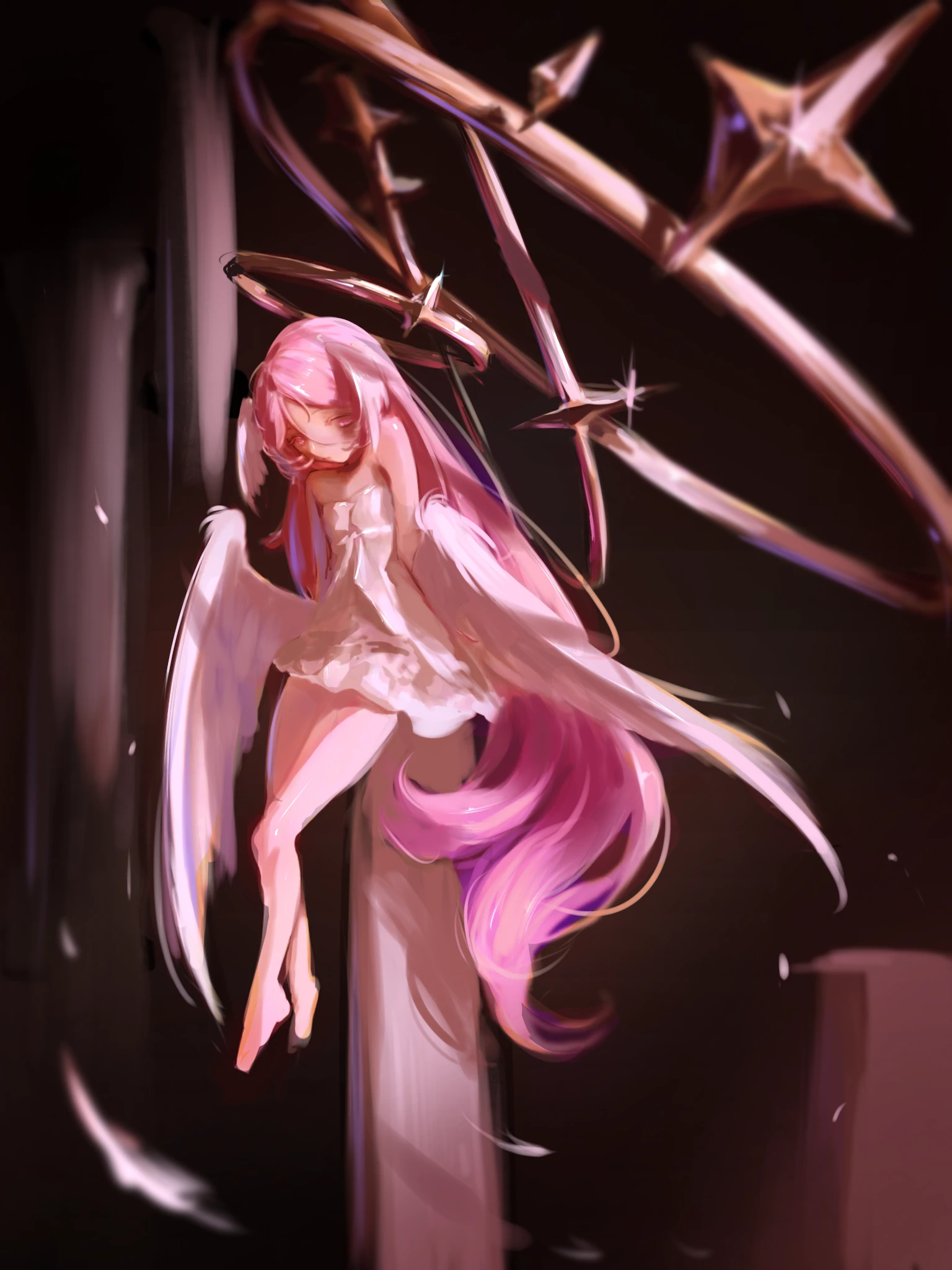
Hi! Really cute drawing, love the idea! The form and composition are pretty nice, too. What can be fixed: - everything needs to be in similar tone - BG needs to be less saturated and either darker or much lighter than the main subject - don't use white for coloring/shading, save it for finishing touches/highlights. Same for shadows - don't just use darker shader of the same color - use different saturation and hue as well - don't just blurr everything around the character. Whatever is on the same level/plane as she needs to have similar focus - shadows from rings are missing - metal should be reflecting environment, including the main figure - add more detail, saturation and contrast to the main figure This is just a suggestion. Hope it helps!

holy.. TYSM!! i really struggles with colors haha this’ll really be helpful for me
Respondendo a @lin
Np! Good luck!