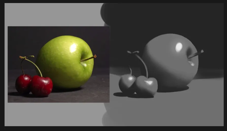
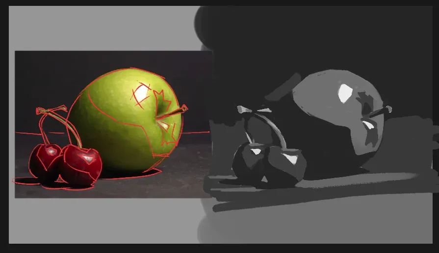

I’d either make your middle value a bit brighter, include more of the apple in the lightest value, or add a fourth value. As it is, the apple doesn’t feel three dimensional because it doesn’t have enough contrast between the light and the dark now, and the lights are a lot lighter in the photo. I know my paintover isn’t great because it isn’t really three values anymore, but my point is to show how much three dimensional it feels when the lights on the apple are lighter. But overall, I think you did a good job splitting it into three values and simplifying it. (It’s also challenging cause the lights of the cherries are so much darker than the lights of the apple.) Good work.
Pintar (2)
Apple & Cherries 3 Value study
Notas do artista:
I would like to understand any extra ways I can push this 3 value study further without having to add an additional value. I would also like to know if my study had any weaknesses I hadn't noticed. Did I forget to include anything?
Comenta 2

Hi, here is my version for your still life. Since you are learning 3 values, my main advice would be Squeeze your eyes, look for shadow shapes, decide what part of a gradient goes to which value and will it produce most interesting shape. No gradients, no transitions. 3 values is a graphic read of an abstract set of masses of light and shadow, where borders of objects - their lines doesn't matter that much or at all. Hope it gives ypou some ideas, keep up the good work, and let me know if anything needs further clarification :)
thank you,