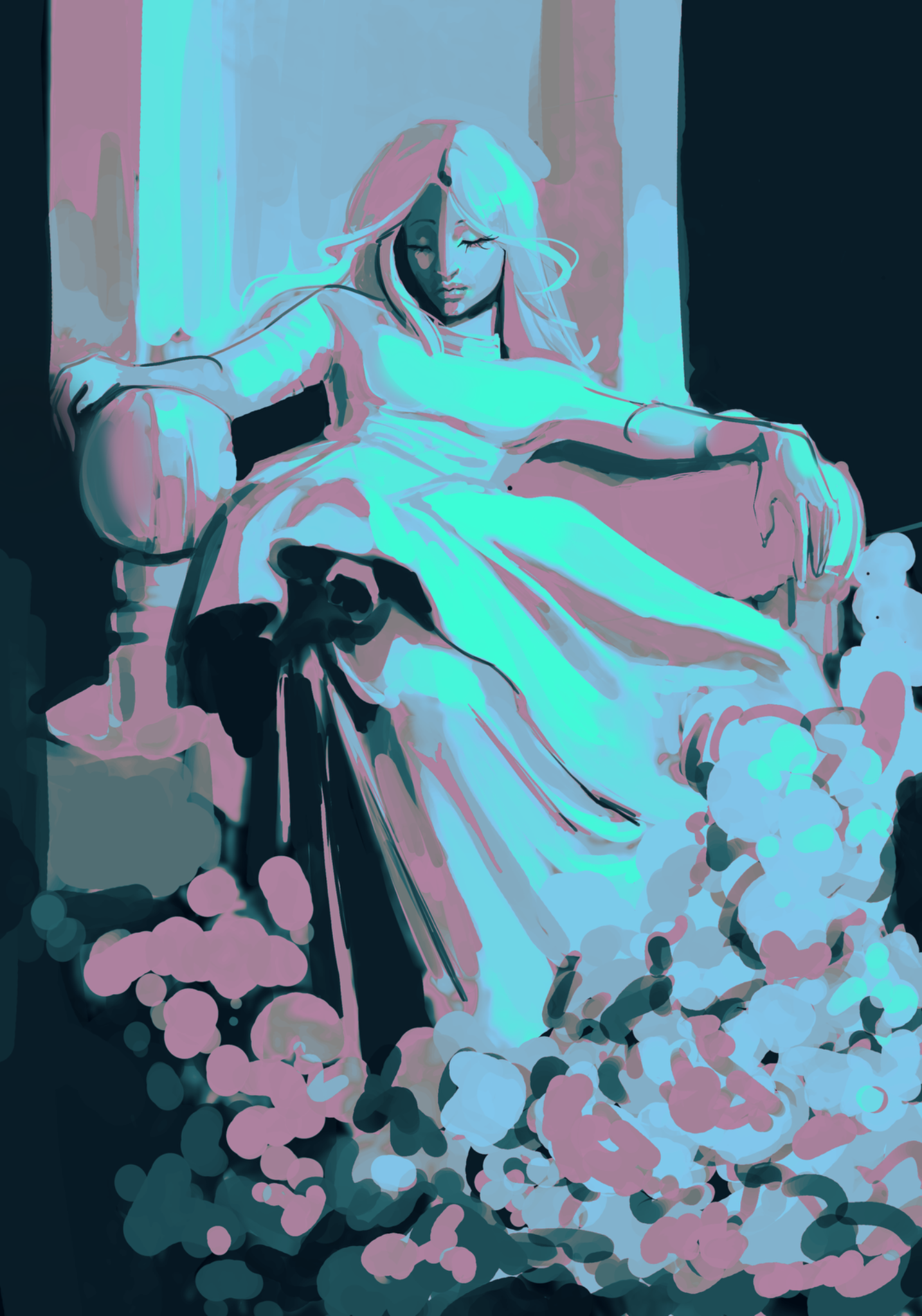
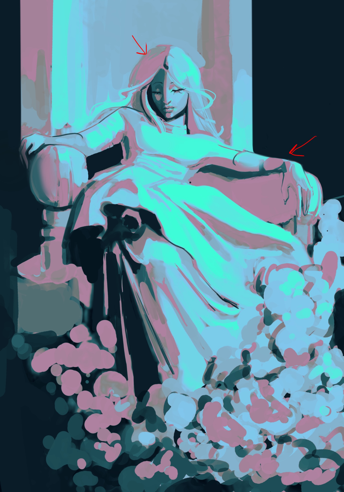

One minor issue is the hair on the left side feels a bit too wide/far from the head. Like the head doesn’t quite make sense under the hair. You’ve done a great job with the lighting, colors, and overall sense of scene and style. It’s very pretty. At this point, I’d consider whether you’d view it as complete for what you’re going for, or if you want to push it to be a more polished, finished illustration. If so, I think your next main concern would be edges. A lot could be cleaned up to get it to a more “finished” point. Not all edges are equally important in making clean, especially with a more painterly style. But some are more important in clarity and making it feel intentional. For instance, I cleaned it up some on the right arm. Edges of forms like that can be important, especially if it helps clarity. You can also make things that people know are straight straighter (e.g. a throne). They don’t have to be perfectly straight or clean, but if it’s something people know should look a certain way and it’s more skewampus, it will look more like a mistake than something like hair or a shadow on clothing that could look a lot of different ways. Basically, be thoughtful in how your brushstrokes can help or break the illusion of form. Anyway, I’m just straining at a gnat. It looks great. I don’t think you need to change this artwork anymore if you don’t want to.
Pintar (1)
Statue study
Notas do artista:
My best work so far, but my problem is I don’t know how to improve from here. Need someone else to show me what’s wrong/how to elevate this piece