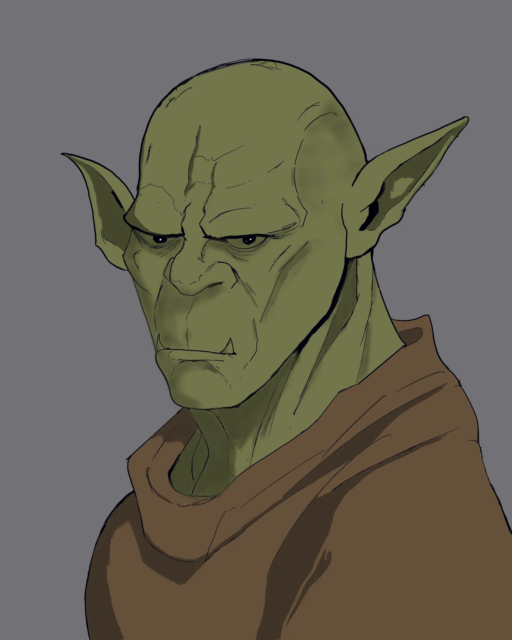
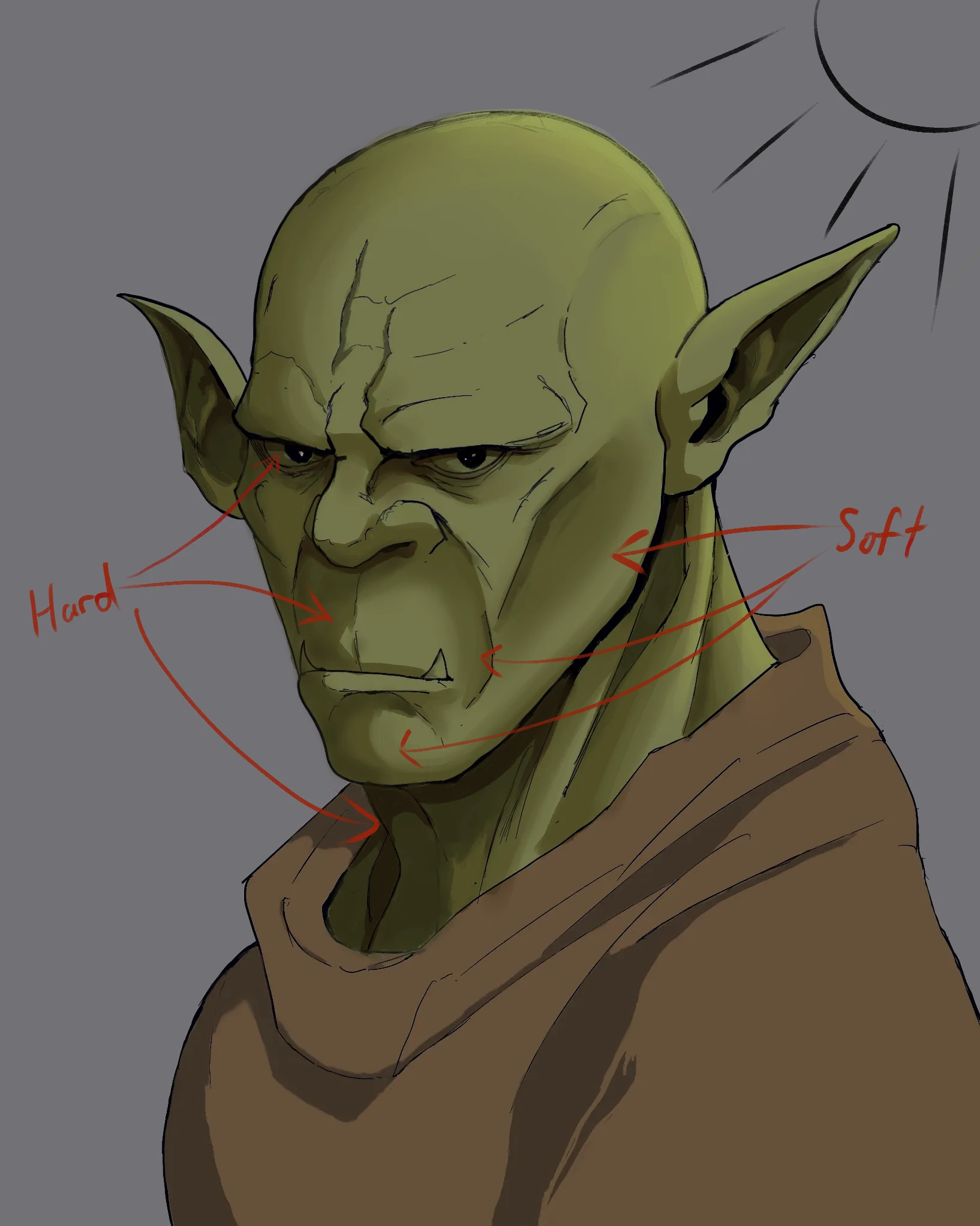

Hello! I did my best to help out with the eyes and shading. Below is a breakdown of what I did and some tips I have to help you out. Starting with the eyes, the first thing I did was adjust the right eye (our left), because I noticed that the brow ridge for it was curving down, where the leading eye's brow had an upward curve. I also nudged the right eye's pupil over to have both eyes looking in the same direction. To help with the form of the eyes, remember that the eyeballs are just spheres (forgive me if that is insultingly obvious), with the eyelids wrapping around the eye. To that point, on the right eye, I made the curves on the far side wrap tighter around the eye. These sharper curves help to sell the 3-dimensionality of the eyeball a bit more. For the leading eye, I added a tear duct for anatomical purposes, but also to once again help with the form of the eye. A general tip: when you're sketching, flip your canvas around. This makes it so much easier to spot errors in your work. Your eyes get used to seeing the image one way, so flipping the canvas forces you to see the drawing how it really is, not how it exists in your mind. By doing this, I was able to see some other errors with the shape of the head and made some adjustments to the cranium and the eyes. For your shading, I have two pieces of advice: saturated shadows, and edges. For shading, try to avoid using desaturated colors (especially gray) unless you're intentionally trying to make a washed out image (that is a valid stylistic and moody choice). For my shading of your orc, I created a multiply layer, set it to roughly 60-70% opacity, and used a bit of a yellow-orange color that was roughly in the middle of the color picker (so roughly medium in brightness and medium in saturation). The reason I choice orange-yellow is because the orc's red blood (I assume he bleeds red) would add a bit of color to his green skin. Normally I'd shade human skin with red, but given his skin tone, I went in the middle between red and green. Of course, the color can change depending on the lightning and the mood. The important thing is to use a color with at least a bit of saturation. As for edges, your original painting had almost exclusively soft edges. You want a mix of hard and soft edges for more realistic rendering. The hard edges would be from cast shadows. For instance, a shadow made by the nose, by the jaw, and by the brow ridge, which I've marked. Soft edges are for form shadows--shadows which bend around a form because the light source can't hit that form uniformly. The cheek bones, the cranium, the chin, and the jaw are places where you'll typically find soft edge shadows. If all you have are soft edges, your image will look muddy, and the forms won't stand out as much because they lack striking cast shadows. I hope this was helpful! Let me know if you have any questions or if I can explain anything better.

This critique deserves an award. I am so appreciative of the time you took looking at this - I’ve learned several things. Thank you so much.
Respondendo a @alexander21554858
Haha! Glad to hear! :> Hope to see more from ya.