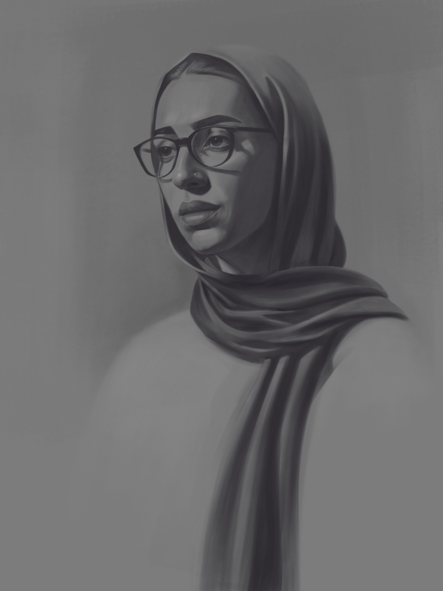
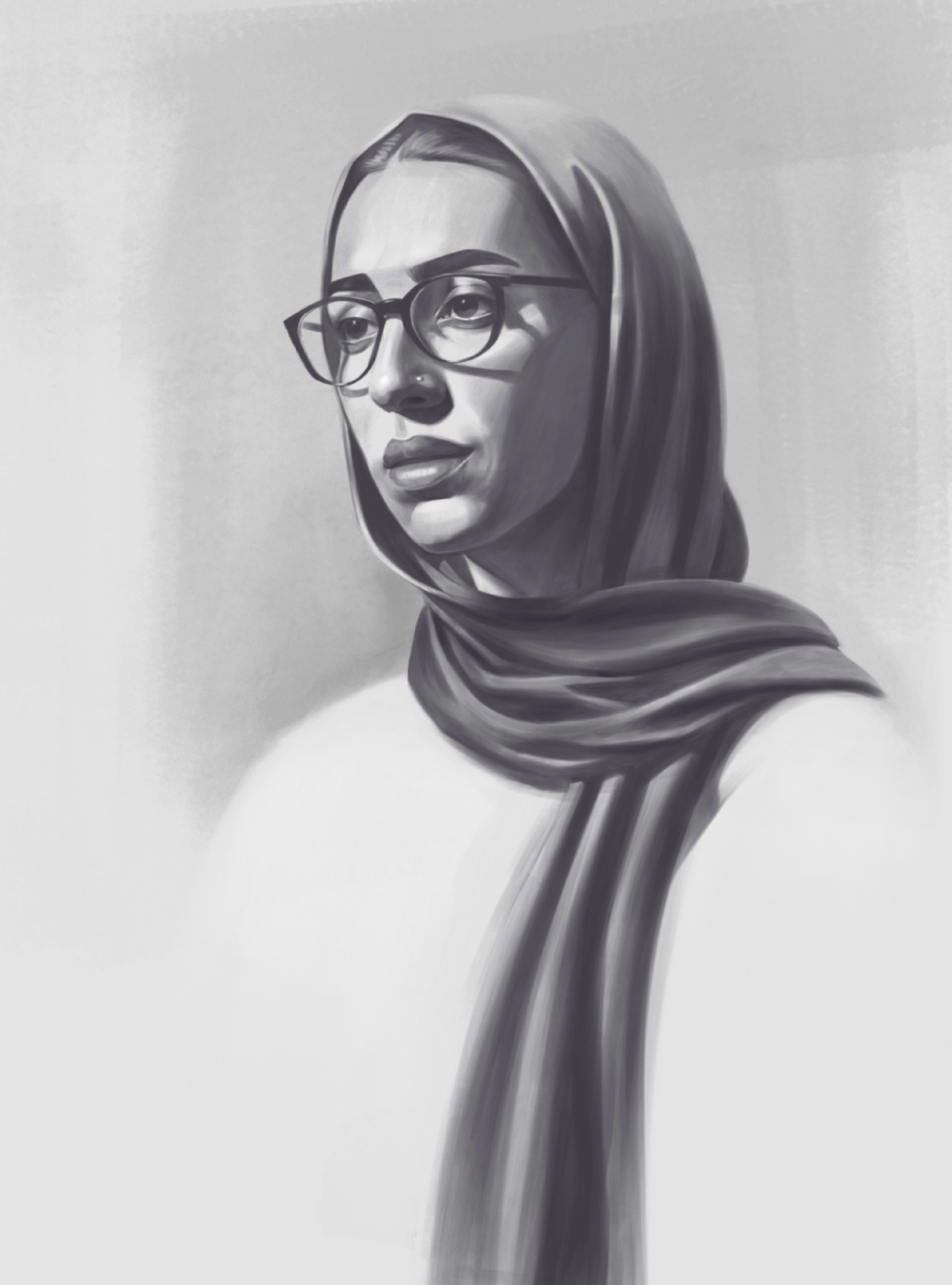
You could use lightening the lights and the background. Especially don’t be scared of getting some of the highlights on the face a lot brighter. As it is now, the artwork looks like someone turned down the brightness on it. If you want to keep going with a low contrast style, I’m sure you’ll figure it out. It looks really nice overall. Your brushwork, simplification, stylization, and form are all working very nicely.
Pintar (2)
DIgital Self portrait
Notas do artista:
I want to have the courage to paint my portraits and understand the form more
Comenta 3
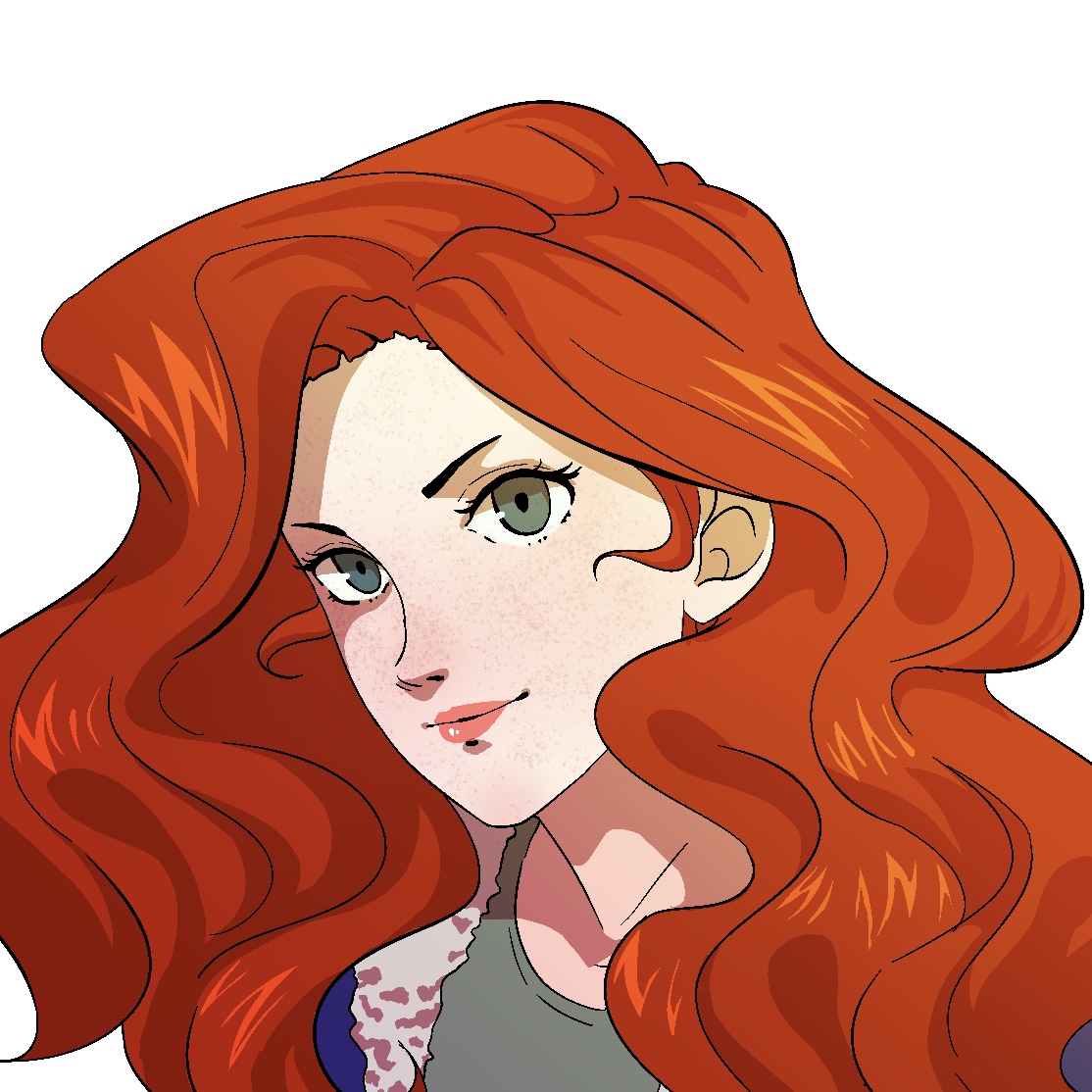
Your portrait is gorgeous! Only you can tell if the anatomy & form is correct because we don’t have a reference, but it’s a great study. The only thing I would change (in terms of general advice) is to add more contrast. However, if you were purposefully going for a low contrast painting, it works well as-is. Lovely work :)
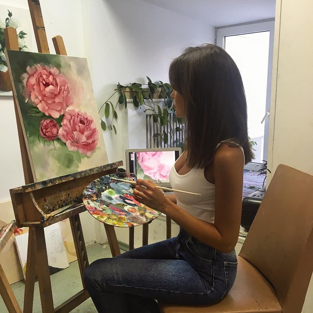
this look so good, i love this.