Pinte
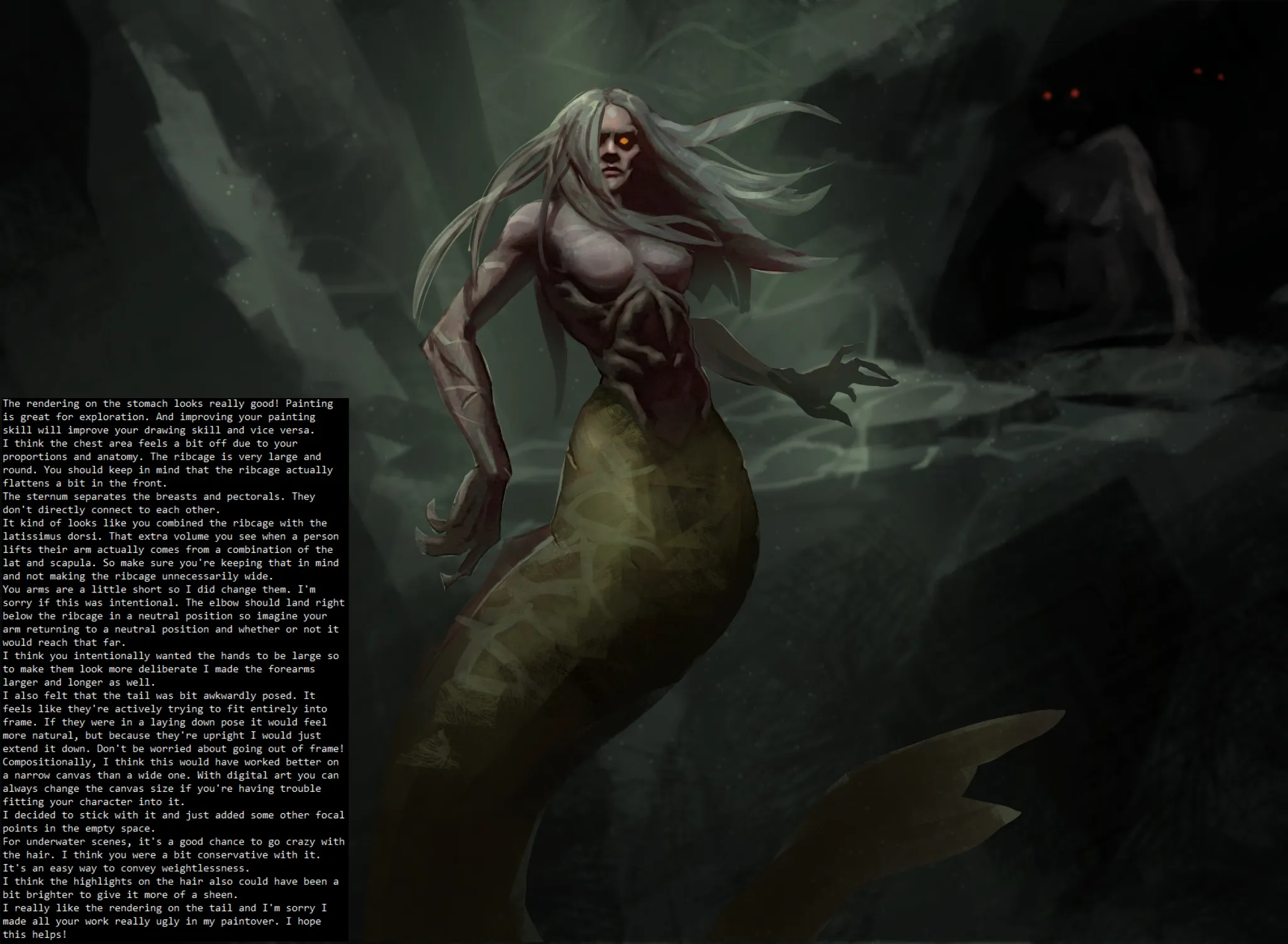
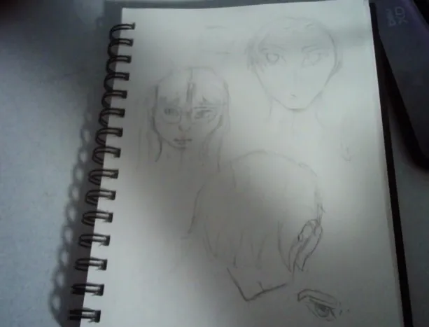
Artwod has a strict filter so I had find a way to work around it like changing the eye colour. Sorry about that! I hope it's readable.
May 30, 9:19 PM
Carregar respostas...
Participe da conversa
Assine seu feedback sobre esta obra.
Quer guardar seu feedback?
Registre seus comentários em um só lugar na sua conta. Seu feedback será privado e não público.
Artwod has a strict filter so I had find a way to work around it like changing the eye colour. Sorry about that! I hope it's readable.
Participe da conversa
Assine seu feedback sobre esta obra.

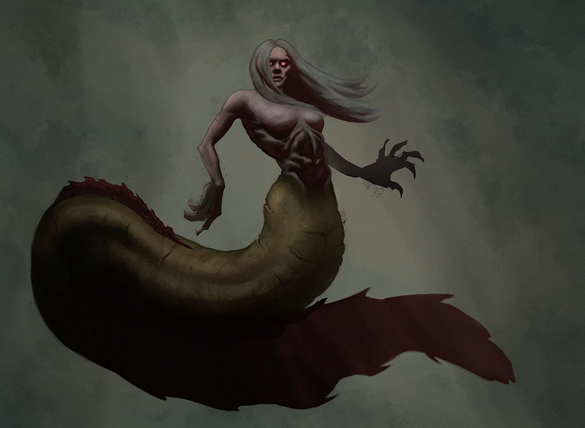
i like this sea slug inspired 'mermaid' a lot/ i would go all out on the idea and add some creepy appendages as its a very unique approach.
Participe da conversa
Assine seu feedback sobre esta obra.
I really love the looseness and pose of your drawing, everything seems really solid already. It's hard to give feedback on it, but maybe push the tail back a bitmore. For the belly maybe add the small abs. Then I also suggested making hand/arm smaller for distance and add slight detail. I changed one finger because it drew a lot of attention. Great job on trying out new things!
Participe da conversa
Assine seu feedback sobre esta obra.
Melhore seu talento, a 3 min
Master monkey drawing by progressing from simple shapes and photo tracing to imaginative sketches with anatomical structure and details.
Animals
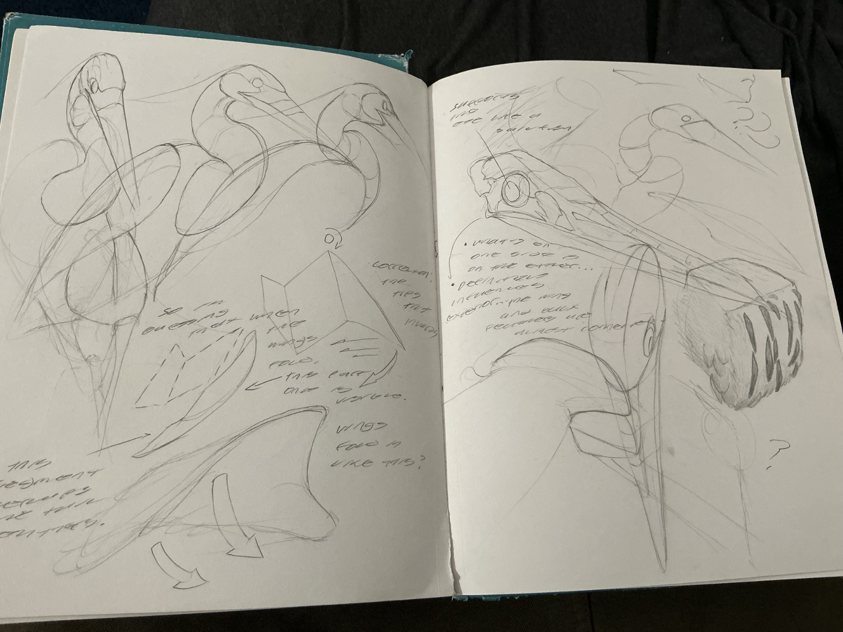
The Heron Woman
GUYS!!! remember those heron studies i did not too long ago? Well, i turned it into an idea, a concept, if you will, and came up with this heron warrior. quite proud of it! what's more is that when she pulls down her mask, the bird's nostrils act as eye holes, making it into a rad frickin' mask! anyways, i want feedback. particularly on the rendering. i feel like i didn't take advantage of the heron's plummage texture enough, or like i was a bit carelss with my light source and cast shadows. but what do you all think? any other suggestions? please let me know!
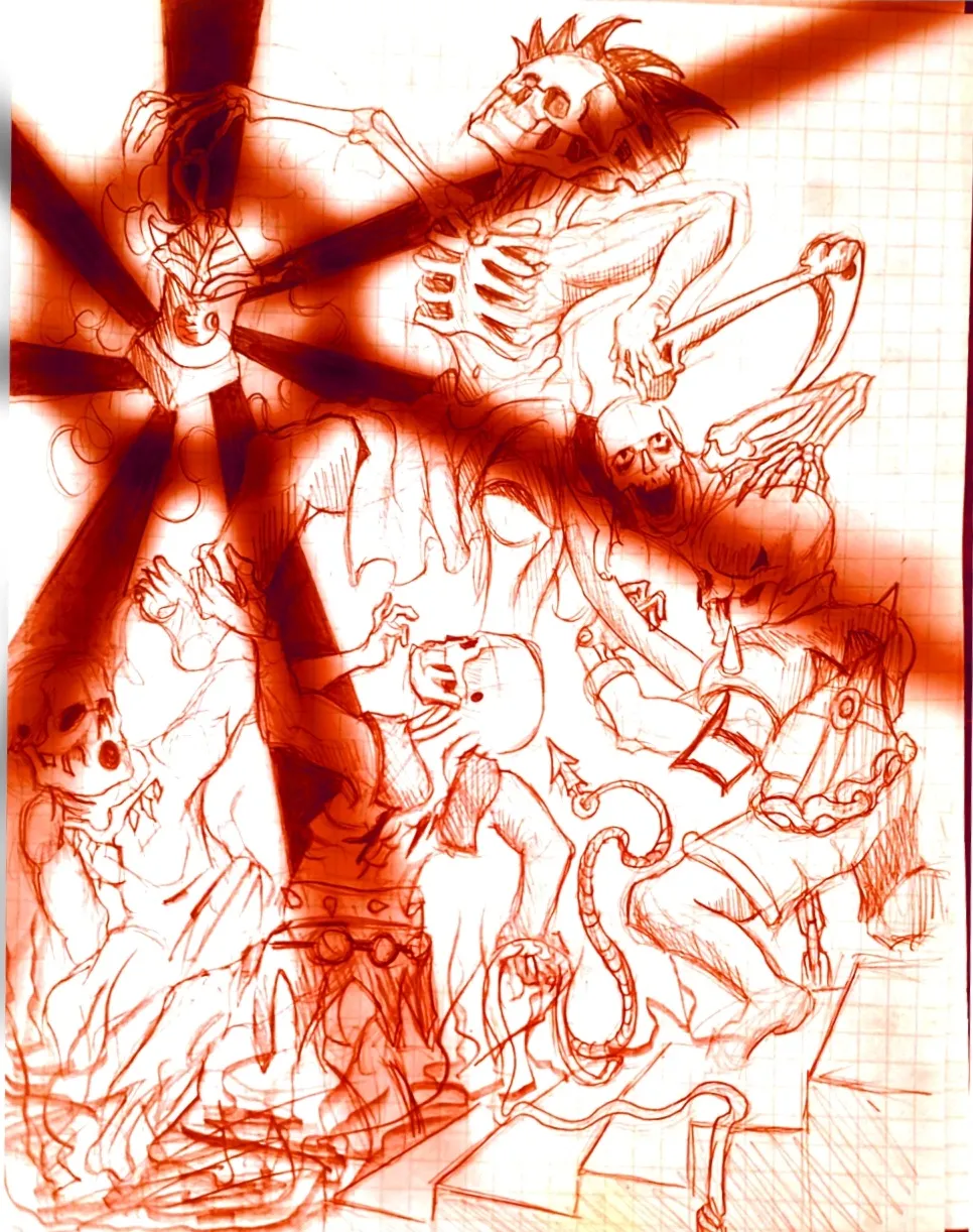
Eternal Fight of the Wicked Part 2
Im the same creator of the OG drawing in the figure drawing section, I just decided to throw the drawing on a sketchbook app on my phone and play around with it. Feel free to critique it some fun ideas to play around with.
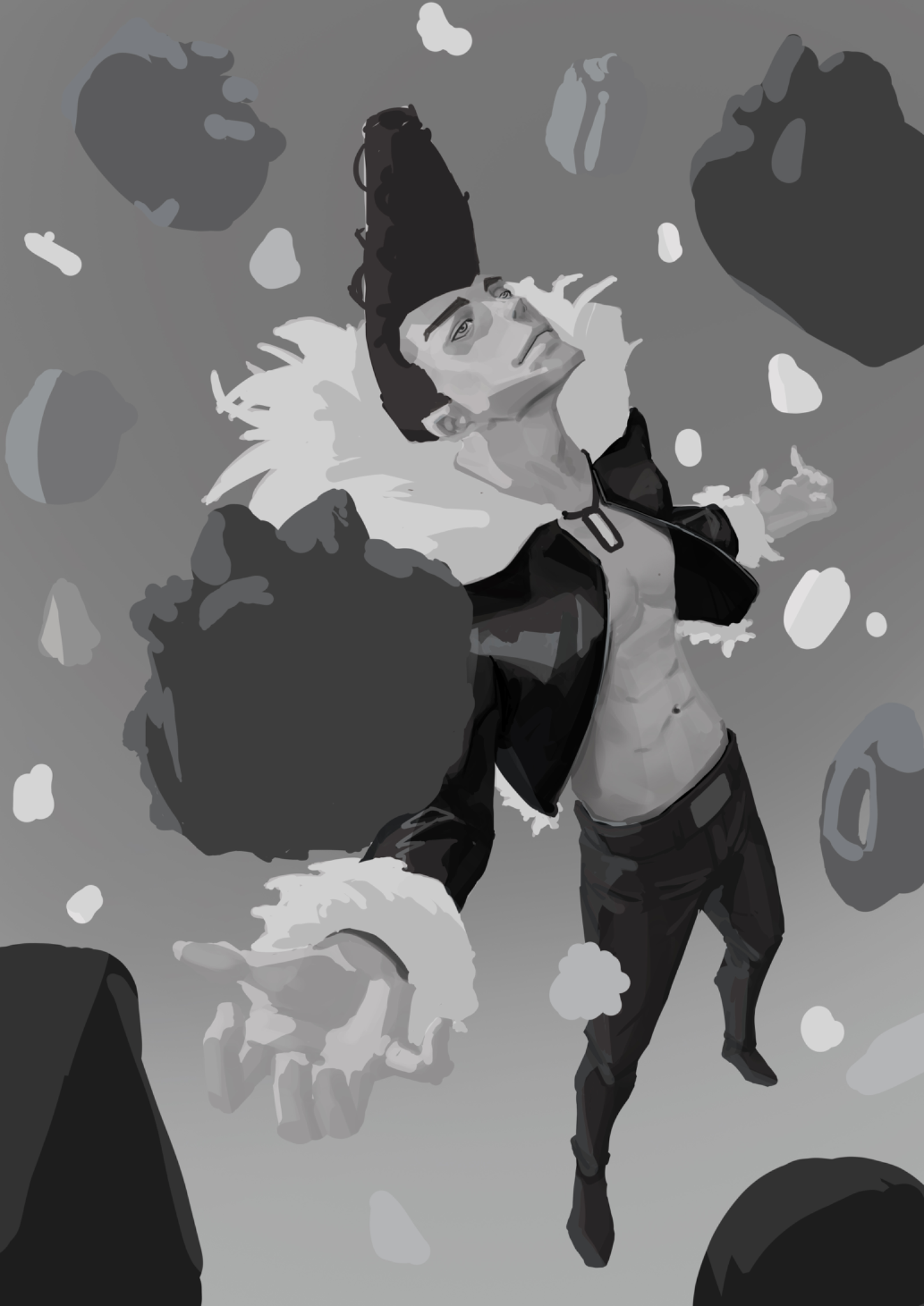
Feeling lost with values
I tried to create an illustration of Ichigori Ryu in a rain of dessert and I feeling quite lost when the rendering part came on. Like how do you choose if you need more contrast on the skin for example or less. It’s not finished but I would appreciate some guidance
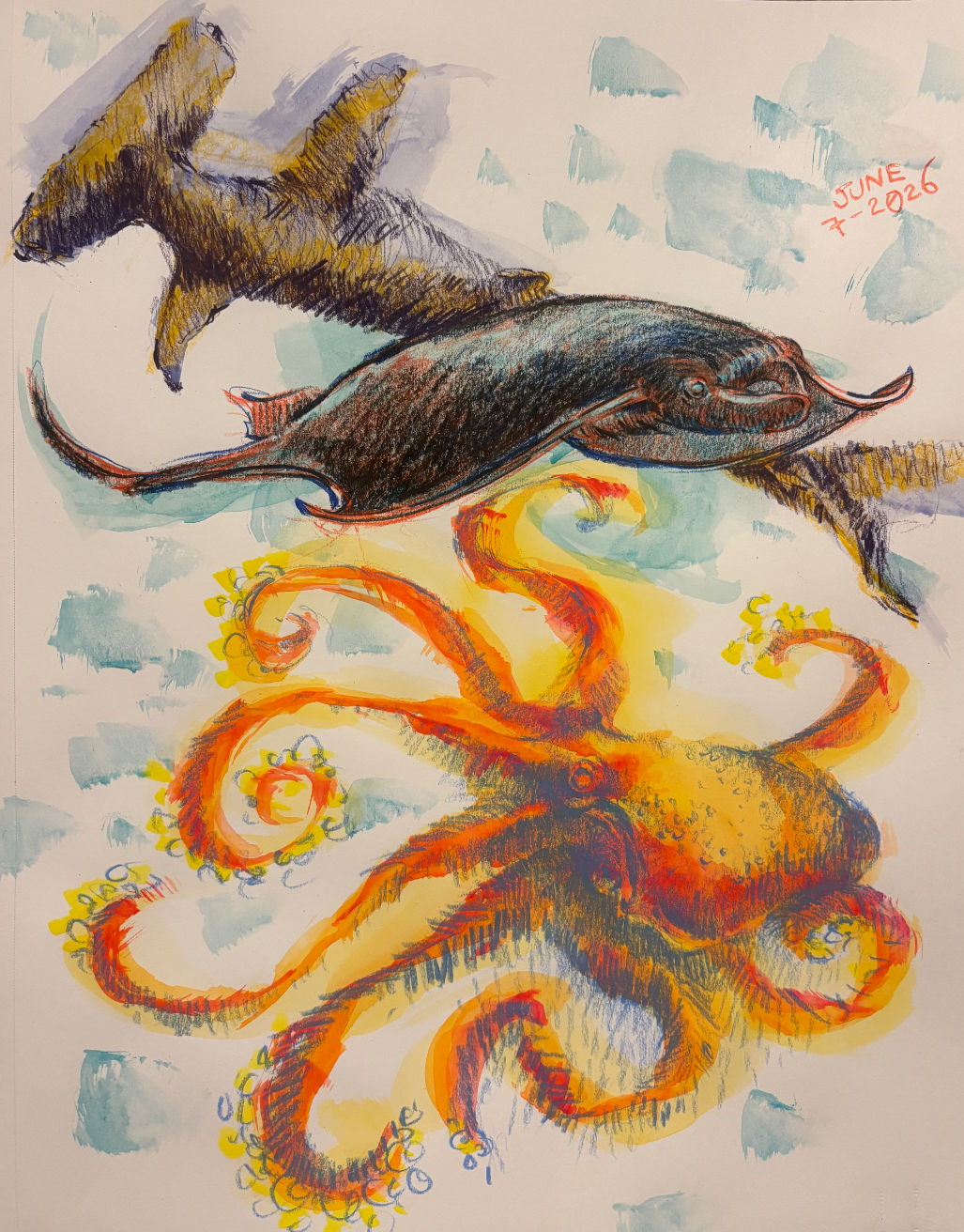
6/7/26
Day 7
the lad and the neroh
I was studying grey blue herons today since i usually see them around my local lake and love miyazaki's films! Whilst doing these studies, i put on a peter han sketchbook tour for background noise, so that influenced my studies a bit with the observational notes and texture blocks and such. I also did 3d rotations, and even tried to figure out how the wing folded in. On either one of these things, how'd i do? Please let me know so i can push my drawings more towards that peter han skill level sort of direction!
6/7/2026
im having a hard time with constructer
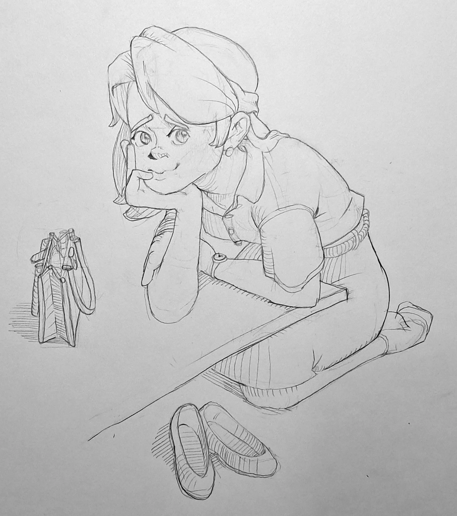
June 30 Sketchbook Pages Challenge Day 7
I am happy with the pose and the objects around the character. The main problems I'm seeing in this piece are proportions. Firstly, the head is much larger than I intended, and it makes this character look like a young girl when I was going for a lady just getting back from work look. I had already drawn a face I was happy with and the hand felt believably placed on the head so honestly I couldn't muster the willpower to draw the head again at that point. I also think the left arm's above the forearm (do you call that an upper arm?) is short, and I am unsure about her right arm's proportions. I did spend some time fixing things in the construction stage, but I got hasty and did not double check when the figure was fully in, I actually extended the length of her right forearm by enlarging the elbow, and I think that helped. I could use some tips on dealing with proportions when dealing with dynamic angles. The one tip I already know I need is to fix all these problems in the construction stage!!! Thank you!
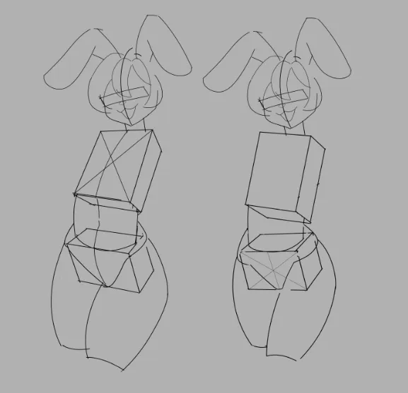
FIgure drawing
Which version is better constructed? I want my figure to have a downward-tilted pelvis and for the contrapposto to be visible. It seems to me that the first figure has more volume, but I’m confused by the fact that the front plane is higher on the side that should be lower, which is why the contrapposto isn’t noticeable.
Forcing myself to put my work out into the world
Original photo