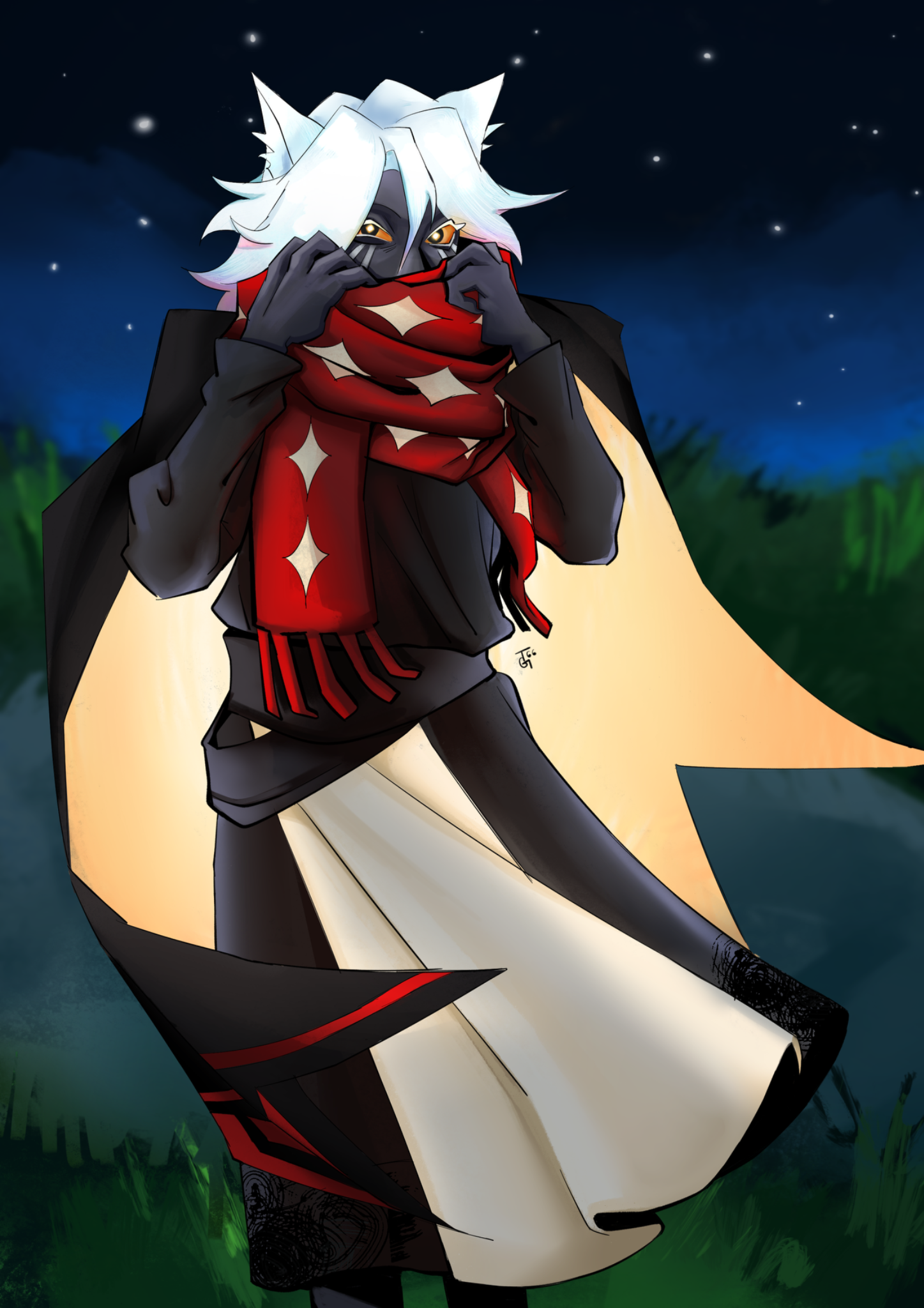
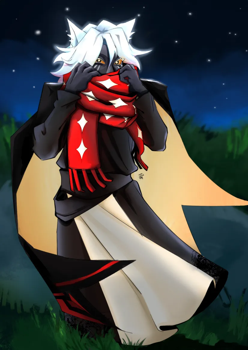

Hi there! I wasn't able to address everything you were looking for feedback on, so I just focused on two things: values and composition. When you're working with a character with so many dark values, one trick to help you is to set the image to black & white. You can do this by making a layer above all others, setting it to Color, and filling it with pure white. By toggling this on and off, you can check to see how readable your drawing is. When I did this, I could see that some elements weren't standing out as much, and it gave me ideas for how to separate your values. What I did was darken the coat, especially the shadows on the coat, which I made pure, solid black. I also lightened up the scarf, as that helped to draw more attention to the face and separate those surrounding darker colors from each other. I added heavier shadows to the wrists to separate the hands from the sleeves, and added various other darker shadows across the body to make parts of the outfit more readable. For the hair, the main thing I did was add a glow around the edges, since you said it glows. And by adding a few subtle shadows to indicate parts where the hair overlaps with itself, it makes that bright glow even more pronounced. And since the hair is so bright, I darkened the inner coat (even though it too seemed like it was supposed to glow) a little bit. As it was, the inner coat's bright value was competing with the hair for attention. So I dialed that back a little. Finally, for the background and general composition, I added some overlap in the form of grass around the character's feet. I also added a deep cast shadow on the grass. I hope this helps!

Thanks so much! I will definitely keep this trick in mind, and all the added details have really helped it pop so much 💚 plus I really love how a few added details on the hair made it look more 3d :)