Quer guardar seu feedback?
Registre seus comentários em um só lugar na sua conta. Seu feedback será privado e não público.
Pintar
Pinte sobre notas
Escolha uma tinta
Escolha um avatar para ver suas anotações e discuti-las.
Também luta com ambientes?
Melhore sua composição e profundidade, a 3 min
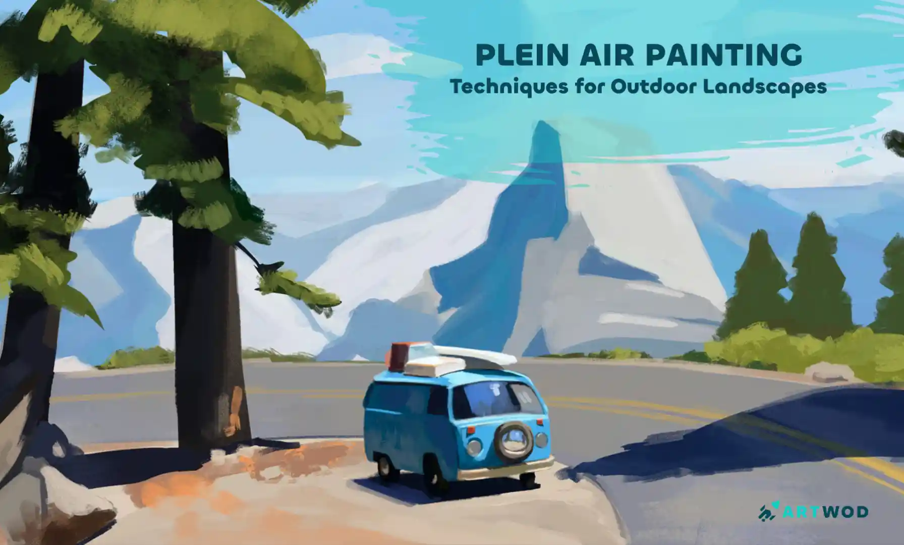
Plein Air Painting: Outdoor Techniques for Landscapes and Nature Scenes
Master plein air painting by analyzing compositions, sketching real environments, building value structures, and layering color to create immersive landscapes.
Environment
Quer ajudar alguém que ainda está esperando?
Portraits
Ainda sem resposta
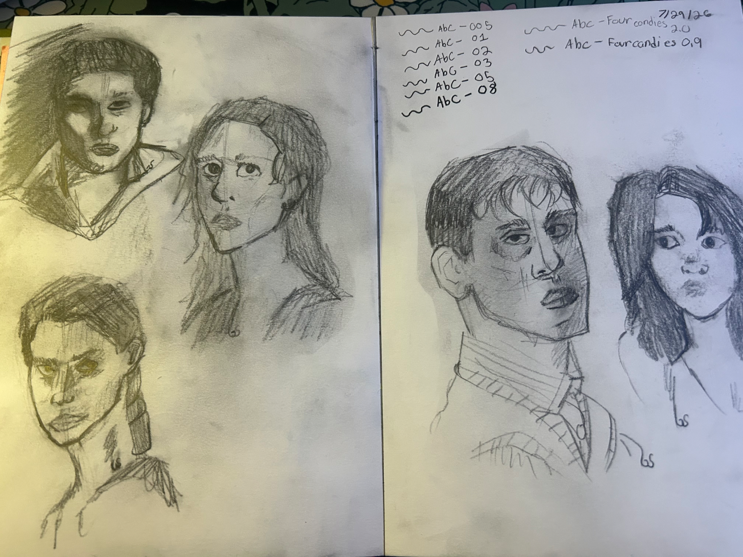
Relearning the fundamentals
So I started drawing super young, and i was always a bit naturally better then most of my peers because of it, but it was just a hobby. But I'm older now and that's not the case, i've been wanting to get more serious about art, but now that i've been trying more harder styles of art; realism/semi realism, i've noticed that i skipped over learning the fundamentals. I'm using this specific spread on my sketchbook because it has more variety though i have slightly better ones in my sketchbook. I'm currently a strictly traditional artist but plan on doing digital as well. Looking at these portraits what do you think i need to focus on first when it comes to the fundamentals? Is there something I'm lacking on more than others? And lastly, is there any methods anyone personally recommends? Thank you in advance for any help!
1 há 1 hora
Ver
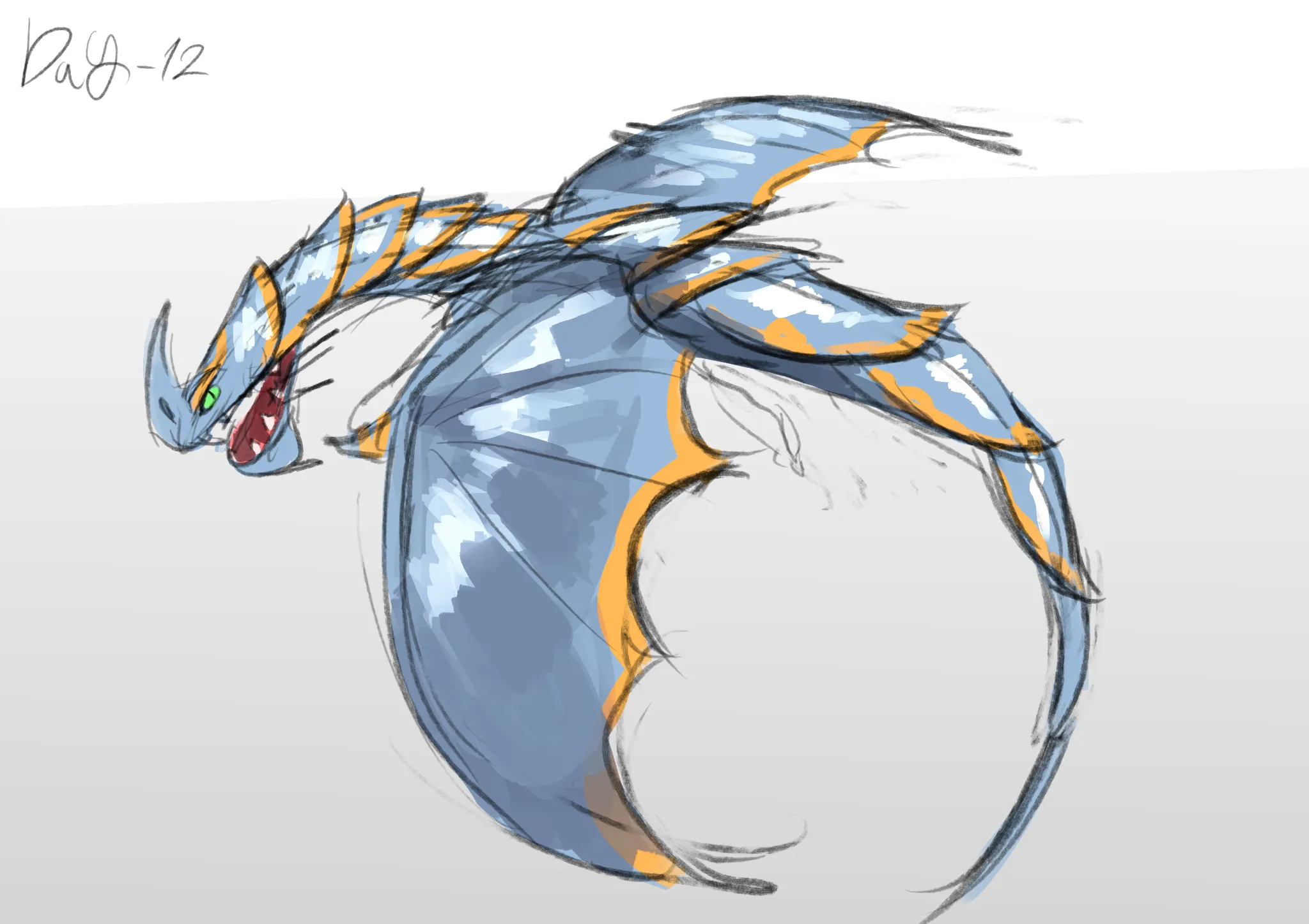
August Smaugust Challenge
Ainda sem resposta
12 - Razorwhip
A Razorwhip
há 2
Ver
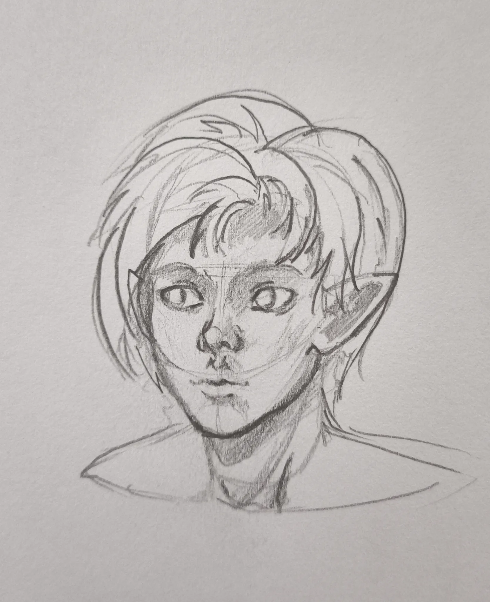
Portraits
Ainda sem resposta
Simple portrait (?)
I beg your feedback ❤️ The neck is a little bit short but the face itself is important to me
há 3
Ver
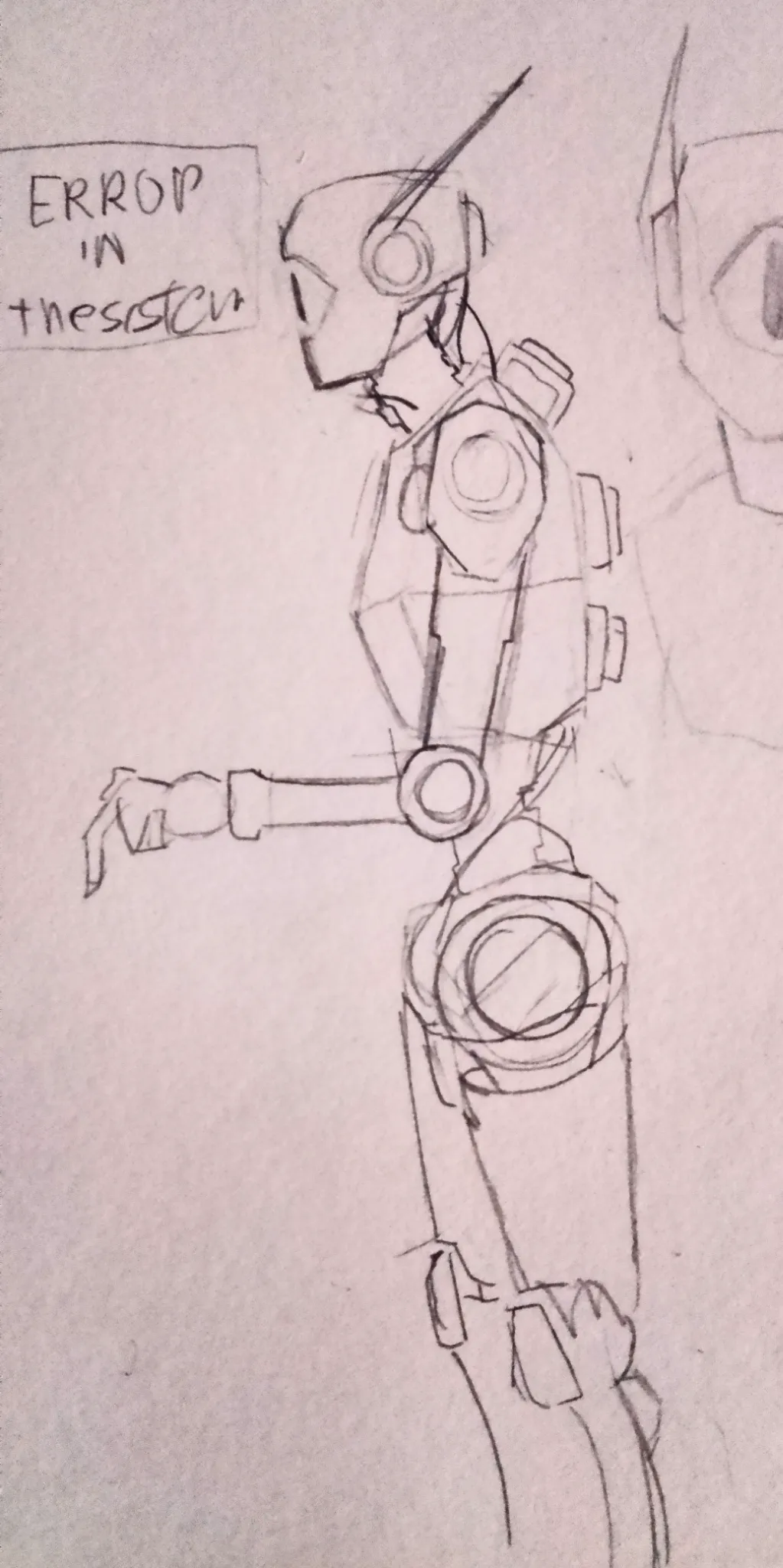
Perspective and Form
Ainda sem resposta
Robot
Hii I was trying to draw a robot for the first time. Even if a like it, something is off. Any advice?
há 5
Ver
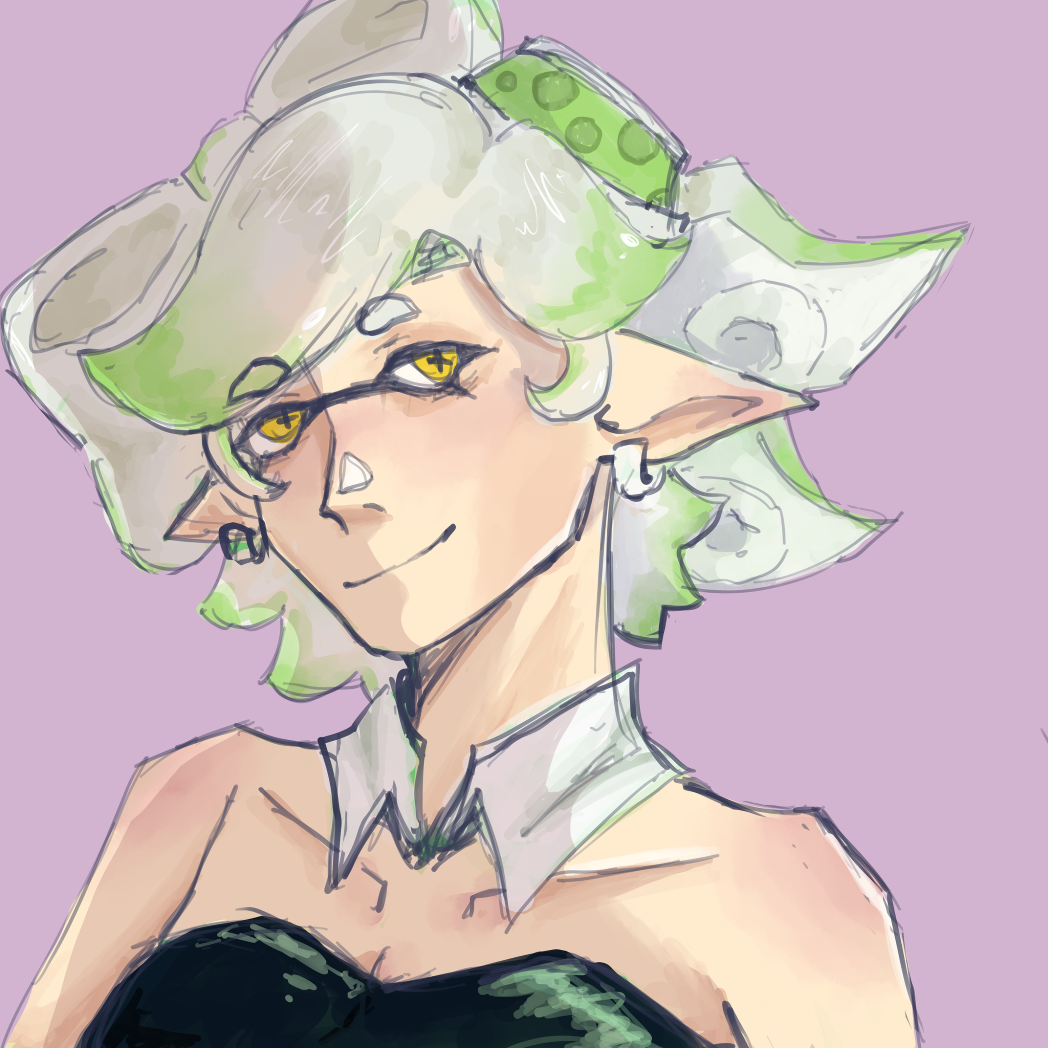
Anatomy
Ainda sem resposta
Marie from Splatoon
I feel like something always looks off / flat with my faces. I think it might have to do with the jaw but I can’t tell for sure. + I think it might look uneven, but I’m not sure how to consistently get my faces to look even / not super skewed to one side w/o them looking stiff instead.
há 5
Ver
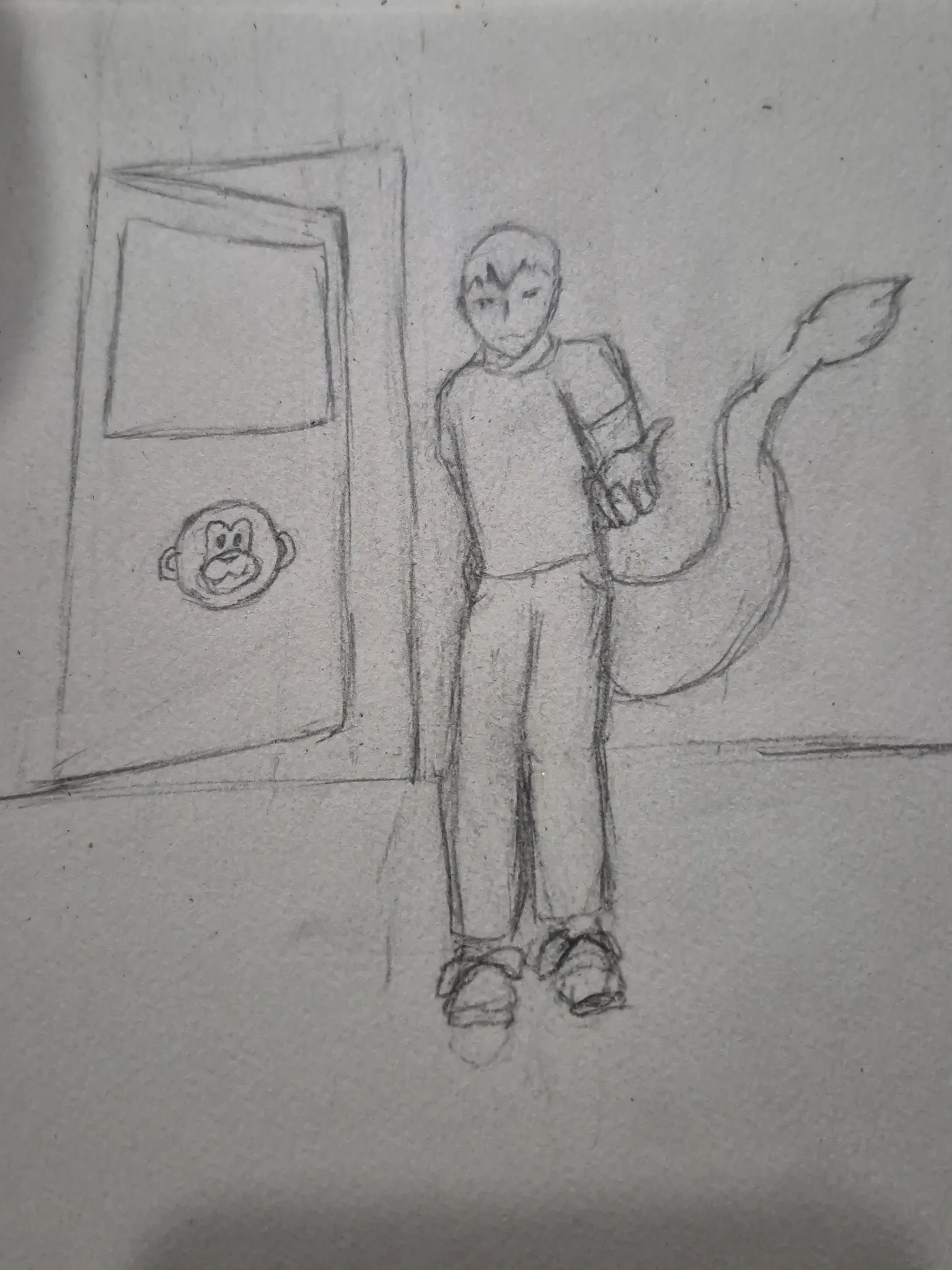
Perspective and Form
Ainda sem resposta
Sketch
The low angle perspective has been a struggle for me, the legs are looking really strange
há 5
Ver
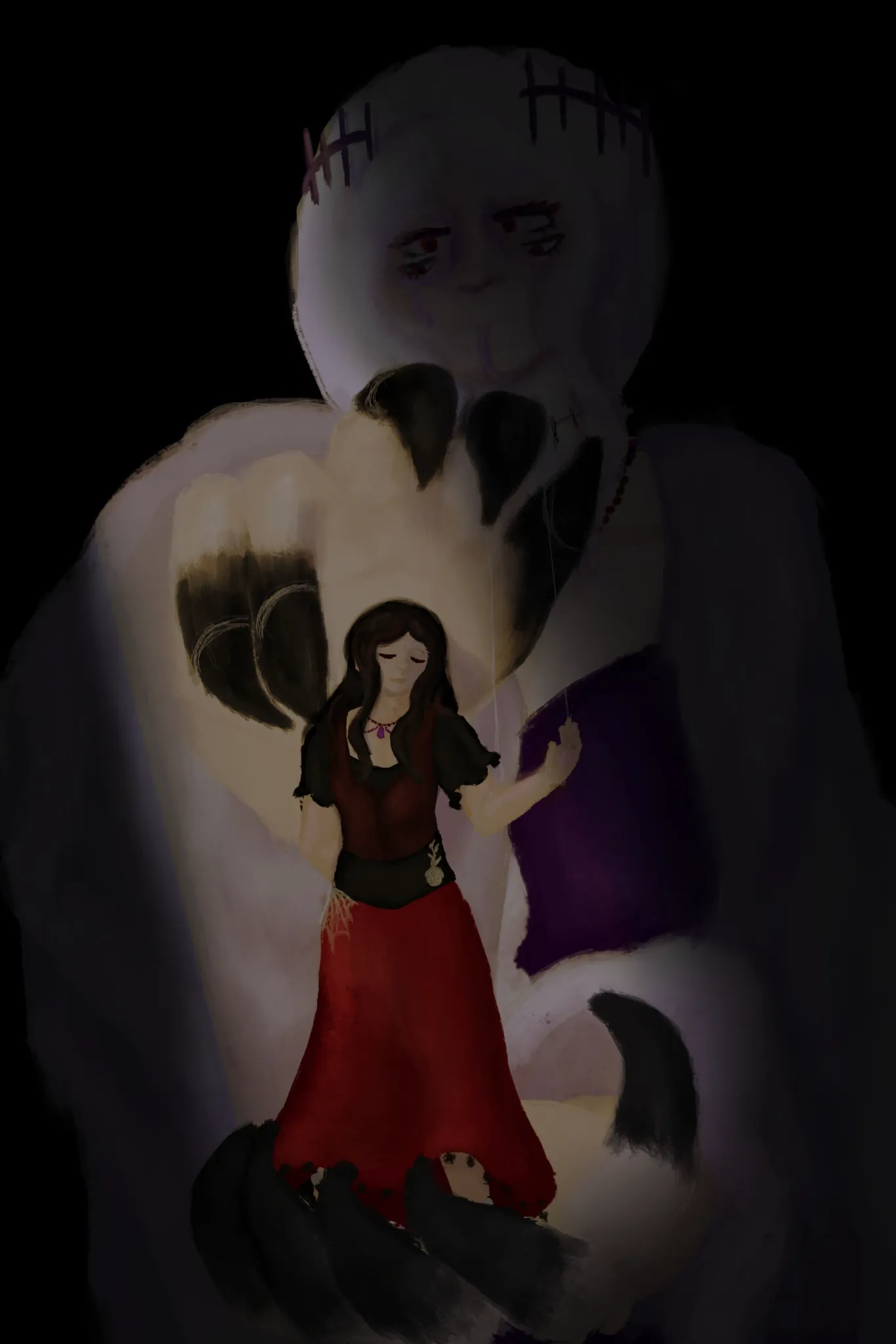
Perspective and Form
Ainda sem resposta
Puppeting
A piece I made a bit ago but never felt satisfied with it Something about the composition just feels off, I am struggling with proper debt
há 5
Ver
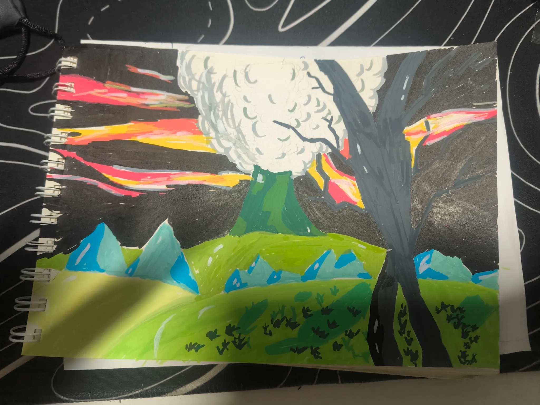
Environment
Ainda sem resposta
A landscape
I trying out coloring for the first time, I wanna go with the contrast view of the chaos of volcano and the peaceful of the tree, but I think I mess up a lot with the color theory and the perspective of each viewpoint
há 6
Ver
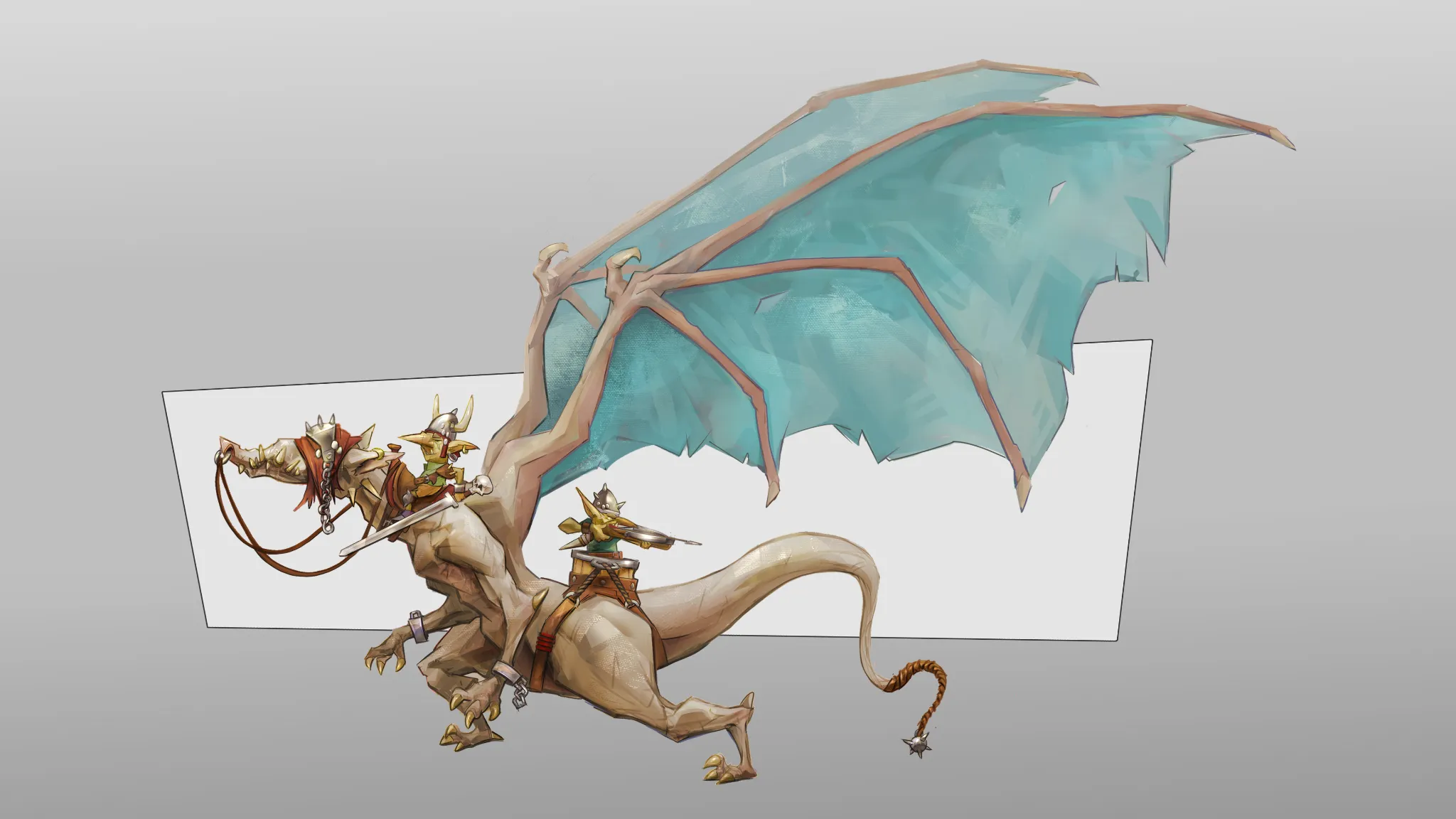
August Smaugust Challenge
Ainda sem resposta
kid moe - goblin dragon riders
After some feedback I made a bunch of changes to the wings and some small changes to the Goblins and the back leg.
há 8
Ver