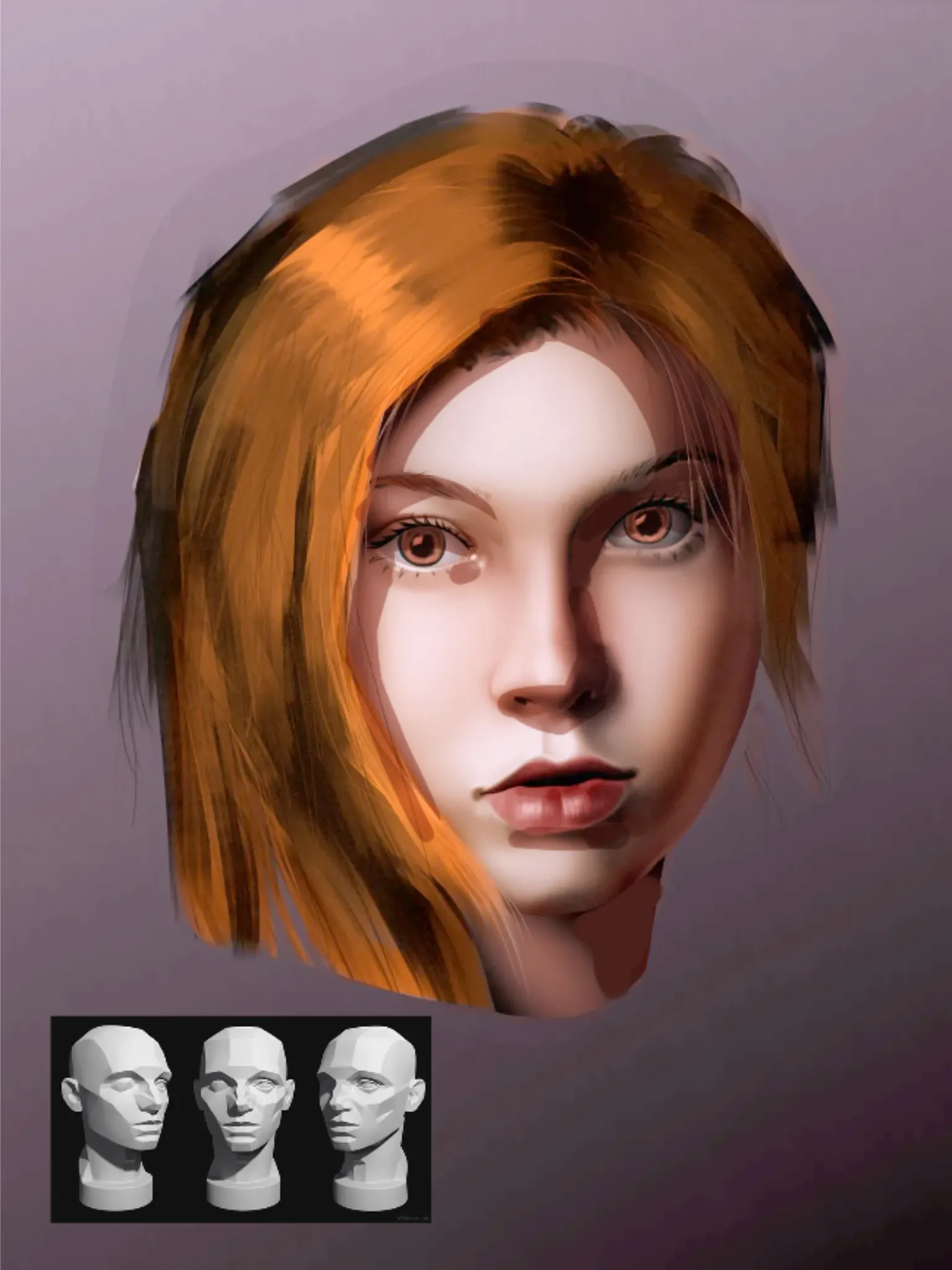
Hi Hi! Great portrait of Nami! You did a good job on capturing the face of the actress! Now, regarding the shading and colors: I started by increasing the picture's light levels and decreasing its dark levels. Overall, it was a little too dark to read the artwork. After that, I utilize colors instead of heavy black shadows. Avoid applying pure black for shadows; instead, use a neutral gray or orange tone with multiply layer for warmer shadows or a neutral gray or blue tone with the same layer type for colder shadows. Nearly all digital drawing programs have both adjustments; Photoshop was the one I used. Finding the light source would be next. It is slightly frontal positioned (leaning into 3/4). This is helpful since it makes shadow mapping easier. Always remember the planes on faces, and use the 3D Asaro head I have included in the drawing to assist yourself. In this manner, artwork will have greater volume and appear more realistic. Hope it helps! Keep up with workouts!
Participe da conversa
Assine seu feedback sobre esta obra.