
Peindre
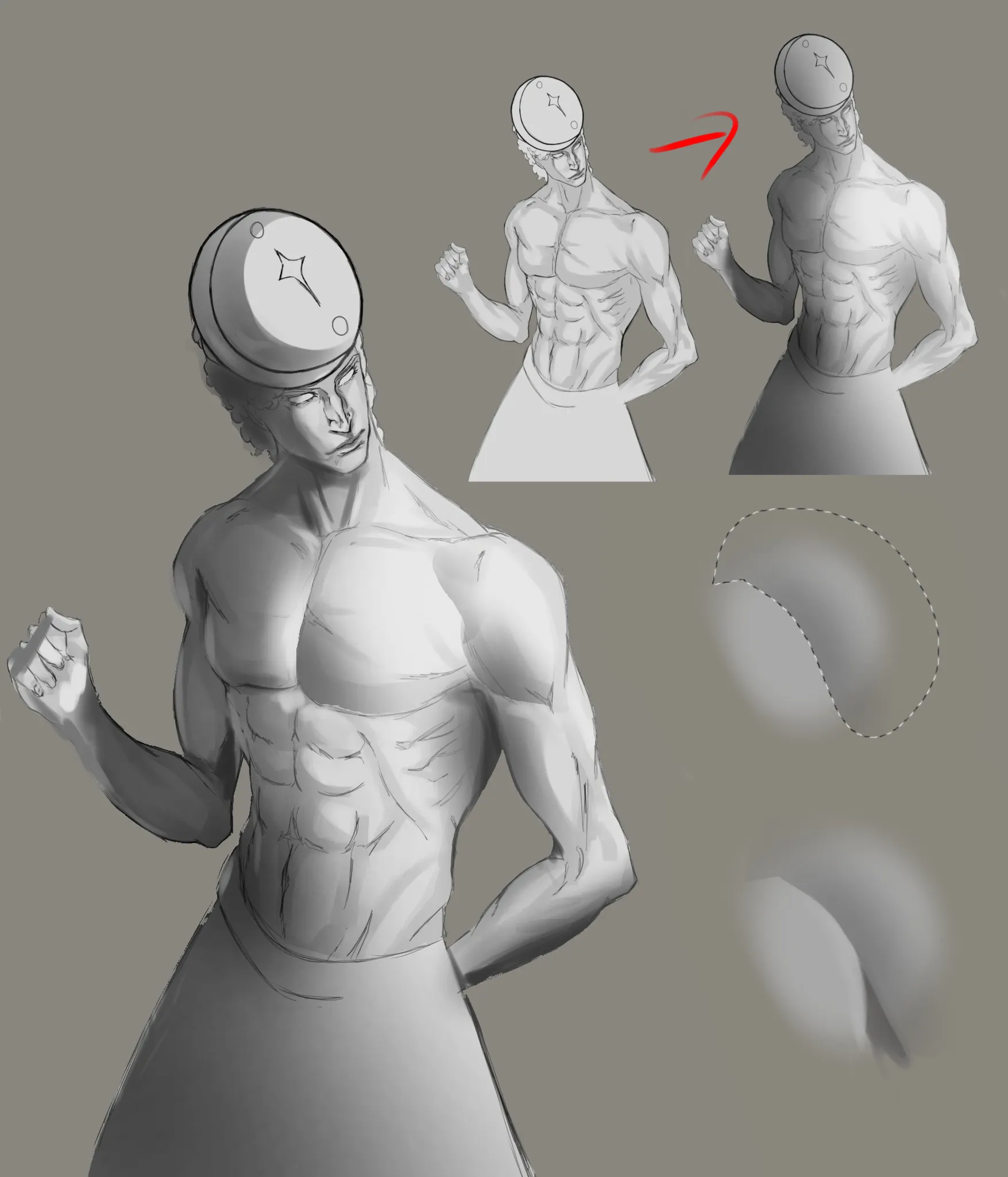
Sur « Some oc » de @nafota52429
“Hi. I am using Ibis Paint as well. 1. One issue is values. You have the same value for everything that is why it looks so flat. 2. It heavily depends on style and what you are comfortable with b...”
Peindre
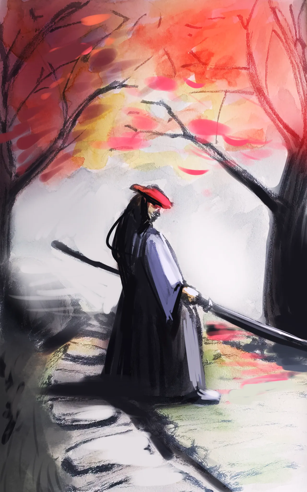
Sur « Brushpen and color » de @pim40224250
“I think working with stronger values and reducing number of colors could improve this drawing greatly and push it more towards stylized one with a single focus. Considering working more with silhoue...”
Utile + 1


Peindre
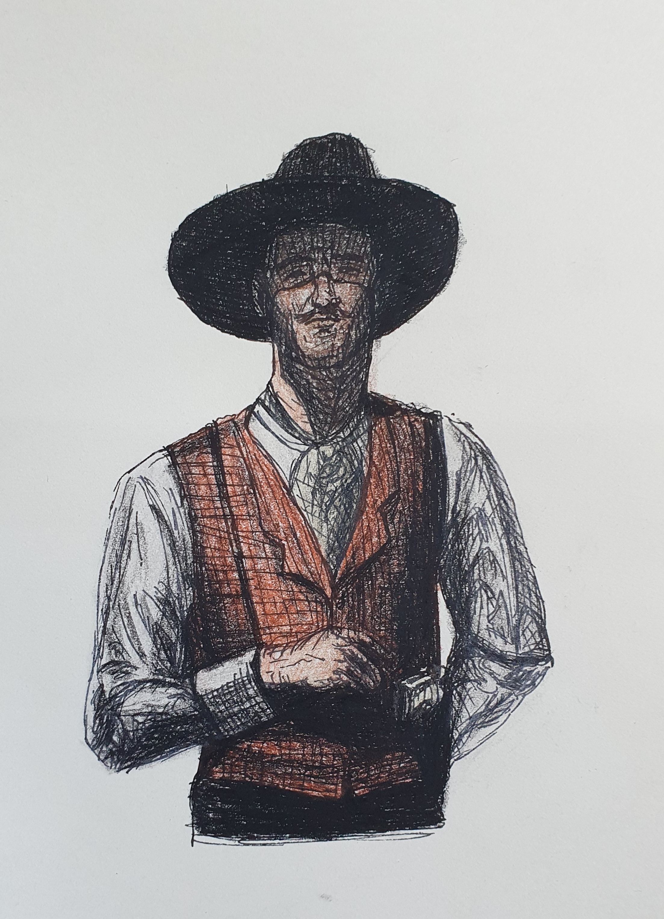
Sur « First time test » de @mellow21803
“I won't comment on anatomy since this post is in the rendering section but anatomy issues are also one of the reasons why rendering is suffering (try to flip canvas to chrck anatomy). Considering f...”
Utile + 1
Peindre
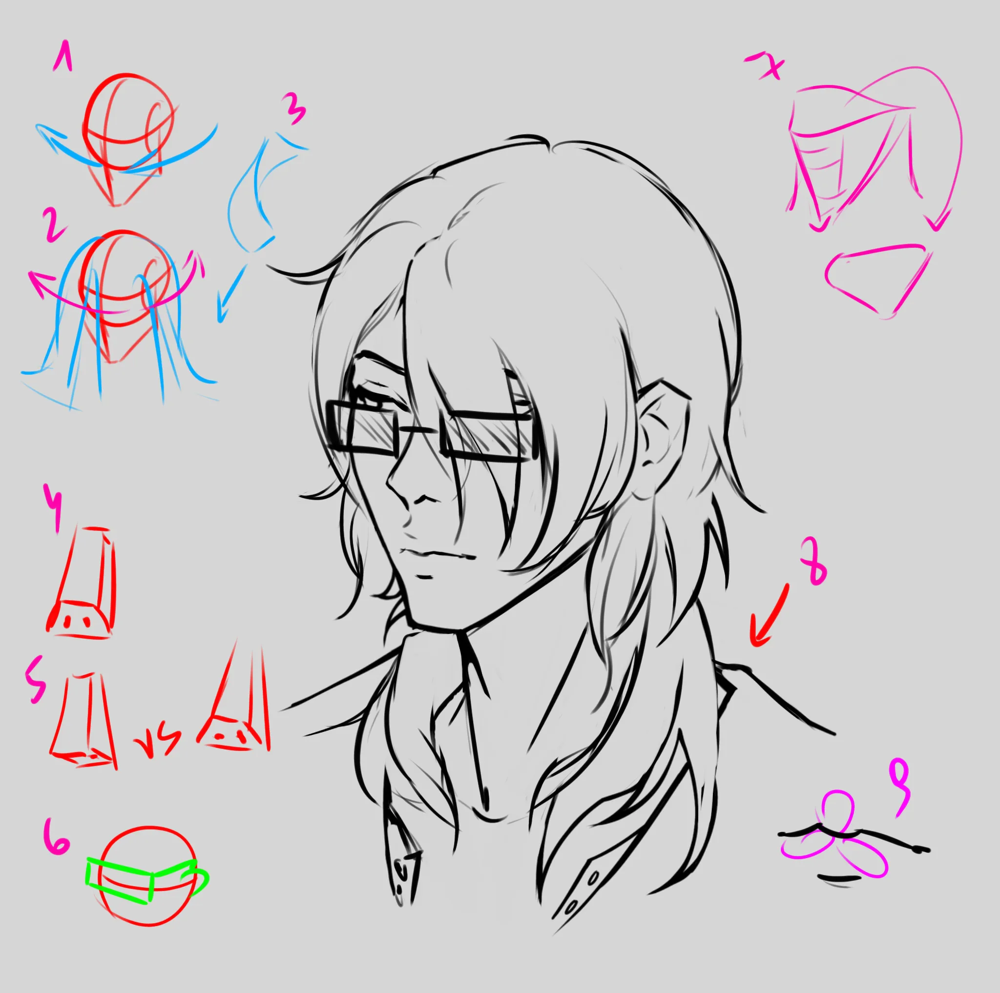
Sur « Commission » de
“1. The reason why it looks flat is because the underlying construction either wasn't done or was ignored later. Look up Loomis head for base construction. Roughly, the head is a sphere/cylinder, so yo...”
Peindre
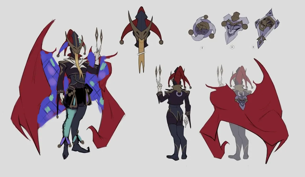
Sur « Royal Jester boss » de @slava03309418
“Jesters are fun! I really like the ragged cape, if it moves - even better! (If it indeed does, adding extra drawing conveying the idea would be great as design should speak for itself). For design:...”
Utile + 3
Peindre
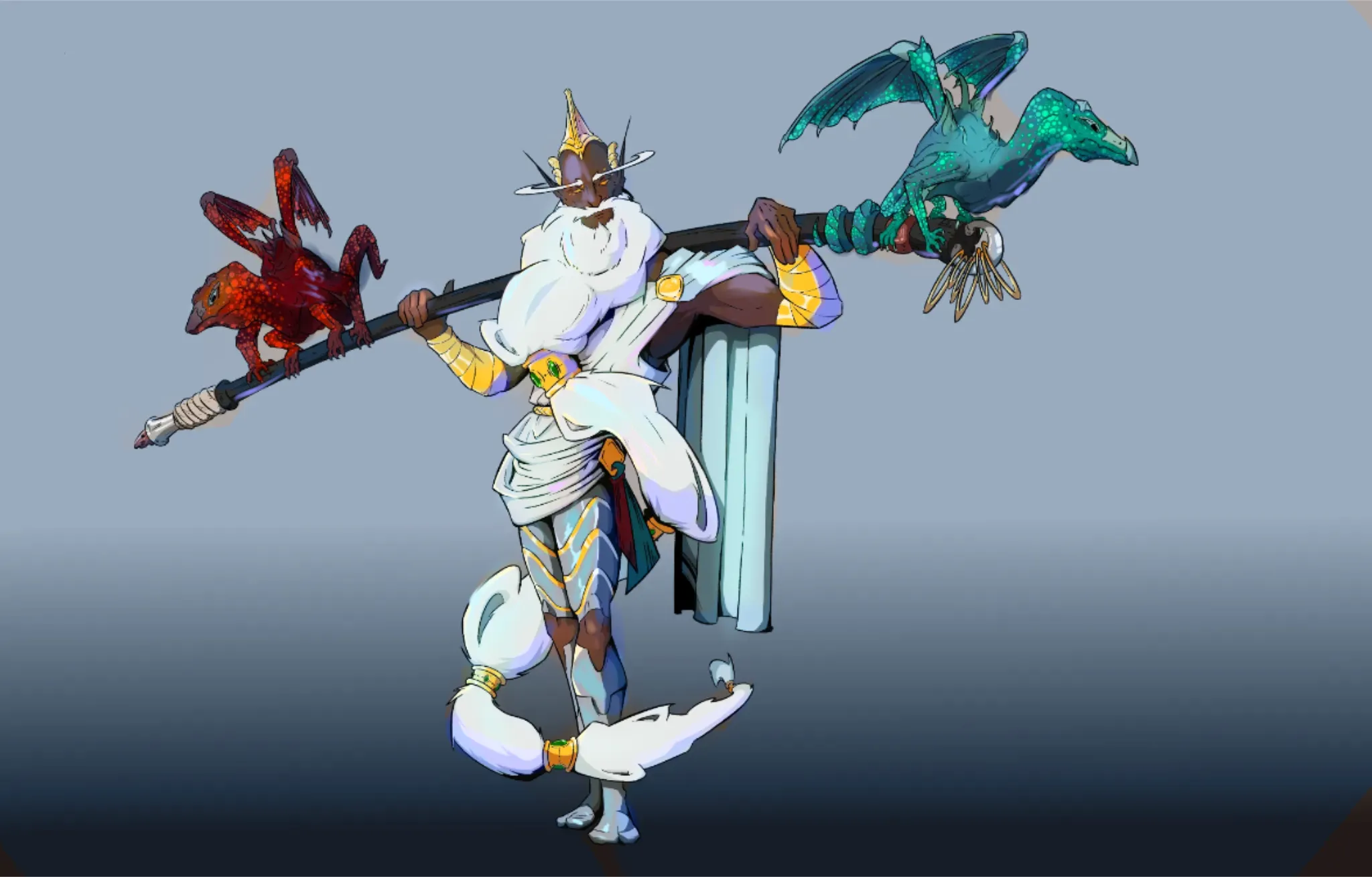
Sur « colors » de @gustavo87660373
“The shapes and lineart are really nice! For colors: I think the issue is that you picked darker value of the same color when painting shadows. Shadows however are often not just grey, depending ...”
Utile + 1
Peindre
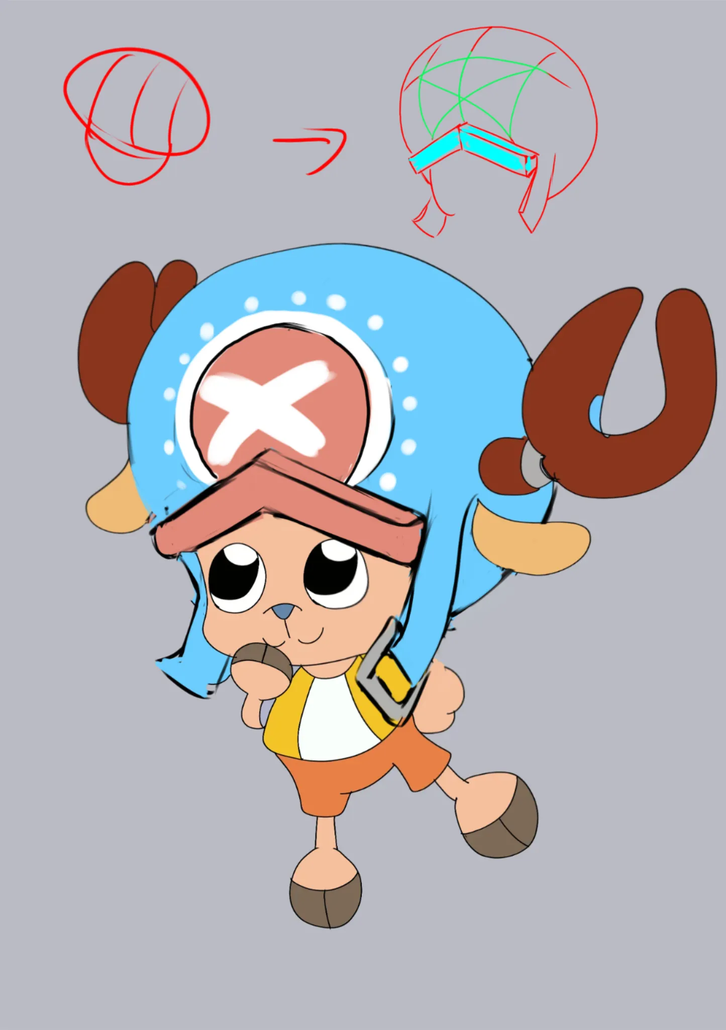
Sur « Tony Tony Chopper » de
“This is a very cute drawing of Chopper. The pose fits him well. For hat: Try to think in basic shapes. If you look at official art, his hat seems to have a shape of a slightly squished and elonga...”
Utile + 1

Peindre
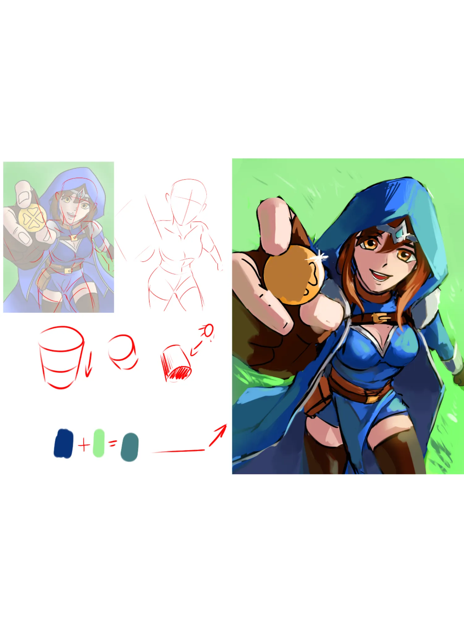
Sur « Luck Domain Cleric » de @alex43422881
“I like her cheerful expression and the pose. Instantly gives good vibes. Anatomy: 1. Her shoulders/head face left, torso faces right, legs face left again. Shoulders should be moving with torso, o...”
Utile + 2

Peindre
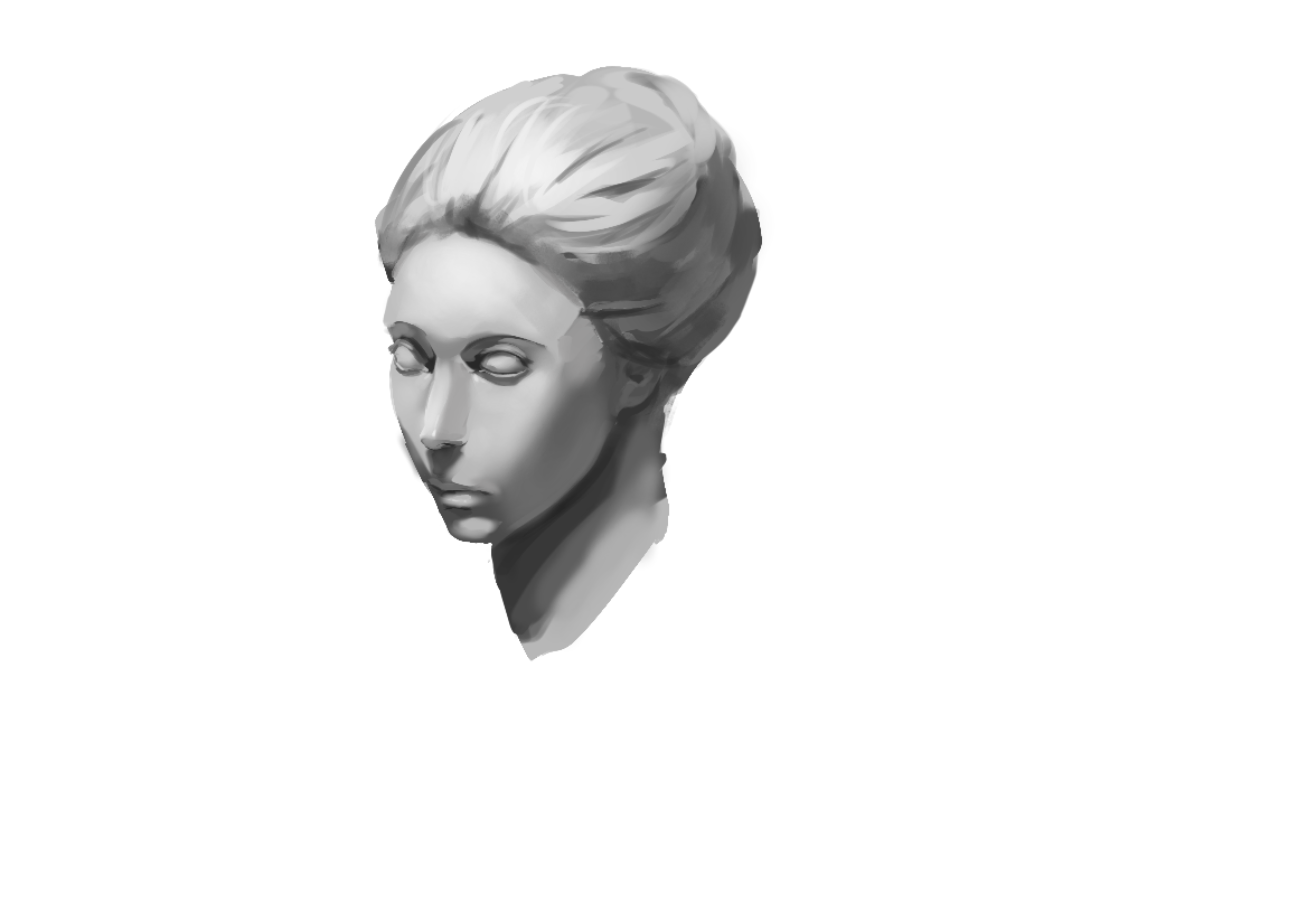
Sur « » de @bruh51996794
“For values keep in mind: 1. The closer the surface is to the source of light the brighter it becomes while closest shadows become darker. While there is highlight in her forehead, her hair is nearly ...”
Utile + 3