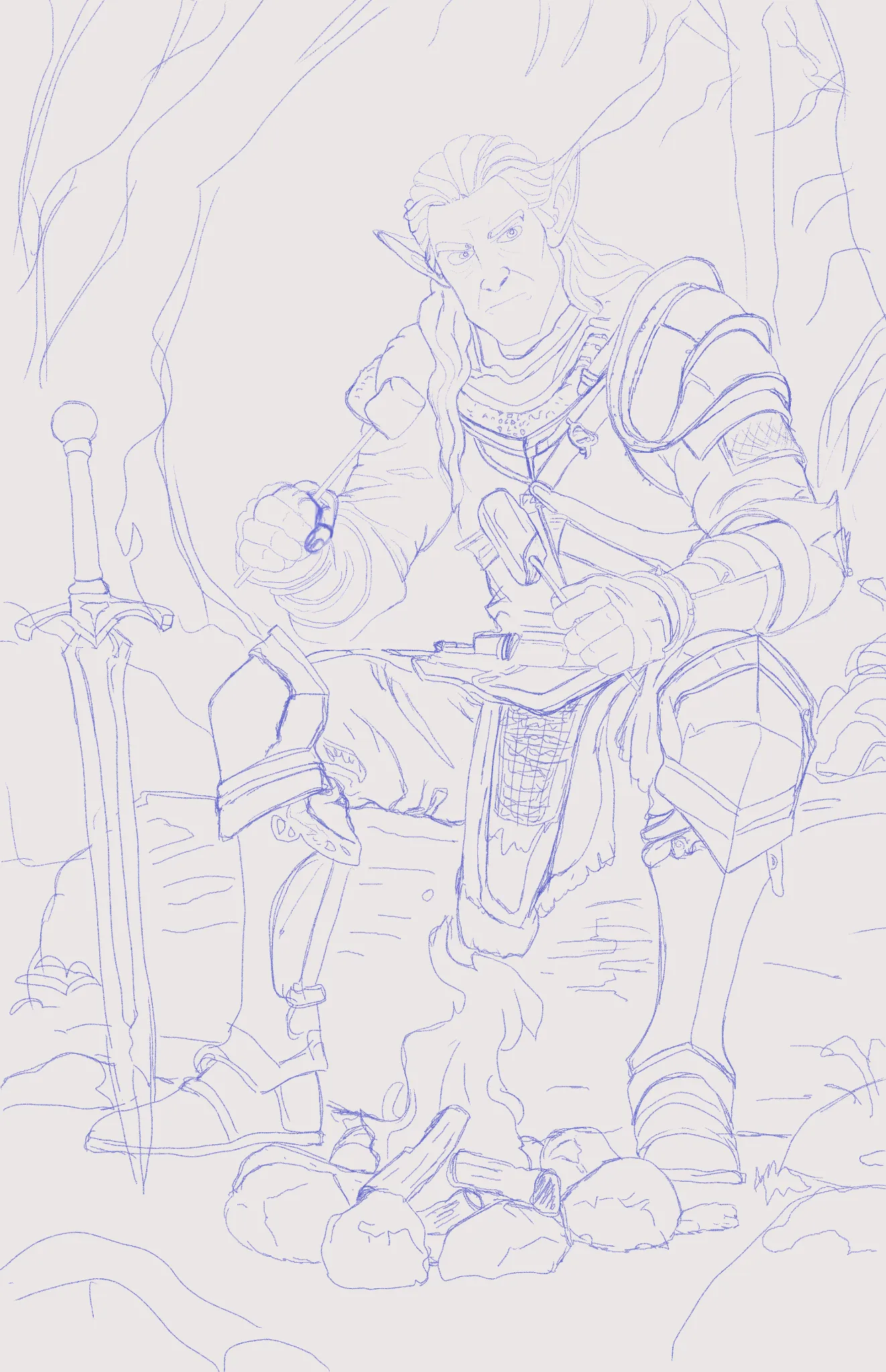
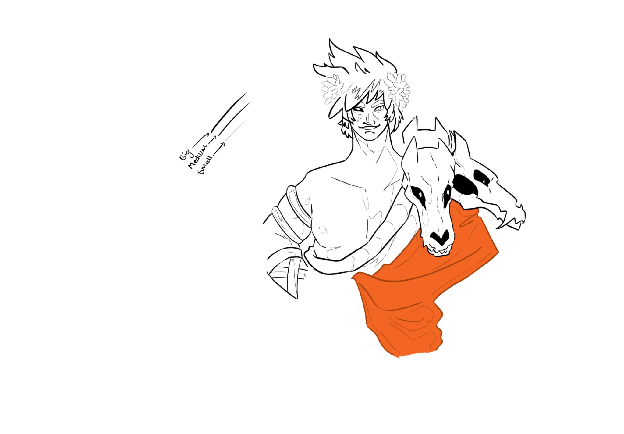

Howdy! The most glaring thing I am noticing with your image is that a lot of the lines are the same thickness. I am struggling a little to figure out what is form vs what is supposed to be shadow. You can apply the rule of big/medium/small with your lines to make it a little easier for the viewer to figure out what it is they are looking at. It can also help with the heaviness of your line work and make it feel less busy. I'd also suggest making sure that when you draw a line it is purposeful. Right now it feels like there are a bunch of black lines for the sake of being there instead of depicting form or volume. If you are still worried about it being too line heavy you can also try inking with colors besides black. It can make the lines feel a little less jarring and makes the line work overall feel less heavy. I hope this helps! Happy drawing!
Participez à la discussion
Inscrivez-vous pour donner votre avis sur cette œuvre.