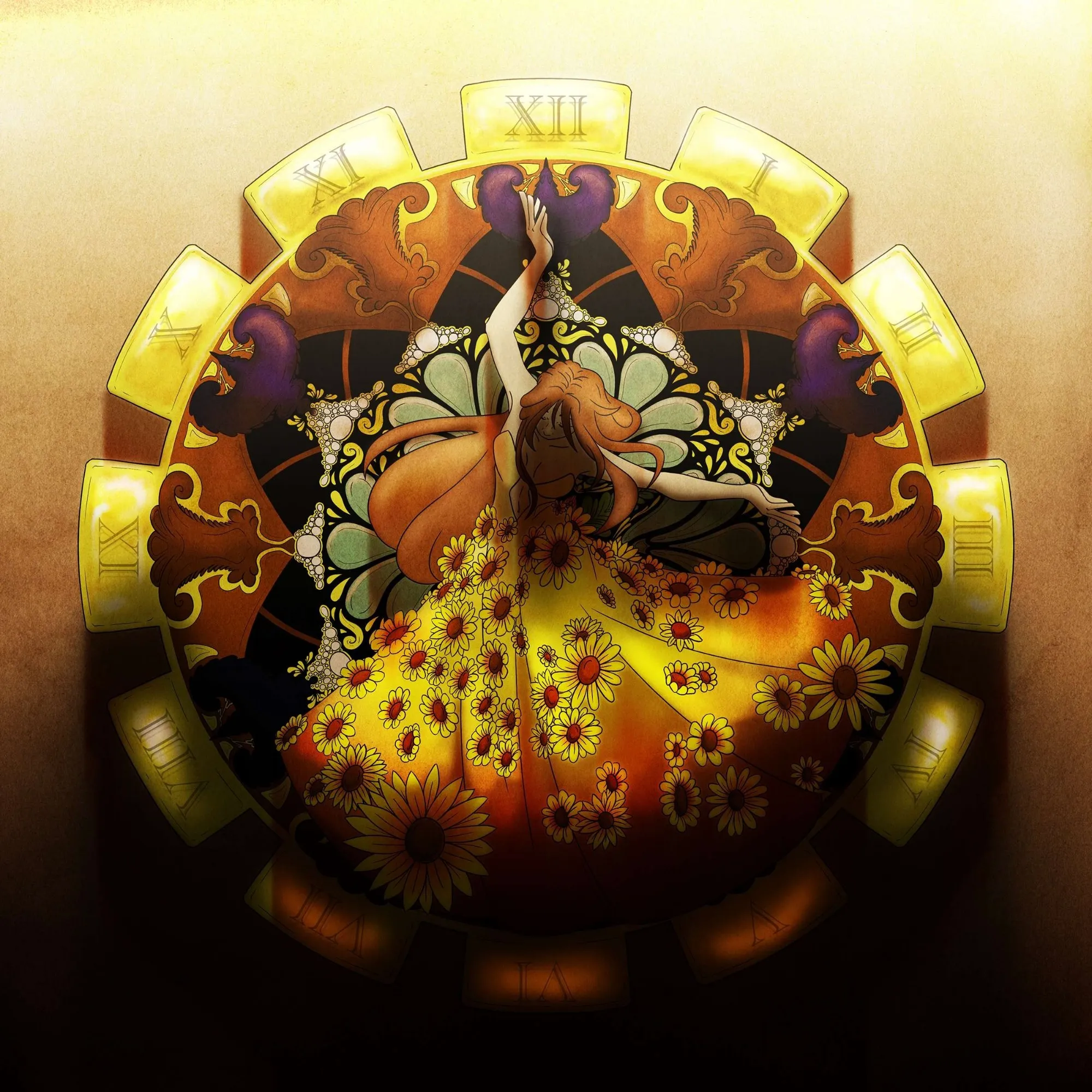
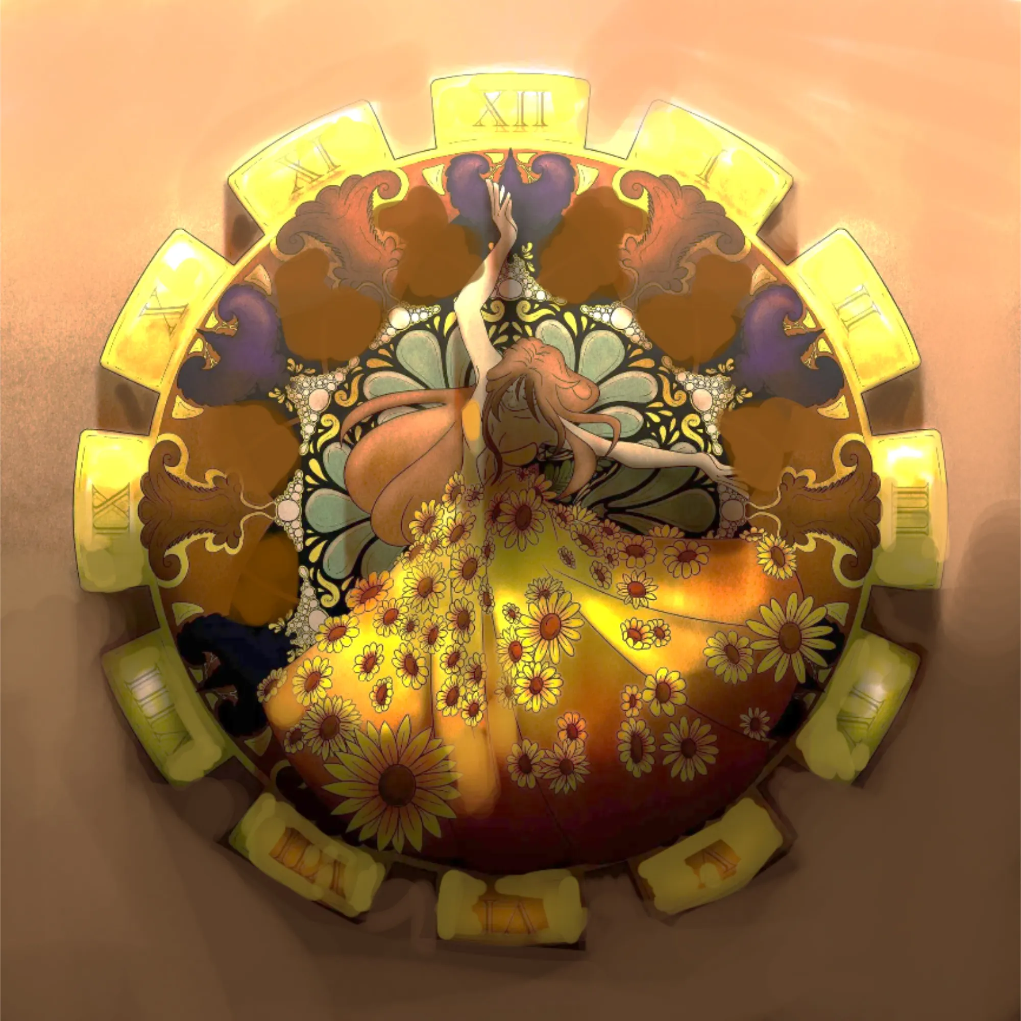
Hi Hi! Its very interesting idea and gives us a lot of room for adding/reducing the elements. I am curious how you would rework the artwork! What you have now iss overly saturated and dark picture. Dark colors should be avoided when generating shadows because they will make the artwork look muddy and artificial. Change to either cold colors (mostly blues but avoid purple) or warm colors (a mix of orange and yellow), depending on the type of light you are using. Each stage—linework, flat colors, shadows, light, and background—should be kept separate for a cleaner finish. Remember the volume of each artistic feature, such as the clock and the ornamented figure. When using light and shadows, treat each as a three-dimensional form. As for the design, I only reduced a bit of ornaments in the clock. Be careful to not have noisy drawing and focus most of the details on focal points: figure and their details. Hope it helps!
Participez à la discussion
Inscrivez-vous pour donner votre avis sur cette œuvre.