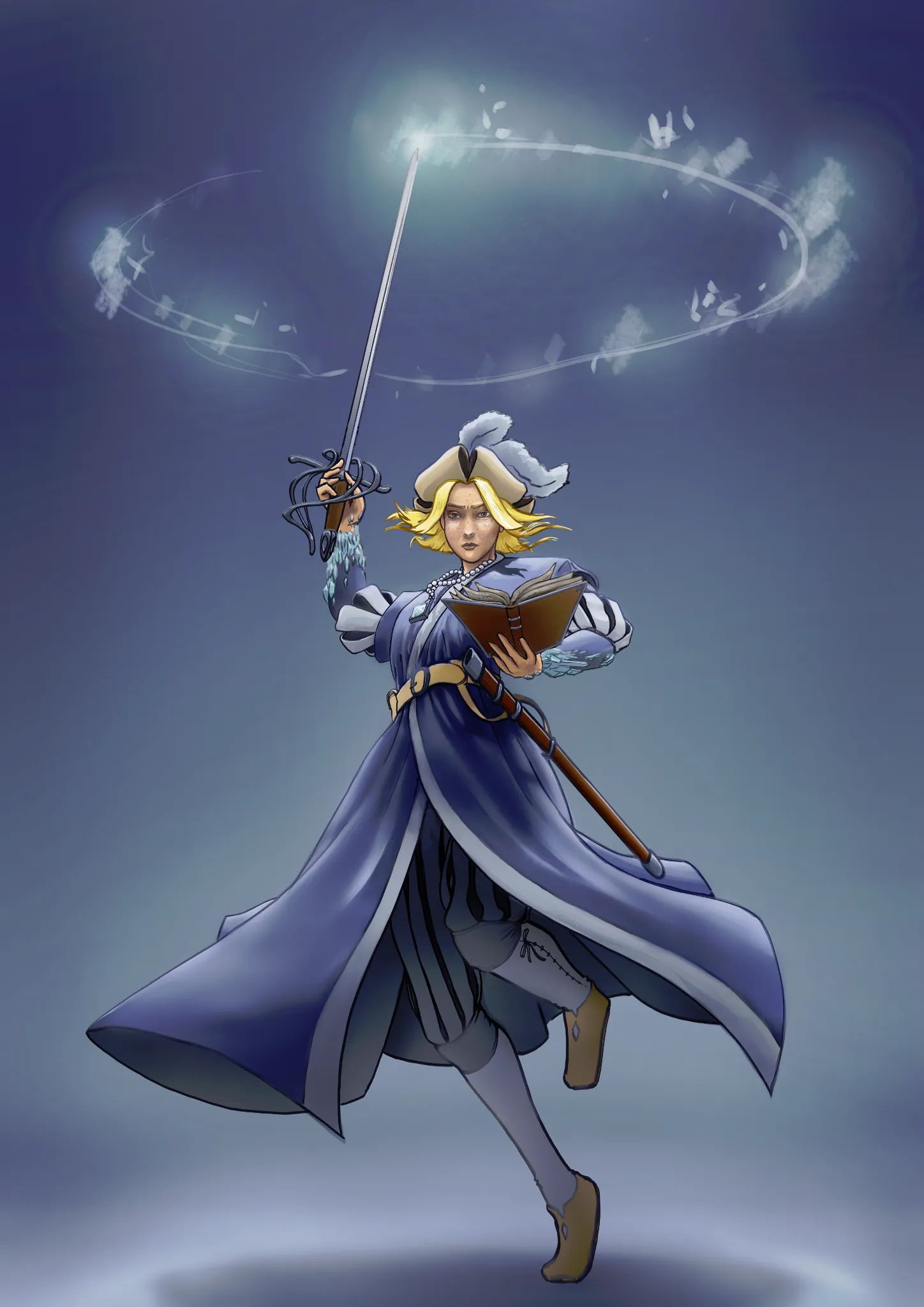
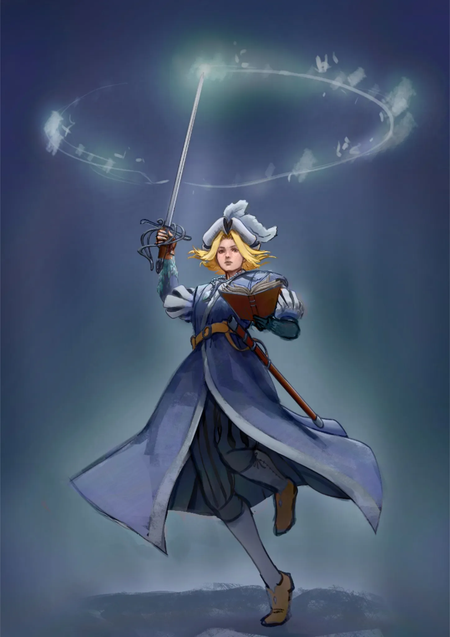
It's a really cute design! As for a critique, it seems like you have a good idea of things you need to work on based on your description. Anatomically, her left wrist is a bit broken to fit into the pose you have so I fixed that. That can easily be fixed in the future by acting out the pose yourself and seeing what feels natural and of course studying from reference. The other anatomy issue was the head or more like the neck. To be at that angle when we are looking up at her, her chin should be close to or touching her sternum. Especially because her chest is pushed out. I decided to lift the face instead but you could have gone either way. It's funny you should mention working in monochrome because I think your values could actually use a little work. Though I suppose it's more of a compositional issue. The image is just so bright. I think it could've been benefited from darkening everthing except for the magic and where the light hits the figure and adding harsher cast shadows. Since you're used to monochrome, perhaps starting in value would help making painting easier in the future. Hope this helps!
Participez à la discussion
Inscrivez-vous pour donner votre avis sur cette œuvre.